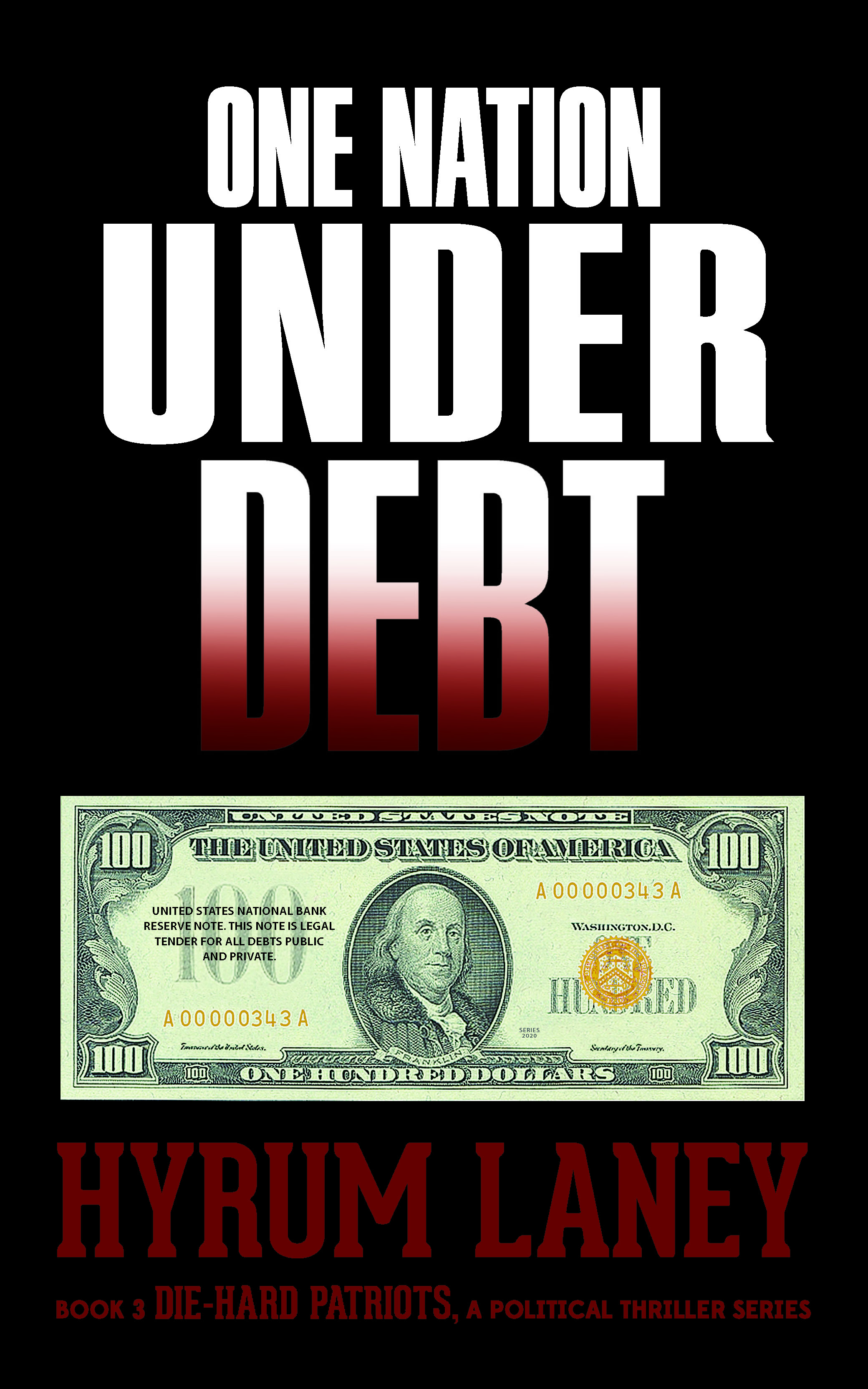
The author says:
HUNGER -A Thrilling Suspense
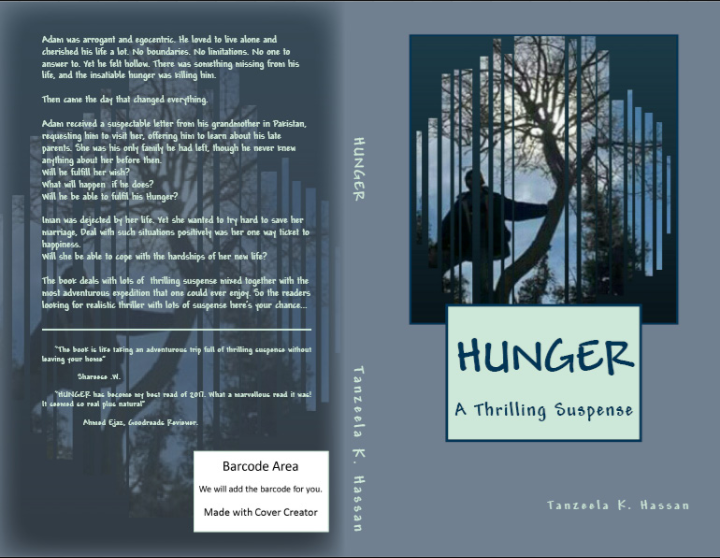
Adam was a satisfied New Yorker until he receives a suspectable letter of his grandmother from Pakistan, requesting him to visit her to know the truth about his thrilling past, his insatiable Hunger begins. Will he satisfy his hunger?
Iman is dejected by her life, yet she wanted to save her marriage. will she be able to save it? or a new chapter in her life awaits?
It’s adventure, drama, thriller and suspense plus with a little hint of family and love. Target audience is everyone who lovery thriller with travel and adventure. My primary objective to write the book was to tell the world positive aspects of Pakistan. As I am a proud Pakistani myself. At the beginning it’s set in new York where Adam finds our about his grandmother travels to Pakistan to meet her. Then it goes back to his parents story connecting Adam himself with it. at the end the story takes a seven year leap and the action thickens.
Nathan says:
All automatic cover generators and their templates have problems, and this one is no exception. Here are the main problems with this template:
- There is a metric ton of wasted space. Look at the thumbnail; we can barely read the title, and the subtitle and byline are only a few pixels each, but golly do we see a lot of blue-gray background!
- I assume that the font is one of only a few options given for this template. It’s completely wrong for thrilling suspense.
- Coming back to the byline; seriously, who would want their name to be so small?
Those are all complaints directly related to the template itself. Now here are some complaints about your use of it:
- “A Thrilling Suspense”? Yes, “suspense” is technically a noun, but as a descriptor of a book it functions as an adjective. It should be “A Thrilling Suspense Story” or “A Thrilling Suspense Novel” or something.
- Blue-grey, and more blue-grey, are not thrilling colors. Look at how other suspense novels broadcast their genre: Lots of high-contrast color and strong type. (And no frames.)
- On the other hand, the story you describe on the back cover isn’t a thrilling suspense story. It’s a family drama. You either need to change the subtitle on the front, or include the actually thrilling parts of the story on the back.
- If all of this is about Pakistani heritage, why is there no hint of it in the imagery? A guy sitting in a tree isn’t specifically Pakistani. (Also not thrilling.)
I think you’d be better off by scrapping this and starting over from these questions:
- What do I want my potential audience to comprehend in the first split-second of seeing the cover? (I think the answers are “suspense” and “Pakistan,” unless you decide that “suspense” is really not a primary descriptor of your story, in which case “drama” and “Pakistan” would be the answers.)
- How do you visually say “suspense” to potential readers? (Again, look at the covers of other successful suspense novels to see how readers of suspense novels are used to being marketed to.)
- How do you visually say “Pakistani” to potential readers who will likely not be Pakistani? (I’m assuming here that your target audience is a broader one than simply Pakistani-Americans.) A Google image search for “pakistani culture” shows me lots of bright colors, intricate designs, and Islamic imagery. If you’re not using some combination of those elements, you’re not telling us about the book at all.
I think the evidence says that thinking in terms of visual design and impact is not your skill set. There’s no shame in an author admitting that they don’t have experience in design, and instead turning to someone who does have that skill set. You should probably look around for a designer to work with.
Other thoughts?