The author says:
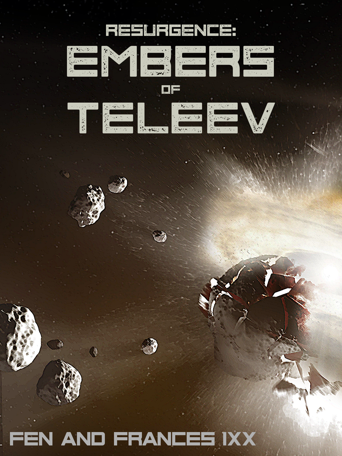
Sci-fi novel and series debut. In a galaxy struggling to rebuild after an interplanetary war that ended with the destruction of the neutral world of Teleev, a task force is formed to apprehend the vengeful survivors of the shattered planet. This is the final draft of the cover.
Nathan says:
Aw, don’t tell us that it’s the “final draft,” because that means all you want to hear from us is, “Good job, don’t change a thing.”
I think it’s a solid foundation, but it looks awfully murky thanks to the color scheme. Giving a deep navy tone to the non-explody parts would lend some much-needed color contrast.
I don’t understand why both the title and byline are so small — there’s so much space to play with (see what I did there?), and it’s not like you’re in danger of covering up an important detail like a character’s face. And that would help with readability; a relentlessly square font like this is in danger of causing eyes to skip across the letters. Not that you have to change to something with upper and lowercase, but even some space between letters might help slow down those skipping eyes.
So the byline is “Fen and Frances Ixx”? That’s… an awfully hard surname to read, and the size doesn’t help. You might want to change that font to something that (a) has upper and lower case, and/or (b) looks less like a Roman numeral. Unless that’s supposed to be a Roman numeral, in which case I’m hopelessly confused.
Other advice?