The author says:
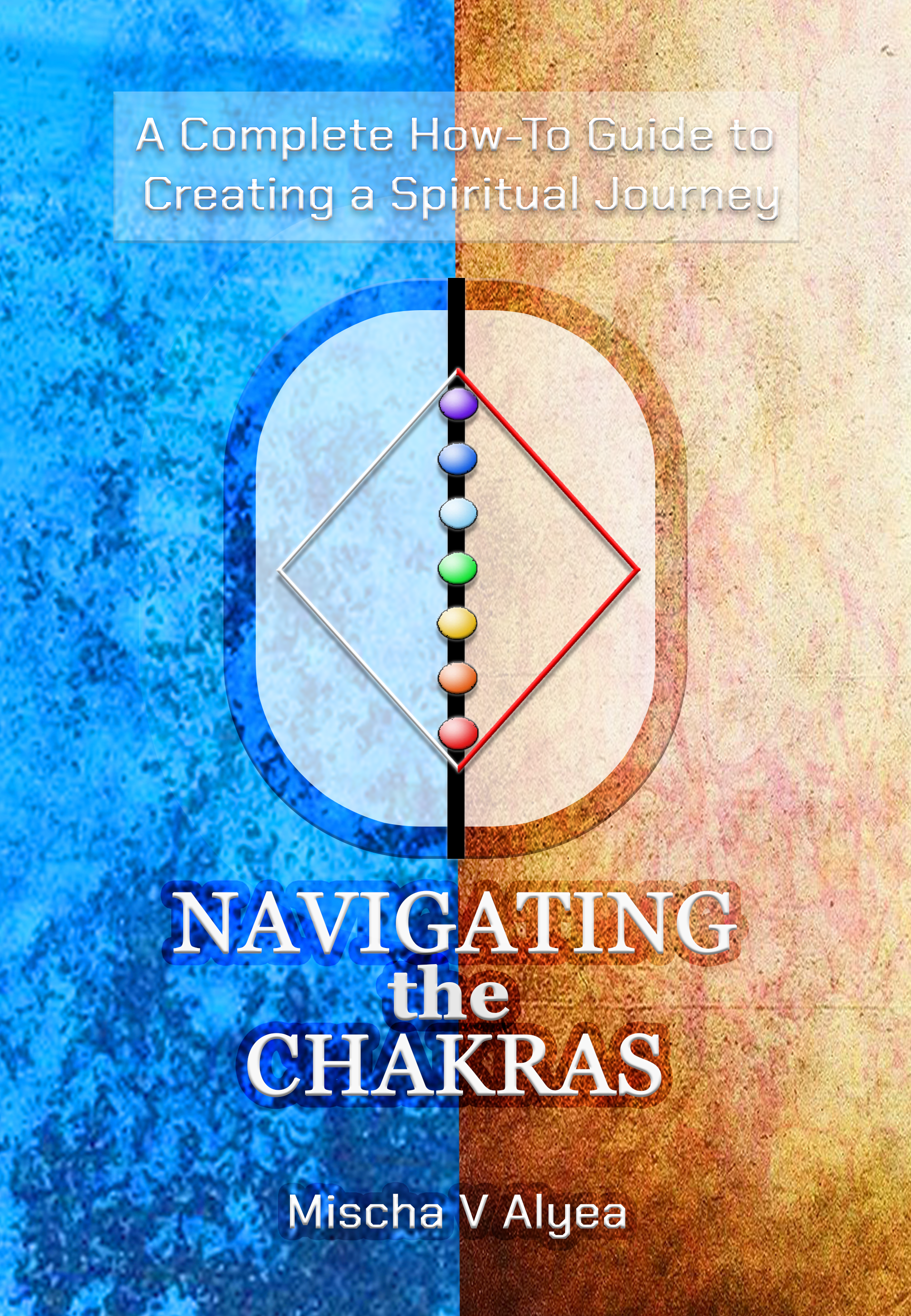
Embark on a transformative exploration of the chakras with “Navigating the Chakras,” a comprehensive guide that unites ancient spiritual wisdom with the latest scientific insights. This book is your roadmap to understanding the intricate connections between the chakra system and two profound spiritual paths: the Hero’s Journey and the Heroine’s Journey. Inclusive of every religion, “Navigating the Chakras” emphasizes the concept of Yin and Yang, the essential balance between opposing forces. This holistic approach reveals that there is no absolute good or bad, only the harmonious interplay of energies that leads to spiritual growth and fulfillment. Each religion is seen as a necessary piece of the grand spiritual puzzle, contributing unique insights and practices that enhance our understanding of the divine.
The Hero’s Journey: Opening the Heart with the Element of Fire
The Hero’s Journey follows the element of fire, guiding you to open your heart to love and compassion. This path aligns with Jungian psychology, focusing on discovering and developing the anima—the feminine qualities within the psyche. As you traverse the Hero’s Journey, you’ll ignite the flames of courage and empathy, unlocking your potential to connect deeply with yourself and others.
The Heroine’s Journey: Focusing the Mind with the element of Water
In contrast, the Heroine’s Journey follows the element of water, narrowing the focus of the mind and enhancing the executive function of the brain. This path is where the concept of the Virgin Birth to the Divine Male Child emerges, symbolizing the discovery and development of the animus—the masculine qualities within the psyche. By navigating the waters of the Heroine’s Journey, you’ll cultivate clarity, purpose, and the strength to manifest your deepest aspirations.
A Synthesis of Science and Spirituality
Drawing on the sciences of neurology, psychology, and physics, “Navigating the Chakras” validates ancient teachings with modern knowledge. This synthesis of old and new provides a robust framework for those seeking to deepen their spiritual practice and achieve a state of balance and enlightenment. Discover how the chakras can guide you to a life filled with love, abundance, and peace.
Whether you are just beginning your spiritual journey or are an experienced practitioner, “Navigating the Chakras” offers valuable insights and practical tools to help you map and navigate your personal path with confidence and clarity. Join us on this enlightening journey and unlock the full potential of your Body-Mind-Spirit complex. “Navigating the Chakras” is more than a book—it’s your guide to a balanced and harmonious life.
Nathan says:
Evenly split covers are a challenge, and you’ve conquered the biggest hurdle by having the two sides roughly equal in value. However, the other big challenge here is lack of contrast between the type and the background. Especially in the subtitle (or, rather, supertitle), the lack of contrast interferes with readability. The secondary typeface chosen also seems a little too clean and modern to me.
My advice: Increase the contrast, increase the title size so it can be more clearly read in thumbnail, and play with that second typeface.
Any other comments?