The author says:
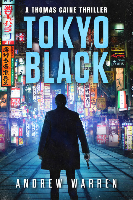
I am the author of this book. It was published in 2016, but I am considering a cover redesign for the series.
Tokyo Black introduces readers to Thomas Caine, a former CIA assassin. Betrayed and left for dead, he has put his past behind him. Now he lives off the grid, in the seedy underworld of Pattaya, Thailand. But when local gangsters set him up for a crime he didn’t commit, his old CIA masters make him an offer he can’t refuse: rot in a hellish Thai prison, or accept a dangerous mission in Tokyo, Japan.
The book is a spy action thriller. There are three other books in the series, which all follow a similar design treatment. Readers compare the style of the books to Vince Flynn, Ian Fleming, Barry Eisler, etc. It has a cinematic, high action feel, with a mysterious streak, and a heavy emphasis on Tokyo and the Yakuza.


Nathan says:
It’s very well put together, but I can also understand the impulse to redesign, especially if it’s been a few years and your sales are leveling off — it’s time to attract some new eyeballs!
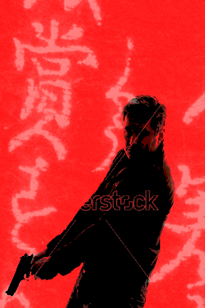
I don’t think this cover is too busy (the elements of the background blend into a good backdrop for the main character silhouette), but when doing a periodic redesign, I always think, “What can I flip to catch the attention of those it didn’t hook the first time around?” So instead of blue, I’m thinking red. Instead of a full background, I’m thinking a few strings of half-toned brush-written kanji, at an angle to the edges of the cover. Instead of a silhouette from the back, I’m thinking a posterized view of a man with a gun from the front. Sort of like this:

Note: Do NOT use that stock model photo. It was on the first page of search results of “man with a gun” on Shutterstock, which means that it’ll be overused and overexposed. But this at least illustrates my idea.
Other comments?
