The author says:
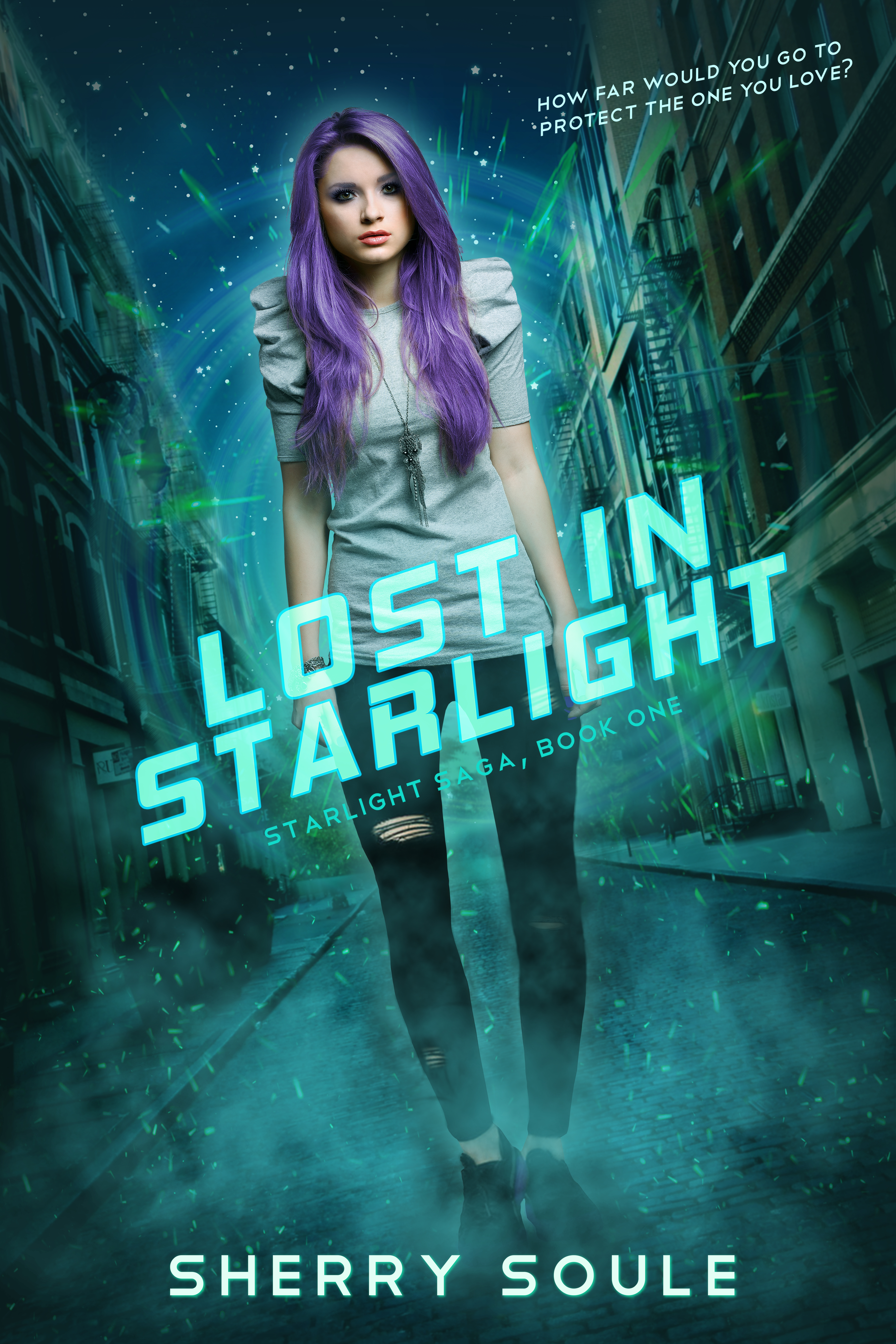
This is the currently published cover to my dark humor/superhero novel. I want to ‘re-brand’ the cover because I feel like it missed the mark on depicting genre/tone. While it does have superheroes throughout the book, the main focus is on Adam, the guy who got stuck with the worst superpower ever-an immortal disaster magnet for superpowered events. There’s a lot of insanity (mole people and portals to twisted versions of Wonderland anyone?), and a darkness that follows a jaded and sarcastic Adam. While I initially thought the illustration definitely hit those targets, I had a few people mention they didn’t even notice the superhero in the background. But I’ll be honest, I’m at a complete loss in what direction to go with this, as there are two more books in the series I don’t want to mess up the next two covers. (Authors’ readers it would appeal to: Caimh McDonnell, David Neth, Samuel Shem) Thanks for your time!
Nathan says:
The art is well executed, but I can see the problem that others mentioned to you: the superhero in the background both blends into the general busyness of the cover and is partially covered by the title, which means that the superheroicness (I’ll let someone else figure out the appropriate noun) is lost.
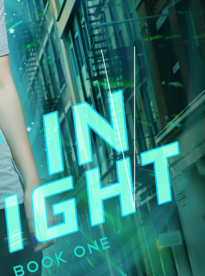
I think that you could work with the same artist — I REALLY like the style for this novel — and modify some elements:
- Make the background much less busy; let the smoke isolate Adam and the girl visually.
- While you’re at it, move Adam and the girl further to the bottom.
- Place superheroes in shadow of silhouette nearer the top, letting them be both distinct from the background and separated from Adam.
Here’s my thumbnail sketch of the layout:
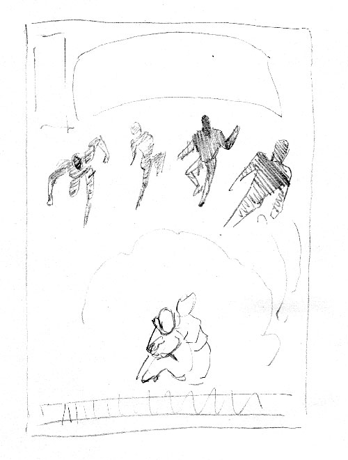
This both simplifies the cover, and makes a point of Adam’s visual separation from the superheroic types. I blocked in the title in an arc because it would take up less of the real estate, allowing your artist to put in the hero silhouettes clearly while allowing space between them and Adam.
And if you still need it to me more comic-booky… the rectangle to the left of the title is where most comic companies put their indicia, as more of a visual cue to the genre.
Other comments?