The author says:
170 practical tips for how to do office writing jobs with ease, speed and style. For small businesses, less experienced writers, and non-native English speakers. Business/Reference book.
Nathan says:
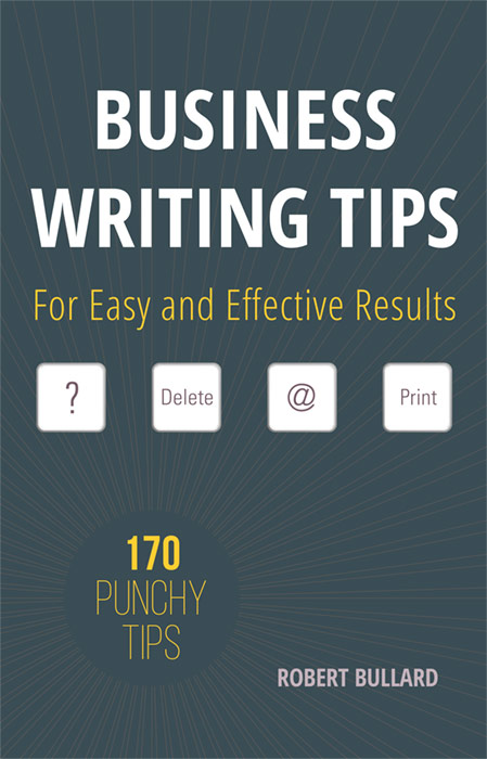
I think it needs just a little more “punchy” — it could be as simple as reversing the font color and background for the “170 Punchy Tips” circle.
Other comments?
Exactly my first thought: a cover that boasts a “punchy” subject that is itself simply dull.
I am not too sure what special significance, if any, the choice of the four keys might represent. They don’t seem to have any particular relevance to the subject of the book. Four random keys floating in all of that dark space just makes the cover look duller and less interesting.
I need to stare at this a bit more, but my immediate reaction is that the background color is painfully dull. I realize, I do, that this is a business book, and all that, but…I think it needs to brighten up a bit. More teal, less black in the tint.
More comments later.
My main complaint about this cover? In a word: it’s boring. Granted, business writing isn’t exactly the most exciting topic in the world, but that’s no reason for the advertising for a how-to guide on it to be so aimless and dull.
While the process of business writing itself can be a rather tedious chore, the benefits of learning the finer points of business writing like how to write a really gripping progress report or a snappy memo can be very exciting indeed to the business-minded target audience: more money, more job perks, and more promotions to prestigious positions. This cover never alludes to any of these benefits specifically, only generally, and in the most abstract manner of allusion at that: “170 Punchy Tips” on… something (no categories are listed); so what’s so “punchy” about them?
Bear in mind that while “Show, don’t tell” is an axiom for fiction writing, the covers for nonfiction books like how-to guides on business writing are generally far more exclusively text-oriented. Take a look at the Amazon page I just linked: the only image I see on any of that page’s book covers that isn’t a logo or a piece of clip art (or both) is one solitary picture of a pen, which is used almost like a piece of clip art anyway in literally underscoring its title’s artsy custom-textured font. Everything else on all of these covers is text, text, and more text.
If you want something sufficiently eye-catching to your prospective readers, you need two things: a boldly contrasting color scheme, and a snappy tagline or short list promising the reader some specific benefits. Concerning the color scheme, take another look at that linked page: even the very dullest of those covers (10 Steps to Successful Business Writing by Jack E. Appleman in my opinion) has got strong retina-punching black-and-electric-blue big bold text against a stark white background to reach out and grab its customers. On your cover? The white title against the dull bluish-gray of the background is the only part legible in thumbnail, and all the rest of the text (most of it dull yellow) is swallowed up in illegibility.
Now check out how snappy and straightforward some of the taglines and lists on those covers are:
“Boost Your Career By Saying What You Mean”
“Engage readers / Tighten and brighten / Make your case”
“What Works, What Won’t”
“e-mail – letters – memos – presentations – plans – proposals – reports – speeches – resumes”
Don’t you think all these terse phrases sound a bit more promising and specific about the benefits of reading these books than the vagueness of “For Easy and Effective Results” does? What kind of “results” are you promising your prospective readers? Chances are they’ll never know, since they probably won’t pick up your book if you don’t tell them these things in advance.
Basically, your cover needs three improvements:
1. Get a better color scheme. I’m partial to the bright-red-and-dark-blue-and-beige-against-stark-white I’m seeing on two of the covers at that link, but any of the color schemes I’m seeing there is more gripping than the one you’re currently using on yours.
2. Make all the text legible in thumbnail and fill your cover with it. Since imagery is (as mentioned) not really necessary for the cover to this kind of guide, you might as well expand all your text to fill the available space; and for heaven’s sake, none of that spidery sinks-into-the-background-without-a-trace font you’re using for your byline and tagline right now! Use a good thick bold font as large as you can make it without bleeding it off the edges of the cover; even plain old generic Arial Black would be more eye-catching and legible than what you’ve got now (and Hitch can probably suggest some fancier fonts than that if you need any).
3. Make at least one concrete promise to your readers in a terse tagline, and preferably several. Since we’re working exclusively with text here, this is your chance to apply your writing talents as “art” on the cover. Think of how to express the benefits you’re promising to your readers in snappy phrases so terse that they won’t even need an exclamation point to sound exciting. Try things like:
“Get That Job”
“Get That Raise”
“Get That Promotion”
“Get That Corner Office”
“Sell That Product”
“Claim Your Rightful Credit”
“Deflect The Blame”
“Get It Done Before Lunch”
“Show Them How It’s Done”
“Keep That Conference Hopping”
“Grab Their Eyeballs”
“Shake Them Awake”
“Keep Them Alert”
“Write Stuff They’ll Actually Read”
You may notice a number of these suggested imperatives apply directly to yourself, which should come as no surprise and you should not consider to be at all ironic. After all, what you’re selling here is basically an effective business document you’ve written to… teach others how to write effective business documents. The more you convince your prospective readers you’re practicing what you preach, the more effective you’ll be at persuading them to follow your lead.
Above all: be bold, be shameless in promoting your product, and show some confidence. If you can design your cover to make it look like you know what you’re doing, that’s all the proof anyone (including yourself) needs that you actually do know what you’re doing. If your cover design thus demonstrates to the prospective reader that you know what you’re doing, you’ll make the sale.
I also don’t like the keys. I’d remove them and instead make the background pattern bolder.