Category: Covers

Puzzling Escapes: Space Station

The author says:

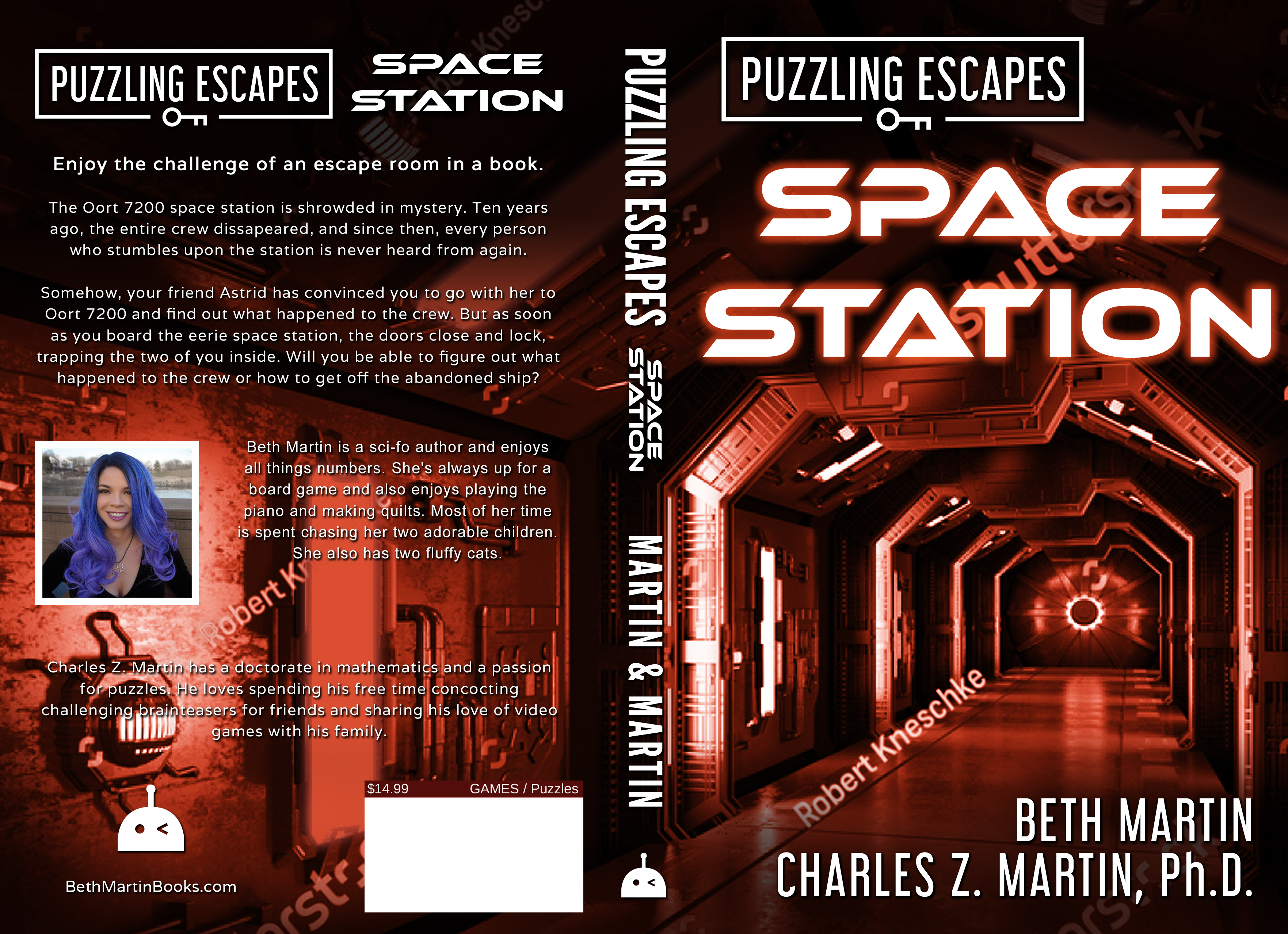
Puzzling Escapes: Space Station is a puzzle book with narration to give it the feel of working through an escape room. The primary audience I’m targeting is people who enjoy puzzle books. Since it will only be available in print, I included the full print spread. This is a mock-up, so the image still includes a watermark.

Nathan says:

The cover conveys “space station” well, but not “puzzle” or “escape” — the “Puzzling Escapes” tag at the top is easily overlooked (especially in thumbnail) for the crucial few seconds in which the reader would assess the cover and decide if it’s for him or her.  I don’t know how best to convey it visually; my only idea is to put a silhouette or a head from the back in the foreground to convey the idea of the reader’s involvement, but I’m not convinced even that would do it. Maybe the best way is to reverse the sizes of “Puzzling Escapes” and “Space Station.”

Further notes:

  • Unless Charles’ advanced degree is indicative of his expertise in designing puzzles (and it doesn’t look like it is), ditch the “Ph.D.” on the front.
  • Either have photos for both co-authors or neither.
  • Your own cover bio tells us a bunch of details irrelevant to your own ability to design puzzles.  Save the kids and cats for an interior back-page bio; if you have nothing in your resume that helps sell this book specifically, it doesn’t belong on the cover.

Other comments?

Wisdom From the Blue Fuzzy Chair

The author says:

A look at living with an incredible child. Imaginative, creative, and beyond belief. A blog turned into a narrative of real life.

Nathan says:

I suppose it’s okay that the cover looks like no subject in particular, as the contents are probably pretty random. But you’ve got two focal images here: The chair, and the man-and-child.  You should pick one or the other, and of the two, I’d go with the chair because the people in the photograph are unfamiliar to the reader (unless, of course, you’re only marketing to friends and family), and the photo isn’t remarkable to carry the cover on its own.

My own inclination, though, would be to use a photo that both conveys adult/child interaction and universalizes that interaction (because, as I said, nobody who sees the book for the first time is going to be familiar with those particular people). I’d look for a soft-focus, sunny photo of adult and child hands doing something together.

(Obligatory note about the cover as is: The title gets lost, both by being wedged to make room for the photo, and by being black text against a blue background.)

Other comments?

The Legend of Silverwolf

The author says:

This book cover is the final concept made by me. Not sure if this is eye-catching or not. Set in the current time period, a male human from another planet travels to Earth to become a hero of the people living under a global apocalyptic dystopian tyrannic rule. He wears a nanosuit in a liquid metal chrome texture and calls himself Silverwolf.

Nathan says:

Unless your story largely occurs in space, I think you’re making a mistake with a space cover. Both superhero novels and post-apoc novels are popular right now among Kindle readers — something that indicates both from the cover would trigger a lot more interest than a generic space picture.  And it wouldn’t have to be terribly expensive, either — there are cheap stock post-apoc landscape images, and you would just need someone to insert a silvery glowing figure hovering above.

Other thoughts?

The Indivisible and the Void [resubmit]

The author says:

I posted this book cover months back on your website, and I am very grateful for your feedback, as well as the feedback of your followers. I have since tweaked the cover a bit, and would appreciate if you could post this with the original. I am really curious what people think of this new one versus the original.

[original submission and comments here]

Nathan says:

Since most of the specific suggestions on the original submission came from the commenters, I’ll let them do the heavy lifting this time around. My only comments are that a couple of the tweaks seem like steps backward to me:

  • Having the “D.M.” of the byline in a larger font size looks like misplaced emphasis.
  • The map you’ve added in the background is clearly mirrored — all the text is backward.

Other comments?


Borderlands [resubmit]


The author says:

My previous submissions for this project were all self created and variously unsatisfying. (some were so broken that not even the arrayed talent here at Cover Critics could fix them) After running a very exciting and intense cover design competition at 99Designs I have three finalists to choose between. If this book were a standalone I would be happy to have any of these three as its cover. However, this is intended to launch a series so I need a strong brand identity and a layout that is flexible enough to stretch across all the different characters and situations. (At the moment my heart favours one design and my head a different one) Which would you choose? or Have I missed something fundamentally terrible about them all?

Proto-blurb: The Aether Guard has patrolled the Borderlands for aeons protecting the nations of the Rationalle from the encroaching Realm of Chaos and its vile Spawn. When a flesh eating shape shifter slips past a renowned Patrol Captain, both personal ambition and the sanctity of the most sacred relic in the cosmos are put at risk. Can the monster be found and stopped before it is too late, or will Chaos finally reign for all of eternity?

(Original submission and comments here)

Nathan says:

Designating them “#1,” “#2” and “#3” in the order they appear here, I would go with the artwork for #3, although possibly with the title treatment from #1 (it’s more distinctively branded). Then you just need to make sure that the covers for the following books in the series also feature a dynamic close-up character portrait.

Other opinions?