The author says:
It’s set in a Hellenistic world where people who have exhibited supernatural abilities are known as Tallents. Its an Urban fantasy/Dystopian novel. The target audience is young adults both men and women between ages 12 and up, mainly those who are into fantasy elements like vampires, demons, werewolves, etc.
Nathan says:
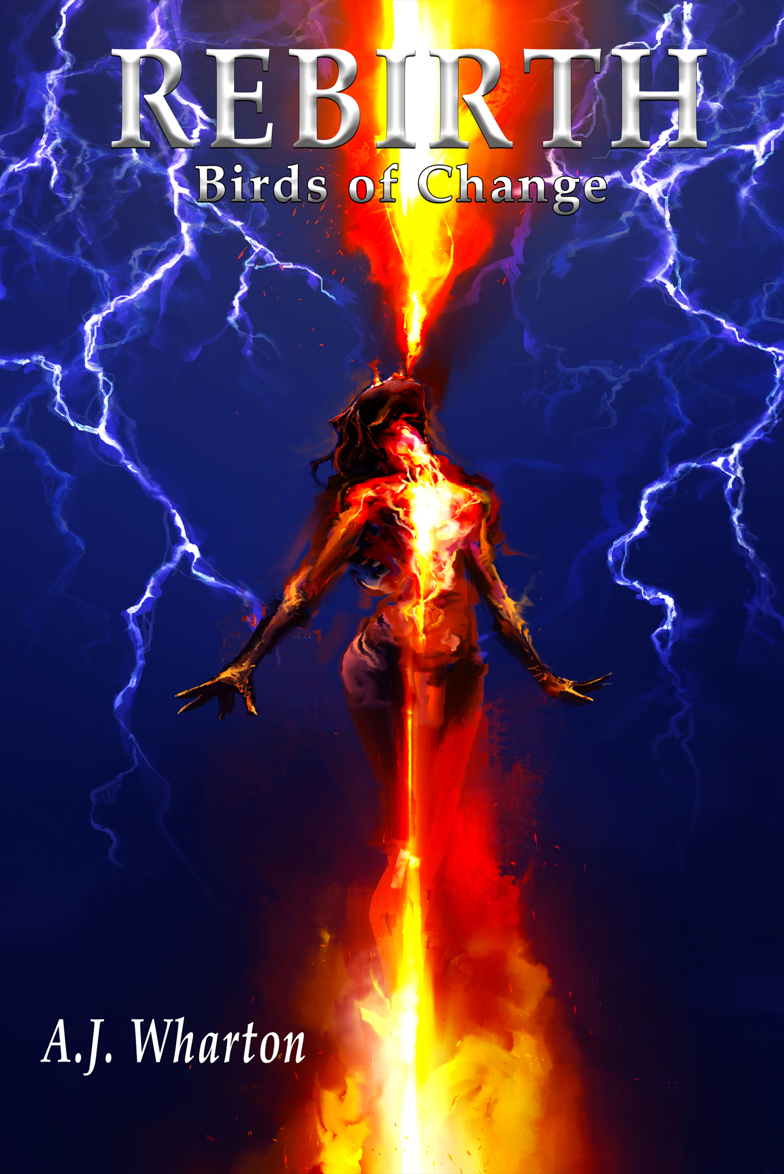
It’s a good start — the artwork is obviously snazzy, although I’d take the color saturation down a titch.
The biggest problem is with the text. As you can see especially in the thumbnail, the title and subtitle merge with the background, and the beveling on the letters hinders rather than helps. And there’s no reason for the byline to be the only part of the cover not aligned to the center (and in italics to boot).
I would actually make the title and subtitle larger (recrop the art so that the figure is lower if you have to) with a clear drop shadow or outside border to set the letters off from the art, and then have the byline in the same font, centered and extending almost fully side to side at the bottom.
Other comments?
I love the firebreathing shooting above, the fire extending below looks like its extending from her “nether region”. Removing the lower fire and dropping the text to below the image would also solve the font merging with the background above as Nathan mentioned.
I’ll edit my comment as I’m not qualified to make suggestions. So, ignore ” Removing the lower fire . . .”
I can say (especially after reading TracyAnnMiller’s comment) that everything in the bottom half of this book bothers me. I feel the top half of the image is stunning. Typography seems off.
I like the artwork, though I wish that the head and arms were a little better defined. They are so close in value to the dark blue background that they tend to merge into it.
As Nathan says, what needs to be worked on most is the typography and I think his suggestions are excellent. I know it’s always a temptation to not want to cover up any more of a nice piece of art than possible, but I think that will be too much of a problem. And I want to underscore what he said about centering all the type. The vertical symmetry of the entire cover is so strong that it is really disconcerting to see something violate that.
These covers I did have a similar symmetry, to show you what I mean:
http://www.black-cat-studios.com/black-cat-press/firebrands/imag001.jpg
http://www.black-cat-studios.com/black-cat-press/firebrands3/IMAG003.JPG
http://www.black-cat-studios.com/black-cat-press/firebrands4/imag001.jpg
(Where did you get the art? Was it specially commissioned? Anyone doing artwork meant for a book cover should always make sure that enough space is left for the title.)
Originally I had found the artwork online, and sought out the artist after finding it. I then commissioned him to add the lightning effects and make it more in line with the tone of my book. You can find the original artwork here —> https://www.deviantart.com/cobaltplasma/art/Feeding-the-Fire-587596548
There’s a phallic shape in the groin area. Intentional? It bugs me.
Yes, I saw it instantly, too. If it’s deliberate…well, even if it’s not, I’d ask the artist to tweak it a bit to remove it. I don’t think it’s deliberate, though.
Augusta’s example shows what I would have commented upon, so…I won’t go into my riff about the fonts. You’ll notice, for this book, that using dark blue, red and yellow really limits your lettering options, color-wise–you see what happens when you have to cross blue AND yellow, it’s a mother to letter–so, keep that in mind for your next book.
I do want to say, while it’s a breathtaking image, I still have NO idea what the hell the book is about, or genre, etc. Just a wee observation.
You’re falling into the trap that a lot of self-published authors do, which is “I have this great art! I can’t cover it with text!” As a result, you treat your title and byline as unimportant information, when they are very important. It’s coming across as apologetic.
Take a look at other books in the same genre. Many of them have the title smack dab on top of the artwork. Others have it on top or below, but in all cases it’s noticeable. Also note the relative subtlety of text effects: many titles are in a flat color, quite often white, and if there’s a text effect it’s usually an outline or a drop shadow, to make the text stand out.
The ones that have (successful) text effects are pulling something out from the artwork: a grungy dystopian artwork has a grungy text effect on part of the letters (not applied evenly!), or there’s a gentle beveling on the title that takes colors from the sunlight effect behind the hills and whose light and shadow follows the direction of light on the cover.
This dramatic text effect on the title pulls exactly from the artwork and was designed in conjunction with the art: it’s part of a compositional triangle made of the blue aura and tattoo on the male figure, the blue reflection on the female figure’s face, and the title.
For your book, since the artwork is so bright and so stark, I’d do something like this: https://i.imgur.com/urFSPG2.jpg
Simple font that’s taller than it is wide, done in plain white with a bit of a glow and a thin outline to make it stand out against the white bits of the painting. Title BIG, so it’s visible and important. Move the picture up a bit to center it.
Augusta’s example is dead-on.
Thank you! That’s really insightful! What font did you use for that concept? I think that would look great! Especially with the audio version of the book coming out soon.
Thanks! I used Balestya Sans, which comes with the script bundle of Balestya.
By the look of things, you’ve pretty much tweaked the artwork as much as it can be tweaked: the contrast between the dark blue and fiery orange has apparently been ramped up as high as it can be before it starts making the image look grainy. Judging by the covers Ron Miller showed us, a human figure amid some kind of glowing energy (be it fire, lightning, plasma, or whatever) seems to be fairly standard for this genre, so this artwork is perhaps a bit too generic but otherwise well within acceptable parameters. What mainly remains to be fixed is the captioning for the titles and byline: while that History Channel-style beveling more or less fits the Hellenistic setting, it really just doesn’t show up quite right against certain parts of the image; also, you’re being too shy with both your titles and byline, and need to make everything bigger and louder for the benefit of readers looking at that tiny little thumbnail while browsing the book listings at sales sites.
The difficulty of making your captions readable, of course, is that with the strong contrast between two colors so nearly direct opposites of each other in the artwork, captions of any single color are likely to fade into some part of it. My solution for this is something I call a counter-gradient: make a gradient of the two main colors in the background, and apply it to the caption in such a way that each of the colors in the caption is roughly displayed against its opposite in the artwork. Here’s my revision of your cover doing just that.
(Note: since your image is broken up a bit like a cubist painting in order to hint at the chaotic “dystopian” setting of this novel, I’ve used the somewhat distressed font You Rook Marbelous in keeping with this style. I wouldn’t actually recommend that you use that specific font however, since identical letters in pre-distressed fonts are always identically distressed, giving away the designer’s being too lazy to customize the title along with the artwork. When you caption the cover, be sure to do the distressing yourself along with any other necessary customization.)
“Judging by the covers Ron Miller showed us, a human figure amid some kind of glowing energy (be it fire, lightning, plasma, or whatever) seems to be fairly standard for this genre…”
No. Not even remotely! Out of the some 200 covers I have created I was able to find only three with a similar symmetry. One is a science fiction novel, another a fantasy-adventure and another a science-fantasy. They are only very distantly related regarding genre and only two of the three actually illustrate a figure amid fire or energy. The examples were chosen only to show how typography might be handled on a cover with a similar strongly vertical symmetry centered on a figure…not to suggest that there is anything even remotely generic—let alone “standard”—about the artwork.
I should reiterate that I find the artwork for the submitted cover to be very nicely done, with the exception of the few minor improvements I suggested. The main failing is the handling of the type.
I like the art, but the line of very bright contrasting white cutting through a very dark image top to bottom makes it REALLY hard to position typography without it getting at least partially lost. I wonder if it would look good to lighten the whole thing so the background is more of a light navy instead of blackish-blue (I see a lot of light navy in YA), and then put contrasting darker text on it. Just a thought.