The author says:
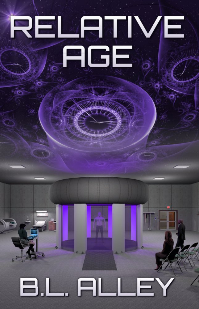
I’m considering updating the cover for Relative Age with this version. The “Quantum Fetus” wasn’t a favorite among critics so I eliminated it along with the simplistic clock, replacing it with clock-based art found on Pixabay.
Relative Age follows a group of physicists and engineers who have accidentally discovered time travel while attempting teleportation. During the first full-scale test an unexpected arrival forces them to shut down the program until the problem can be identified and corrected. A professional troubleshooter is brought in to either find the problem with The Machine or rule it out as a cause, but during his investigation he becomes far more involved in the Project than he ever imagined.
[original submission and comments here]
Nathan says:
You’ve replaced a slew of the specific problems, but I think the overarching problems are still present: It isn’t very dynamic, and doesn’t read well as a thumbnail.
I mean, mid-range purple isn’t a dynamic color, and then with the rest of the image you have… people sitting in folding chairs. The one part of the image which might be intriguing — the guy fading away in the chamber — is so small that it’s easy to miss (plus, he’s fading away, which means he’s even harder to see, plus he blends into the purple that’s all over the place.)
I found the clock image you used on Pixabay, added the first “man with gun” image I found (it could easily be replaced with “man holding whatever instrument he uses for troubleshooting” so long as it’s dynamic), and gave the title a tilt to make it active. Voila, the five-minute redo:
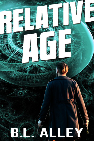
Totally crummy, but active and dynamic.
Other comments?
Nathan, I also noted that you nicely employed complementary colors with the background, which is teal-ish, and the dude, who has got orange/rusty tones.
I know I’m supposed to shut up but when I post suggestions I prefer feedback so I can hone my ideas. Personally I really struggle with my covers, particularly with this book.
There is nothing crummy about your mockup. As you said it’s very dynamic without being complicated.
I was going for an image of hard science giving way to the fantastical. Would it help to zoom in on the traveler as he vanishes? I like my lab image but am afraid to enlarge it without it revealing its amateurish nature. Perhaps it was best left on the back cover.
I’d still like to keep some purple since it’s a key color in the story, but it doesn’t need to be the primary color on the cover.
I like your titling but does it suggest Science Fiction well enough? I’m asking as someone far too close to the material to remain objective.
Would it help to add the tag “How far would you go?”
Will Trevor support Mary’s pregnancy or run away with Betty?
Thanks in advance, y’all.
Nathan’s nailed it. The clock graphic is cool, but the other image is all gray floor, gray walls, and gray ceiling, and also has a pseudohumans issue. His redo is just what you need.
(Although I don’t think there’s anything wrong with purple if you like that color.)
And now for something completely different…
https://imgur.com/a/aBC1zL2
https://imgur.com/a/AqdcMQ8
This has the inkling of a very nice concept. But it needs more contrast and focus. It would take a potential reader far too long–given the brief glance the cover might get—to puzzle out what is really going on.
More like this?
https://i.imgur.com/K6Xu1hB.png
The fetus image you use looks far too unnatural. You need to replace it with something more natural looking. Also, the time-pieces background is obscured by the fetus, leaving only small images of clocks in the background. They would be lost in a thumbnail, and still easily missed in the full size image.
Even though I like this design, this image suggests a story totally different than the one you are telling. Your book is a scientific investigation/experimentation story, where this cover suggests a non-scientific story, based on a pregnant woman. It even suggests the woman would be the main character, which is not the case.
I’m lost in the woods! LOL
The fetus triggers the story and is the lone carryover from when the book was going to be horror rather than science fiction (other than that to which the title refers). The pregnant women are secondary characters but still play a part in the story resolution.
Since it ended up being hard science fiction I replaced the abstract, art-deco cover with The Machine while keeping the quantum fetus from the opening scene.
Keep the suggestions coming. I appreciate the feedback and eventually something will click.
One thing caught my eye: you said that you found an image on Pixabay. Please be aware that a lot of content uploaded there is actually NOT free and NOT released under the CC0 license. Users often upload material that is actually copyrighted – whether from lack of knowledge or from malicious intent – and using images from Pixabay might actually get you in trouble: from simply having to redo your cover to legal actions. If I were you, I wouldn’t take that risk.
I remind people of that all the time. Artists and photographers can post images all they want but if they contain trademarked or copyrighted elements that license means nothing.
It’s not even that.
Anyone could take your picture that they bought or downloaded from an artist website or got from a friend and upload it to Pixabay claiming it’s CC0. Unless they’re reported to Pixabay by the owner of the picture or his/her fans, people keep downloading it thinking it’s free to use even when it isn’t.
True. Diligence is key
If the image is subject to copywrite the poster would be the one breaking the law, not the user. Good Faith protects the user. To post on pixabay the poster asserts they own the copyright.
The same is true for any supplier of pictures be they free or paid. Anyone could steal a picture and put it for sale on a paid site. Whether they charge for it or give it away, stealing is stealing. The buyer is not responsible for that if they acted in good faith. You do not get arrested for buying stolen goods unless it can be proved you knew it was stolen. The pictures on pixabay all come with a creative commons license.
At most you could be asked to return the stolen item. (IE not use the picture without the real owners permission)
Yup–it’s called “detrimental reliance.” The person who downloads and uses the image is relying upon the poster’s assertion, that they own the image. They have a reasonable belief that the poster owns it, and that the image is usable.
🙂
The fundamental problem with this version is that it is static. There is not one dominant image. Instead, there are several that all contend for attention…but none are interesting enough to really attract the eye. And with everything of equal interest there is nothing of real interest. It all averages out to a visual blandness. I think that if I had to sum up the basic problem it is that you are trying to convey too much in the cover. You need to pare down the imagery.
Design-wise, it looks like two entirely different covers joined at the hip…or, rather, at a line dividing the upper and lower halves of the cover.
Finally, the color is, overall, monochromatic and too much of the same value.
The first thing you need to do is find a focus: something that dominates the cover visually. Nathan has shown, in his example, how this works.
That’s why I had the “Quantum Fetus” inside a clock on the previous covers, but most didn’t like that. Now I’m stuck without a focal point unless I go back to the fetus as I did in the second mockup I posted.
As I recall, it was how the idea was executed that was the issue, not the concept itself.
Good memory. It was the nuclear rings surrounding the fetus, but without them it seemed isolated and out of place. This one is a bit better and hints at the horror origin of the novel even though it eventually evolved into hard scifi with a horror-lite opening scene.
https://i.imgur.com/YFnbBE5.png
You need to either extend the umbilical cord or, preferably, delete it. You should also make the digital elements in which the fetus is embedded and surrounded more evident, so they don’t read as just a texture. At the moment they have a nice technological feel but it is not at all evident that they represent clocks.
In general, better, but there is something seriously wrong with the woman… looking at it closer to find out what creeps me off is first, the male face falling from the sky in front of her torso, and second, the way her black bra has no edge, so it looks like she has no breasts. In combo, it looks like a man who is pregnant and his face has just fallen off: While this would be fitting for some sort of body horror, for that it should be more clear and even more gruesome. The overall design is pretty good, if the stock photo bit could be changed, I think.
What comes to the original, the setting of the lab is rendered in a style reminiscent of old video games. I would leave it out altogether. The setting is very undynamic – as was pointed out – and the tyre-thing on top pf the chamber lets it down badly; the rest looks much better than it, but still a bit too much like ‘Max Payne'(Classic game, but not a looker).
I hope the pregnant women from the original photo doesn’t read that. LOL This is a mockup, of course, to present the idea of a pregnant woman dissolving into time (Not to far from part of the story).
I’m not too crazy about having that kind of imagery, to be honest, but I’m really stuck and trying different things often sparks a better idea.
That’s not a “male face falling from the sky in front of her torso,” that’s the pregnant woman, looking down at her own belly. For quite a while, I kept looking, trying to find this “male face” and finally realized, you meant the pregnant woman’s face.
The angle that her head is crooked is deceptive, and BL’s Disco Confetti effect is hiding the neck, but that’s what it is.
I don’t think it’s a great image for this particular book or cover. FWIW.
I didn’t create the dissolve effect. It was like that already. It seemed promising until I assembled the cover.
I think I’m more lost on which direction to go now than when I started.
If it’s any comfort, this does strike me as an improvement over the previous cover. Though (as noted) that cool mauve isn’t very dynamic, the complicated clock-and-gauge artwork on the ceiling does look a bit more modern and, y’know… science-y than the material on your previous cover. Having lots of contemporary technology in the shot doesn’t hurt either.
Whereas a fair number of other covers we’ve seen on here sometimes seem to have zoomed in a little too close on their subjects, you have more the opposite problem with yours: while it’s well-centered (a definite positive), you’ve zoomed out awfully far from the subject at the focal point. Also, cool as the abstract clock-and-gauge artwork is, it doesn’t mix well with the more concrete parts of the picture below it; it’s breaking up the image and muddying the focus. Abstract and concrete artwork in general, for that matter, don’t tend to mix very well.
Basically, you have to decide between making your cover abstract or concrete, and then stick with your decision. Our host’s five minute revision has shown you more or less how an abstract cover should look. For a more concrete one, I’d say zoom in on that chamber, use either an actual photograph of a human model or a rendering real-looking enough to look like a photograph of a human model as your focal point, and simply line the pillar walls and floor of that chamber with something that looks hi-tech. (It doesn’t have to be actual machinery; a bunch of “der blinkenlights” as one satirical piece put it or any other kind of modern-looking lighting such as LED strips should do the trick.) If your realistic human model at the center of the picture is a pregnant woman with that “disintegrating into time” effect for which you seem to have a particular fondness, so be it: just make sure your prospective readers can see she’s in some kind of hi-tech chamber.
In short, try to make your cover more dynamic as my colleagues are telling you, but don’t sacrifice consistency and focus to do so. Also, keep the focus on just one or two subjects: a picture showing gestation + time travel = a good cover. A picture showing gestation + time travel + laboratory + scientists + folding chairs + mall kiosk + kitchen sink = not a very good cover.
Ugh! I guess I wrote myself into a corner. To be honest I’d prefer not to feature real people on the cover for two reasons:
1. Verifying licensing to use a person’s image is difficult.
2. I wrote the characters to be ethnically neutral so the reader can decide.
I’d also prefer not to get closer to my ‘models’ because they look fake. I was able to get away with the traveler because he’s bathed in purple light and vanishing. I thought it was a good idea to feature the lab but now I think it was better to have it on the back cover as an inset.
I don’t know if this will help, but the story begins with the arrival a Human fetus inside the Machine. That causes the Director to shut down the project and hire the troubleshooter who is the main character and serves as the reader’s representative. I can’t add random ‘blinky’ lights or machinery because it would contradict the Machine’s configuration and operation. The inner workings including another, larger toroid and the particle accelerator located in a huge room below the lab shown in the cover image. The reveal of that part of the Machine is part of the story.
The ‘tyre’ on top is the secondary toroid. Together with the vertical panels which are wave guides they create an electromagnetic field to contain and control the particles, in this case Muons. When the Muons decay they create a quantum gravity shift, allowing any object inside the chamber to break free from the constraints of time into a state of both temporal and spacial superposition (so they are projected beyond their Present both forward and backward in time).
The story as a whole is driven by character and science rather than action. I really liked Nathans mockup but it’s more action based and doesn’t immediately suggest time travel, yet I have no better suggestion since I can’t use common visuals like wormholes or even people dissolving (in spite of my pregnant women idea). Even the Traveler vanishing isn’t completely accurate since you’re either there or not. I took a bit of license regarding quantum mechanics to depict him being in that state of superposition.
Since time travel is fantasy but my Machine is based in science I thought I could blend science and fantasy on the cover, but so far it’s not working. I don’t know if my description will help, or send the rest of you spiraling into the same vortex of confusion where I currently reside.
Thanks either way.
Took me longer to make this one than expected because of doing it between work shifts. Anyway, I think the fetus image is an important element to your story because it is the catalyst for everything that happens. Putting it in your lab didn’t work, and the timepieces can be considered cliche’, I had an idea of using a wormhole type image to represent space/time, with a fetus appearing within. This may work for your purposes. My quick (relatively speaking) mock up even uses the color purple you like. You’ll have to do better on the font. I just grabbed this one because of time constraints. The fetus is an istockphoto image that I purchased a license to use on Brutal Adaptation. You’d obviously have to do the same if you decide to use it.
http://www.tomawright.com/pix/relative_age_cover_test1.jpg
I saw you had posted on Terraforming Teardrop and got excited to see the latest version!
I like the visual you presented but wormholes don’t apply to RA so I rejected that idea. I agree clocks are cliché but I need to convey time somehow. Since most time travel books (other than yours, thankfully) seem to use the spiraling clock face I figured anything other than that wouldn’t appear too derivative.
Even so, I think you’re right about the fetus so I will rework it.
Thanks.
About the wormhole-type images, I think you are mistaken by dismissing it out of hand. From a scientific point of view, time travel is by its very nature moving between two different points in time, AND in space. Because we (the potential time travelers) live on a planet that is spinning on an axis, and orbiting around our sun, which in turn is orbiting around the center of our galaxy, which in itself is moving outwards from the origin point of the Big Bang, we are never in the same place from one microsecond to the next, and will never be close to any point in space in which we have already occupied. Therefore, by its very nature, time travel must be thought of as moving through time and space. Now, your novel never indicates actual wormholes, but the tunnel suggests such a time/space movement, and therefore, can be symbolic of a time travel journey. Nobody would actually call you out for using it because you are putting a visual representation of something that truly has no visuals. Personally, I like the tunnel effect better than any clock approach.
And about the fetus, the one I used is available from istockphoto at a reasonable cost. It looks far more real than anything else I’ve seen. You just need to be able to Photoshop the hell out of it to make the coloring fit whatever background you ultimately choose.
You speak as though I didn’t consider those variables. As I described in my other post I don’t use wormholes. The Machine works by inducing temporal and spacial superposition.
BL:
Honestly, my friend, I think you are entirely too hung up on the idea of your book not using wormholes. So? How’d’ya know? For all you know, your temporal superposition really causes a wormhole. This is TIME TRAVEL. This isn’t Donny changing a flat tire by the side of the road, and everybody knows that you don’t replace a flat tire with a bunny rabbit kind of thing.
I mean, seriously, do you really think that if John Doe buys your book, and finds out that you’re using spatial superposition, he’ll return it or feel ripped off, because you have a toroid that looks like a wormhole on the cover? I would bet you nearly real money that that would NEVER happen. Never. I don’t think it would cross someone’s mind. I mean, sure, if you put a cover on the book that hinted at swingin’ triplets in a sexual rectangle with a guy, and then your book didn’t have triplets, OR sex, someone might get vexed, but, I just don’t see ANYONE, ANYWHERE, getting their knickers in a twist because of the suggestion of a wormhole! How do you know that the Muons don’t create itty-bitty teeny-weeny wormholes that enable this time travel, anyway?
I really think you are doing the typical author thing–far too caught up in the story, thinking that things that you know that the reader will find out 40% of the way into the story matter on the cover. They don’t. As long as you are relatively true to the story and the theme and the genre, you’re fine, and I kinda like the Wormhole-Fetus cover. A LOT more than the big-empty-folding-chair room. (I mean, really–who puts folding chairs in a room with a critically important, earth-shattering science experiment, anyway?)
From the bottom of my heart, BL–you’re making yourself crazy for no reason. Nobody’s gonna give two shets about a wormhole being there, rather than “spatial superposition.” (And what’s “spatial superposition” look like when it’s at home? For all you know, it might don a disguise, and look like—a wormhole!)
Trust me. There are things to be faithful to, and things you can blow off, and this? It’s a blower.
Lab removed, fetus added, abstract clock backgrounds.
https://imgur.com/a/v6lVc0g
Getting there, but you need to integrate the fetus into the clock motif…otherwise there is a visual disconnect. That is, it is just a fetus against a background of distorted clocks.
1. I am not sure that the clocks by themselves are enough to convey a sense of time travel. I think you need to get across a movement through time.
2. The fetus is disturbing looking.
“The fetus is disturbing looking.” Definitely agree on that one. The one I used, (see above) is much better and is reasonably priced from istockphoto. It just needs to be Photoshopped to fit the specific needs.
PS
The important thing is to get across the idea of time travel with immediacy. It is almost irrelevant whether or not wormholes are involved.
A fetus outside the womb in inherently disturbing, and I understand what I need to do to convey time travel but have no idea how to do it. That’s why I’m seeking help and need specific suggestions.
I have no money for artwork. That’s why I do my own with free or self-made art.
I can relate to the cost issue. That is why I have to do so much of my own graphics. With that said, when I was doing my Brutal Adaptation cover, and decided on the fetus approach, spending $33 dollars for a superb quality image made far more sense. I could never have made anything close to this, no matter how long I worked on it. My wife and I spend more than that for a rare evening of dinner and a movie.
“A fetus outside the womb is inherently disturbing.” As an element on a science fiction book cover, not so much for your target audience. The only thing I found disturbing was quality of the fetus images you have used, which made the book look amaturish. Those who actually do feel disturbed by an image of a fetus wouldn’t buy your book anyway because of the subject matter. Remember to cater to your audience.
That’s because it’s a sickly looking Barbie Baby, without any genitalia. I’m not some perv, saying, put a wanger on the baby, but it’s obviously been Barbied. That’s bizarre-looking. Or, is it an alien baby, sans baby-making equipment of its own? That’s NOT a good-looking baby, BL, and it’s not because it’s outside of the womb. It’s because–second verse, same as the first!–that’s a sickly looking Barbie Baby. (I am refraining, heroically, I might add, from saying something along the lines of “having a Baby on the Barbie.”)
Ixnay on that baby, BL. That’s not a good baby. #BadBarbieBaby
Yes, it was the weirdness of the art that was disturbing to me.
Seems to me an unborn child outside the womb is not all that disturbing, provided the kid’s intact, though there’s a subtle kind of horror in realizing that without some kind of immediate artificial life support to replace the natural kind, the kid won’t live very long. If you’re hung up on what a concrete depiction of time travel is like, why not just go abstract instead? Also, try thinking a little outside the box here: cool as that abstract background with all the clocks in it is, it’s not like you’re obligated to use it.
In fact, given that you’re indicating you don’t want your cover’s dynamics to be so frenetic, that busy-looking background might be the very thing holding you back: I certainly don’t see much in it that would inspire serenity in viewers or put them in a calm intellectual frame of mind. If you want the dynamic to be quieter and more rational, I’d suggest having the baby be curled up as if still in the womb and encircled by a warmly lit abstract outline of a clock face. To ensure a thoroughly modern and scientific look, have the numbers around the clock be digital (i.e. numbers 01-12) instead of those Roman numerals (I-XII) you had on your first cover.
Find a cheaply available stock image of an actual unborn baby (they can’t be all that difficult to find), and center it in the middle of the clock face, and you’re pretty much good to go. If you’re in a more daring mood, you could try experimenting with showing a spiral of numbers instead of the circle of a clock’s face, and/or maybe have the numbers counting minutes or months or years instead of hours. If the baby’s condition is due to the machine causing some kind of age regression in somebody somehow, you could also try having the numbers placed backwards so they’re counting down instead of up, subtly indicating this process involves some kind of temporal reversal.
True, that kind of abstraction doesn’t allow you to show much machinery, but again: digital numbers should be all you need to indicate the story’s modern technological setting. The difference between fantasy and science fiction has been and will always be that if you can do some impossible thing (such as time travel) by chanting a spell or waving a wand or praying to a deity, that’s fantasy; but if you can do the exact same thing by crawling into a machine and adjusting the dials and throwing the switch, that’s science fiction. How exactly the science behind the machine works doesn’t matter to your readers so long as the machine works; so if they see modern-looking digital numerals on your cover, they will assume the method employed is technological and therefore science fiction, and won’t bother asking what kind of technology it is and where it actually displays these numbers (if anywhere).
Basically, don’t sweat the precision of the depiction. As long as your image of an unborn baby doesn’t slide too much into uncanny valley territory (which some of the actual ones kinda do, though that’s only in the earliest weeks of gestation) and as long as your prospective readers see numbers telling them this story has something to do with time (which always has something to do with time travel when the story is science fiction, whether the travel is forward or backward or sideways), they’ll know everything they need to know when deciding whether to take a closer look at your sales page so they can read the synopsis and have a look at the preview material. For most such readers, sticking to the basics in your cover art should prove to be a virtue.
The fetus in the book is barely 7 weeks old so even my version is more defined than it should be. I’d prefer not to make it more realistic since it’s already an uncomfortable image (and part of the reason I originally surrounded it with nuclear rings to further distance it from reality).
I didn’t spend months researching and developing a plausible time machine with specific characteristics important to the story just so I can toss those aside for a cool cover element. I am open to ideas about depicting time travel, but I clearly stated the one thing I won’t include is a wormhole because it’s contradictory, like Apache helicopters on the Reign of Fire poster. I’d rather use a cliche spiral clock than a wormhole because it doesn’t represent anything scientific or theoretical.
I can’t justify getting this frustrated trying to make a better cover for a few more months of exposure so I’ll keep the current cover. Thanks anyway.
Well, then, BL, instead of throwing in the towel, what about twisting someone? I know, sorta tropey, but…you remember the 2-D characters in the Speilberg movie, Young Sherlock Holmes? Remember how they twisted? What if you took your adult character and twisted him like that, in front of the machine, or inside the machine, in a much, much closer-up? I mean…great, you researched and created a plausible mode of time travel, but if it’s boring, that doesn’t help you, right? Not in the story, nor on the cover. So, if you won’t use a wormhole or other immediately recognizable “time travel” element, how about the “machine’s” inside, twist the dude, so at least you have some action going on, and run with that?
I think that Hitch has a very workable idea here…
A wormhole is not scientific or theoretical? That will come as a surprise to Kip Thorne.
Never mind. I see what you meant.
“I didn’t spend months researching and developing a plausible time machine with specific characteristics important to the story just so I can toss those aside for a cool cover element. I am open to ideas about depicting time travel, but I clearly stated the one thing I won’t include is a wormhole because it’s contradictory, like Apache helicopters on the Reign of Fire poster. I’d rather use a cliche spiral clock than a wormhole because it doesn’t represent anything scientific or theoretical.”
This really sums up a great deal of the problem the cover is facing, and that is the lack of objectivity. This is a hurdle most authors face when dealing with their own cover art. A friend of mine who is an immensely successful novelist becomes incensed if any detail on a cover is different than its description in the book. She describes it as being as though the artist has taken it upon themselves to rewrite the story. In her words: “if a character is portrayed very differently on a cover than they are in the story, the cover version will conflate, confuse, or even replace the vision in the readers’ heads that the writer’s words are trying to convey. It as if the art has muscled in and edited the text, without the writer’s permission.”
Which I think is one of the greatest overreactions I have ever run across.
A cover should be as accurate to the book as possible…but illustrating the story is not the purpose of the cover. To quote myself: “While it is always nice to try to get all the details right, in the end it really doesn’t matter in the slightest whether a heroine’s hair is the right color or the hero has the right number of buttons on his uniform. You will have to have already read the book in order for these things to matter—and if you have done that, then the cover has already served its purpose and any mistakes it may contain are moot. A fundamental truth is that all the exactingly precise details in the world will go for naught if no one ever picks up the book and reads it. Indeed, a book cover that fails to attract a potential reader has failed as a cover. As I said, it’s nice to try to get the details right. It’s also a lot of fun to do. But in the final analysis, making the cover do its proper job overrides everything else.”
Perhaps there is no literal wormhole in the novel…but it doesn’t really matter. It’s the conveyance of the idea of time travel that is important. The image of an abstract tunnel of spiraling light gets across the impression of movement in another dimension far better than does a clock or depiction of a machine. Rather than taking the “wormhole” image literally, look at it symbolically. (Besides, no one has any idea what a wormhole might actually look like, anyway!)
Thanks again.
As indicated by my mockups as well as my original cover I’m certainly not hung up on depicting the specific events or science of the book. I only added the Machine hoping to indicate time travel based on suggestions that the first cover was too abstract, but the current version is ultimately too amateurish. I’d much rather go abstract while keeping some form of the fetus (in a less than realistic way since it’s essentially a temporal abortion) as well as suggesting time travel without being contradictory. I was hoping someone might come up with the perfect idea to accomplish that, but the restrictions I’ve place appear to have a universal effect on such ideas.
I grounded the science as much as possible to draw the reader into believing it’s possible. Even the test subjects are barely aware of traveling other than seeing the people in the room suddenly change while experiencing minor physiological symptoms consistent with research. It’s that lack of the fantastic that enhances the discovery of another, unexpected symptom. That may seem boring, but it’s the reality of the event that allowed me to explore how different people will react to it.
I stepped away and came up with this in three variations:
https://imgur.com/a/BIzcQoy
I tried angling it as Nathan suggested but there isn’t room. The byline sucks on the two with oblique titles but I don’t have a good non-distorted match for those)
This is probably your best effort yet!
I do feel very strongly that you should try to find an image of a real fetus. You are treading a little too close to the uncanny valley with this image for it to really work. Aside from its weirdness generally, I am sure you don’t want to convey the impression that the baby is artificial, alien or computer-generated in any way.
There are details about line and letter spacing that might be addressed, but the overall idea and design is pretty nice!
I can’t find a decent fetus image that’s free and not disturbing.
Well, anything would have to be better than a digitally generated one.
https://commons.wikimedia.org/wiki/Fetus#/media/File:Human_Fetus2.jpg
but it is sort of disturbing
I experienced a lot of disturbing images when I was creating my original cover, which is why I ended up with CG baby. The uncanny valley actually detached it from reality enough to avoid being disturbing.
The one I found and tried below is much better.
Before reading what I am about to write, please remember I have no clue what I am talking about…
After: reading through all comments so far; thinking about all the advice and help I have received on this site (including from B.L.A.); filtering out as much frustration as possible; taking a looooong step back to see the big picture, I have the following to say.
1. I believe the whole time travel / wormhole argument is an ENORMOUS red herring.
2. I am picking up three keyword elements – ‘trouble shooter dude’- MC, ‘feotus / baby’-inciting incident, ‘hard science fiction’-genre.
3. Fascinatingly (for me at least) The two MOST powerful words in all this ‘relative’ and ‘age’ have not been mentioned once in all the discussion. This is significant because both these words are both emotional AND ambiguous.
4. Textures are nice but only if they add information.
5. I think the cover design needs to specificaly accentuate the title.
With this in mind and if I were a talented artist, I would do something like this.
A. Dude front and centre. Make him bright and colourful. He is the eye candy.
B. He is swinging his trusty laser pistol (or sonic screwdriver) in one hand and he is looking at the readings on his Trecky Tricorder held in the other.
C. If you can’t do realistic people and faces just bury him in a bio-hazard suit or something.
D. Put your disturbo-embryo as the background image. Inflate it so you can see it around the sides of the dude. In fact you may only need the head and shoulders. Give it your favoured purple rinse if you like.
At a meta level this achieves two things.
i. The inciting incident is now looming over the MC.
ii. The juxtaposed images express a difference in age.
So in conclsion.
a. That was my tuppence.
b. You can all go back to talking amongst yourselves now.
c. I like writing in the form of bulleted lists.
Believe it or not, I’m walking on… err, both time travel and the fetus are directly related to the title and together they kick off the story. While depicting the difference in age between two figures is appropriate it’s also something of a spoiler and I’d rather avoid it. My original cover did that but was abstract enough to not be obvious. I’m not against having someone looking toward the main element as Nathan suggested but have not found a suitable image.
Purple isn’t necessary but the color appears in the story in two significant ways, and in doing so offers a clue to the end of the book. I also really like it.
How’s The Captain coming?
*** Off topic ***
Warmest salutations B.L.A.,
the Capt.’s cover is currently simmering at the back of the stove.
I had an editor submission deadline recently so I had to crack on with the manuscript first. [Yes, I write & design in parallel. I’m a messed up kid. However, the discussion we all had helped to break a minor writer’s block I was suffering, so thanks to everyone for that too.]
Expect a cover re-submission in a couple of weeks time.
Found one!
Three typeface variations: https://imgur.com/a/nt4w9gT
Three background variations: https://imgur.com/a/ThbFaHQ
Of the 6, I like the swirly toilet-flush one. Granted, I’m the only idiot that will see that, but it’s got movement, so, that’s my vote. The supernova-explosion one, the third one on the background variations page/url, gets my 2nd-fave vote.
I’m still not wild about blue/purple, but that’s probably just me.
IXNAY on the 2nd font on the typeface variations page. NO, just say no.
I’m with Hitch on this one. The swirling lighting does suggest movement. It works well with the descending clock numbers. I’m still not crazy about the fetus, but it is an improvement on the last.
I’m open to color suggestions, but this one could use more correction, especially with the bubble which I forgot to adjust after I color corrected the background.
The spiral isn’t my favorite because it competes with the clock spiral, but I’d still like to know what others think (Since I made it myself I can reduce the amount of spiral). I like how the straight version complements the clock’s hash marks.
In spite of being plain I kinda like the first typeface, too, calling back to Nathan’s mockup a bit.
Other thoughts?
(Just dropping by with some additional ideas. Food for thought.)
What about a typographically-based design?
Arthur C. Clark’s hard sci-fi, right?
https://www.amazon.com/Arthur-C.-Clarke/e/B000APF21M
Quick search for “hard scifi” on Amazon shows some covers are like 70-80% text, with just a peep of image.
Consider close crops, extreme close ups, silhouettes (fetal Jurassic Park?), maybe big tall sans serif typeface (more like a thriller or suspense) with images peeping through the characters (like the type is a window through which you can see the images..it’s late, can’t think of how to describe it)?
Danielle has offered some good advice, though it is much easier to get away with typographic covers if your name is fairly well known. But even at that, a predominately typographic cover with the imagery reduced to a minimum as she suggests might be something worth considering.
When I did the ebook covers for Lois McMaster Bujold’s Vorkosigan series, we decided to go for an entirely minimalist, symbolic look rather than anything representational. The covers were a success and generally very well-received by her fans. Here is one of them https://images-na.ssl-images-amazon.com/images/I/51nnxlK6J-L._SY346_.jpg
Nice cover, and a good example of how a silhouette can work. Since I’m jumping like an eager child to see over the heads of the unknown authors I had the same reaction to the suggestion. Clarke (and even Weir) can get away with a lot more than can I.
I have gone part way down that road with my Arosil series, using simplified, monochromatic images with bold titling covering nearly half the cover.
I also am mostly pleased with the latest attempts I posted which use only three elements to make up the image. I favor the first typeface which is simple, bold, and oblique (poor kerning aside, but that’s easy to correct). Making “RELATIVE” taller is hard to do unless I move the focal point downward and angle the title as Nathan did.
Any thoughts on color?
Dearest Nathan,
What the heck is the font you used? All those I’ve tried are 19 degrees, leaving too much empty space in the top left corner of the cover.
If you have Photoshop you can create the effect using the Skew tool.
That’s how I achieved the slanted type for this cover
http://black-cat-studios.com/Book_Cover_Design/imag007.jpg
All of them are, how can I say this, in major need of help.
Honest, I would just past them by due to the cover alone.
That’s helpful.
And ironic
I was about to ask why you said “ironic”…
Pay attention, Ron–there’ll be a test in the morning.
A title test and a few image tests…
https://imgur.com/a/ONO98Gt
The first example is pretty nice. At least the fetus looks a little more natural than in earlier versions.
I rather wish that more of the outer part of the spiral was visible. That would make the impression of traveling into time a little more apparent. At the moment, there may not be enough of the spiral showing to really take advantage of its effect…or that there even is a spiral, for that matter. And if at least part of the spiral could be integrated a little more into the figure or its sac, that might help as well.
I don’t think that the version with the iris is quite so successful. Probably just one too many visual elements. (And you lose the effect of the spiral almost entirely as well.)
I agree this fetus is far better than any previous versions. I also agree the mockup with the eye sucks (it looked far better in my head).
I adjusted the spiral clock, tweaked the fetus and amniotic sac, and color corrected everything. The more I look at it the more I think the byline is too big. Thoughts?
https://i.imgur.com/CXRxRKJ.png
I like the typography on this one, but overall I’d rate all these fetus covers as…fine. Okay. Serviceable. But none of them make me want to actually pick up the book as much as Nathan’s “dude staring at timey-wimey stuff.”
Yes, that’s kind of unfair to you, because your imagery is more specific, but on that instinctive lizardbrain level, “completely generic dude who looks like he’s going to do something” catches my eye better than “fetus just sitting there.”
Yeah, ditto. But, BL’s gonna Fetus Not Into Temptation.
Okay. So I’m not supposed to reference the book while giving the potential reader enough information about the book to want to know more. How do I do that?
At this point I’m inclined to pull my books and call it a day.
Very nice!
I don’t know if the byline is too large. You are probably just being too modest.
What I would drop, though, is the tagline. It really doesn’t refer to anything, suggest anything or add anything particularly interesting or intriguing. “How far would you go?”…to do what? It’s like the difference between “In space no one can hear you” and “In space no one can hear you scream.”
Besides, there may be more than one person who might take that image of a baby and the phrase “how far would you go?” in a context you didn’t mean.
You might want to now think about closing up the kerning between the A and T in Relative and the A and G in Age.
Of course these are mockups so they lack a final polish, but I think I’m close. I can’t be more specific with the tag without it being a spoiler, so I’d rather skip it altogether.
I know some here don’t like the blue and less so the purple, but it’s important to the story and I don’t mind my cover not being teal and gold like every other book cover and movie poster.
I also have a hard time believing a time-traveling fetus isn’t at least intriguing. I realize my previous attempts did nothing to convey that, but this one seems to do a much better job.
Thoughts about the offset and overlapping title?
Kerning, no tag, smaller byline.
https://i.imgur.com/Edg2P13.png
A time-traveling fetus is, of course, intriguing…but it needs to be absolutely clear that that is what is going on. Don’t forget that what might be obvious to you, as the author, might not be equally transparent to the uninitiated. This cover does, as you say, a better job than previous versions, but the idea could still be made more apparent.
The same goes for your rationale regarding the color. It might be “important to the story,” but that’s only evident to someone who is already familiar with the novel.
True, but before reading it they will simply see it as an interesting color and image choice, but after they will think “Oh! That’s why it’s purple and there is a fetus on the cover!” LOL
I realize it’s best known to me which is why I’m trying to simplify the cover while keeping something unique and intriguing. Even those who only read the sample will know.
I honestly have no idea what else I can do. To me a random person staring is boring and overused. I’ve never seen another time travel book with a fetus on the cover.
Here’s a quickie inspired by classic scifi but it doesn’t really say time travel:
https://i.imgur.com/tbe5yqx.png
I found another graphic that is pretty cool but another book already used it.
I actually really like this one! Yes, maybe the imagery is less specific, but it’s more dynamic.
Well, book covers should not be puzzles where the reader has to read the book in order to understand the significance. I have no objection to the color…my point was only that the fact that it is an important point in the story is irrelevant. The only thing that matters is how effective the color is on the cover.
I also have no objection to the fetus. It just has to be clear that it is traveling through time. I think you hit that pretty closely with the last attempt. I just felt that the fetus needed to be integrated into the background spiral more, rather than looking as though it were superimposed onto it.
I don’t know how to integrate the fetus more and have no idea how to make the last one say time travel. We also just discussed not using silhouettes.
I’m not an artist and I know my covers suck (although not like LBC), but I’m broke, can’t sell books, and my health has reached the point I can’t even go for walks without risking nausea and possible brain damage.
People like my books but I can’t compete with pro covers even when Amazon decides to show mine in search results.
Your covers don’t suck at all…and I hope no one here ever said they did! (I
like “Identity” very much, in fact.)
Indeed, if your work wasn’t so good to start with it wouldn’t be worth all of the effort everyone is taking to make it even better.
You posted enough recently—the time spiral backgrounds, specifically—that I will try to take a crack at doing what I’ve been suggesting. Perhaps I can come up with something for you.
By the way, have you ever submitted your work to a commercial publisher?
Publishers won’t give someone like me the time of day.
Well, what do you mean “someone like me”?
Am I wrong in thinking that you might be suffering under the all-too-widely held old wives’ tale that publishers are only interested in established writers, that they have no interest in new authors or that you have to have some sort of special “in” in order to get your books published?
All of these things are untrue.
I know something about this. I have been intimately involved in traditional publishing for more than half a century. I have worked with publishers ranging from Berkley/Ace and Macmillan to HarperCollins and Smithsonian Books. I have worked with a dozen different editors during all that time and many of my friends are editors and professional authors.
When I first started hearing these things from self-published authors, I talked to editors at some of these companies. What, I wondered, just was their policy regarding new, first-time authors? In every instance I was told that they welcome new writers. (In fact, one editor gave me a very pragmatic answer: “New authors,” said, “are cheaper to publish than established ones.”) This was backed up when I took a tally among the latest catalogs of about a dozen top publishers. Anywhere from 5-10% to more than 30% of the new titles listed were by first-time authors.
I know that it seems as though all publishers are interested in are books by big name writers or celebrities, but the real fact is that is books like those that enable publishers to afford to take chances on new writers. After all, there is no guarantee that their book won’t wind up on a remainder table.
No publisher can go on forever publishing books by the same stable of writers. They are always looking for the next Stephen King or J.K. Rowling.
Think of it this way: every best-selling author had to have had a first book.
Yes, it does help to have a track record. But all that can do is get you directly to an editor’s desk…it is no guarantee that you are going to sell your book. That has to stand or fall on its own merits.
And, no, you do not necessarily have to have an agent (which in any case can be more difficult than finding a publisher directly: agents can take on only a very limited number of clients, so they have to be immensely selective). Some of the largest publishers in the country welcome unsolicited submissions and some of the smallest will only look at agented work. It all depends on the individual publisher.
None of these things mean a guarantee that you would get your book accepted…but by the same token, publishers do not dismiss out of hand “people like you.”
Let me tell you a little story about a friend of mine. She began writing a science fiction novel during breaks while raising her children. She sent it in to a publisher. The book was not only accepted, she was offered a contract for the next five books. She is now one of the best-selling science fiction authors in the country, racking up as many Hugo awards as Robert Heinlein.
So sometimes it’s worth taking the shot.
In the meantime, here is something to play with:
https://imgur.com/jftFsk8
I never found a publisher willing to take unsolicited manuscripts. They’ve been quite clear about that, and the authors I know have encountered the same reaction. Two of them have walked away from writing because it’s too frustrating seeing junk sell while their hard work goes unnoticed by readers and publishers.
No one would give Andy Weir the time of day for The Martian until it blew up as an indie. They can claim they are open to new authors all they want, but the reality from our side says otherwise.
It’s no different than Amazon and book stores stocking our books but placing them on a hidden shelf in the back of the store.
Based on my experience your friend was lucky to find the anomaly. The closest I ever came was finding a publisher who was accepting new submissions for children’s books, but even that was for a limited time.
You must not have been looking tremendously hard, since this was the first Google result:
http://www.authorspublish.com/21-science-fiction-manuscript-publishers-that-accept-submissions-no-agent-required/
And even if you’re talking about the Big Five, don’t say “publishers won’t give someone like me the time of day” when you mean “I don’t want to get an agent.” There’s nothing about you or your manuscript that’s remotely difficult to traditionally publish if you wanted to.
Go indie or don’t and get an agent or don’t, but don’t act like you’re being discriminated against because you don’t want to jump through the same hoops as everyone else.
Gwen is absolutely right.
All you need to do is either get hold of a copy of the current edition of Writer’s Market (most public libraries carry it) or consult it online. It lists many hundreds of publishers, large and small, independent and not. Included among the information provided for each entry is the submission requirements, where you will find out exactly who accepts unsolicited submissions and who does not. It’s as easy as that. WM has a companion volume devoted to a listing of literary agents. Both are cross-indexed so you can focus on those publishers or agents who would be specifically interested in the kind of book you have (you probably don’t want to send your lesbian vampire novel to a publisher of Christian children’s books).
I don’t know what authors you have been talking to, what their experiences have been or to what degree they may have been doing things right or wrong. What I am telling you, however, is based on interviews and research I have done specifically meant to address these very questions, because they come up so often among self-publishers, as well as my own personal experience which, as I have said, has involved working closely with editors and publishers across a wide spectrum. This includes something around 50 commercially published books. Sometimes it’s been a cakewalk selling a book to a publisher…but more often it is a long, uphill struggle.
One thing is very simple. What publishers are looking for are new ideas well told. What they are not looking for are the 10,000th urban vampire story or Harry Potter reboot.
Footnote:
You wrote “They can claim they are open to new authors all they want, but the reality from our side says otherwise.”
You ignored what I said. It was specifically to support that claim that I told you how I went through the catalogs of a dozen publishers. What I found showed that publishers do in fact take on new authors, with in some cases a significant percentage of new titles being by first-time authors.
There are probably two overwhelming reasons why authors find their books being turned away. The first is easy: their books simply aren’t new, original or unique enough. (Of course, they might just be god awful books, but we’ll assume they are at least well-written.) You will always find resistance to books that are trying to take advantage of a perceived trend. The second is just a plain failure to do the necessary homework. The publisher’s submission requirements might have been ignored, for instance (a big no-no), or the publisher simply doesn’t publish the kind of book being submitted.
Not to pile on, but I feel I should add that I have a client, whose novels in a new series were self-pubbed, picked up by Soho (a RH subsidiary) and now, those self-same books break open at launch, in hardcover–on B&N’s front table. Now…that’s a very real story, and I know it as such, because I was involved in it.
Ran across this really nice article about a first-time author’s experience with Baen Books, one of the largest publishers of SF in the country. I have worked with Baen often, so I can vouch for what he says.
https://bradrtorgersen.wordpress.com/2014/03/16/why-publish-with-baen/
Not to be blase–it IS difficult to break into the trad pub market, lots of good authors DO fail at it, and even in the best case, it takes years for a book to get to market. But even so, hundreds and hundreds of new authors (self included) successfully sell debut novels every year.
I think the time it takes to get a book onto shelves depends a little on when you start counting. For instance, if you start the clock ticking from the moment you first have an idea, it might take two or three years or more before your book is published and in bookstores. That time might include, for instance, sending a proposal to agent, the time it takes to implement any changes the agent may request, the time needed for the agent to send the proposal on the rounds to editors, negotiating a contract offer, the time needed to actually write the book and deliver the manuscript, the editorial process, design, marketing and advertising, etc, etc. There is even the time it takes to get the book printed, bound and shipped to warehouses. Of course, if instead of a proposal you have a completed MS, that cuts some time off, and if you find a publisher without the aid of an agent, that cuts some time off, too.
But some of these things are hurdles even a self-published author has to make allowances for, such as the time spent in writing, getting the book edited (hopefully), etc.
Something else to factor into the equation is that books are usually released seasonally, most often in the Spring and Fall, which is also when publishers will issue their newest catalogs. That is, even though a book might be completely finished and ready for press in, say, June, it may not be officially published until October or November. Sometimes this is dictated by the type of book it is. A book that might be considered a gift book or coffee table book might be released at the end of the year. This means that a book that is finished and ready go in December or January might not be in bookstores for nearly a year. But while frustrating, this is not entirely a bad thing since the entire idea is to maximize sales.
Well, only nonfiction books are sold on proposal, so that’s a non-issue for novels, but, for instance, I started querying Among the Red Stars (which was finished) in January 2014 and it hit shelves in October 2017, 21 months after it sold, and those are fairly typical numbers. And a good two years of that was just wait time when the book wasn’t being worked on at all.
I certainly don’t grudge self-published authors for wanting to skip all that wait time. But it’s just the price everyone pays if they want to be in that market segment.
I wish that more authors would develop patience. There seems to be an undue need for instant gratification. But instead of even trying to get published, or giving up after a few half-hearted efforts, they rush headlong into publishing their books themselves. But if they were to give their books even a fighting chance with getting published traditionally, the benefits certainly outweigh the effort and eventual wait. (And they should also consider this: the time spent waiting could be productively applied to writing another book, where, on the other hand, a self-publisher has devote him or herself to all of the processes of publishing…time that could instead be spent working on a new book.) Among these benefits are an advance, professional editing and copy editing, professional design and art, marketing, advertising and distribution. These are all jobs that the self-published author has to either undertake themselves or pay out of pocket to have done. So it’s really worth the time spent in at least giving traditional publishing a fair shot before launching feet first into self publishing.
It’s easy to cite a few success stories from people who were lucky enough to catch the right person on the right day or had an inside advantage, but you’re ignoring the hundreds of thousands like me who generated those same publisher lists and eagerly studied their submission rules only to receive pre-written FO letters or no letter at all. I’ve read a number of indie books that are original and well written yet were rejected by publishers. My own books may not be literary masterpieces but they are competently written and as original as I could make them, so I’m pretty sure that wasn’t the issue.
You all assume I have no initiative and I understand none of you know me, but I didn’t spend my entire life teaching myself a host of skills only to completely change my stripes when it came to publishing them. I lost everything in 2011 due to my failing physiology, but instead of feeling sorry for myself I augmented my high school and college writing education and became a novelist, so please don’t suggest I failed because I wasn’t willing to put in the work. Even as my condition worsened I managed to assemble and publish three shorts from two practice stories and an outline intended to be my sixth novel.
After so many closed doors and not knowing whether I’d be lucky enough to get another day on Earth I chose not to wait for someone else to open one of those doors and instead found a different door. That’s why I learned how to format paperbacks and ebooks and create passable cover graphics, and why I’ve tried to pass on what I learned to those with similar experiences, especially now that I’m unable to write (I had to write this reply in two sittings, and those cover mockups I post usually take three or four unless I’m having a rare not-as-shitty day).
Good day.
BL:
I can see why you might feel a bit put-upon, but much of what was discussed here is simply an ongoing discussion between those of us in the industry, about self-pubbing in general. I don’t think anyone is criticizing you. It was you who said that
Naturally, those of us who have some insight into that, especially Ron and Gwen, felt that they should reply to that, and so they did. Not just for you–for all the people who will read this thread, this entry, and see the replies. Right?
All that being said, on the “lucky enough” comment, my “lucky” guy had been writing for 30 years. He’d been trade published, for one series–and dropped, mind you, in that series, the same year he was both nominated for a Macavity and an Edgar. Not chump change. He self-pubbed his new series, and yes–it was discovered, ON Amazon, read, and they came to him to publish it. A new company. But this lucky guy also took writing courses, belonged to a crit group, did the seminar circuit, practiced his elevator pitches, and he wrote and wrote and wrote–no matter what. He wasn’t lucky–he made his own luck.
There are some, sure. They write ONE book or two, and they sell, and magic happens. Rarely, but it happens. Most of the lucky ones have done all the grunty hard work. I need to be clear here–I’m not saying you didn’t. But 99% of the self-published authors haven’t. They haven’t submitted a single inquiry letter. Haven’t taken a CW course. Don’t belong to a crit group, don’t have beta readers, don’t use an editor. Those folks will pretty much never be lucky.
That 10,000 hours thing? It’s just as real for writing as it is for tennis or swimming or anything else. You may have done those 10,000 hours. I don’t know. You write good stuff. (You may also write very good stuff that’s not in a publisher’s niche, too. That happens all the time.) But most of the clients I see most certainly have not.
Just saying.
I can only second what Hitch said.
The advice we all try to give here is meant not only for the original poster but for everyone who comes to this site. And none of it is ever meant personally.