The author says:
The story is set in 1967/8 on the island of Guernsey in the British Channel islands. Mild-mannered Colin becomes outgoing Colette. I want a cover that will ‘pop’ but you may have other ideas. It’s a 65k novel. The byline is a pen name. Genre will be LGBT but I want it to appeal to non LGBT readers, too.
Here’s the blurb I’ve written for Amazon.
When nineteen-year-old boatbuilder, Colin, is offered a new job in Guernsey, he doesn’t expect to become a girl. But he hasn’t counted on unconventional boatyard boss’ wife, Leanne. Theirs is no ordinary attraction. In encouraging Colin to become Colette and explore a new sexuality, Leanne is confronted with her own conflicted physical needs. Even in the sexually liberated sixties, falling for a woman while she’s still a man might be seen as taboo. Together the pair embark on a reckless adventure of sex, love, and rock ‘n’ roll. Then Colette falls for kindly, down-to-earth George, and both women’s lives are thrown into turmoil. Torn between George and Leanne, it takes an unexpected turn of events to force Colette’s hand.
Nathan says:
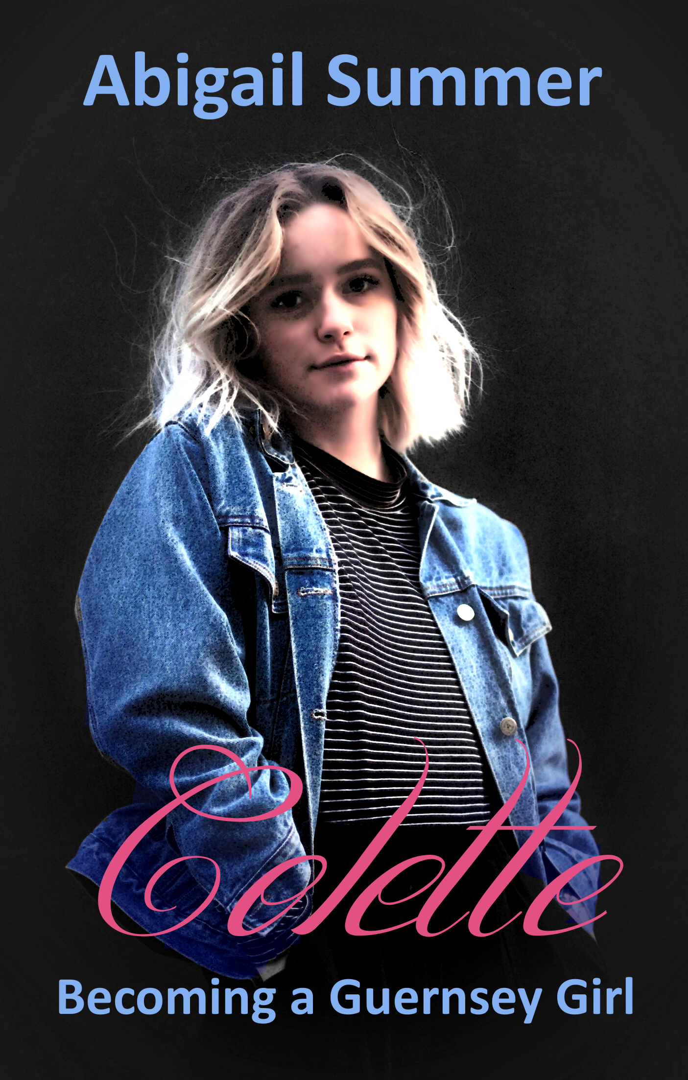
Um… raise your hands, everyone who sees “a reckless adventure of sex, love, and rock ‘n’ roll” in this cover?
Yeah, that’s what I thought.
The problem here is that the cover doesn’t convey anything about what your message and blurb emphasize as the main selling points: a transgender love/sex relationship.
I think my advice to you would be a standard recommendation to many authors whose covers don’t really reflect the selling points: Find other successful books that you would expect to appeal to your target audience, and see how those covers convey to their target audience that this book is for them.
As so often happens, I suspect that this cover is far more meaningful to the author than to the uninitiated reader.
The cover, as Nathan says, reflects absolutely nothing significant about the book as it is described. Put the cover to this test: Imagine the book with neither title nor author name. Would you be able to tell anything meaningful about the book, its subject, nature or themes, from the image alone?
Even the subtitle is meaningful only if you already know what the book is about.
The best advice I can give is for you to go back to square one and rethink the cover from scratch.
My best guess when I saw this cover was “novelization of a John Hughes film,” which is pretty far off base.
Unfortunately, there aren’t enough trans novels for them to really have a type, and those that do exist aren’t very helpful. So we have to punt. Maybe Colin is standing in front of a mirror and Colette is the reflection, something like that?
P.S. Not going to get into it here, but you may want to run that blurb by people in the current trans bookosphere to see how they feel about your approach. Some of your wording strikes me as something they might not go for.
Thanks Gwen. I’d be happy to change the blurb, I wouldn’t want to offend anyone. Is there something specific that you think might need to be reworded?
Oh, stuff like “become Colette and explore a new sexuality,” which sounds like you’re describing being trans as a sexuality, when being trans is generally described as a gender identity.
But I am not an expert and would not want to act like an authority on this topic. If you like, I could ask around for trans authors who are interested in giving you feedback, though.
Thanks Gwen. I know the rules of this site say not to discuss anything but the cover, but if it’s OK with Nathan I’d appreciate other trans women’s opinions. Perhaps if I omitted the words ‘a new’ that might work.
Ran your blurb by a trans friend of a friend and yeah, they found it pretty offensive. Here is their feedback; hope it is helpful to you:
“First of all, it makes light of the serious nature of realizing one is not their assigned at birth gender. It’s not like someone decides to *become trans: they were born that way. Plus, it’s just so wrong that Leanne is pressuring Colin to come out. honestly, the whole thing made me uncomfortable.”
Sadly, we live in an age where people are easily offended. I did not say in the blurb that Leanne is pressuring Colin to come out. Do you or your trans friend actually know the difference between encouraging and pressuring? Having discovered his inner female, Leanne ‘encourages’ Colin to be true to his feelings and be Colette. I guess transgender issues make many people uncomfortable. I can only write the story.
Y’know, Abigail, with all due respect, your last few posts have sounded exceedingly…touchy. Irritated, or, speaking bluntly, condescending, as if you’re speaking to a bunch of Cro-Magnon jugheads that can’t abide a creature from outside the “tribe.” That’s not who you’re talking to.
The comment that Gwen posted was written by a person who is Trans. You’d said that you wanted that feedback. You got the feedback. That it’s not what you’d hoped for is a part of the authoring and publishing process. Requiring a thick skin is Authoring 101, whether you’re writing straight romances, mysteries, literature, etc. You’ve criticized our efforts to help you with this cover, and now you’ve criticized the Trans individual who took the time to read your blurb, and respond.
You clearly don’t want to hear the real thoughts of the people you’ve asked. I can’t speak for anyone else, but I’m not all that wild about donating my time to help someone that snipes back at us with condescension and insults. Thanks, but…good luck with your book. I strongly recommend, for your ongoing growth as an author, that you join a writing and critique group, and become more accustomed to hearing people tell you things other than “oh, that’s wonderful.”
*shrug* You asked for their opinion. I gave you their opinion.
You can take our advice or not, but at some point, if literally everyone just can’t comprehend your book, you’re writing for an audience of one.
Well said, Gwen.
Thanks Ron and Gwen. As Gwen says, there aren’t enough trans novels to have a type. They seem to be either ‘How I transitioned’ or suggest erotica. My novel is neither. I wouldn’t want to mislead ‘romance’ readers even though my novel is romance with a transgender main character. Ron suggests going back to square one and rethink. Gwen suggests Colin in front of a mirror with Colette’s reflection. I’m trying to avoid this approach because, to me, that screams transvestite, and anyway, Colin and Colette look much the same, so that would probably be confusing.
The story focusses on effeminate Colin’s feminine feelings then progresses to transition and sexual experimentation (not explicit) with both males and females. Colin is an accomplished but shy guitarist. Colette is much more outgoing and has an affair with a bisexual lead guitarist (male) in a rock band that she becomes involved with.
I don’t have much to say about the cover, but in terms of wording, this:
…makes it sound like you’re discussing alters–a different personality from a person with MPDD, not a person who’s transitioned. Transitioning is one thing–having an alter is a wholly-unrelated situation, unrelated to gender or transitioning. I would strongly recommend that you check that wording, too. Those two lines sound completely off to me, for the reasons I mentioned.
Thanks for the comment Hitch. I was trying to convey in just a few words that Colin is shy and introverted with few friends because, being ‘different’ he was subjected to bullying at school and beyond. He is able to tell his new friend Leanne about how he feels. She helps him to transition and encourages Colette to explore a new lifestyle. However, you may be right, a reader may think alt personality rather than introverted boy to outgoing girl.
All right, this genre is far outside my field of expertise and I’m definitely not your target audience. Basically, I can’t really offer you any advice on what to do, only what not to do. In other words, I can tell you what’s wrong with this cover, but don’t look to me for advice on how to do it right.
One reason the genre itself is rather problematic is that various books about sexual transformation have been a veritable goldmine for our companion site Lousy Book Covers: numerous works by Tanya Allan feature especially prominently there, and also several by Gillian Llewellyn and T.G. Cooper, to name just a few of the major authors. Even books from the genre that haven’t ever made it to Lousy Book Covers have consistently had rather sleazy covers, mostly featuring pictures of voluptuous women exposing a lot of skin. Those wretched covers fit their contents rather well, as the vast majority of them (if the summaries at their sales sites are any indication) are nothing but pornography-in-prose for a “chaser” niche audience.
Your cover here, at the very least, seems to have avoided the pitfalls of those other covers; yet that one admirable quality is also its downfall: basically, it doesn’t look like those other covers because it doesn’t look like any particular kind of book cover. In thumbnail, the girl looks no different from any other young blonde in a denim jacket from just about any era (from the 1960s on up to the present). Up close, I can only just barely spot a hint of a man-jaw now that you mention this girl is actually formerly supposed to have been a man, and that might be nothing more than my imagination; the contours of her face look to be well within ordinary feminine parameters. (In fact, if you were to tell me this is actually a glamor shot of a thirteen-year-old Drew Barrymore with her hair straightened, I’d have no trouble believing you; did I mention the model on this cover also looks rather underage?)
The title may also be mildly problematic because here across the pond, the few people who’ve heard of the word “Guernsey” usually have heard it not in the context of those British Channel islands, but in reference to a common breed of bovines arising from that particular island. The Grand Theft Auto video game series, for instance, has one of the exurbs on its Liberty City map named Guernsey City in reference to its supposedly being a “cow town” i.e. a place catering to rural hicks. A small but significant portion of your prospective readers may therefore mistake your reference to the protagonist becoming a “Guernsey Girl” to mean this is an erotica about a girl trying to develop her mammary glands (and maybe other body parts) to make herself more like a dairy cow as part of indulging somebody’s fetish for lactation and possibly a secondary fetish for human-bovine hybridization.
In short, your cover and title won’t draw the attention of your target audience and will draw the attention of a fair number of niche fetishists who’ll be sorely disappointed to realize this book is not for them once they read the summary on your sales page. I don’t know what exactly your cover should do to draw its intended audience, but I’m quite certain this is not it. You’ll have to start over from scratch and ask around; if this is a serious novel that’s neither erotica nor romance as you say, maybe try asking people who design covers for women’s literature? That’s another genre that has to struggle to distinguish itself from both erotica and romance.
Thanks RK for your detailed comment, most of which I agree. The authors you mention do have covers that are erotic, I’m trying to avoid that. My effort was to depict an ordinary young male/female, but that doesn’t seem to work. I do have permission from the copyright holder to use the image, and he knows the theme of my book, maybe I should contact him again to confirm the age of the model.
I’m not too worried about using the word ‘Guernsey’ in the subtitle. If Grand Theft Auto players are confused, so be it, I can’t please everyone!
I guess the main reason I came here for comment is that I don’t want my book to be mistaken for trans erotica. If I was asked to describe my novel as a genre, I’d say action romance (with non-explicit sex scenes.)
I think it’s fairly safe to assume that the overlap between trans fiction readers and GTA players is pretty slim.
Of course, my reference to Grand Theft Auto was merely an example; the point was that most people in America, if they know the word “Guernsey” at all, have heard of it in reference to the breed of cow. In fact, the place I first heard the word referenced was in Tom Lehrer’s “Hunting Song” in which he boasts about having shot, stuffed, and mounted “a pure-bred Guernsey cow!” Anyone else familiar with the term generally has either heard it second-hand as I did, or has worked in some occupation related to dairy farming. The point is that the word needs some proper context to indicate a reference to the place rather than to the breed: something as simple as “Becoming the Girl From Guernsey” might suffice.
To the author:
Incidentally, if that’s an actual transsexual on the cover, I can fully believe the model is actually full-grown and well past the age of consent (maybe even somewhere in the late twenties). The reason the model looks so much younger is… well, the lack of breasts, and the reality that whether he has made the full surgical transition to a she or not, a genetic male’s age is typically more difficult than a female’s to discern from looks alone, particularly when clothed and clean-shaven. Even before they grow any cleavage, pubescent girls typically develop some curves, whereas pubescent boys do not.
Hence, when we see a somewhat tall and apparently flat-chested girl in loose denim clothing which conceals whether she has any feminine curves or not, we tend to assume she’s just on the edge of puberty and a little too young to have “filled out” very much yet; which would place her in her early teens or late preteens. The possibility that we’re actually looking at a twenty-something guy who’s trying to turn himself into a gal isn’t the first idea to occur to most viewers. To get that idea, most of your prospective readers will need to see some kind of “Before & After” visual short hand.
Now I can understand why you might not want to model your book after those “sexy transformation” books, since the models on them are typically just stock images of traditionally attractive women. That said, you do need to show in some way that this apparent girl on the cover was previously a boy. If you don’t care to use the old “mirror shows your true identity” trope, why not just use an old “stages of life” kind of picture showing a young boy with a kind of effeminate face wearing typical young boy clothing (e.g. jeans and a t-shirt), and standing in front of a taller and more ambiguous-looking older model in some neutral kind of clothing either sex might typically wear (e.g. denim overalls), who in turn is standing in front of a taller full-grown woman in typical women’s clothing (e.g. one of those denim poodle skirts typical in the 1950s and 1960s) with just a man-jaw to hint that she used to be that he standing down in front?
I’m going to try, one more time, even though I’m fairly sure that I’m wasting my time here–what about an image like this: https://pixabay.com/en/woman-nature-human-girl-waters-3106589/ ?
It’s a mirror–but not. What if you used that, replacing the face on the lower side with a man’s face? Something along those lines? That requires a level of skill that is beyond me (because of course, I’m not a cover designer, I’m something else entirely), but I believe that the more-skilled here could do that and make it look great.
Just an idea. And, given the tone we’ve all been subjected to thus far, my last one. But I saw that image and thought…hmmmm.
(I did have another thought, but I don’t know how it could easily or affordably be done…I wonder, could you have a beautiful woman’s face, or, at least, that would be the impression, covered by a face mask of a man????)
Thank you Hitch, that’s a very good image that I could work with.
The same effect could be applied to any picture of any woman/man. So if that girl isn’t right, pick one who is.
You could just have 2 faces merging together without the water but then you run the risk of a horror vibe. Keep in mind the tone of the story. I get the feeling this is supposed to be sort of sweet, a first love, finding yourself kind of tale.
But, I really think your overthinking the entire thing in effort to avoid the cliché. Stay in the genre expectation and use the cliché to your advantage. Sell the story. How important is the trans part? would you be better off selling the romance, the love triangle? and hinting at the trans part with more subtle symbolism? If a straight person gets a hold of this book are they going to be horrified? I doubt it if the romance is good. Don’t limit the audience to just transgender. The problem with the girl you have now on the cover is she says nothing at all. she’s just a random girl. you get no feeling for the type of book this is. Using a cliché to tell the type of book isn’t necessarily a bad thing.
Honestly, I wouldn’t even worry about showing the setting as 60s UNLESS that is somehow important like your going to show sit ins or something throughout the book, like if this is a book about sputnik, the TET offensive, JFK, free love, one of the political activist movements famous then or whatever, otherwise it doesn’t matter. (and in fact most publishers would say why the heck would you set it in the past if it doesn’t need to be in the past)
In your case I might opt for three people at the beach/pool, a boy and girl in the background. the MC in the foreground with the reflection showing the opposite sex
Hi S Savoy,
Appreciate your response. This is a first love finding self story. Trans isn’t important for the cover neither is 60s. A hint of trans is what I was trying to get to with the androgynous photo, but I can see it doesn’t work, The important character is Colette, it’s her story. One other thing that is repeated through the story is a sunset over water, so I’m playing with that idea right now. I know I’ll have to change the girl image but this is the direction I’m going in at the moment. (just roughing out) https://www.dropbox.com/sh/4wpw7475p55uytm/AADpXzVEt9PD3Hc0mPDgD41na?dl=0 Not sure if it’s the right direction though 🙁
The background is very adult and sort of ‘Harlequin’ Try a more kid friendly one, like a bonfire or something kids would do on the beach.
But, I took a quick look at romance covers for New Adults and the people in the pictures were more vague, in most cases you couldn’t make out the face at all they were just sort of in the background behind the text. Type and colors carried the covers and they tended to be flowery, which gave me an idea. How about going with the flower idea and showing a flower morphing? Like the bottom half is thorny or messy and the top half is a beautiful pink or white rose. symbolism. Set the entire thing over a sunset and use a great tagline with effects that say romance.
A thorny stem with a beautiful flower – sunset BG … that might just work 🙂
https://imgur.com/a/ZAJJ7dj
I mean, it’s nice looking. But it really just contains no visual information to attract readers.
It’s symbolic like lots of covers. (admittedly not my favorite type of cover) but symbolic covers are popular for YA/NA like the twilight covers- a girl holding an apple symbolizing a hard choice. (there are tons of theses types of covers)This is meant to symbolism a girl blossoming, going from blue to pink to symbolize boy to girl. Since lots of the romance covers for the younger set sport simple patterns, flowers being a common theme while others have bright covers it seemed like a good compromise. A bright cover to draw the eye, a familiar pattern, etc.
Like this book from Harlequin (admittedly a romantic fantasy but the style is the same for their romance line)
https://www.amazon.com/gp/product/B01N0GLZKC/ref=dbs_a_def_rwt_bibl_vppi_i1
there’s nothing at all about this cover that relates what’s inside the book and the symbolism escapes me even though I’m familiar with the story. The cover is counting on the strong graphic. Her covers got better as she gained prominence, her newest sports a flower…lol
Whether a more straightforward romance cover would be better, the man and woman shown atop a background that reveals some setting, is debatable for the genre. I’d say definitely go with the couple/threesome if this was for adults but since it’s meant for New Adult/ YA symbolism should be fine.
Whether my version works is an entirely different debate.
Okay, but “pink and blue rose means it’s a story about a trans woman” is not a symbol anyone else knows the meaning of.
And that’s the problem with symbolism. What one person gets another is left scratching their head, which is why it isn’t my favorite sort of cover. (I seldom get it at first glance and sometimes I never get what the picture is supposed to symbolize, (I mean what the hell is the bloody flower supposed to symbolize or the broken ribbon for the twilight books?)whether that that’s the fault of the artist or viewer is debatable.) But using symbolism is a valid cover design trope. Whether a flower is right for this book is debatable too. I think it is but art is so damned subjective that no group will agree on it, but hopefully the author can see the direction the art needs to go to get across the themes of the book. But the flower here isn’t supposed to symbolize trans just romance/ coming of age. I picked the color for trans (cliché though it is) but the flower is supposed to symbolize a budding young woman. (Hence the highlights on the bloom) The trans bit is in the title flourish but the author says the trans part isn’t the essential selling point, that the romance/ becoming a woman is. But maybe it needs a softer flower or a field of flowers, a faceless girl holding a flower…a bloody flower?…lol
The choices are endless.
I’m still not sure myself. I’ve even searched for pre-made covers in the hope that something will pop out. In the meantime, between sessions of revision prior to sending the book to my copy editor, I’m trying different themes here https://www.dropbox.com/home/covers In the uk trans community the butterfly is/was a symbol of transition. I think it might be a subtle enough hint at the content. Colette was given a butterfly necklace by her workmates when she came out, so it has meaning in the story.
Sorry, wrong link … https://www.dropbox.com/sh/4wpw7475p55uytm/AADpXzVEt9PD3Hc0mPDgD41na?dl=0
I like it. I’d drop it a bit so the leaves bracket author name closer and I’d change the fonts. Colette is a bit hard to read and its clashing a bit with the other font. Maybe try a simple serif font for the smaller words instead of the sans serif to better match the slant on Colette although I don’t love that Colette font so maybe its just me…lol Maybe you just need a thinner sans serif font for the smaller words. They’re sort of blah now. Not horrid just not pretty.
I’d also pick a shade of pink blue or green from the art in the picture for the fonts colors. I’d most likely go with the pink. And I’d spice up the title, make it really pop but you’ll have to try some effects to see what works. Off the top of my head I’m thinking add some shine to it but I might add some ‘glitter’ on the butterfly wings and use that on the title too. I might even try moving the all the words to on the flower so the butterfly is clearer. And it might look cool to have a small stem leading to author name or even switch it and put author name on top Colette across the flower and the two lines on the bottom space but those sorts of things need to be played with to see. I’d also try some colored backgrounds. Not that black is bad , its just generally for thriller/ mystery type books. Romances is usually lighter toned.
Thanks, all good suggestions. I was really just playing with the flower/butterfly theme. I hadn’t given much thought to the fonts. The idea came partly through the rose/bramble idea and the feather on a dark glittery background that was posted. I tried different colour BGs, but the flower and butterfly lost the pop-out effect. I need to play with the tagline, too. A prominent song in the story is Dusty Springfield’s You Don’t Have To Say You Love Me. I’m wondering if that might be a good tagline, although I notice that several novels on Amazon have that as the main title.
I tried the glitter but it just looked sort of Barbie 🙁 Found a background that still lets the symbols pop (stars & sunset are both in the book) Changed the fonts and colours, and changed the tagline to a song title that’s in the first chapter. I’m fairly happy with it but would appreciate any tweaks you think would improve it.
https://www.dropbox.com/sh/4wpw7475p55uytm/AADpXzVEt9PD3Hc0mPDgD41na?dl=0
https://imgur.com/a/t6UPUUM
A few quick tweaks:
the font is Paprika. It isn’t a free font though although designcuts gives it away occasionally.
the author name is Lato Light, it is a free font.
you can use your background but fix your trim lines on the rose so no white lines show. (the easy way to do that is to use the quick selection tool on the flower and butterfly and place the background layer on top of it then cut out the shape on the background.)
But the trick is to make the font pretty and match. Make it look like part of the picture, not an afterthought) If you look close you’ll se a hint of the yellow in the pink of Colette. The yellow is taken from the rose. Then I added a hint more shadow on the right of the rose. (Draw a diagonal line across the rose then gaussian blur it a bit, then use the quick select tool to pick the rose and trim the edges to be just on the rose then fade it really low.) and I added a hint of light on the center of it. ( just dab on white with a soft brush, blur it a bit and set the layer to soft light)
there’s a thin stroke(outline) on the small words to make them more readable but the opacity is set halfway on it so it isn’t too harsh. Title and author name got a subtle drop shadow.
PS.I didn’t mean to imply my version was the only way or the best way to tweak it. It was just an example of they types of things that make a good picture
Many thanks. I should have replied sooner but I’m trying to meet a deadline with another project. I love the fonts you used and will mimic that. I appreciate you sticking with this. It’s been a difficult but interesting learning experience for me.
Just to let you all know that I really appreciate your help. It hasn’t been easy for me giving up my original idea (is it ever for DIY covers?) I’ve decided to go with the rose/butterfly theme and I’ve tried to reproduce that done by S Savoy (sorry I don’t know your familiar name) I’ve now completed the first draft of the novel so tonight I uploaded my version to my dropbox. I think it could do with tweaking but it’s close. Again, thanks everyone for steering me in the right direction. I’ve learnt a lot along the way. https://www.dropbox.com/sh/4wpw7475p55uytm/AADpXzVEt9PD3Hc0mPDgD41na?dl=0
Nice! I might move the second line of your tag up a hair and set it back a tiny bit so the M is right before the Y in say.
Somehow your rose looks a bit blurry on the bottom petals, but I don’t hate it.
Try replacing the black background with a romantic colored one. (I might try a half pink, half blue one) Black doesn’t say romance, its says dark, thriller, mystery. (I’d probably try some obvious boy and girl graphics behind her that would set the tone too. Like maybe a pair of boys swim trunks on the floor and a sundress on a hanger beside a calendar with a circled date for a dance or movie, something that says date. Or maybe a man’s razor on a sink behind her with a lipstick beside it, then add a hint of that color to her lips. Pick items that will speak to the reader. I have no idea what sort of things might resonate with them as I have no experience with a transgender but if there are issues that are stereotypical don’t be afraid to play them up. You’re not trying to duplicate a scene from the book, your trying to get the nature and themes of the book across at a glance.
What’s the tone of this book? Is it serious or fun? I think you need to consider what would appeal to a prospective reader, IE who will enjoy this book, and then make a cover they will recognize even if that means using cliché or stereotypical elements you don’t love.
I’d also put a flourish or border between author name and the picture to ensure the author name doesn’t get confused as title seeing as how both are names.
I think the mirror idea could be very fun. If you use the back of a girl’s head, fancy ponytail or pretty dress- something that says young woman but a man’s face and show him getting ready for his date but the expression needs to be just right. (you want the expression to clearly match the tone of the book. so if this is a story about a nervous boy excited to begin his new life you need to show that) or vice versa show the back of a man and the face of a woman. (you might be able to play with that easier, show a slouched man and a confident woman face. it will be difficult to find models wearing the same thing but you can use lighting to obscure clothing or search for models wearing robes or white t-shirts or any generic thing)
I had another idea. What if you change the subtitle a hair to something like: From a shy boy to a Guernsey girl
Thanks S M, Your first reply was really helpful, a lot of positive stuff in there. I’m feeling a bit deflated about the whole process! The negative comments above have made me wonder if I should go back to the original title I had for my WIP: ‘Sunset Over Lihou.’ A sunset would make for a more romantic cover. A scene where George, at last, tells Colette he loves her is key to the story.
I will cut the ‘reckless adventure’ and ‘rock n roll’ bit from the blurb as Nathan prompted everyone to hold their hands up if they could see that.
I said I didn’t want the mirror thing and today I looked at several ‘feminising’ fetish style books on Amazon and there’s one or two with that type of cover. So, the mirror thing is a no no. Razor and lipsick is a bit ‘transvestite’ too.
I’ve spoken to cover designers online and not one has yet understood the story. Most think cross-dressing, but this isn’t what it’s about. Colin is an effeminate nineteen-year-old, he has shoulder length blond hair, he’s slightly built and he doesn’t shave. Colette, after trying out makeup, doesn’t much care for it. In fact, visually there’s little difference between them. It’s all about the emotion of someone, Leanne, recognising his inner feelings and bringing Colette out, she does have hidden agendas though. I just need to find a cover idea that will convey that. I can’t go for anything that even hints of cross-dressing.
I tried changing the background colour but couldn’t do it without losing the ‘flyaway’ strands of hair. I also tried Leanne looking over Colette’s shoulder but it looked a bit like a protective mother figure, not a jealous lover.
I did at one time do a mockup of a sort of collage which is still on a website that I was testing: http://www.expatauthors.com/
I do still like the idea of ‘Guernsey Girl,’ but when I discussed the subtitle in a writer’s forum someone (not a Brit) said: “Is she some kind of cow?”
I’m sort of stuck really, the writing process was much easier than deciding on a cover design. If only I could find a beta reader who is also an artist!
https://imgur.com/a/7X2M3d8
A quick mockup. I used lots of stereotypes in this. The rainbow color flowers inside the symbol the color scheme itself, the background etc. all the little details could be changed to add the rock n roll vibe you’re going for. For instance, I used a really plain texture on the title bar. But you could use one with a rock vibe or romance vibe. same with the texture behind her. I was going for a fun vibe with just a hint of angst. (color is fun and girly but the points in the pattern are angsty)but you could make it whatever best matches the book. All the details could be tweaked to give the impression you wished too. The trick is to decide what you’re trying to sell, what impression are you trying to give. Changing the title font to a more hand drawn one adds a young feel. this one has a great look for the new adult crowd but if I were aiming for an older audience I’d change it (and the girl, getting an older looking model) and if I were aiming for YA I’d use one with a bit more humor or darkness in it. (The font is Ink Free, a free font from Google fonts) You might want to change it for one with more flourish but I’d still use a hand drawn looking one to give the gritty real vibe. I might even use 2, like making the first letter real decorative as if she’s learning to sign with a feminine flourish.
you can use a hair paintbrush like I did to add those strands back in. she looks all blurry in my pic because I enlarged the crap out of her from a thumbnail but the hair brushes are easy to resize. just google hair brush for whatever photo editor your using. ( I did a quick crappy job with my cut and paste but if you’re willing to put in fifteen minutes or so you can do a much better one.)
Keep in mind you don’t have to tell the story with the cover. you have to sell the story. You want the potential reader to glance at it and go this a story about a x y z so make sure the cover portrays what the major theme is.
I think we’re heading in the right direction. I’ve used Gimp for years, I’d find it difficult to use a different imaging software now. It’s a nice idea adding the strands of hair back in, I like it. Not sure about the male/female symbols, but that could be changed. Thank you for the effort, I appreciate it.
Shelly did her usual great job offering some excellent suggestions.
But here is a problem…
There is nothing about the cover in any of its iterations that remotely suggests that this is a novel. The title and subtitle, combined with the use of a very matter-of-fact photographic image, makes the book look as though it is a biography or autobiography rather than fiction.
Well, there’s that, too.
I’ve refrained from comments, as I’m really not the target audience, but even for anything in my preferred oeuvre of reading, this girl’s image wouldn’t make me pick it up. To me, she looks 13-14, or so. That’s definitely not a book I’d read. I’m not a YA or NA reader–and IME, those two markets don’t read books with tweens, either. They read instead books that “star” people their own age or a teeny bit older.
I liked someone’s idea, about perhaps having a girl facing a mirror, with a mirror behind, showing the back of a guy’s head, somehow.
I just think this is not the right cover for this book. It might be a great cover for a book about young teens, or I should say, a great primary image, for a cover, for a book designed to appeal to tweens.
Offered FWIW.
Thanks, everyone for your time, I appreciate it. It seems, the same as other cover designers I’ve contacted, that no-one, apart from the transgender community, understands the difference between a crossdresser and trans female. I’ve tried to explain that a mirror and shaver on the cover just won’t work, nor will the reflection of a different gender. I’m going to contact the image copyright owner again and if the model is under 18 I won’t use it. My book isn’t aimed at YA or tweens. I had hoped for something positive here, but I guess you just don’t or can’t understand the nature of my work. I’m disappointed, but that’s life. Thanks again.
Of course we understand that a transvestite and a transgender person aren’t the same. However, you need to realize that the only visual difference–please think about this–isn’t something that you can put on a cover. You can’t put altered genitals on a cover, to be blunt. The challenge–trying to convey that difference–that your character is transgender, rather than “simply” a cross-dresser–is the entire problem. I mean, seriously–what, exactly, do you think that you can put on the cover, that will say that?
You’ve addressed this–or haven’t–by just putting a girl on the cover. That’s it. That doesn’t convey sh*t to anyone, much less your desired audience. This could be a cover for a tween romance. Or a YA coming-of-age story. OR a girl and her dog story. There are a million novels that this could be.
What we tried to do is get something on the cover that would convey the idea. Now…it’s hardly the fault of the people here if there’s no “easy” way to say “this is a transgender story, not a trans or cross-dressing story.” You seem to loathe the mirror, but it’s as valid for a transgender person as a cross-dresser–probably more so. I find it hard to believe that a transgender doesn’t spend a ton of time in front of the mirror, wondering “what if?…” And sure, maybe cross-dressers do, too. I don’t know.
You say what won’t work–but other than one girl’s picture–a girl who looks 14-15 to me–you aren’t saying what will. What imagery, really, says “transgender?” Other than using some interlocked gender icons–the ubiquitous cross and arrow–what else works? What else is universally recognized? NOTHING leaps to mind.
So, sure, people here played with ideas. Of course they did. That’s what we do. We play with ideas, to see what flies and what doesn’t. Apparently, you’re convinced that the mirror won’t work–but again, what will? What image, or pair of images, or symbols, specifically scream “transgender story” to a casual viewer? If, other than the girl, you know of a concept that will fly, say so–there are at least 2 people here that would happily mockup ideas.
This. It’s pretty uncharitable of you to insist that anyone who makes suggestions you don’t like just doesn’t understand what a trans person is.
The fact is, we have to put SOME kind of imagery on the cover, and if you’re establishing from the get-go that anything that visually represents masculinity/femininity is de facto wrong, then we’re SOL. (You can’t even use symbols, since the trans flag and even the pride flag would be anachronisms. Even the term transgender wouldn’t be coined for another 20 years.)
I think we understand the nature of your book, it’s trying to find an image that reflects that nature that is the problem. And simply putting a photo of a girl on the cover is not remotely sufficient. I understand that the image might be significant to you, but you are intimately involved with the story. The potential reader does not have this information, so the cover needs to unambiguously convey it. As I pointed out, from the title and and image alone, it’s not even clear that the book is fiction.
One way to develop a better idea is to explore alternatives with the author, not only to come up with potential covers but to get a more detailed handle on the book itself. Giving up after only a couple of suggestions is premature. After all, you have presented a sticky problem, if the goal is to get across a male to female transition as unambiguously as you seem to want to.
https://imgur.com/a/ee40sbi
while making this I realized part of the problem is the tag line. As worded it really gives the impression of a biography. You need something that makes it much clearer the sort of story this is. Mine is completely lame…
The pictures I used would need to be bought, they still have watermarks on them but it could be done pretty cheaply.
Figuring out the tone to portray for this is the key. this version is much more rock n roll
Hi S M, thanks for the effort, love the background, the characters don’t fit the story or the 60s, but the idea is good.
I like your replacement tag line!!!
Finding characters that portray that specific era will be challenging. It might be easiest to just find one who really suits and blur the other two but to also change the color scheme to a more sixties vibe. The ‘girls’ in my version could be tweaked to a sixties style but the boy would need replacing completely, so keep in mind when choosing your characters that adding a small detail on a basic article of clothing could make them fit the era, like adding a peace sign necklace or a colorful headband or beaded belt, that sort of thing. Tweaking hairstyles is easyish for some models and impossible for others but straight, ‘styleless’ hair fits any era.
I might try a more 60 font, like this one too
https://www.1001fonts.com/baveuse-font.html
and maybe add a tie dye effect to it to further bring it home but that would depend on the final picture.
If you aren’t in a terrible hurry to finish this cover you could wait for one of the sales Depositphoto’s offers and buy a block of photos for like a dollar each. They occasionally sell a block of 100 pictures for 100 dollars with no use by date. Their more frequent sale is 50 pictures for 100 dollars which is still a great bargain when you consider most places sell them for 10 dollars each.
Here is a thought…
Since we are not talking about a Regency romance or some historical epic set in Elizabethan or ancient Roman times, why not just find some clothes reminiscent of the 60s and two or three willing young friends? (As Shelly points out, getting across the idea of the 60s would not require much at all: “a small detail on a basic article of clothing could make them fit the era, like adding a peace sign necklace or a colorful headband or beaded belt, that sort of thing. Tweaking hairstyles is easyish for some models and impossible for others but straight, ‘styleless’ hair fits any era.” All you need to do is convey an impression.)
Everyone who has a cell phone has a camera capable of taking photos of high enough quality for a book cover.
Let me add a post script to my last comment.
There are two or three advantages to my suggestion. One, of course, is that it would be cheap. You would also have complete control over every detail: you would not have to make do with whatever you can find. I also have the distinct impression that you would prefer to have the characters on your cover appear as ordinary people rather than professional models. If the setting for your novel is someplace nearby—or there is a nearby stand-in—you would also have control over the background.
I have used my own photography in dozens of covers and even though I am not even remotely a professional photographer, the results have been successful. But if you don’t feel comfortable taking your own photos, you may have a friend who would help you who might be more experienced.
I agree that communicating transgender through a single image is nearly impossible. From the blurb, I get the impression that this is a novel about self-discovery, sexual awakening, and young love. Assuming the audience is readers who enjoy edgy coming-of-age stories, here’s a quick mock-up:
https://imgur.com/tMBNCz9
The colors say romance, and making them more saturated will make the image ‘pop’ and feel younger. The pop-art newsprint dots and woman’s hairstyle are very 60’s. Her pose and the apple are fairly suggestive, hinting at the sexual content. I doubt the model I used looks exactly like Colette, but that’s okay. The cover’s job is to attract the right readers, not be a faithful depiction of the characters or a specific scene in the book. I agree with S. Savoy that the tagline could be used to communicate that Colette is transgender.