The author says:
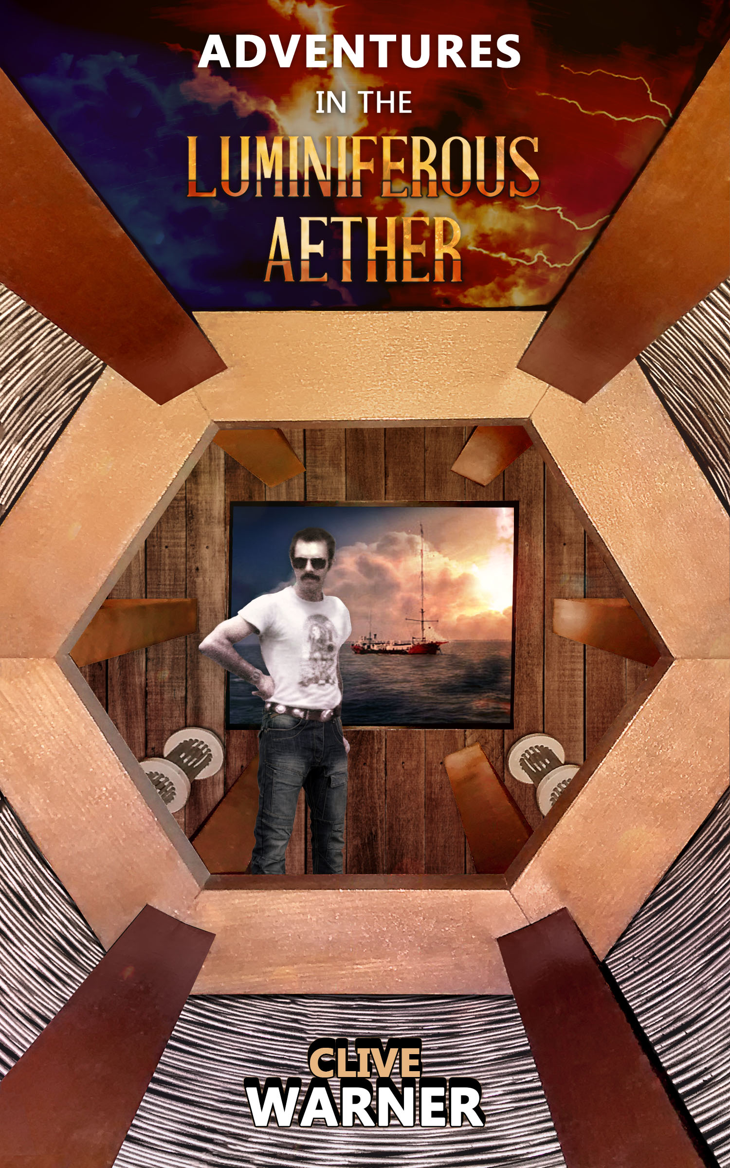
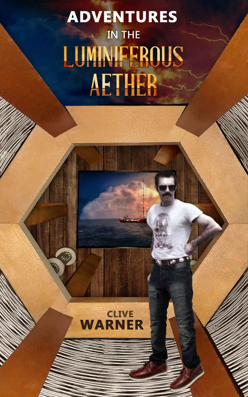
Travel to exotic places, shag the natives, see death and destruction. Experience life as an international project engineer through these pages! New version of cover; which is best? The ORIGINAL is currently on Amazon.
Nathan says:
For comparison, here’s the current cover from Amazon:
I think I can say, without fear of contradiction, that the tweaks you’ve made between these covers are merely rearranging deck chairs on The Titanic. Neither cover gives any indication of what the book is about, or what kind of reader would enjoy it — and the minimal blurb you have for it, for those few readers intrigued enough to over come their confusion and click through, doesn’t enlighten any further.
I think you need to scrap both of these and go back to the initial questions:
- Who is the ideal target reader for this book?
- How do I indicate to that reader that this book is for him?
It’s listed in the memoirs genre, so look to other covers in that genre for good examples. This one is a no-go, a real what-the-heck?
Also, unless you have a great photo of yourself, don’t put it on your cover.
(Side note: Thank you. Thank you. Thank you, Nathan, for beginning a new cover critique.)
There’s really not much I can add to what Nathan said. This cover needs to be rethought entirely from scratch.
The problem is nothing about this is instantly recognizable. I have no idea what it is. Because the title is ambiguous also the picture needs to be something recognizable a reader can relate to. If this is supposed to be the inside of a balloon/blimp I think you’d be better off going with the outside of one because few people are going to recognize this. If you’re dead set on this and it supposed to be a flying machine of some sort change the picture of the boat to birds or something you’d see in the sky to keep the perspective correct. unless that isn’t supposed to be a window…lol
I followed the link to your book on Amazon to find out what the subject of the book was as the title and cover didn’t do much for me apart from the very small Radio Caroline ship in the little ‘window’ at the back.
On reading the ‘look inside’ I was pleasantly surprised to find that you are/were a transmitter engineer for the BBC and, by references to Radio Caroline, I guess there’s a section dedicated to your time working as a ‘pirate.’
It could do with some editing and proofreading, but I found the content really enjoyable from a technical standpoint, but I fear it would only appeal to someone interested in ‘wireless’ if they only read the first few paragraphs available before actually buying the book. I did find myself giggling at the humour though.
OK, having said that … I do now get that the thing the guy (you?) are standing in is supposed to be a tuning coil of some sort. But that doesn’t work for me. I believe, from reading the ‘look inside’ that your target audience would be wireless buffs (radio amateurs and the like,) and shortwave listeners, but most of all, like me, those wanting to read about Pirate Radio, Radio Caroline in particular.
I’d seriously advise you to change the cover to reflect the content, change the title to draw in your target audience, and rewrite your blurb to entice a prospective buyer to look inside. Focus on the BBC and Radio Caroline aspect.
Whatever you decide, good luck. It’s a very interesting book to those of us who appreciate the content. But, I would never have found it if I hadn’t seen it on this site.
Well, as the title means, “Adventures in the Light-Producing Sky,” I’m really left in the dark. If this is a memoir, it’s woefully unclear as to for whom the memoir is written–not about whom–for whom. Every memoir–even the ego projects–has a target audience. If you’re a rock-n-roller, you’re writing to rock enthusiasts, and to your fans. If you’re a pilot, you’re writing to would-be pilots and other pilots that perhaps haven’t had your wondrous adventures. Many, many folks today are writing memoirs that are really meant for their families, but…publish them anyway.
So, like all self-published authors that have braved the treacherous waters of self-pubbing–who is your audience? Fellow Project Engineers? STEM students? Boomers, as you’re the tail end of that generation? Or…?
Without knowing who your intended reader is, no one here can start to suggest a cover design–and neither can you. Your existing attempt displays that cover design isn’t your forte. You might be the finest project engineer that ever lived, but cover design, creating that clickbait, truly is a specialized skill. (Don’t take it personally. Few people are good at it, and even cover designers, as recently evidenced, can suck at doing their own covers.)
So, if the memoir is a thrill-packed adventure of work-related travel, you should consider something that conveys that, especially since the title is not illuminating. (Yes, yes, dreadful pun). But it’s not. It’s quite misleading, and I feel I ought to point out that the only other books published at Aamzon, with “Luminiferous Aether” in the title are a Steampunk adventure, an LGBT Holiday Short read, De Volson Wood’s original treatise on the topic, a Smithsonian reprint, and a reprint of an article on laminar motion from 1887. I think I can safely say that patently, nobody can infer a damned thing from the title. And even if they remotely could–let’s say that they’re a fan of Wood’s–the cover would certainly throw them off the scent.
I would, personally, refrain from using an image of myself on the cover, unless I was Mick Jagger, Madonna, et al. Being a non-famous person and penning a memoir is difficult enough to sell; using a picture of yourself is probably not a great idea, even disguised behind sunglasses. Also…what does that do for you? I mean, really? A picture of yourself conveys absolutely nothing to the prospective buyer, unless you are wearing a clown suit, a pilot’s uniform, a military uniform, etc. You’re not. So…nada. Zip, zein, zilch, nothing. It tells them nothing.
So…back to the drawing board with this. I strongly recommend that you nuke this, entirely. I truly don’t think it’s salvageable. If you can afford it, get a designer. If you can’t, post back here, enlighten us a bit more, and perchance some of our kinder, more generous posters might do some mockups, to help you with ideas. Their mockups are always usable, they can tell you where they got the artwork, etc.
Okey-dokey? We also need to talk about fonts–but there’s no reason to discuss those until we have something better upon which to use them.
Thanks for the analysis, most interesting and appreciated.
Clive you may need to rewrite that book blurb because it sounds way to general. And i don’t even know who the main character’s name is ir even what genre it it looks like a pirate time travel book just looking at the cover it self.
Looking at the image I thought this was going to be some kind of steampunk thing, and in that context, I was going to say it was a fine concept if the execution were improved.
But for a memoir, it’s all wrong. Most memoirs seem to go light on the imagery and focus on typography and, of course, a descriptive title and subtitle. (They almost all seem to have a subtitle like “The memoirs of…” or “A true story of…”) I suggest you do the same.
I know it’s been done before, Clive, and I’m no cover designer. But, a picture of the Ross Revenge would definitely draw me in to ‘look inside’ – I’ve done a very poor mock-up of what I believe would attract your target audience here http://www.ourfrance.net/temp.html – I guess some text effects might make the title ‘pop’ but this was just a 5-minute attempt. (Sorry guys ‘auntie’ is a Brit thing.)
You mention drugs a lot in your first few paragraphs and I think you’ve attempted to convey that on your original cover. But, you could put that in the blurb. Very few people under the age of 50 would have any idea of what life was like in the 60’s 70s, So your target age group is boomers, you need to play on that in your blurb.
In the 60s UK, Pirate radio was a big part of our lives. (I’ve even put references to ‘Caroline’ in my own book set in the 60s) In my opinion, you should play on that with your cover and blurb.
Thank you very much, (it would be the Mi Amigo rather than the Ross).
Most interesting. Thinking!
https://imgur.com/a/wBJ0oQF
Hi S.Savoy … I looked at your mockups and not sure if you’re familiar with Pirate Radio in the 60s in the UK. First of all, independent commercial radio in the UK wasn’t allowed, the BBC had the monopoly, that’s why the ‘pirates’ took to broadcasting from ships outside the (then) 3-mile limit. Second, a radio mast depiction very similar to yours was used (not so colourful though) as a logo by Radio Luxembourg which wasn’t a ‘pirate’ station. For 60s pirate radio enthusiasts, the ships themselves are really important. I can’t see Clive’s target audience being tempted by a radio mast on what looks like dry land. As the book is quite humorous, a cartoon ship would probably work, it’d have to be recognisable as a Radio Caroline ship though; either the Ross Revenge or the Mi Amigo.
It comes down to who the audience is here. If the target audience is indeed specifically people who were into UK pirate radio 50 years ago, then symbols that are only meaningful to them are a perfectly good approach. But, not to put too fine a point on it, that’s a dying audience.
Most memoirs are aimed at an audience of people who AREN’T in that field, but are interested in learning about it. IE, if you write a memoir about your time as a CIA agent, your audience isn’t other CIA agents. And for those people, symbols used in the field are meaningless. So the cover should use more widely-recognized imagery that means something to laypeople.
Thanks for your comment Gwen. The book is only about 10% pirate radio. The rest involves being in places that have left me with PTSD. EG I became quite used to stepping over dead bodies at one point. Not that I want to put dead bodies on the cover. I don’t recall any non-horror books with that concept…
I have to say, what you have said in comments here has done more to make me fascinated by this book than your cover and blurb as they stand. It sounds like you have some incredible experiences to share and it’s the kind of book I personally would really like to read.
You’re right that not many books feature dead bodies even when the content goes to some dark places! This is why research is so important. Think about other memoirs that may cover some similar territory to your own. Warzone correspondents, medics, rescue workers etc. Or might match your writing fairly well tonally, e.g. David Sedaris’s sometimes gets into some very morbid subject matter but the genre is still generally ‘wry, funny memoir’.
Here are some covers from various ends of the memoir/semi-memoir type genre all of which cross over with what you describe to some extent or another.
https://www.amazon.co.uk/gp/product/1786892677/ref=s9_dcacsd_dcoop_bw_c_x_1_w?pf_rd_m=A3P5ROKL5A1OLE&pf_rd_s=merchandised-search-15&pf_rd_r=RASKFSVSNK9FP37TGSZA&pf_rd_r=RASKFSVSNK9FP37TGSZA&pf_rd_t=101&pf_rd_p=7864138c-01c4-4a40-8545-00eaeb3e2045&pf_rd_p=7864138c-01c4-4a40-8545-00eaeb3e2045&pf_rd_i=67
https://www.amazon.co.uk/gp/product/B06XWDJRGS/ref=s9_acsd_top_hd_bw_b3BV0_c_x_1_w?pf_rd_m=A3P5ROKL5A1OLE&pf_rd_s=merchandised-search-4&pf_rd_r=2530S10QE7MQWC5MQWP8&pf_rd_r=2530S10QE7MQWC5MQWP8&pf_rd_t=101&pf_rd_p=f1a1570f-79bb-556d-bd57-c782de1376b2&pf_rd_p=f1a1570f-79bb-556d-bd57-c782de1376b2&pf_rd_i=759190
https://www.amazon.co.uk/When-You-are-Engulfed-Flames/dp/0349116474/ref=sr_1_12?s=books&ie=UTF8&qid=1541248134&sr=1-12&keywords=david+sedaris
https://www.amazon.co.uk/gp/product/1982917016/ref=s9_acsd_zwish_hd_bw_b3BPi_c_x_w?pf_rd_m=A3P5ROKL5A1OLE&pf_rd_s=merchandised-search-6&pf_rd_r=P3GWG1RWEW4B1C21M5VK&pf_rd_r=P3GWG1RWEW4B1C21M5VK&pf_rd_t=101&pf_rd_p=0396f6b1-511a-50c7-92a6-099cc59fb75d&pf_rd_p=0396f6b1-511a-50c7-92a6-099cc59fb75d&pf_rd_i=758862
https://www.amazon.co.uk/gp/product/0008267464/ref=s9_acsd_zgift_hd_bw_b3BWE_c_x_w?pf_rd_m=A3P5ROKL5A1OLE&pf_rd_s=merchandised-search-4&pf_rd_r=NHPVC54DDSQXS7H91ZPZ&pf_rd_r=NHPVC54DDSQXS7H91ZPZ&pf_rd_t=101&pf_rd_p=ec0c5351-556f-5385-9bb2-70a27ebf7cb1&pf_rd_p=ec0c5351-556f-5385-9bb2-70a27ebf7cb1&pf_rd_i=759266
They are all wildly diffferent books. But the more you do this kind of reaseach the more you start to pick out the things in common about these covers which you can apply to your own: they have large clear title treatments, and they use simple, only semi-literal imagery relating to the content. The Sedaris books uses an image that has no literal relationship to the content but that absolutely sums up the book in terms of feel and tone. A useful solution for a book that (like many memoirs, cos like is varied and illogical!) has no one simple set of imagery to draw on. The judge and doctor autobiographies, which DO focus on one very specific area of life/profession each (and both of which got to some very dark places while being broadly comic) use the most recognisable props of their respective trades to communicate the subject matter in the most immediate possible way. These books both rely on very evocative and witty titles to get their tone across and need only add a judicious (haha) touch in the imagery department for any view to immediately get ‘wry but not light memoir of interesting job’.
Just for fun…
https://imgur.com/nN0YVww
LOL, that’s freaking brilliant!!! I love that, Ron!!!
Put that tower with a sea back drop with maybe a hint of a boat and you’ve got a winner!
https://imgur.com/a/JWZUoUq
Or this ?
http://www.ourfrance.net/temp3.html
Ditto bingo!
Bingo!
Yes, Shel–that one is perfect (someone who does remember the UK’s Pirate Radio days!).
Just for fun
http://www.ourfrance.net/temp2.html
Love your boat!
Here’s the original clipart if you can do anything with it
http://www.ourfrance.net/temp4.html
Oh, yes, that makes it better. Put the guy on the other side fixes everything.
Barf!
Yes, Shel–that one is perfect (someone who does remember the UK’s Pirate Radio days!).
I can’t add much to what everyone else here has already said except to say: show something very obviously related to radios, whether it’s an antenna or a transmission tower or even just one of those old-fashioned vacuum tube transistors. (That last one will only probably only appeal to old-timers, however; the vacuum tube is a bit of an obsolete symbol since the arrival of solid-state transistors and then microchips in the Information Age.) What you’ve got right now is a great cover for… well, some other genre altogether, though I couldn’t say for sure which one. You need a cover for this genre: namely, memoirs of a radio technician’s time in both his official and somewhat less-than-official endeavors.
Actually it IS all related to radio. The main part (background) is part of a 1934 100KW Marconi medium-wave transmitter, it’s the loading coil, in reality it’s about 4 feet in diameter. Unfortunately the image seems to abstruse to be useful…
That’s the thing. You’ve got to remember that the job of a cover is to communicate to people who:
1. Probably don’t have any specialist knowledge of the book’s subject matter (one of the many reasons people love to read books is to find out about an area of life they had no idea about before)
2. Have just a second to take in enough of the cover as they browse through Amazon to make them pause and find out more
Your priorities in creating a book cover that attracts people has to be imagery that is striking and interpret-able in a simple way, that communicates the right tone and subject of the book at a glance.
It’s hard to make specific suggestions for your book as there’s little information to go on.
For example, you’ve included a lot of radio-related imagery but radio is not something you mention in the brief blurb so what’s the reasoning for thinking its significant enough to include on the cover?
I can only tell even the broad genre this book fits by context (as it’s in the memoir section of Amazon). As for whether it’s funny, serious, light, in-depth… context clues like the wording of the very short blurb hint this book has a wry, maybe even funnily cynical, tone. If that’s true, it’s not there on the cover.
Your title is a little opaque as a memoir title (it could belong to a steampunk SF novel or something) but I don’t necessarily think it’s a weakness. It’s an unusual title with a nice ring to it. If I were handed this book to design a cover for that would be my starting place for forming the centrepiece of a successful cover (alongside looking at other covers in the genre, pending further information about the content).
Like others have said, I think the photo has no place on the front cover. A photo should certainly go on the back. But on the cover I’d concentrate on conveying the tone and imagery of the specific subject matter of the world this memoir comes from. Think of Bill Bryson covers – even though he is a well-known face, and his books are mostly more-or-less autobiography, his covers never feature his face.
That’s very useful to know, thank you.