The author says:
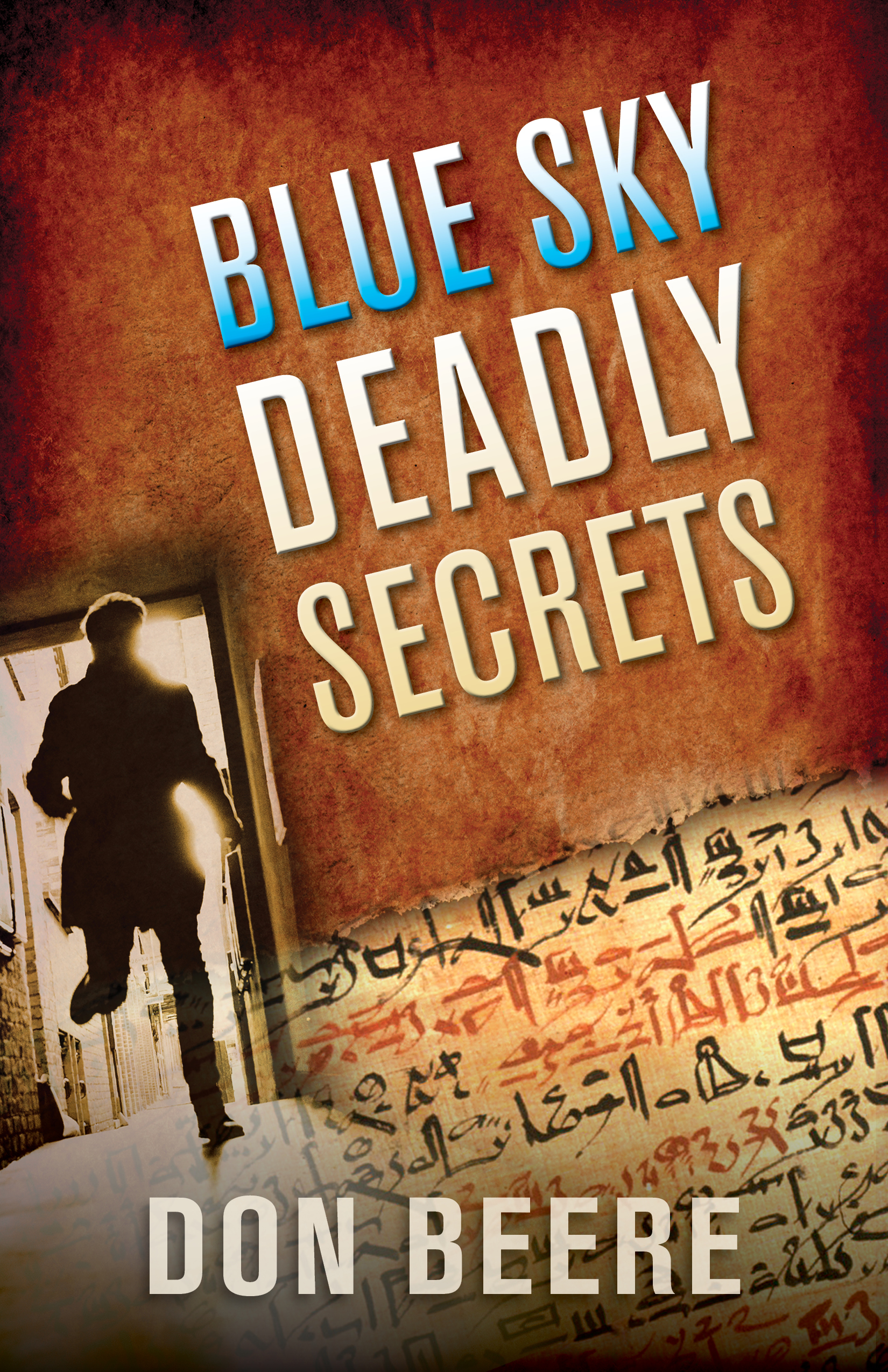
A terrorist tracks professor Jason Butler to reclaim secret sacred texts.Can Jason conquer his inner demons in time to survive the deadly poison called Blue Sky, rescue his family, and save his life? After a tumultuous past, Jason and his wife are at a turning point where everything looks wonderful. But disaster hits. Taking place on a university campus in 1986, Jason sees a terrorist assassinate a colleague who sent him sacred religious manuscripts. The manuscripts are deadly to possess, and the terrorist must reclaim them. The assassin kills with a poison called Blue Sky. To his dismay, the police pursue Jason as the prime suspect. Wherever he turns, Jason can’t escape: he can’t go to the police, he can’t find his family, he can’t return the manuscripts, and he can’t elude the assassin. Why has his family disappeared? Will he survive the deadly Blue Sky?
[original submission and comments here]
Nathan says:
I think you’re getting closer, at least in the elements you chose. Here’s where I would concentrate my efforts:
- The ginger background, while pretty, doesn’t add anything except filing space. I’d darken it enough to really contrast with the running figure.
- Your description mentions “sacred religious manuscripts,” and with the definite Da Vinci Code vibe here, one would expect something Latinate, not hieratic Egyptian. Better change either the image or your description.
- In fact, I’d overlay the hieratic text lightly across the whole dark area, like so (five-minute version):
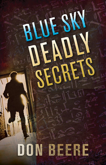
It needs a lot more work, obviously, but that’s the direction I’d go.
Other thoughts?