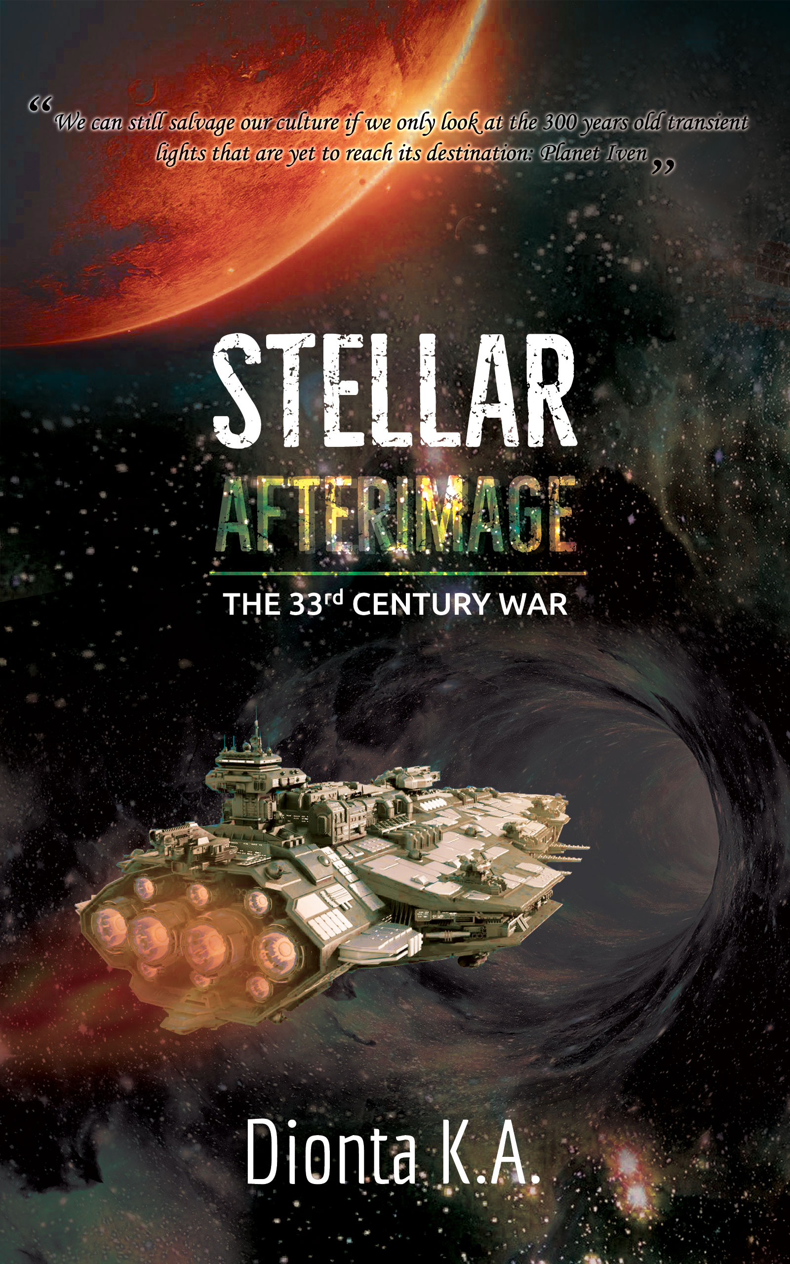
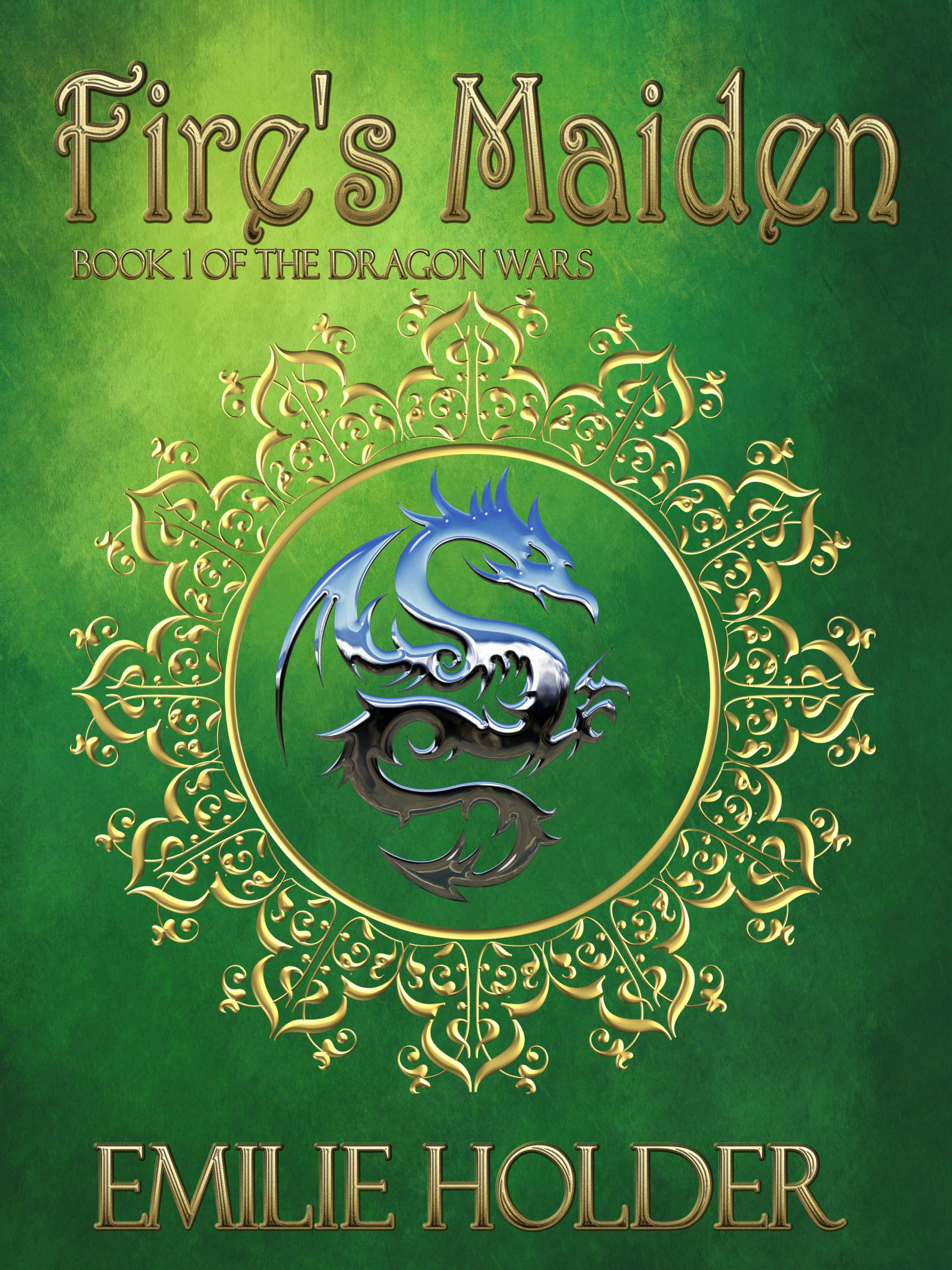
Category: Covers

Hell Can Wait Forever [resubmit]

The author says:

A polite and soft-spoken pedophile discovers that every time he dies, he will awaken at any previous point in his life he happens to be recalling at the time, from several months before he was born on up to a few moments before his latest death. Finding himself seemingly freed from the consequences of his actions by this strange form of immortality, he uses it to indulge all of his worst impulses. However, that he’ll never go to Hell doesn’t mean Hell can’t come to him; for having to live with the evil desires of a desperately wicked heart for all eternity can be a most infernal consequence unto itself.

Working from suggestions you posted in response to my previous submission, I’ve thrown together these two silhouettes symbolically portraying the villainous protagonist’s perversity and his soul’s distress at being entrapped therein. Thanks to everyone again for your excellent suggestions, and in advance for any further improvements you may recommend.

[original submission and comments here]

Nathan says:

Don’t take this the wrong way, but there’s an artlessness here that I don’t think any amount of advice from us will correct.  I’m just not seeing the instinct or experience to know what imagery or combination thereof works.

That’s not a comment on your intelligence, your skill as a writer, or your worth as a person.  The writers also can design; some can’t. Some designers can write; some can’t. The most important trait for a self-publisher isn’t design chops, it’s realistic self-assessment, to know that some things need to be outsourced.

I think the best option here is to work with a designer to come up with a cover which can advertise and promote the book in such a way that the likely target audience will want to look closer.

Two Thousand Leagues as the Seabird

The author says:

TWO THOUSAND LEAGUES AS THE SEABIRD is a literaryish fantasy novel set in an Central-Asian inspired world. It is the memoir of Khatan, an aging mercenary, as he attempts to navigate his own past and revisit the mistakes that have brought him to ruin, along two mirrored military campaigns. It’s very character/relationship focused, with the warfare and politics sort of fading in the background. I’m still a ways out from publishing and I’ve never designed anything like this before, so any feedback is greatly appreciated. Cheers!

Here’s the blurb in case you want to crop to just the front cover:

Khatan searches for healing in a life already lived. He has been kinslayer, exile, mercenary, slave. Through steppe and snow, two distant empires: one ascendant, another waking from its long night. Both have designs on the White City where their fates will be decided. Khatan has been there: he has ridden beneath both banners; for that, he is called now to recount, remember. But memory is fickle, moreso when it is sung: a record of wars long won becomes one of loves lost; of pain, and the limits of redemption.

Nathan says:

My frequent quip is that the covers to “literary” novels try hard not to look like they’re about anything in particular.  This cover succeed in that, as it really doesn’t give any indication of content, nor use any specific element to attract attention.

Your bigger problem, though, is with the “literaryish fantasy.”  What you’ve described may be well written and character-driven, but it’s a fantasy novel — full stop. By that I mean that you’re going to have a lot better luck marketing it to readers of fantasy novels than readers of “literary” novels.  And that means that you have to put image elements on the cover that are going to appeal to the readers who would want to read your book.

As always, my best advice is to find other books that you would expect to appeal to the same readers or be mentioned in the same breath as yours, then see how those books signal their appeal to readers.

(Side note: The usual convention in the English-speaking world is to have text on the spine rotated clockwise, not counter-clockwise.)

Other comments?

Love Potion Commotion!

The author says:

Soon-to-be college student Alanna Lu Feng helps her great-aunt and -uncle with their doggy fashion design business, shooting photos of their French bulldog mascots. It’s good money and fun work—but why can’t Alanna Lu get lucky in love? Vivian and Frank Feng adore their great-niece, but they’re hiding a secret from her: Vivian is a witch! Sick of listening to her great-niece’s dating woes, Vivian concocts a plan to get her great-niece into the arms of a special someone. But can magic solve the problems of love? Turn senior fashionista Iris Apfel into a good witch, give her some talking French bulldog familiars, add a pinch of love story, and you get “Love Potion Commotion”. A fun read for fans of Hallmark movies. A lighthearted comic fantasy that will make the whole family smile.

This book is live, but I’m looking to completely refresh the cover (and blurb) since I’ll be formatting it for print soon. In other words, don’t feel tied to this particular image, composition, or anything because I’m prepared to start from the ground up if needed (I did the illustration and styled the text). Here’s the two main things I’m looking for help with:

– giving it more of a Hallmark Channel vibe. I think this cover, while cute, may skew too young. – ideas on a composition or graphic element that will help me brand the rest of the series (2, possibly 3 more books are planned.) Things to note: – It’s an ensemble comedy. I’m not sure if the cover needs to reflect this, and if so how to go about that.

– This series is based around holidays (Valentine’s Day for this one; the United States’ Fourth of July for #2, Halloween for #3, and Christmas if I do a #4). That might factor into the use of color for branding the series. – I think this book lives roughly in the same space as the classic “Bewitched” TV sit-com, though it has more dogs, fewer wacky hijinks, and a larger cast.

– There’s no mystery/sleuth component, so I’m not sure if it’d be appropriate to visually style it as a “Cozy,” but I think it has a similar vibe to a cozy–light and fun.

It was tricky developing this cover concept the first time around on my own, so I’m looking forward to your help! Thank you, everyone!

Nathan says:

While there is certainly a contingent of readers who are drawn to covers with dogs, there’s a much greater contingent drawn to covers with people.  And as the dogs are more background to the human story (at least as given in your synopsis), I think relegating them to a similar background role on the cover is wise.

What you’ve got here is a comedic paranormal romance.  I point that out because, once you know how to categorize your book, you can look at how similar books are marketed, which means you know how your target readers recognize books meant for them. Here are the first non-sponsored covers that come up when I type “comedy paranormal romance” into Amazon (and it auto-completed, which means that it’s definitely a thing):

Not a lot of specific commonalities — the images alternate between photos and cartoons — but here are some things that do stand out:

  • Protagonist front and center.
  • A touch of whimsy to the font.

Your novel also has an Asian protagonist, which seems to be a good hook as it’s fairly unusual to the genre, and yet that doesn’t come through at all on the cover, so I’d play that up.

So here’s what I’d do:

  • Female Asian as the focal point.
  • Dogs in the background/to the sides.
  • Magic indicated by glitter and glows (you’ve already got some of that going on).
  • Try to indicate an Asian magic, if you can without turning it into a caricature.

Other comments?


To Catch a Bride

The author says:

TO CATCH A BRIDE is a contemporary romance set in the high-society world of Santa Barbara. The series is called Santa Barbara Billionaire Bachelors, and the target audience is women of all ages who read contemporary romance. It would appeal to the readers of Bella Andre.

Nathan says:

The main photograph certainly bullseyes the genre requirements (I hope this is a mockup, because the photo as presented here is too low-res).

I’m not so sure about the lower half. I can see what you were going for, mixing the “straight” type with a cursive font, but I don’t think they’re the right ones. The handwritten fonts I see most used in the contemporary romance genre are less measured and more free-spirited:

And my cursory examination of the genre divides the non-cursive font into “serif” and “tall sans serif” — the blocky sans serif font you use for the byline and “To” doesn’t fall into either. (It also seems that the more erotic and 50 Shades-ish the book is, the more likely it is to use a sans serif font, while the “clean” romances go more for serifs, but I’ll leave a deep examination of that design trend to others.)

Other thoughts?

The Panopticon Experiment

The author says:

The Panopticon Experiment. YA/Adult crossover. Interspecies telepathy made possible by a mutant gene. Main characters are two 17-year-olds (boy and girl, a snow leopard and an array of baddies). I wanted to avoid simpering girls and cute snow leopards. I don’t have enough money to get a cover designed for me and the ready-to-go covers aren’t suitable. It isn’t a typical YA story so the cover isn’t a typical YA design. This is a complete rough thing I knocked up myself using Canva. The image is DNA sequencing and the circular form reflects the form of a panopticon prison. The red dot is a)visible and b) represents blood.

This is the blurb I was thinking of using: For interspecies telepaths like Flo, the world seems fair and just. Humans and animals live in harmony and the world government represents all sentient beings. When a terrorist attack nearly kills her closest friend, Lonce, the world’s last snow leopard, Flo realizes that life in New Era London is not as safe as she thought. Generations after the apocalypse, a new society based on equality has emerged from the ashes of the old, yet only those with the telepathy gene may serve on the highest council. Marginalized and resentful, those lacking the gene, form a secret society – The Human Supremacy League. Its mission: restore man as the dominant species and eliminate the telepathy gene. Ten years before, the League killed Flo’s parents, and she now aims to find their killers and prevent the league from destroying the genetic bond between man and animal. But she can’t do it alone. While Lonce joins her on her quest, Seb attempts to infiltrate the HSL. He is captured and delivered into the hands of league’s chief scientist at the mysterious Panopticon. With Lonce at her side, Flo races to rescue him before her friend becomes the latest experiment.

Nathan says:

I think the first problem is glaringly obvious: If you have to explain the cover imagery, it isn’t doing its job — a cover has to be understood BEFORE a potential reader knows anything else about the story.

Whether the story is “typical” YA or not, you have to identify: Who is my target reader, and how is she used to have books targeted to her? That means that the cover may not accurately represent the contents, but that’s okay IF the cover attracts the appropriate eyeballs.

The problem here is I can tell absolutely nothing about the book from the cover.  Not just “I can’t tell it’s about a snow leopard” or “I don’t recognize the image as being DNA sequencing”; I can’t tell that it’s YA, or that it’s SF, or even that it’s fiction vs. nonfiction. To use the term found over at LBC, this cover is total “mystery meat.”

A readable title font that says “SF,” a partial image of a snow leopard head, and a color scheme that says “YA” (yes, the color scheme can convey that, and more easily than any specific imagery) — that would be a simple cover that hits the bases.

Other comments?