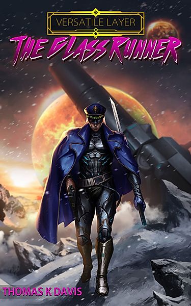
Category: Covers

Stellar Afterimage


The author says:

Hostaged in the hands of technology, the seski beings have long forgotten their cultural values and an integral part of their history. In an attempt to reclaim their lost past, an expedition force makes use of dimensional portals to outrace the light and land on a human habited planet, Iven, to stargaze into the afterimages of their planet – 300 years in the past. Some missteps and the seski beings’ identity are compromised before the human inhabitants. The human beings are intrigued by the discovery of a new sentient race but threatened by the intrusion, creating hostility between the locals and the expedition. Meanwhile, the seski expedition is intrigued by the cultural values of the humans but threatened by their hostilities. The humans try to defend their own in a preemptive strike, while the seskies try to defend their own and recapture the human culture through an aggressive one. The 33rd Century Wars commence.

Nathan says:

Here’s the first thing I saw:

The cover is full of terrific elements for a perfectly serviceable (if slightly generic) SF cover, but the layout needs work, as everything is unbalanced.  The text treatment on “Afterimage” is also a bit of a problem — I can read “Stellar” in thumbnail (just barely), but “Afterimage” is a complete loss.

Here’s the five-minute version of where I would go with the layout:

The byline seems, well.. having the surname be initials only comes across as too precious.

Other comments?

Rusalka

The designer says:

An on-location film crew is making a monster B-movie, but the incantation that raises the monster in the script raises a real monster when delivered by the actress. (The rusalka in this book is a female Slavic water spirit, which may or may not be relevant.)

Client has asked for a cover that resembles a B-movie poster from the 50s, and loves the current version, but I don’t. I know it should be a true illustration, but client insists that I, a photo manipulator/compositor, am the best person for the job. At this point I have spent too much time with this cover to be at all objective (except to recognize it’s Not Right.)

Nathan says:

All rightie! This is right up my alley — not only did I review B-movies and cult cinema online for a dozen years (for a site which the internet has unfortunately swallowed), and not only do I have an archive of 65,000 movie posters and video covers on my computer, but I’m in the middle of making a B-movie-flavored cover for a project of my own. IZ MY JAM.

The problem here, as I see it, is that you’re trying to take an image perfectly suitable for a modern ebook cover (although not in itself particularly horrific or spooky), and then retro-engineer it into a B-movie poster.  The problem is that old B-movie posters were built differently from the ground up; the entire layout philosophy was different, and it’s a difference which even the most casual viewer will instantly recognize even from the thumbnail.

Here are a smattering of B-movie posters from the era, to show what I mean:

There are several cheats here — Cry of the Banshee is from 1970 and definitely shows a psychedelic influence, Flesh Feast is from 1970, The Day of the Triffids and The Body Stealers (“Galaxy Horror” on the Italian poster) and The Plague of the Zombies are from the 1960s, Night Monster and Calling Dr. Death are from the 1940s — but I think they all demonstrate the same aesthetic.

And that aesthetic is OVER THE TOP. Don’t hint that something unsettling might be going on; portray MENACE and MONSTERS and COME TO THE DRIVE-IN BECAUSE YOUR BEST BABE IS GONNA WANT TO SNUGGLE UP TO YOU DURING THE SCARY BITS.

Even more so than with other covers critiqued on this site, where the general advice is to follow the visual trends that other covers in a particular genre have used, I’m just gonna say: Steal. Look at old poster layouts in thumbnail like this, so you can see which ones still manage to convey their content at such a size (since you still need a cover that sells on Amazon), and then swipe that layout.  Trust me, anyone who recognizes that the cover of Rusalka is a direct homage to (for example) Terror From the Year 5000 is going to be more likely to look at it, not less.

Other comments?

Mike Delaney action thriller series

The author says:

Five covers in one image of my Mike Delaney action thriller series. Think Lee Child meets Dean Koontz. I have avoided the ‘man alone’ formula. I’d appreciate opinions of the series concept and if they work and will attract clicks.

Nathan says:

I think they look very professional and “spot-on” for action thrillers, although I wouldn’t say you’ve avoided the “man alone” formula — it anything, you’ve jumped into it with both feet.  But for the genre, that’s okay.

I think the next step up for you is to think about the branding. These all look like part of a series when we see them together, but when they’re mixed in with other covers from the same genre, there’s nothing to tie these together. For instance, if the figure were wearing a red armband in all of the covers, it would be a simple but effective element tying them together. (I’m not suggesting that that would work for your series concept; I’m only putting it out as an example of a visual motif.) perhaps a distinctive sigil or symbol behind each title or in the lower right corner.. I’m spitballing here, but I hope you can see what I’m aiming for: a visual motif tying the series together more immediately than the series title below the book title.

Other comments?

Inhabitants

The author says:

Short version: Sci-fi thriller about immortal beings who inhabit a new human body every time they die.

Long (more sales-y version): In pursuit of their eternal love for each other, will Amon and Juno end up saving the world or destroying everything and everyone around them? Can they rally other Inhabitants to their cause and defeat their eternal foe, or will they remain outcasts life after life? Once you pick up this book you won’t be able to put it down until you’ve reached the mind blowing conclusion. Timeless love and hate play out over the centuries as immortal beings, “Inhabitants”, struggle to find balance and peace before they end up destroying the world.

From the award-winning author of “Digital Dementia”, “The Gravedigger’s Song”, and “Nemesis” comes a story that will have you racing from page to page, battle to battle, love to love.

Nathan says:

Your main font is Ubuntu. Don’t use it. Not only is it generic to the point of being characterless, it’s also one of the most used fonts in do-it-yourself cover templates, which means it automatically looks low-rent.  Find something that says “sci-fi thriller” by looking at other book covers in that genre, or at movie posters.

The photograph is intriguing, but it’s largely meaningless at thumbnail size. I would try cropping it down severely.

I don’t know if you can say your book “shocked the world” if no one’s really heard of it yet.  And your byline placement seems more like an afterthought than intentional.

So put that all together, and the five-minute version of my advice would be something like this (working with the small original you sent, so resolution’s gonna be a problem):

Other comments?

Rambunctious

The author says:

The cover pretty much sums it up although even I am not positive about how the photo talks to the cover text. The ten stories in the collection are near insane and the first sentence gives one the idea: “I’m back from France and boy, are the French people happy about that.” I’ve my ideas on the photo connection. One is spoiling for a fight, one is a knock-off of Uma in Pulp Fiction (Which is the Halloween costume truth as I am the one who snapped the shot), and one idea is that it is art.

Nathan says:

Well, I don’t think the cover sums of anything, which is part of the problem.  It may seem a little lighthearted, but “humor” doesn’t come through clearly until you get to that word at the bottom.  (We DEFINITELY don’t get a “near insane” vibe.)

The Uma-Thurman-knockoff photo, as it is, just looks like substandard photography; to make it work, you need to lampshade it, i.e., make it apparent that it’s a snapshot, perhaps with a Polaroid border or something.

In fact, that may be a good concept for the whole: Overlapping snapshots on a bulletin board, with pseudo-Uma front and center. That can convey both the “multiple stories” idea as well as, depending on the non sequitur partial images seen underneath, the “insane/unexpected humor” idea.

Other thoughts?