The author says:
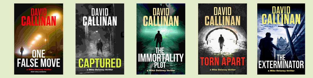
Five covers in one image of my Mike Delaney action thriller series. Think Lee Child meets Dean Koontz. I have avoided the ‘man alone’ formula. I’d appreciate opinions of the series concept and if they work and will attract clicks.
Nathan says:
I think they look very professional and “spot-on” for action thrillers, although I wouldn’t say you’ve avoided the “man alone” formula — it anything, you’ve jumped into it with both feet. But for the genre, that’s okay.
I think the next step up for you is to think about the branding. These all look like part of a series when we see them together, but when they’re mixed in with other covers from the same genre, there’s nothing to tie these together. For instance, if the figure were wearing a red armband in all of the covers, it would be a simple but effective element tying them together. (I’m not suggesting that that would work for your series concept; I’m only putting it out as an example of a visual motif.) perhaps a distinctive sigil or symbol behind each title or in the lower right corner.. I’m spitballing here, but I hope you can see what I’m aiming for: a visual motif tying the series together more immediately than the series title below the book title.
Other comments?
Very nice overall. A few minor nitpicks:
Change the red lettering to something else.
Use the same style for all the books. One is colorized, one B&W, one almost B&W with a splash of color, one normal, and one primarily one color but not completely. Look at the images without the text and ask yourself if they look like they fit together. I was originally going to have full-color images for my series but even with the same basic layout they didn’t fully pass the non-text test, so I sacrificed some detail in favor of better branding by colorizing each cover differently.
Place the series and byline in exactly the same place using the same font (scale and weight). Personally I’d also make the byline the same color for each book.
If these need to be read in order I concur with Nathan regarding the need for a symbol, but also including each book’s series number. If the order matters not, then anything identifying them will be helpful.
You have been very successful at creating a branded series…when all the books are seen together. As Nathan points out, it’s only when the books are seen individually that there may be any problems. In my case, it’s the generic quality that doesn’t seem to work well. It’s pretty clear that each book is a thriller (with the possible exception of “The Immortality Plot,” where the title and cover art conspire to create a vaguely science fictiony effect), but that’s really about all anyone might be able to tell about the books from the covers alone. I wish that each one had something that was specific and unique to the story, something that said “This is a thriller about —-.”
Think of it this way, change the author’s name to, oh, say Robert Ludlum and the titles to those of his books and you may see what I mean. The covers are a little too generic and don’t really convey anything specific about each book’s plot or theme or what might set them apart from any other thrillers.
I like them. I would nix the yellow title on the second cover. I think Nathan’s right that a strong element that ties them all together would help the branding. But they’re very professional-looking. Overall well done.
Yeah, same as everyone else; I like them; they look great together, but they don’t necessarily scream “one of a branded series” when seen individually.
As much as I like the strong sans-serif font, I wonder if switching up the title font a bit, to something more easily distinguishable, would brand them a bit more?
I had found myself wishing that the samples were larger, since there may be telling details in them that provide some real clues as to just what each book is about…but then realized that if the covers don’t work at thumbnail size, that’s a problem in itself.
Like everyone else, I have little problem with their overall design and the effectiveness of the branding. But here are two issues, the first related to the branding itself.
A brand by its nature tells you something about what the product is, and that is the result of familiarity. You see “Campbells” and you think “soup,” you see “Budweiser” and you think “water.” But a brand-new brand doesn’t have that sort of cache yet. You know that the books are related…but that is all you know about them.
This leads to the problem I raised at the very beginning, and that is the ambiguity or generic quality of the covers. There is some suggestion of mystery or thriller—but that is a very broad category. Are they murder mysteries? Police procedurals? Spy thrillers? “The Immortality Plot” might be science fiction, while “The Exterminator” might be anything from a serial killer to some sort of vigilante.
Each cover taken by itself is attractively designed but uninformative—or perhaps I should say, apparently not specific to the book. They don’t really tell you much more than the broad genre, if even at that not unambiguously. As I mentioned before, you could change the author on most of the covers to Robert Ludlum and the title to “The Bourne Identity.”
There needs to be something in each cover that says something more about what the book is about, its idea or theme, something that will set it apart from the hundreds of other books on the same shelf.
Not that the Delaney covers need to necessarily be as explicit as these, but I did want to use them as an example of how a cover should not only broadly convey the general genre of a book but something of its specific nature, subject, theme, setting, etc. While I think it’s probably pretty clear that these books are fantasy, there is also (hopefully) a suggestion of story.
https://www.charliehills.com/gallery/picture.php?/553/category/3
How is there not a waiting list for this site? Everyone not able or willing to pay for cover art should be submitting their covers here.
I couldn’t agree more! Lousybookcovers all by itself should be an object lesson…
THAT is a question I ask myself daily. I am always telling people to come over here, and only a handful listen. SOOO frustrating.
I enjoy the challenge of creating covers for other books without knowing the story. Sometimes it’s easier and sometimes more difficult, but I always learn something new. It’s also baffling that so many have rejected free one-on-one help, either before or during the collaboration process.
“It’s also baffling that so many have rejected free one-on-one help, either before or during the collaboration process.”
And that’s what keeps “Lousy Book Covers” going.
By the way, I have no doubt but that it’s a challenge to create a cover for a book without knowing what the book is about!
I should say it’s more challenging to create an appropriate cover without knowing the book, but usually fairly easy to do so without such constraints. As you’ve seen it’s also quite difficult for some authors to create a cover for his or her own book.
I can just imagine that it’s challenging! So…if I get this right, it’s fairly easy to create an appropriate cover just knowing the title of a book and nothing else?
I can certainly agree that it is difficult for authors to create their own covers…if it weren’t, this site would have no reason to exist!
Easy to create a cover, not necessarily one that is appropriate. It’s usually still an improvement, however.
Well, creating an attractive cover that has nothing whatsoever to do with a book shouldn’t be too hard at all. But, frankly, I don’t think that an inappropriate cover—which would also mean a misleading one—would necessarily be an improvement over a badly executed cover that at least is related to the book, its idea or themes. Imagine, for instance, a beautifully rendered cover depicting an erotic lesbian vampire scene…but on a book of Christian children’s poetry. An important part of the definition of a successful book cover is that it is appropriate for the book.
That’d be one way to increase sales of Christian children’s poetry.
As long as a cover doesn’t contradict the book content it can work, or at least be an improvement. There is a book titled Crimson Flare and the author used the cover creator, adding a generic photo between black bars. It was both boring and had nothing to do with the story. He asked for help and I created a cover featuring a dense nebula in the foreground with a bright star in the background among the rest of the smaller stars. I added a nice lens flare and colorized the whole thing crimson red, making it a literal translation of the title. No more appropriate than his cover while not contradictory, yet it was far more eye-catching than what he had created. I charged him nothing yet he rejected it in favor of creating a slightly different version of the original cover with the cover creator. Odd.