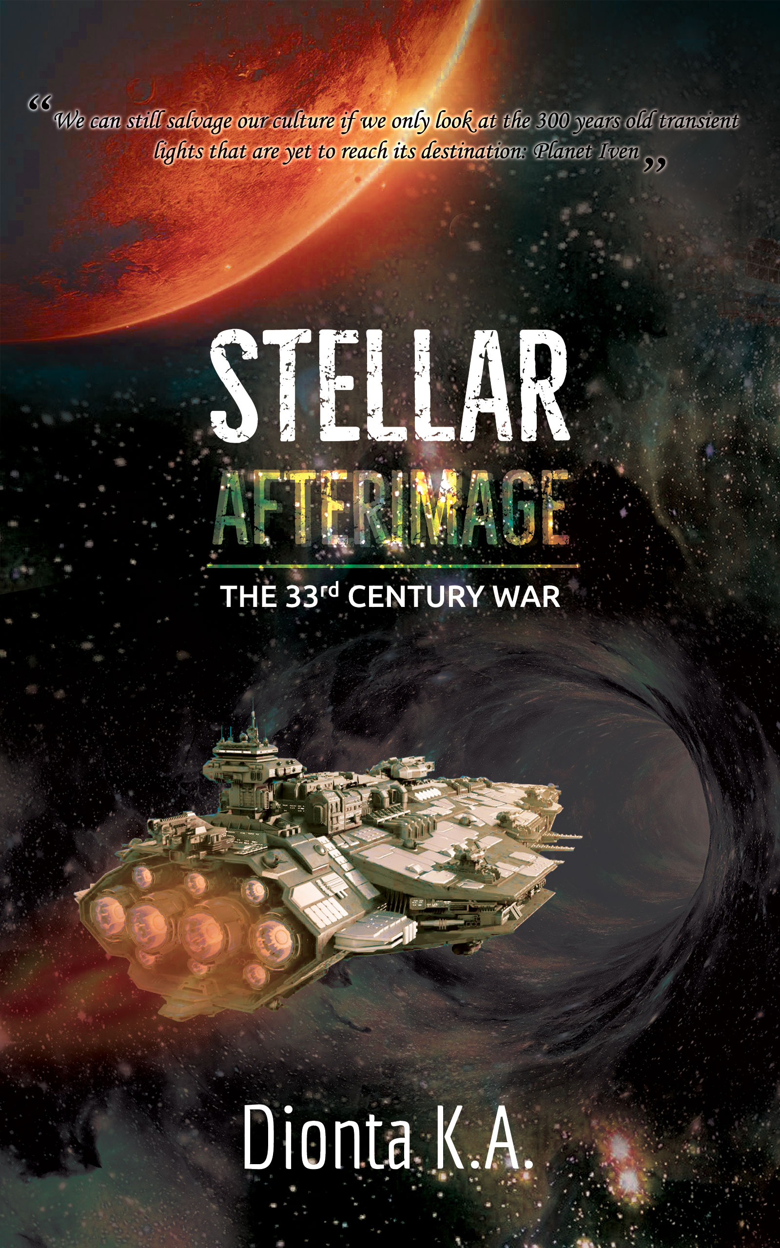
The author says:
Hostaged in the hands of technology, the seski beings have long forgotten their cultural values and an integral part of their history. In an attempt to reclaim their lost past, an expedition force makes use of dimensional portals to outrace the light and land on a human habited planet, Iven, to stargaze into the afterimages of their planet – 300 years in the past. Some missteps and the seski beings’ identity are compromised before the human inhabitants. The human beings are intrigued by the discovery of a new sentient race but threatened by the intrusion, creating hostility between the locals and the expedition. Meanwhile, the seski expedition is intrigued by the cultural values of the humans but threatened by their hostilities. The humans try to defend their own in a preemptive strike, while the seskies try to defend their own and recapture the human culture through an aggressive one. The 33rd Century Wars commence.
Nathan says:
Here’s the first thing I saw:
The cover is full of terrific elements for a perfectly serviceable (if slightly generic) SF cover, but the layout needs work, as everything is unbalanced. The text treatment on “Afterimage” is also a bit of a problem — I can read “Stellar” in thumbnail (just barely), but “Afterimage” is a complete loss.
Here’s the five-minute version of where I would go with the layout:
The byline seems, well.. having the surname be initials only comes across as too precious.
Other comments?
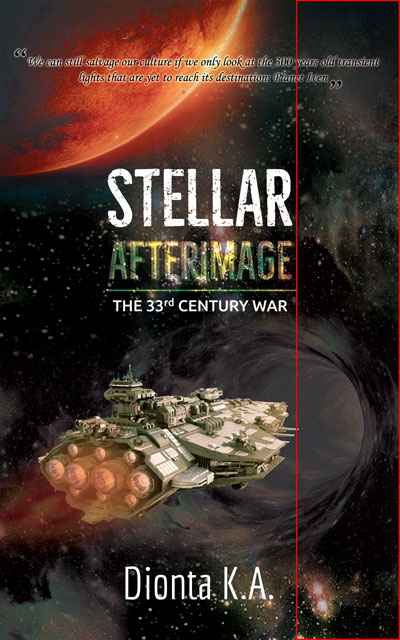
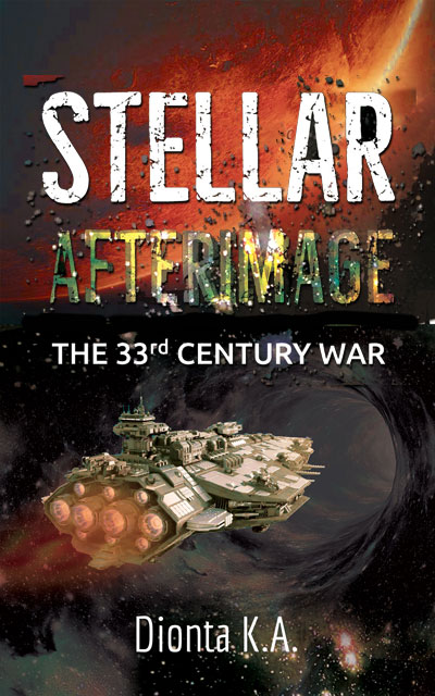
Nathan’s redo takes care of most of the covers problems.
A few still remain. One of these is having given in to the urge to make the type as decorative as possible. It is never a good idea to do anything that makes a book title hard to read. And all of the fancy effects really add nothing whatsoever: they are totally gratuitous. I would eliminate them.
The “dimensional portal” is nearly impossible to make out: it’s just a dark grey blob. You ought to make it a lot more prominent and a lot more interesting.
https://imgur.com/Wv9aE6f
What do you think?
It looks good, but…
1) The quote doesn’t work. But, if you really want it, it needs to be on a Sans Serif typeface and without quotation marks
2) The line between the title and the series’ name doesn’t look good.
3) The 33nd century war text will look better if you arrange it like the Stellar word.
4) The name will look better with a bolder typeface.
It’s a great cover.
All very good suggestions.
Much, much better!
The main thing I would emphasize is to not obscure the title by adding so many layers and textures. They are unnecessary and add absolutely nothing while at the same time making the title harder to read.
Much the same criticism applies to the tagline. Replace the script with a simple sans serif typeface. And if you need a glow, don’t make it so tight. A broader, softer glow will set the type apart from the background better.
That quote makes no sense at all. It’s not grammatically correct, firstly–which would make alarm klaxons go off in my head, were I a prospective buyer–and it tells me nothing at all about the story. You’re including something that you understand because you know the story. You’re not helping the prospective buyer understand what the story is about. What, they’re going to “look” at “transient” events (is there another kind of event?), 300 years in the past. So what? That doesn’t mean a thing, outside of the context of the story into which you’ve placed it. I’d also point out that if you can look at events in the past, the duration of those events (back to “transient”) makes zero difference. You can look at some uber-slow event, or some very quick one–makes no difference at all, because, by definition, they are past. Right?
PLEASE, for the love of heaven, lose the font treatment. I get it–you want an “afterimage” for the word, afterimage, but all you’re doing is making it unreadable or at best, blurry on a thumbnail. This cover does not need it. You have lots of “bang” here. You have the giant Red Sun, you have the ship, a great starry background and the time-tunnel/event horizon/whatever you have there. There’s NO reason to add a text treatment like that. It would be one thing if you had a simple, not-very-busy cover, but your cover is pretty busy. You’re distracting from the visual elements, by making the text a visual element, too.
I see you replaced the Pseudo with your other authoring name, and I hope you retain that, or find a better pseudonym. I agree with Nathan that the first name, then two initials is definitely too too–too precious, too twee. I wouldn’t recommend using that.
I do like a lot of what you’ve done here. If you stick with the alignment that you have in the redo, and fix the font treatments and the authorname, I think this one is very, very solid and a winner.
https://imgur.com/undefined
This link isn’t working.
The re-do is much improved but still far too busy, to the point the ‘after image’ effect of AFTERIMAGE is lost. Try a simple texture or gradient, duplicate it, offset it, and lower the opacity and possibly add a mild Gaussian or motion blur.
The ship is awesome (I wish I could get that level of detail but my computer threatens suicide any time I try). It looks much better on the original cover. If it was rendered, try adding more shadow to make the details pop. It’s a bit flat as is and doesn’t quite look like it’s interacting with the scene.
I know flares are cliche but they can still add a level of detail and sense of professionalism. Try adding one to the sun peeking out from behind the planet, then lose the quote and move the title up to interact with the flare.
Try a separate texture or manipulate the built-in texture of the typeface so the matching letters are not identically distressed.
Make the byline larger and show you’re actually proud of the book. I also agree about your nom de plume. Even Ty and Dan had the foresight to include a first and last name to bookend the initials.
Now that I am looking at the art more closely, lose the shadow under the spaceship. Not only does it make no sense, it makes the ship look like a cut out pasted on.
And the more I look at the cover the more the two main visual elements—the spaceship and portal and the large planet—bother me. They seem totally unrelated, making the top half of the cover and the bottom half look like two different covers stuck together.
The revision is better, and I also approve of going with your real (sounding) name instead of the pen name. I agree with Hitch that you need to lose the quote. It’s absolute word salad; it just doesn’t mean anything, and it’s riddled with errors. (Your plot summary is also riddled with errors, but this isn’t Plot Summary Critics.) Just lose it; the cover has plenty of dynamic elements without needing a blurb.
Overall this cover is very solid!
To add to the comments, this is a good basic design and your redo works to fix the weaker aspects. But there’s one additional issue which is actually getting emphasised in the redo – the visual hierarchy.
I.e. when you look at a cover your eye should be able to sort the information immediately. The viewer should take in one thing straight away, without thinking (on a book cover usually the title – though for very famous authors it’ll be the byline), and then sort naturally through the remaining elements equally naturally.
Here the problem you have is that the two words of your title have slightly different treatments so the eye struggles to group them as a unit. It wants to attach ‘STELLAR’ to the other white tect ‘THE 33rd CENTURY WAR’ and ‘HENRY R. VISION’. Meanwhile the yellow in ‘AFTERIMAGE’ links it to the image of the ship.
And there’s not much variety in the ‘weight’ of the elements. The main illustration (spaceship plus wormhole) is the same size as the title, the red planet is about the same size too.
None of these are bad elements or decision in themselves, they’re just currently sitting together in a way which confuses the eye.
It’s to do with the dispersal of highlight and brighteness too. E.g. in that revised version you have a bright point in the nebula pattern right on the left hand edge of the page near the ship’s thrusters. That point of brightness, and others on the edges, are enough to pull the eye away from where it needs to naturally fall.
A simple fix is to reduce the size of the ship/wormhole illustration: https://66.media.tumblr.com/45a4150393feefd81bb91322650d3f36/1ac22bb6b55bfcc7-43/s540x810/c4252d4824a2bdc45585930159c8c861ccd89e94.jpg
You don’t actually need a massive illustration on the cover. You’ll want to make sure the shape is nice and readable, with nice dark space behind it. But if the spaceship isn’t the clearest at thumbnail it doesn’t matter because everything else about the cover is already saying ‘space SF’ nice and clearly.
Space opera novels actually tend to have the spaceship small on the cover against a lot of space (and often a planet for scale); it helps give that epic feel, the might ship dwarfed by the grandeur of space etc
https://www.amazon.co.uk/gp/product/B08253WST7/ref=dbs_a_def_rwt_bibl_vppi_i0
https://www.amazon.co.uk/Light-Impossible-Stars-Embers-Novel/dp/1785655248?ref_=Oct_s9_apbd_onr_hd_bw_bSqrjj_3&pf_rd_r=XHQ9BEAMFK9CFNSP3KXH&pf_rd_p=1e92857d-6cdf-500b-91d8-21b9d5e9bce8&pf_rd_s=merchandised-search-10&pf_rd_t=BROWSE&pf_rd_i=426337031
https://www.amazon.co.uk/Children-Time-Winner-Arthur-Clarke-ebook/dp/B00SN93AHU/ref=lp_426337031_1_5?s=books&ie=UTF8&qid=1578655367&sr=1-5
Obviously mine is the quickest of edits to demonstrate, but I also fiddled with some brightness and contrast because I think that’s important too. You want to be very careful where you’re deploying the brightest spots. I would pull out a lot of brightness from the peripheral space to let that around the wormhole draw the eye more. And it could come away from the top and bottom of the ship. They want to be more crisply defined against dark space.
That’s why those classic scifi covers still work. The images were drawn in a simple and clean style to do exactly what you stated; draw the eye to each element quickly. The trend now is to add layer upon layer of visual noise, to the point any potential reader is going to spend too much time deciphering the cover to bother reading the book.
Sadly, there are still too many competing, unrelated elements. The cover needs to be greatly simplified and given a single focus. This includes removing all the special effects added to the title. An unfortunate effect of reducing the size of the spaceship/portal is to shift interest to the larger, brighter element, the planet.
I don’t think that reducing the size of the spaceship works in this case. The big idea to get across is not the vastness of space but traveling through wormholes…and that point is obscured by making both it and the spaceship small. Perhaps a related but slightly better idea would be to have the wormhole dominate the cover (eliminating the planet) and have the small spaceship silhouetted against the bright entrance.
Here is my 5-minute re-do
https://i.imgur.com/Tm82dcI.png