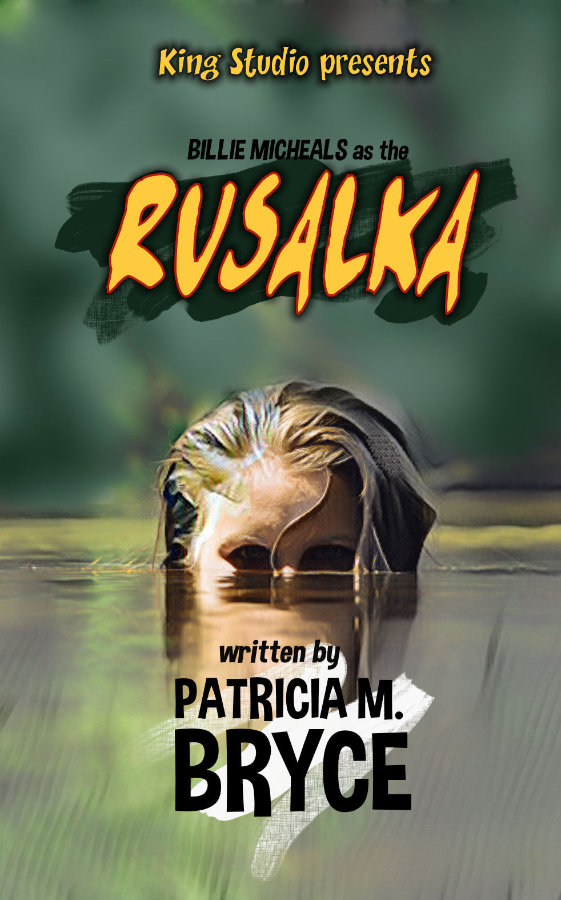
The designer says:
An on-location film crew is making a monster B-movie, but the incantation that raises the monster in the script raises a real monster when delivered by the actress. (The rusalka in this book is a female Slavic water spirit, which may or may not be relevant.)
Client has asked for a cover that resembles a B-movie poster from the 50s, and loves the current version, but I don’t. I know it should be a true illustration, but client insists that I, a photo manipulator/compositor, am the best person for the job. At this point I have spent too much time with this cover to be at all objective (except to recognize it’s Not Right.)
Nathan says:
All rightie! This is right up my alley — not only did I review B-movies and cult cinema online for a dozen years (for a site which the internet has unfortunately swallowed), and not only do I have an archive of 65,000 movie posters and video covers on my computer, but I’m in the middle of making a B-movie-flavored cover for a project of my own. IZ MY JAM.
The problem here, as I see it, is that you’re trying to take an image perfectly suitable for a modern ebook cover (although not in itself particularly horrific or spooky), and then retro-engineer it into a B-movie poster. The problem is that old B-movie posters were built differently from the ground up; the entire layout philosophy was different, and it’s a difference which even the most casual viewer will instantly recognize even from the thumbnail.
Here are a smattering of B-movie posters from the era, to show what I mean:
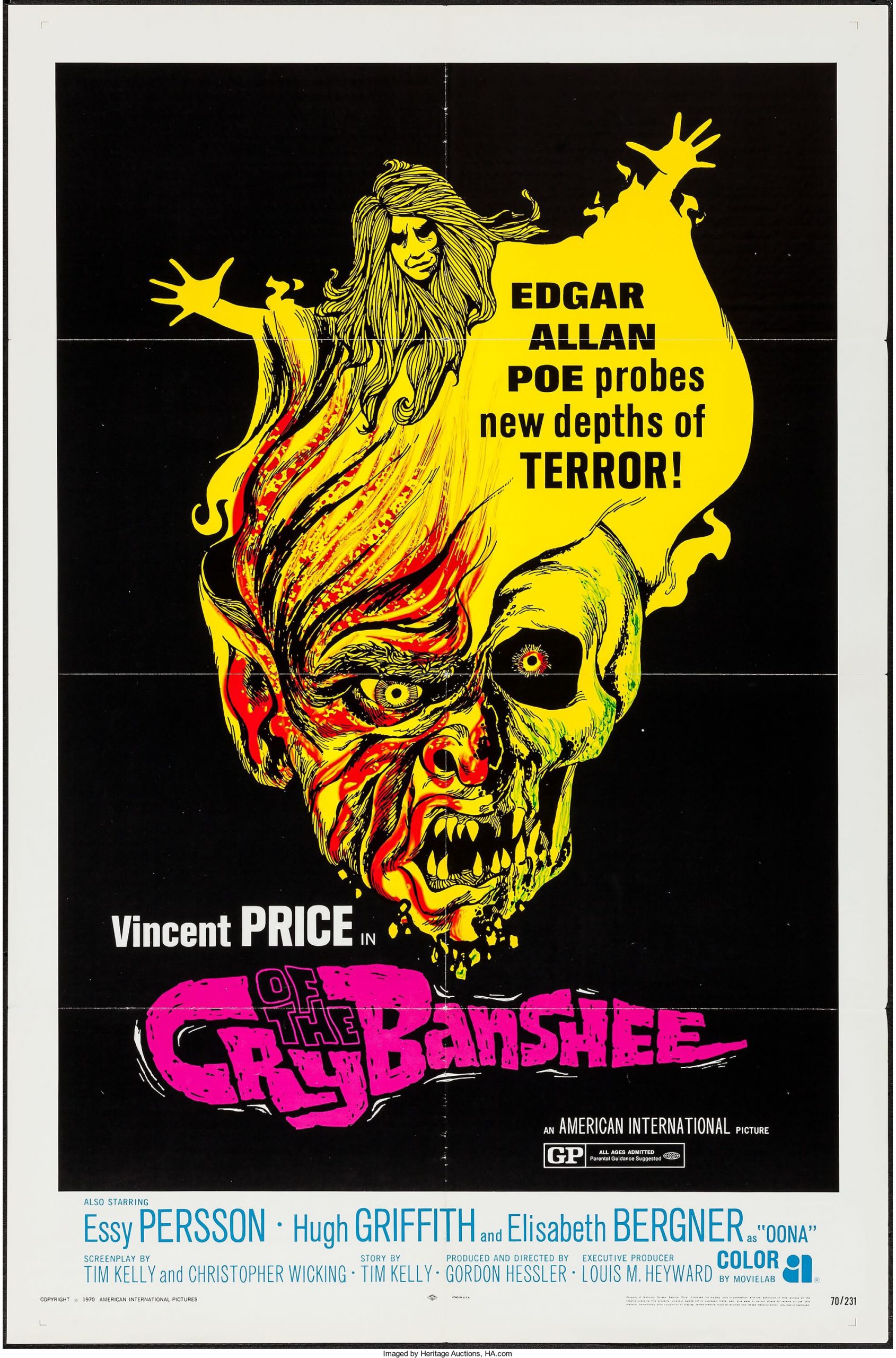
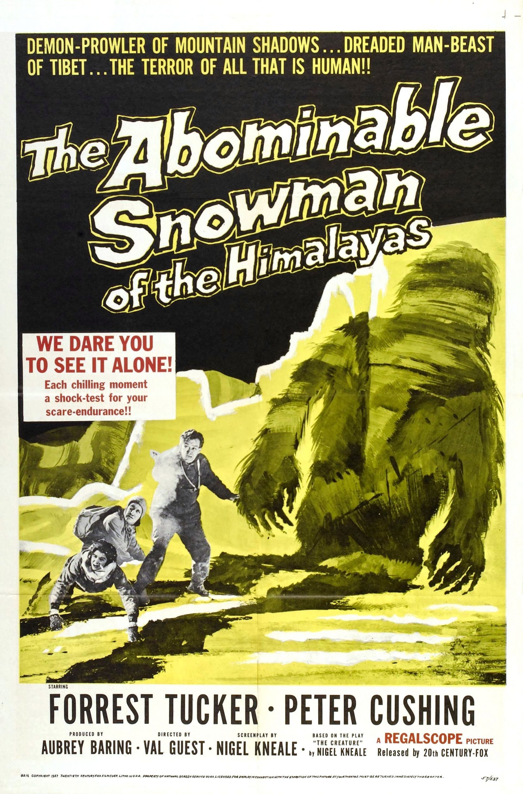
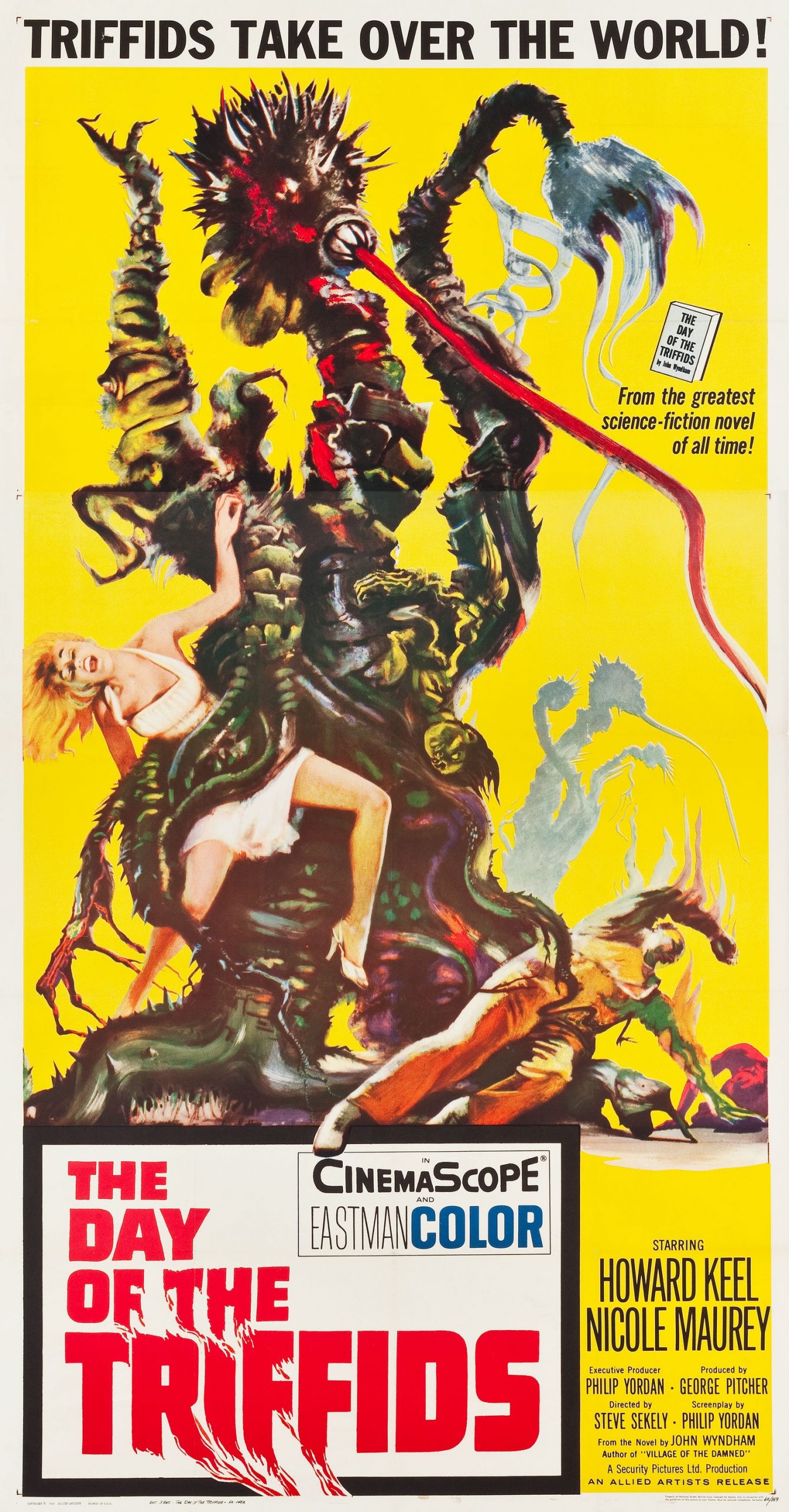
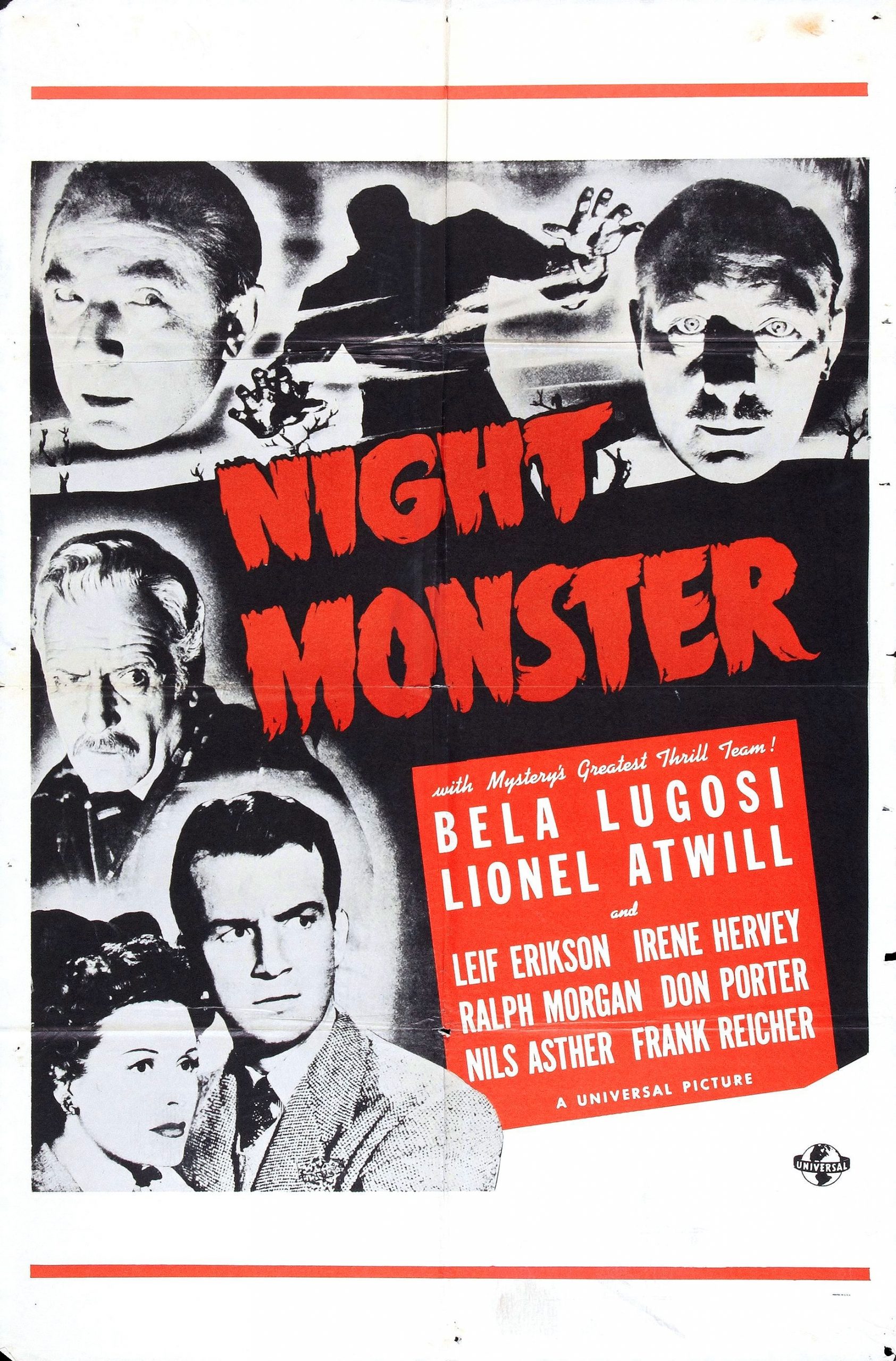
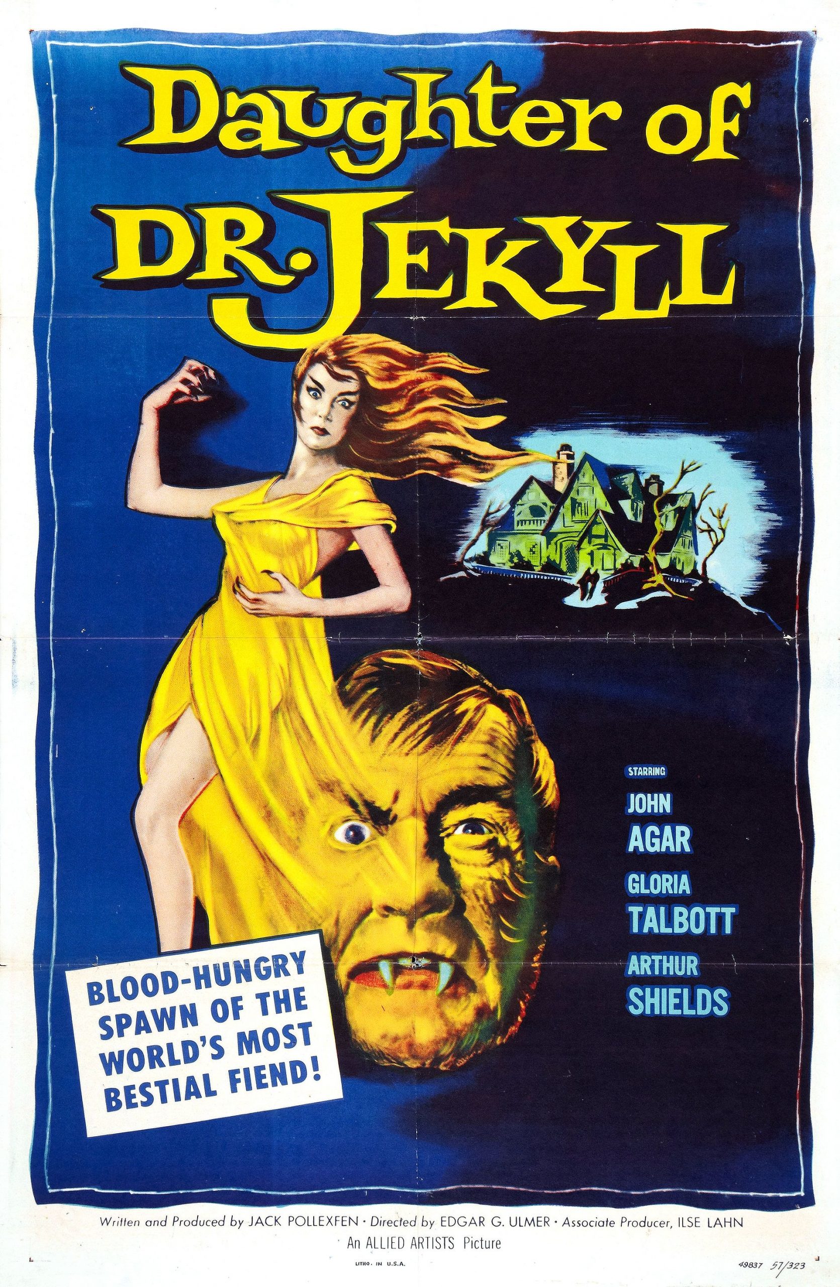
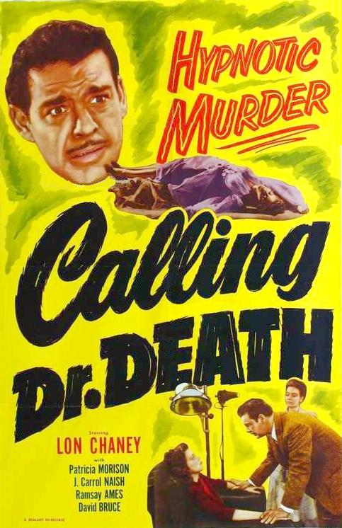
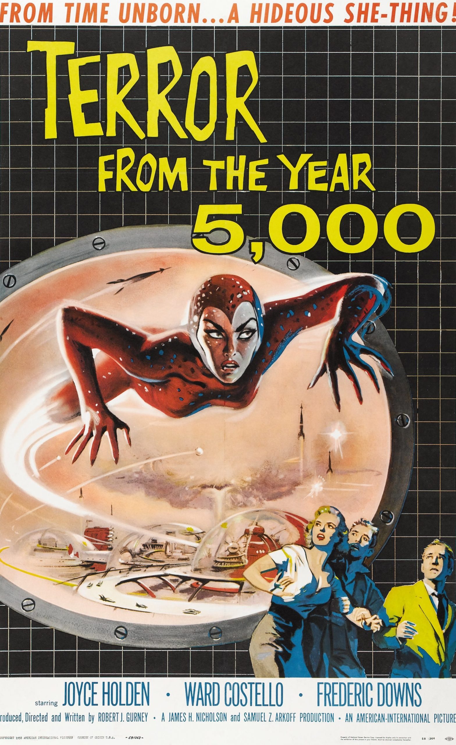
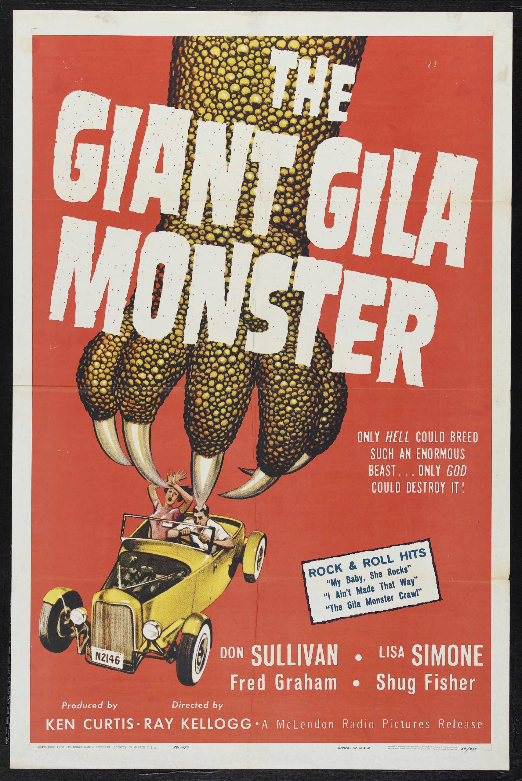
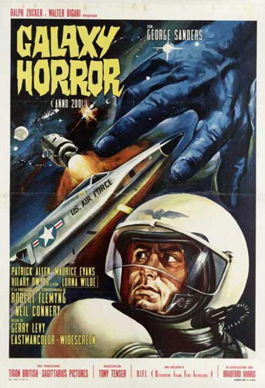
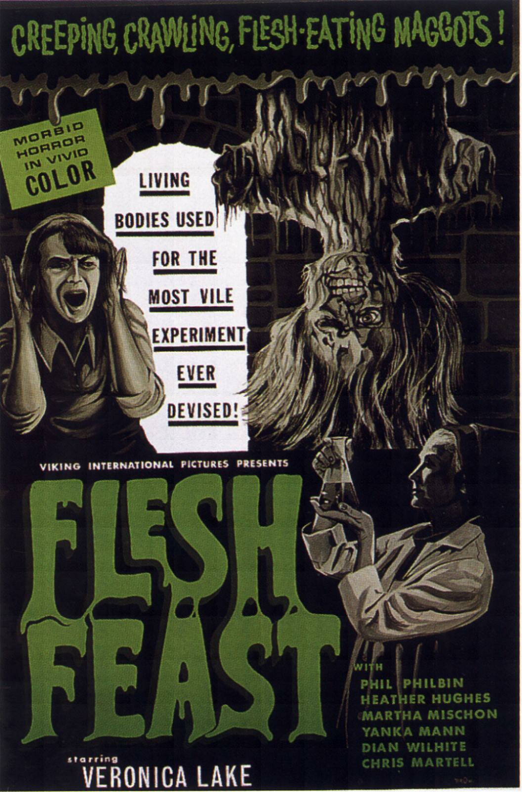
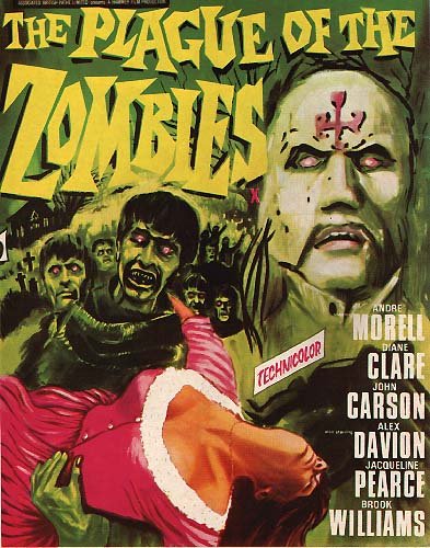
There are several cheats here — Cry of the Banshee is from 1970 and definitely shows a psychedelic influence, Flesh Feast is from 1970, The Day of the Triffids and The Body Stealers (“Galaxy Horror” on the Italian poster) and The Plague of the Zombies are from the 1960s, Night Monster and Calling Dr. Death are from the 1940s — but I think they all demonstrate the same aesthetic.
And that aesthetic is OVER THE TOP. Don’t hint that something unsettling might be going on; portray MENACE and MONSTERS and COME TO THE DRIVE-IN BECAUSE YOUR BEST BABE IS GONNA WANT TO SNUGGLE UP TO YOU DURING THE SCARY BITS.
Even more so than with other covers critiqued on this site, where the general advice is to follow the visual trends that other covers in a particular genre have used, I’m just gonna say: Steal. Look at old poster layouts in thumbnail like this, so you can see which ones still manage to convey their content at such a size (since you still need a cover that sells on Amazon), and then swipe that layout. Trust me, anyone who recognizes that the cover of Rusalka is a direct homage to (for example) Terror From the Year 5000 is going to be more likely to look at it, not less.
Other comments?
I’m afraid that it does miss the mark.
As Nathan points out, it really doesn’t come off as a 50s B-movie poster at all.
There is also too much going on…not the least of which being at least three too many typefaces or variants.
There is also no really dominant visual element. The title, the face and the author’s name are all about the same size…which means that all are vying for the potential reader’s attention…which in turn means that none of them get fully focused on. The effect is to dilute any impact any of them might have. Take a look at most of the posters that Nathan found…in just about all of them there is a dominant visual element—either the title, a figure of some sort, etc.
Everything could be larger: the title, the tagline (which is all but unreadable) and the face. But one of those needs to be predominant.
One thing you might notice in the examples that Nathan found is the use of asymmetry. Type is slanted, images are off-center, etc. This adds a lot of drama and action to a poster/cover. The strong vertical symmetry in the cover you have results in a very static effect.
While I think copying the aesthetic of a B-movie poster is great, I don’t like the conceit of the “King Studios Presents” part. Is the full title “King Studios presents Billie Micheals in Rusalka”? Because that’s what it looks like. (Also, is it actually spelled “Micheals”?)
I would simply handle the text like a normal book cover: Title (large), author’s name (no “written by”), and then throw in one of those goofy B-movie taglines (“She thought it was a movie…but the monster is real!” or what have you). Let the graphics do the work of communicating “This book is like a movie.”
Gwen’s advice is excellent. The “Presents” and “Billie Michaels as” conceits are only potentially confusing.
As everyone says, the cover doesn’t resemble a B-movie poster.
If I were you, I would split the cover: 40% at top for title, author’s name and tagline, and the rest for image.
The head needs to be bigger (almost filling the 60%) because it’s hard to say what I was looking at when I see the thumbnail.
Also, I think “EasyComic”, (a free Photoshop action), could be good for giving the image an “illustration” feeling. I would use “Broken Wing” (a free typeface for commercial use) or another similar one for the title and a Sans-Serif typeface (something like Vremena Grotesk) for the name and the tagline.
I would only use complementary colors for the text and the image (if your text is yellow, your image must look purple). Red, yellow and black were the most prominent colors in B-Movie posters.
I really want to see how do you do this cover. Good Luck!
By the bye, someone might want to point out to the author that “Rusalka” is not going to be a term familiar to many people. I thought it was a character’s name (and was puzzled by the “the”) until I read the description. She might want to consider changing the title to “The Rusalka.” This would also make a little more sense, since it would be the same as saying “The Yeti” or “The Selkie” as opposed to “Yeti” or “Selkie.”
I can testify that indeed, this is the very first time I ever heard of such a creature as a rusalka, though what I’ve turned up in my ten minutes of research suggests these Slavic creatures are not so different from other ethnicities’ legendary “strange women lying in ponds” (as Monty Python would put it) such as Scottish kelpies and Greek sirens. So far as I can tell, a rusalka is basically an undead virgin gal who got that way by being drowned, and now may or may not be trying to entice others to the same doom with seemingly innocent and naive behavior. While I can’t think of any 1950s movies with that specific plot, one can see how such an enticing “monster” gal might appeal to the same generation that liked to read lurid men’s magazines with lots of pictures juxtaposing Nazis with scantily-clad women.
Ron Miller is right, of course, that you should probably include a The in the title just to let people know that this is supposed to be one of those movies about a mythological creature. As for the aesthetic, I would note that 1950s B-movie posters with a gal on them usually showed her in one of two poses: cringing away and screaming at whatever is supposed to be menacing her, or passed out and slumped over backward in the grip of the movie’s monster, who’s usually got her in something like a bridal-carry position (usually with her also wearing a scanty dress so that she’s showing a fair bit of leg). This being a story about a movie in which the gal is the monster, one trick you might try to add just a little humor would be to show the rusalka holding up some bewildered-looking muscular guy (shirtless in safari shorts or swim trunks to provide a little eye candy for the ladies) in that same bridal-carry pose; 1950s audiences would probably have appreciated the punchline.
Whatever you do, though, and important detail is that your cover must indeed be an illustration rather than just a photograph. If you look at the sample posters our host provided, you can see that even when they did use publicity photos or frames from their movies (all black-and-white pictures, of course) those were painted on by hand, not shot directly from the photographs. One of the reasons your current cover isn’t working is that for all the “make it look like someone painted it by hand” filtering you’ve used, it’s still quite obviously a color photograph you’ve put through a filter in your picture editing program; things that (obviously) nobody did back in the 1950s.
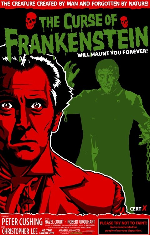
Of course, I’m not suggesting you do everything by hand the way people had to do back in the 1950s; just that your retro counterfeiting of that aesthetic be a bit more believable. Something you’ll notice if you look at those posters is that most of them used a grand total of about three or four colors. Take a look at that The Curse of Frankenstein poster, for instance: the three colors of ink used are red, green, and black; and white is the fourth color if you’re also counting the glossy paper on which this poster was printed.
While you can blend your colors a bit for variety as some of these posters also do, that’s the kind of color scheme you want for your cover as well: making it look like you were only able to afford three or four different colors for the illustration, and had to colorize a black-and-white picture if you wanted to make the illustration look a little more sophisticated. For your particular color, I’d recommend a fleshy pink color for the characters, black for all illustrations and outlines, yellow or green for general background use (maybe mingled with the pink of the gal’s flesh to hint that she’s undead), and red or brown for the characters’ (scanty) clothing. If you like, you can “cheat” a bit by using another color for the title and byline, but (this is the most difficult part) do try to make your text look hand-drawn and painted; you’ll notice most of the title lettering on those posters isn’t any kind of standard printers’ font.
The main trick of using this “1950s B-movie poster” aesthetic is to make it look like you’re operating within the same limitations the artists were back then even though (obviously) you’re not. You also want to use the same visual shorthand: a creature menacing or bridal-carrying the obligatory damsel-in-distress was one of the most efficient ways to signal that the advertised movie was a monster movie. Hence, if you’re paying homage to (or parodying) these posters, these are the kinds of images you must have on your cover as well.
(PS: having the rusalka in question carrying another passed-out scantily-clad woman wouldn’t be out of the question either. In the 1950s, nobody automatically assumed any Sapphic shenanigans just because two women happened to be in the frame; just as any campy guy who dressed a bit flamboyantly was always presumed to be straight unless and until proved otherwise, which he almost never would be.)
Thank you everyone! I love your suggestions; they seem all spot on.
I made up a couple of new mock-ups for the client, mentioned the issues with “Rusalka” vs. “The Rusalka” and bluntly told her that she needed an illustrator to produce a true B-movie poster homage/aesthetic.
Thanks again!
Another thing to consider, though it may not matter. Rusalka was the name of a Hugo-Award winning C J Cherryh book. Just make certain it’s differentiated enough to avoid confusion.
I don’t know much about B movie posters, but I do think to make it more scary put some scales or leaves or glowing eyes in the main figure. I’d also like to see more of her face or maybe up to her bountiful lips. Make it scary and seductive at the same time. Like the concept though. I’d read that book.