The author says:
Short version: Sci-fi thriller about immortal beings who inhabit a new human body every time they die.
Long (more sales-y version): In pursuit of their eternal love for each other, will Amon and Juno end up saving the world or destroying everything and everyone around them? Can they rally other Inhabitants to their cause and defeat their eternal foe, or will they remain outcasts life after life? Once you pick up this book you won’t be able to put it down until you’ve reached the mind blowing conclusion. Timeless love and hate play out over the centuries as immortal beings, “Inhabitants”, struggle to find balance and peace before they end up destroying the world.
From the award-winning author of “Digital Dementia”, “The Gravedigger’s Song”, and “Nemesis” comes a story that will have you racing from page to page, battle to battle, love to love.
Nathan says:
Your main font is Ubuntu. Don’t use it. Not only is it generic to the point of being characterless, it’s also one of the most used fonts in do-it-yourself cover templates, which means it automatically looks low-rent. Find something that says “sci-fi thriller” by looking at other book covers in that genre, or at movie posters.
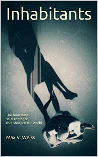
The photograph is intriguing, but it’s largely meaningless at thumbnail size. I would try cropping it down severely.
I don’t know if you can say your book “shocked the world” if no one’s really heard of it yet. And your byline placement seems more like an afterthought than intentional.
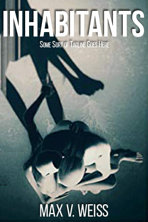
So put that all together, and the five-minute version of my advice would be something like this (working with the small original you sent, so resolution’s gonna be a problem):
Other comments?
My first impression was, cool design! Immediately followed by, but what the hell is it? Unfortunately, I see absolutely nothing that conveys anything about your book’s nature or themes. What is there that suggests (what I assume is the central idea of) “immortal beings who inhabit a new human body every time they die.” Where is any sense of a “pursuit of…eternal love” let alone a “struggle to find balance and peace before they end up destroying the world”?
As striking as the cover might be graphically, it is woefully uninformative. I realize that the tagline at least labels the book as science fiction, but a potential reader is going to have to get that far first. And I like to make a general rule of thumb that a book cover should not depend on a tagline for it to make sense.
I think that any issues regarding the typography are moot until a better cover image is created.
Well, all right, I can sorta see the “romance” after taking a good long look at the cover; judging by the shadow, that’s a monochrome bird’s-eye-view shot of a bald and naked couple getting frisky while seated on a chair (an uncommon, but hardly unheard-of position for doing the deed). One problem with that is that almost nobody is going to spend that much time looking at your cover, especially since as our esteemed host mentioned, the image just isn’t very comprehensible at thumbnail size. Even if you zoom in on the couple more as in his five-minute revision, however, I’m inclined to agree with Ron Miller here that it doesn’t really give me any idea what the genre and subject of the book might be.
Aside from that, your long and short summaries both leave me wondering whether you’ve got the right genre. You don’t mention anything there about this loving couple’s immortality deriving from any kind of advanced technology or scientific phenomenon, or show any such technology in your cover image. Absent technology, unless these lovers are some kind of extraterrestrials with a natural ability (thanks to some scientific phenomenon unknown to us) to take control of new bodies every time their previous ones wear out and go offline, this story could far more easily qualify as urban fantasy.
Speaking of taking control of new bodies, I’m not entirely certain what you mean by that either: do these Inhabitants, like the character Doro from Octavia Butler’s Wild Seed, immediately jump to some other body whenever their current one dies, displacing whatever poor soul originally owned their new body and effectively killing that individual? (If so, that would certainly explain what’s so “shocking” about their situation: people in general wouldn’t be too happy to learn that a couple of lovers among them are rendered effectively immortal by taking other people’s lives, whether they do so voluntarily or not.) Otherwise, are they perhaps capable of something like the reincarnation in which various Eastern religions believe, except without all that pesky memory loss between incarnations? Another possibility: maybe they get new bodies through reproducing and then haunting and dominating their offspring like the Mikage family’s founding ancestors did in Ayashi No Ceres?
Whatever the story may be, this front cover is inadequate for attracting its target audience, and I wouldn’t recommend using your current sales pitch on the back cover either. While mentioning some of the other stories you’ve written is fine (especially for enticing people who’ve previously read and enjoyed those other stories), asserting to prospective readers how they will react to this story is blatantly manipulative, and will tend to turn them off to reading your book. You should focus instead on open-ended questions about the story (Why are the characters in this situation? Do they want to stay in this situation? What will they do to stay in/get out of this situation?) and let the readers make up their own minds about how to react.
As for what to put on the front cover, we still need a little more information. Specifically: is the story more about the romance between the characters, the adventures they have due to being body-jumping immortals, or the advanced technology that allows them to be these body-jumping immortal lovers? When a story involves elements from several different genres, one genre nevertheless tends to prevail over the others: the Star Wars franchise, for instance is basically a series of fantasy stories about space wizards, the numerous futuristic political and religious and scientific elements notwithstanding.
If the romance is the main story, two lovers embracing on the cover (even embracing very intimately as with your current draft) should suffice (although the picture needs to be much more immediately comprehensible). If their adventures are the main story, you’d do better to show the couple fully dressed and charging together into some kind of action. If it’s mainly about the technology, then you should place something representing that technology (whatever it may be) prominently at the center of your cover and have them hanging around the edges in close proximity to it.
Mind, as Ron Miller himself would tell you, this doesn’t mean you take the “kitchen sink” approach of throwing everything plot-relevant onto the cover, as such approach only leads to clutter that will confuse prospective readers. However, you do need to add something to the imagery that will immediately let casual browsers viewing the thumbnail on the retailer’s site know what kind of story this is so they can quickly figure out whether they are in its target audience and should therefore take a closer look. Your current image is off-center, difficult to comprehend, and not very informative; it needs more focus, comprehensibility, and immediacy.
Okay, so, my take was completely different. I didn’t think that this was a couple of bald-headed participants in a sex act; I thought it was meant to convey that the person on the other’s lap was like a puppet, a ventriloquist’s dummy.
As with RK’s comment, if an author or publisher tells me how I’m going to feel about a story, or says something on the cover that’s easily and demonstrably…inaccurate, like “the time travel story that shocked the world,” when the book hasn’t even been released yet, that’s a hard pass for me. I try to stay away from discussions here about the marketing pitch or description, but as this tagline is on your cover, I thought I’d mention it. I’ve run into any number of other readers who seem to feel the same way.
So–we need a bit more information, if we’re to help. What sort of bodyjumping? Is it bodyhijacking? Is it reincarnation, or..? I’m definitely not getting any Sci-Fi or Fantasy vibes from this cover, regardless.
Honestly, it took me a couple of long looks to really figure out what that convoluted lump was…which is 1.75 long looks than a cover should require. The folks in CC might take the time to puzzle something out…but if a potential reader doesn’t get it in a glance they are going to move on to the next book.
Nathan’s re-do is vastly superior but the image is still a colorless blob. What about an individual with another, translucent and vaporous individual offset from them to suggest the merging?
Patting yourself on the back or telling potential readers how much they will love your book is never a good look for authors, particularly those of us who are still unknowns. Also, an “Award-winning” author should have their Author Central account properly set up so their pen name matches and all books are listed.
Assuming “sci-fi thriller” is the intended audience, something more like this, which is slightly more dynamic and uses a variation of the colour scheme used most frequently by sci-fi thrillers, might be the way to go. The dome of light has afterlife (into the light) connotations while also suggesting “not necessarily as human as they look”. Something like this should be enough to get a potential reader to say, “Hey, that looks like my catnip, let’s click through for the blurb!”
https://imgur.com/TMEPC68
Only better blended, obvs.
That’s really good
As BL said, that’s really quite good, Sydney.
Thank you both. I have way too much fun with these, but I hope my ideas work for the OP as visual suggestions. I know I find it easier to get what people are saying when I can see it!
Excellent! And, at last, a good use of silhouettes, too!
Faux-silhouettes, Ron. 🙂 I mean, if you look, you can see that they’re not–which is probably EXACTLY why they work. 😉
The other silhouette(s) use I’ve seen that is actually quite good are the Bonnie MacBird Sherlock Holmes pastiches, published by HC. Very nice. (Does anyone here know the artist that did those, BTW?)
I think Bonnie created the silhouettes herself.
Well, you are right…but they come off as silhouettes (which at first glance I thought they were). And I think you are right in suggesting that one of the reasons they work is that they do have some substance to them.
The MacBird covers are indeed nice…though “Devils Due” is a little bizarre!