The author says:
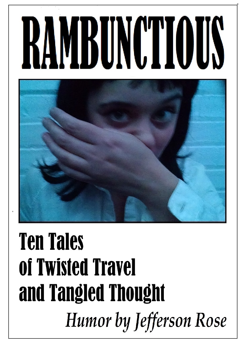
The cover pretty much sums it up although even I am not positive about how the photo talks to the cover text. The ten stories in the collection are near insane and the first sentence gives one the idea: “I’m back from France and boy, are the French people happy about that.” I’ve my ideas on the photo connection. One is spoiling for a fight, one is a knock-off of Uma in Pulp Fiction (Which is the Halloween costume truth as I am the one who snapped the shot), and one idea is that it is art.
Nathan says:
Well, I don’t think the cover sums of anything, which is part of the problem. It may seem a little lighthearted, but “humor” doesn’t come through clearly until you get to that word at the bottom. (We DEFINITELY don’t get a “near insane” vibe.)
The Uma-Thurman-knockoff photo, as it is, just looks like substandard photography; to make it work, you need to lampshade it, i.e., make it apparent that it’s a snapshot, perhaps with a Polaroid border or something.
In fact, that may be a good concept for the whole: Overlapping snapshots on a bulletin board, with pseudo-Uma front and center. That can convey both the “multiple stories” idea as well as, depending on the non sequitur partial images seen underneath, the “insane/unexpected humor” idea.
Other thoughts?
Hello.
Well, I’m not sure humour would spring to mind with the cover as it is. Angst perhaps, existential crisis definitely, but humour? I like the idea of photos being obviously snapshots with borders on a bulletin board. This is my first cover criticism so I’m not very good at it yet, but this was my immediate reaction.
Thank you a triple zillion! You and others have sparked a redesign and I am in much better shape!
Your first comment? Thank you. Angst and ex are up my alley, you’re prescient.
This is all wrong. (sorry) I don’t think it can be salvaged. If I were you I’d start with the text, find one that ‘says’ funny. Then I’d look for a background that reinforced my text. Keep your colors bright and engaging. This sort of book can get by without any picture at all. The right sort of texture would work if your text is strong enough. I’m not saying you shouldn’t use pictures but make sure they are ones that reinforce the theme of the book. A girl wiping her nose isn’t that funny to me,(this could be just me) I need more context for that action to be funny. You need a picture that is funny without context.
PS. If these stories are true, you should say that somewhere.
https://imgur.com/a/ikqaNSS
there are tons of choices for fonts and varied ways to arrange it. Play around with it until when you glance at it, it gives the ‘feel’ for the stories in the book.
You could use any humorous graphic. A drawing of papers, crinkled and scattered might be really cool. Because you have a lot of text, I’d keep the graphic simple so that’s it’s easily recognizable even with text over it.
You are right about it being all wrong. Oops. I like the main fonts, though.
Thank you a triple zillion! You and others have sparked a redesign and I am in much better shape!
I can only second what everyone else has been saying. “The cover pretty much sums it up”? No, I am afraid it doesn’t…not even remotely. I am with Shelley in having to say that there is nothing I can suggest other than starting over from square one.
Even the fact that you yourself take away three different impressions from the photo illustrates its ambiguity. And given the color range and the Wednesday Addams eyes on the girl, it could also just as easily be horror.
And one thing a book cover should not be is ambiguous.
Thank you a triple zillion! You and others have sparked a redesign and I am in much better shape!
Thanks a zillion. I’ve redesigned, much better. Good work on you going three for three! Play baseball?
I was so gobsmacked by the Uma-Thurman-Kill-Bill comparison that I was speechless for the hours that have passed since this was put up. I mean, the very, very last thing I get from that picture is The Bride from Kill Bill. If she were holding a sword; if she had a black eye, was carrying a sword and had a fighting stance, maybe. The Bride from this? Not at all.
I seem to keep saying this lately, but this is scotomization–you’re seeing what you expect to see in this. I see a girl wiping her nose. I’m sorry, but that’s what I see and I thought it was just me until the others posted. I also agree with Ron–her eyes look like the girl that played Wednesday Adams in TAF movie and I would have assumed this was horror.
Offered FWIW. I don’t see anything here that could be salvaged, so I don’t have any critique to proffer.
Um, it’s specifically Uma Thurman from Pulp Fiction (as mentioned in the synopsis). You’re reading Kill Bill into it for some reason, but it’s not there.
It doesn’t look like Uma Thurman from any Tarantino film. It just…doesn’t look like Uma Thurman.
No, but I did understand it to be an homage to this image:
Sorry, you’re right. I screwed the pooch.
But even when I think about PF…and I stare at that picture, I don’t see it. She still looks like she is wiping her nose.
I agree. Even if it IS an homage to Uma Thurman in Pulp Fiction, why would that make it a particularly appropriate image for the cover of this book? Is the book an homage to the movie or Tarantino?
I really fail to see anything that conveys any impression of “humor” or that the subject is supposed to be twisted tales of travel and whatever “tangled thought” is supposed to be.
It’s just the wrong image for this book, plain and simple.
PS—
It also assumes that every potential reader would be immediately familiar with the reference….
Besides, isn’t that precise image Uma after she snorts a line of coke? Rather than “gettin’ ready to get down” in a fistfight? (That’s probably why I was channeling The Bride, rather than PF; in PF, she’s a party-hearty kinda girl, flirting with the dimwit that’s Travolta’s character. Not kicking ass and taking names.)
Thank you Nathan, you and all have been a tremendous help. I did a redesign that makes much more sense. Still a hack job, though. Ha!
Thank you a triple zillion! You and others have sparked a redesign and I am in much better shape!
Scotomization? You’re so right!
Not only is this photo out of focus, but it’s out of focus, motion blurred, and grainy. It was apparently taken with a phone in a very dark room at a very high ISO setting.
Generally, unless you’re a serious photographer, your snapshots are not going to work for a book cover, especially if they were taken with a phone instead of a camera. It’s usually better to drop a couple of bucks on a stock photo.
Thank you a triple zillion! You and others have sparked a redesign and I am in much better shape!
(I do like the photo! But it is now history!))
To be fair, I did get the impression that the gal on the cover was some kind of mental patient; you’ve definitely got the “insanity” element on display here. The problem is that the kind of insanity depicted here isn’t remotely humorous or even mildly amusing. Like Rachel Thornton, my first impression (in spite of the title) was that this was some kind of extremely grim psychodrama about a mental patient who’s constantly acting up and making trouble for the orderlies at the insane asylum.
Your assertion that she’s apparently “spoiling for a fight” is also accurate, but again: not funny, not even mildly amusing; ask any of those orderlies who’ve had to restrain such “rambunctious” patients. It makes me think of all those depictions of Heath Ledger’s Joker with the slogan “Why So Serious?” on all those old Dark Knight posters. The whole point of the Joker’s characterization in every dark and dramatic iteration of the Batman franchise (especially that one) has always been that he’s a failed clown; and the explicit reason he’s failed is that all of his cruel and often fatal “jokes” are seriously not funny.
So too, whether or not one gets the Uma Thurman reference (I didn’t, though I’ve seen her in Pulp Fiction and one or two of her other movies), this picture isn’t really amusing me or tickling my funny bone. This gal doesn’t even have any of Harley Quinn’s flair for black comedy (which is her gimmick in every iteration: one of the reasons she both fascinates and infuriates the Joker is that she actually can be funny, albeit never intentionally). If I saw a gal making this pose in real life, I’d be getting ready to tackle her before she could throw her first punch, and to yell for backup to bring the straitjacket.
If you want a picture that says “nutty humor” for your cover, I’d recommend something that focuses on the humor more than the nuttiness. Think of some actual comediennes like Minnie Pearl or Anna Russell or Tina Fey when deciding what kind of behavior you want your cover model to demonstrate, since there’s already a measure of nuttiness built right into their comic routines. Also, if you insist on taking pictures yourself, be sure to find your model somewhere she can pose away from painted bricks and cinder blocks so reminiscent of the cheerless interior architecture of an insane asylum; a carousel or fun house or the like at any local amusement park would help bring a fair amount of levity to any such photo shoot.
To be honest, though, I think the odds are rather stacked against your having the equipment and expertise to shoot an effective and professional-looking photograph for your cover; especially if you’re on a tight budget. You’d probably do better to purchase a stock photo or (if you want to be more original) asking around on a semi-professional photography site (like e.g. jpgmag.com) for a commercial license to someone’s photograph of a gal acting goofy. (Expect to pay a fair bit more if you go that route, however.)
Thank you a triple zillion! You and others have sparked a redesign and I am in much better shape!
(A mental patient? Ha! That would be me!)
Cool. Good luck. I had my first cover critiqued here and found it helpful. Having objective eyes is handy (lol)
Aloha Rachel! I use Zoetrope.com for feedback on writing. It’s a smooth read and review and discuss site by Francis Ford Coppola.
Thanks, I will check it out.