The author says:
UMMD is a Chinese cultivation-inspired BL (boys love) web-novel, similar in style to “The Grandmaster of Demonic Cultivation” by MXTX (translated from Chinese), or “The Grandmaster’s Weird Disciple” (an indie web-novel in English that is top on the charts of the platform I will be publishing on).
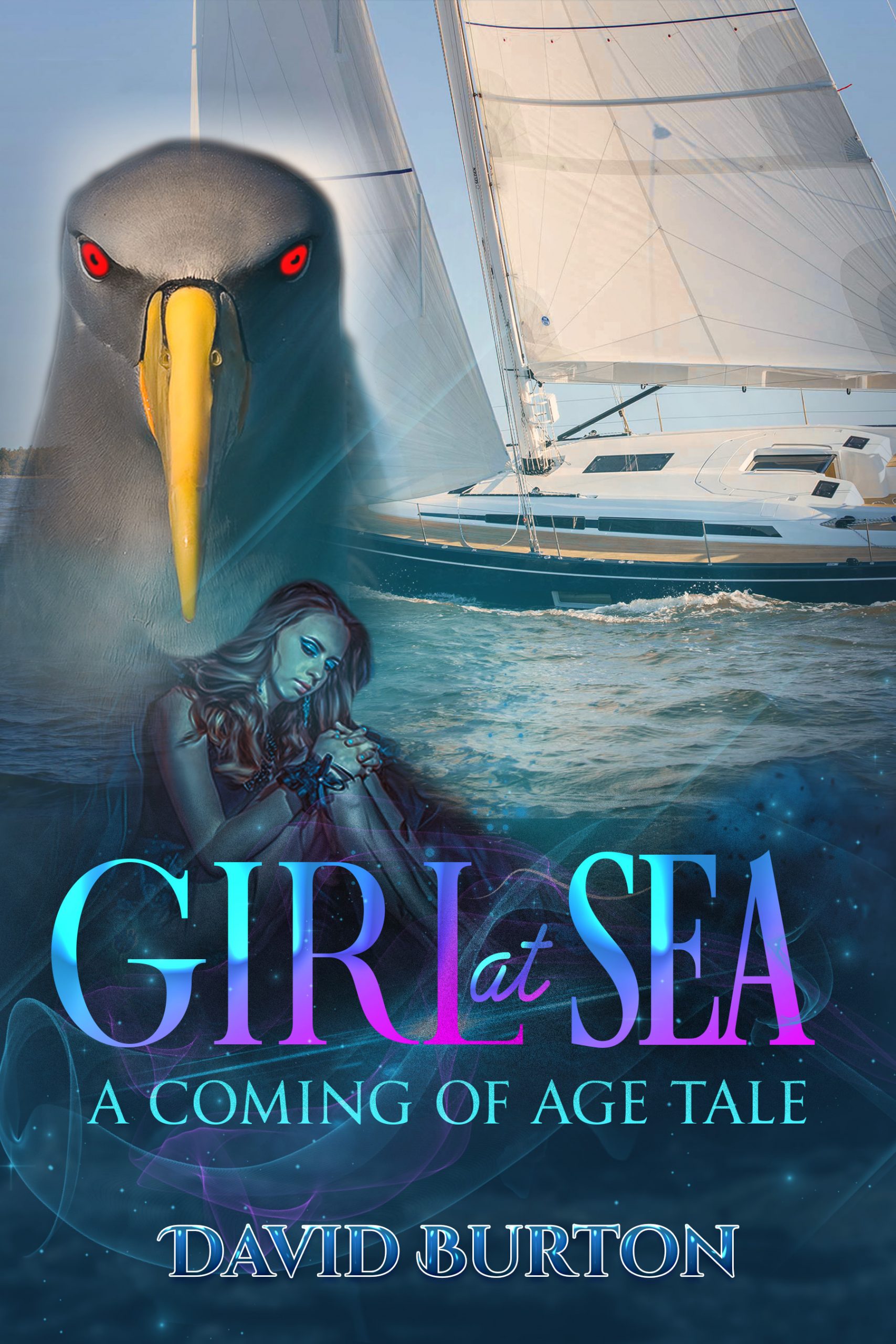
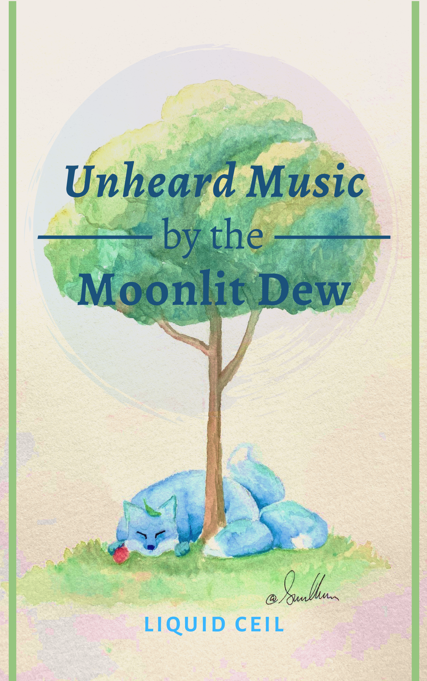
This is my first large project, so I am using the new platform ScribbleHub, which caters to young writers within my genre. I may post elsewhere later. Because this is a purely web-release, profits done by tip rather than purchase, the standards and expectations are a bit different. My title will be searchable, and the cover will only appear next to the appropriate genres, tags, & series description. In fact, the cover will only be shown as a small thumbnail, which cannot be expanded. This gives me more independence from a hardcopy release to catch reader interest. However, the trend for web-novels of this ilk display anime-style profiles of the book’s MCs. Obviously, I did not do that. I am not an artist, and I will not commission paid art for something that may in all likelihood provide nothing more than a bit of niche online hype. A friend of mine did custom art for the story herself, and the fox/tree represents my two MCs vividly (although it won’t become self-explanatory until well into the book). I am extremely grateful. The painting is so fluffy, and I am slightly concerned that it looks too children’s book-like, but the tags should take care of that, no?
Anyway, the artwork is set – unless covercritics find something egregious about it -, but my presentation of it is not. Some notes on the design choices I made: – The two lines are a simple border idea I took from a friend. I have no idea if they enhance or detract from the cover, but I thought that something to frame the art would make it feel more ‘book-y’ and modern. The color can be changed. – The circle watermark brushstroke over the tree can be flipped, altered in transparency, and changed in colors (the two colors are a magenta and a deep blue, to match the color distortion of the filter on the paper in the bottom edges). – The font for the title is Alegreya and the font for the author’s name is Alegreya Sans SC Bold. I chose – Alegreya because I was advised in a forum to use a simple serif font to put the focus on the art. I am inclined to agree, although, it still has to be viewable in the thumbnail. Alegreya seemed to fit, since the lettering didn’t thin out in places The triple em dash framing and italics of ‘Unheard Music’ were all done from a suggestion. I added bold, to make it more readable, except for ‘of the’, which I downsized the font of. I chose a related font for ‘LiquidCeil’ b/c I assumed that means some kind of consistency? I also expanded the kerning of the author’s title arbitrarily. Any more stretched out looked wrong to me, but idk. I originally considered more calligraphy-type fonts, specifically “Waterlily”. But I thought this could look more professional. – For the text color, I have received mixed reviews for having a deep blue (similar to the shadow on the fox), a rich red (to bring out the lychee fruit in the fox’s paw), or the current dark teal. White did not show up, and black was too brash. The teal is my personal favorite.
I welcome anything to add or alter to aid in readability, professionality, or appeal. 🙂
Nathan says:
I’m gonna assume that most of the commenters here are going to be as ignorant of the genre and examples you cite as I am, so for reference, here are the covers to the two titles mentioned. (The first one has several editions, so here’s a representative sampling.)
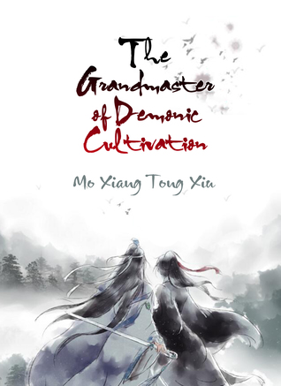


Given that we’re looking at a thumbnail-only presentation in ScribbleHub, and that getting different artwork is off the table (the artwork you have is quite good, by the way), I think the main thing you need to add to your cover is something that conveys “Asian” at a glance, something which could most easily be done by using a typeface like the one seen on the English covers of Demonic Cultivation. I would also experiment with a dark red color for the title (again, similar to Demonic Cultivation) to make it stand out more from the tree behind it as well as to emphasize the similarity to that book.
Beyond that, given that the cover is going to be seen (a) only in thumbnail and (b) only beside a text description (as opposed to Amazon, where covers are usually seen practically all by their lonesome), I’m not sure that any other refinements would be worth the effort. Other comments?