The author says:
Title: Selendrus
Logline: On a distant planet called Selendrus, a displaced heir named Nyco must come out of hiding to stop an evil council called the Select from destroying life as he knows it.
Tagline: The last of his line, the first of his kind
Genre: AetherPunk, LunarPunk, Science Fantasy
Target Audience Members: The Mythologist (consumers who love lore and learning about the history and details of a world), the Romantic (consumers who enjoy complex characters, their chemistry, and the human tale), and the Maker (consumers who enjoy constructing, cosplaying, or creating pieces regarding the world).
Target Audience Demographic: SciFi and Fantasy audiences from late teens to adult
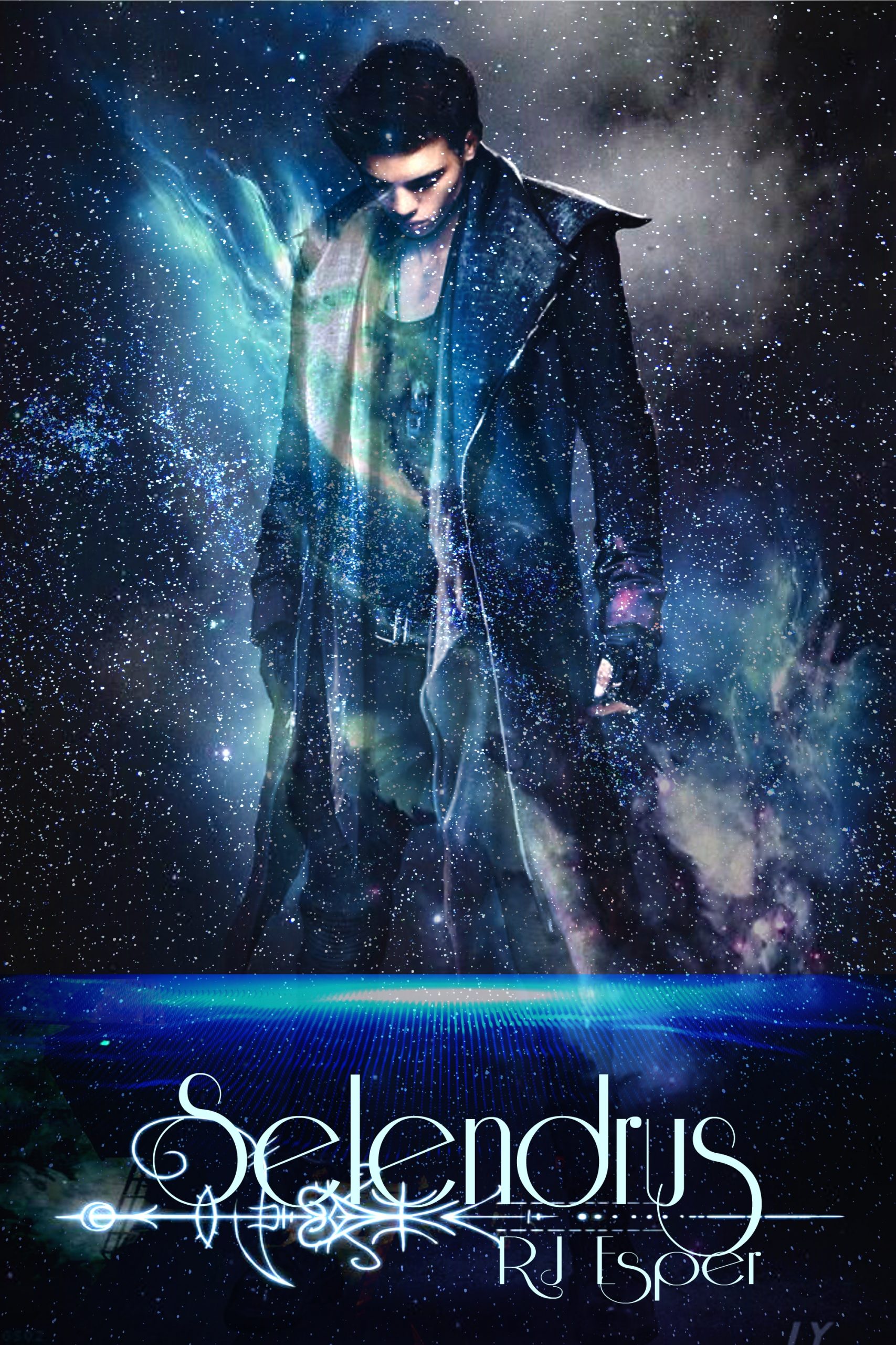
Cover: This is a quick concept mock up done on my computer.
Nathan says:
I had to look up “aetherpunk,” and the best definition I could find was “steampunk with magic,” which doesn’t really look like what I’m seeing here. Maybe that definition doesn’t mesh with yours.
It’s definitely got the SF vibe, as well as general “punk” — how important the granular sub-subgenre identification is will determine if other visual motifs are needed.
From a simple design standpoint, I think you’re hurting yourself by trying to fit too much of the figure on the cover. (One of my rules of thumb: “How often do you ever really NEED to see someone’s knees?”) I’m also not overly enamored of the typeface you used, if only because the thin letters are hard to read, especially at thumbnail side — if you’re absolutely committed to that typeface, make the type larger. (And given that another of my rules of thumb is “The smaller the type, the clearer the typeface,” I doubly recommend changing the typeface for the byline.)
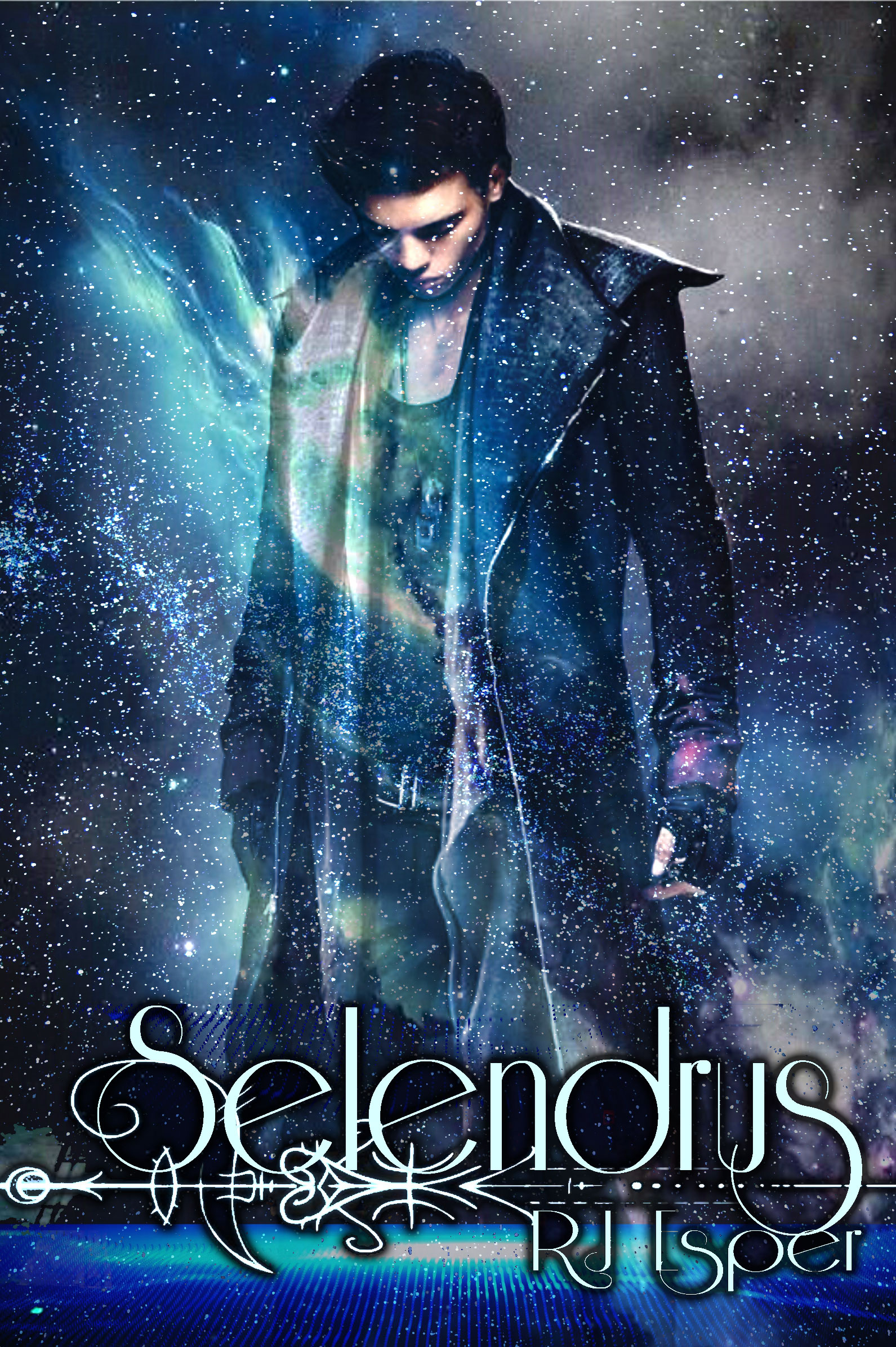
Here’s a three-minute redo trimming the blank space around the figure and title to show what I mean:
If you want to emphasize the steampunk/aetherpunk vibe, my suggestion would be to remove the semi-mystical characters under the title (which make it even harder to read), and instead add a pseudo-Victorian border to the whole thing, letting the curlicues etc. contrast with the starscape.
Other ideas?
As usual, I mostly agree with Nathan, especially his suggestion to make better use of the figure.
I don’t think that the typography is doing you any favors. One of the last things you want to do is make the title of your book difficult to read, and this typeface is doing its best to do that very thing (and your name is absolutely illegible). All of the additional decorative devices don’t do a thing to help the matter.
I think what works even further against the type is forcing the title into the bottom fifth of the cover. You need to get it up into the space much further.
I think the art would work better if the glowing blue shape were to be removed, if that might be possible. I don’t think it adds anything.
All of that being said, I am not so sure that I take away much of what you are trying to convey. Fantasy, certainly, but the book could just as easily be about an urban vampire as anything. (I would not count overmuch on anyone making “lunarpunk” or “solarpunk” connections, neither of which term is in much general use or even really agreed-upon regarding what they mean.) I think that in trying so hard to make your cover look steam/lunar/solarpunk you have lost the importance of getting across what your book is actually about. In other words, try to sell your book more on what it concerns than what its style is.
The majority of the cover is dead space, but also the head is too close to the top of the page–it, ironically, needs space to breathe. Plus, if you do a paperback version of the book, the bleed will either cut off the top portion of the head or make it butt up against the edge of the book, which will look weird.
If I were designing this, I’d make the figure larger and zoom in so that his head is the focal point of the image. You want potential readers to look at his face, and the emotion contained within, not his shirt.
A quick thumbnail. I’d zoom in on the figure, and move the title up to a point about 1/3 of the way up the cover. The byline anchors the design at the bottom, and a tagline up at top would frame him. (The dashed line is to stand for the bleed, which would get cut off in print.)
A bit of advice on the title: I’ve heard Lois McMaster Bujold saying that titles composed of unfamiliar/made-up words tend not to sell as well. It was in reference to, I think, Komarr, when she explained that she couldn’t come up with a better title. Caveats: that’s an SF book, and it was back when Komarr was published, so the market may have changed now. Plus, she might be wrong. So take or leave the advice as you will, but I’d suggest considering a subtitle of some sort to add to “Selendrus” just in case.
As a note to Augusta’s comment on the made-up name, I do feel compelled to point out that there’s a Dryad named “Selendra” in WOW.
Offered FWIW. The second I saw the cover, ti’s the first thing I thought of, and the bad news is, I’m not a WOW-er. I don’t play any of those role-playing or online games or anything, but the word was very, very familiar to me. I’d heard it somewhere along the way–and, as it turns out, I hadn’t–but very close. If someone as out-of-touch with that online community has heard that name…well. (Also, not to rain down on it, but it also kinda sounds like “Splenda,” the sugar substitute that every dieting woman in the universe is familiar with…)
My other comment is, I would not have known the genre here, at all. I would have thought Sci-Fi, first, and then, upon viewing the font, I’d have assumed straight-up fantasy, like…IDK, the Sunrunner’s Fire trilogy or something along those lines. Not aetherpunk or Lunarpunk, neither of which I’d ever heard of before today (and FWIW, I’m a rabid reader of steampunk.) I do not get any sort of “–punk” vibe from this. If some sort of X-punk technology is being deployed here, IMHO, it needs something beside the (really quite good) character art to convey it.
And as much as I love fonts, to convey a given genre, idea, etc, I don’t think that you’re going to be able to say “X-punk” with a font alone, here.
I love the coloration and I like the character art, but the font is too fine in weight and very foofy, even for fantasy like Xpunk. Something else needs to be added and yes, the figure needs to be better used.
Lois may have just been influenced by the reaction to her own book. There are countless classic, or at least well-known, science fiction and fantasy stories with made-up or unfamiliar words as titles:
Shannara, Dhalgren, The Silmarillion, Chanur, Seetee Shock, Hellspark, Macroscope, Neuromancer, Norstrilia, Aegypt, Gormenghast, and Schismatrix are just a few.
I think what you do probably want to avoid is a word that is unpronounceable.
Points of order:
– “Shannara” and “Chanur” books both used full phrases (e.g. “The Sword of”) to cushion the unfamiliarity of the proper names;
– “The Silmarillion” only saw print because Tolkien was already a runaway cultural phenomenon;
– “Hellspark,” “Macroscope,” “Neuromancer” and “Schismatrix” have recognizable roots in known words;
– The Gormenghast trilogy started with “Titus Groan,” which was very well-received, so there was already an audience who knew what “Gormenghast” meant when the second book, thus titled, was released.
Books with titles that are nothing but an unknown word are indeed possible, but it’s an uphill battle, especially as with a standalone book (or first in a series), and a new writer.
Yeah…that’s what I’ve read and what the big sellers in the fantasy trade tell me. Offered solely FWIW. (I’m agreeing with Nathan, to be clear.)
On second thought, you guys are probably right. The author might want to consider a title that includes “Selendrus”—“War for Selendrus” or some such thing.
I like the art a lot but his clothing is very modern. Adding some buttons to his shirt or a lace collar to him will make it more punk. Maybe even add some hair as even men had long hair in Victorian times. I like the brightness of the texture by the title but its a very modern looking texture. that would be a great spot to punk it up with some gears or anything that says punk. (muted, not in your face)
A tagline would go a long with this and I loved Nathans Idea of a fun border but I’d probably opt for a partial, not a full, and I’d definitely change the font.
Now I want to play with it….
https://imgur.com/a/a7GJqIX
just changing the detail. A gun or other weapon in his hand would be awesome
Savoy:
You know I normally luv your work, but to me, in both those covers, he looks like Michael Jackson waiting for the lights to come up. 🙂 That’s all I could see! “Billie Jean is not my lover…”
I do agree that there’s nothing very XXXPunk about it. And yes, it needs some XXX-punk elements. I wish I could figure out what font (if it’s indeed public) that Honor Raconteur used for that Artifactor Series (the later ones). It would really help here. I suspect it might have been made for her, and her alone (rats)…
In fact…IS that Michael Jackson, filtered? Using that new paint/canvas/watercolor filter that’s around?
I think this covers looks more like a paranormal romance than an aetherpunk book. The colors look nice, but the stock photo remembers me something like Twilight and the font emphasizes that.
You can take Shadowrun as an inspiration (here, here, and here) of what most aetherpunk reader expects.
You can use juxtaposed colors, a strong and easily distinguishable typeface and an illustration (or photo) that shouts “Hey, buy me! I’m full of action and you’ll have a great time reading me!”.
Another very important thing is the name of the book. As almost everyone has mentioned, I think it would be good to modify it because it is a bit boring.
According to what I read, about “aetherpunk,” it’s supposed to mean, steampunk-with-magic. (I’d argue, FWIW, that steampunk, alone, is “with magic,” because none of those damned devices could function without it, but, hey, why kibbitz if it’s working, right?)
I gotta admit, the covers that Jose Luis Vazquez showed us don’t look like steampunk with magic. In fact, they don’t look like steampunk AT ALL.
Maybe the OP should focus on the covers that are out there, now, in that sub-sub-genre, and try for that look? I mean…if I’d been told “this is aetherpunk” and then shown those Shadowrun covers, God knows, I’d have said “uh, nope.” So, whadda I know? Not much, apparently.
I,m not really versed in Cyber Punk, because I’m late 40’s and it’s not my generation. Still I relate a bit to the youthful angst in the picture. To outdate myself the jacket and picture makes me think of Jud Nelson in Breakfast Club. So I get the punk aspect. I think a ray gun or magical sword or septar would look cool in his hand. As someone has said. I like the splashes of color, as in the galaxy, superimposed over the black figure. Pretty cool. The font is interesting but hard to read and it’s too low in the frame. Your name should be bigger. It might be cool to have someone stylize a font for you that is more readable. I like the decorative aspect of it.
Maybe make your figure a bit smaller so the creative font you can make it on Top and your name down the bottom.
The head being down doesn’t bother me, it gives me the feeling of teenage angst and uncertainty. It does not look like Michael Jackson. Oh maybe put a planet or moon in left top corner. It might show nicely giving it a space feel not just splashed of color. I can really imagine a forest with dark trees, a moon, a young man with dark coat with weapon. I think you need some background elements to form a story in the viewers mind. It’s hard to change it all, just take some of the good points and critiques and add some elements. Shrink the image down.
Have fun with the redesign.