
The author says:
For months Mark has been bugging his friends to try this gaming system he is enamored with. Skills, Archetypes, and Demons. This system has a skill for everything and even different approaches for some skills. Instead of levels, he tells them, each skill has its own experience and level. “As true to real life as a gaming system could be.” at least it says on the box. When the group finally break down and decide to play it, they head over to Hunter’s house to start. Next thing they know… trapped in the game. Everyone dreams of being trapped inside their favorite game. Abusing the mechanics and becoming OP AF. No one ever dreams of being trapped in a crappy system. One ladened with rules and so much record keeping it almost becomes tedious.
The book is LitRPG genre, so I want part of it to look like the cover of an old RPG book from the ’80s, but also look like a modern fantasy type of cover. I’ve written a couple of short stories/novellas that I plan on selling and using as reader magnet so branding the series is important. Skills and Demons is the name of the series. looking for thoughts and I hope it isn’t complete crap.
Similiar books in the genre, The Land: Founding, Ascend Online, Dungeons of Strata
Nathan says:
The artwork works well. It could use some refinement (the shadows on the foreground figures seem haphazard), but I don’t think that’s essential. I’m guessing that this is a pre-existing piece of art that you’re licensing rather something custom, yes? So don’t worry about it if it’s not within your control.
Are those the only dimensions that it comes in? Because the black bars above and below very clearly say that the art wasn’t made in the right dimensions for a book cover and you didn’t know how to fix it. If not, you can still use a gradient and texture that blends into the edges of the art to fill out the rest of the cover. Five-minute redo:
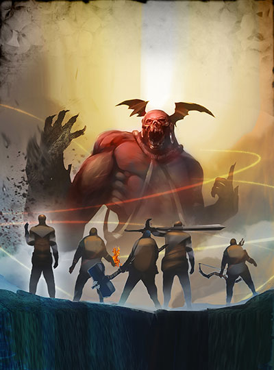
People aren’t going to notice it up front, because those areas will be dominated by…
The typeface! You really need to up your game there. As early as the second print editions of the First Edition rules for AD&D (yeah, it’s confusing), the type designs had character and panache:

Don’t make it so ornate that it’s not readable, but give it a smidgen of class and magic. If you need help with specific typefaces, there are others here who have suggestions at their fingertips.
Anything else?
As Nathan says: you are not taking advantage of the artwork. Neither are you taking any advantage of the possibilities for the typography to add to the character of the book. At the moment, the title and and author name are just labels. The effect is like a picture in an a photo album. Make all the parts of the cover, the art and typography, work together as a gestalt to contribute to the overall impact and effectiveness of the cover.
You guys are correct, I was hoping to have it look like the older D&D handbook but forgot my cover needs to appeal to people unfamiliar with the reference. Also, I didn’t do a cool effect like the image reaching out of the picture into the solid color area as with the cover I was seeking to emulate (https://imgur.com/a/LA23oxT).
I know others haven’t had the chance to comment, but I threw this together as an alternative. you all were immense help with my previous covers and helped steer me away from my poor choices so I’m extremely appreciative of your time and suggestions.
https://imgur.com/a/pSd8kXg
Your second attempt is a great improvement! The only thing I might suggest after a first look is to perhaps think about getting a little more contrast between the title and the background art.
I think the title font is also a little lame. At the very least, use something with serifs (and NOT Algerian).
Agreed. Those fonts are NFZ! (No Fly Zones), for this genre. I will try to make some better recommendations sometime today–just a bit swamped at the moment.
The thing that I noticed most, about the three examples that you linked, in terms of “covers in this genre” was that all three had 3D titling covers, with the text made to look something like stone. That’s a bit of a challenge.
So, I rummaged around in fonts for a bit…and, not being sure how “foofy” or “fantasy” you want to go, here’s a short list:
* Pirates (a fair amount of foof, in the swashes, but heavy enough to be made 3D with a bit of help);
* Qardoos Shadow–some foof, already a 3-D or shadowed look;
* Wellingborough–with our without flourishes and also has smallcaps as well as a Capitals face, to add “foofiness.”
* SPQR, which is an existing, “old-timey” face that already emulates stone or chiseling;
* Winter Holidays–regular and alternates–some weight and lots of foofy alternates;
* Mecka–this is a slighly different, sans-serif font that you might like. Take a look.
* Charcuterie Flared Bold–it’s a definite “maybe.”
* Lightstone–this is a not-well-known font. Depending on your taste, you might go for it. n.b.–no lower-case characters.
* One slightly-off-the-wall suggestion–Montecatini Stretto. Either Pro StrettoBold, SemiBold. it’s a bit different, a sans-serif font–that isn’t. Make sure you look at the alternates.
* Sofia Serif Fat Shadow, might do it for you.
* Royal Signate_1.4 –you need to look at it.
* Bohemian Alchemist–that might actually be perfect. The Caps and Inline faces, not the Script.
* Imperator SmallCaps.
* and lastly, good old Morpheus, which is similar to to what Ascend Online used for their cover.
One of those should float your boat and most of them, anyway, fit in that genre. Some are a bit…different than what’s used, like Montecatini, but it’s still eye-catching. I tried not to list anything that would be “too-too,” requiring a leap of faith, or stepping outside of the typical comfort zone for this type of book.
Hope that helps.
fun with fonts….
https://imgur.com/a/RdCg3Rp
THAT’S the stuff.
Yup, that’s definitely going in the right direction. Nicely done, Savoy.
What is the top and bottom font?
Here is what I got with the Bohemian alchemist for the title, and tried two different things to see how they would look.
https://imgur.com/a/lY8Gh86
I am not too sure what you are trying to demonstrate. What the two typefaces look like or how the words would be placed on the cover…or both?
The bohemian alchemist font has a solid version(Encounters) and the inline version(First). Though the more I look at Savoy’s fonts I’m liking them.
Ed:
There are literally hundreds of suitable fonts. I mean, if Alchemist doesn’t suit, fine, find something that does. I freely admit, I don’t know this genre. I was trying to find something that a) said “fantasy” but also b) had some physical weight (width and letterprint), like the D&D and other covers.
I noticed that the covers you linked too all had 3-d effects and largely, were made to look like chiseled stone. I figured that was a thing, so my effort was to find lettering that could be utilized with that effect. I would have chosen other fonts and faces, if the intent was simply fantasy.
So…find something that YOU like. Don’t feel limited by anything I’ve said. OK?
Hitch,
I dig the bohemian alchemist font, I think I can do a lot of fun things with it as well. I’ll probably use the serif font for the series tag and author, then bohemian with a 3d effect for the title. I could dig through fonts for months, the issue is too many options at times. Who knows I may come up with something and change my mind after looking at the final product.
The great thing is I’m still a month or two from finishing the book so I have time to play and making the cover is a great thing when writing isn’t going as well.
Plus if you have seen my previous attempts you’ll know my normal font choices aren’t that great, lots of Papyrus and such.
Mmm….IDK. I’m not wild about the Bohemian, for this particular cover, at least, not as it’s been used thus far. Yes, yes, I know, I listed it as possibly the perfect solution, but at the moment, it’s not working for me.
Again, I don’t know the genre. Is the 3D effect mandatory, or will any fantasy font do, sports fans?
Augustus Font. Any Roman Serif font would do.
I wouldn’t use 2 different fonts on title because it will make it read as 2 separate phrases.
I’d also reposition author name, centering it more in that spot and fancying it up a bit.
I like what you did with the light beam going through the word. You should add a hint of glow to it and make sure it’s reflecting from the word. I’m not sure that’s a great spot for title though because you want the words to look purposeful, not forced into position. You’ll need to play around with it.
(You can have the version I did. it still needs some work cleaning up the white fragments by the guys.)
Savoy’s version is, as expected, great. I am not so sure about the placement of “Trapped in the System,” though. It looks as though it refers to the author.
I agree with Savoy about having the swirl of light interact with the type. That’s a very nice touch and something you should try to do with the new cover if possible.
Savoy nailed it.
Alright, I know I need to lighten the book title so it is more legiable when smaller, but what do you guys think of this? https://imgur.com/a/SlvaS5H
I didn’t want to just copy Savoy’s and was working with the tools I have. The series thing at the top is something I can use as an identifier, and my skill isn’t enough to do glow effects well as of yet, but was curious if I’m going in the right direction.
ug, and I forget to spellcheck,
Legible not legiable.