The author says:
A writer working in the corporate world receives the ashes of his friend and the manuscript they’ve been working on together. To celebrate his life, the Karaoke writer drinks his way through memories with the help of friends and the girl of his dreams who works behind the bar.
Nathan says:
I’m confused as to the readership you’re aiming for. Is this a fictional memoir? A lit-fic novel about a writer (because aren’t they all)? A high-falutin’ romance? Without knowing whom you’re trying to attract, I can’t easily tell you if the covers sends out the wrong signals — all I know is that the cover doesn’t tell me who the book is meant for, which is a big problem.
However, I can still comment on a few technical issues:
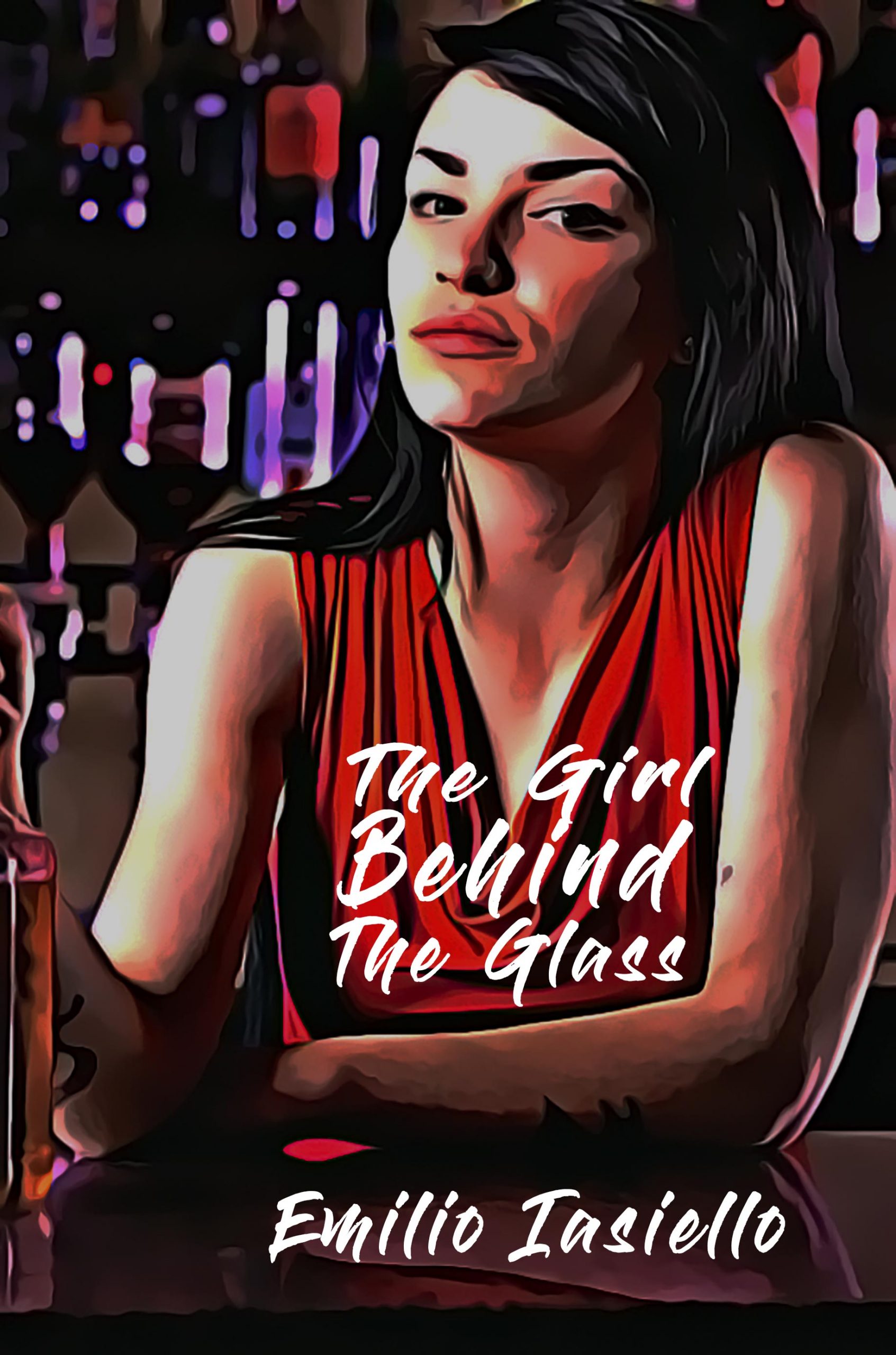
- Even at full size, the cursive writing against the busy fabric background lessens the title’s readability, and the odd placement of the title directly on her chest prompts an “My eyes are up here!” reaction.
- While you’ve deployed this particular Photoshop filter more skillfully than 99% of other instances, it still creates problems; her left eye and the left side of her mouth/chin are the biggest areas of concern.
Other comments?
My biggest issue is with the art. Unfortunately, it seems to be an example of pushing a button and accepting the results without question. But software doesn’t automatically turn out perfect art. In this case, the results very much need to have some post-rendering work. While Nathan points out a few of the problems the worst is, I think, the area around the woman’s mouth. That area desperately needs to be reworked.
You might also want to be careful about where the image is cropped. Having her hand and (a bottle?) running off the left-hand edge looks ungainly. Her hand needs to be either entirely within the frame or entirely out of it.
I think that any questions about the type are largely moot until the problems with the artwork are resolved.
I will go straight to the point. I think the artwork doesn’t work. It has big issues like the mouth, left eye, chin and the fact that it doesn’t look like a painting at thumbnail size. Also the text is really hard to see.
I believe you have two options: remove the filter and choose another typeface or find a piece of artwork that already resembles a painting.
Yes…I hate to pile on, but I received notification of this post, by Nathan, early this morning and clicked right on over to see it. I had an immediate, strong and negative reaction, so I stopped and decided not to proceed with a post, until I could analyze the “why” of that reaction.
I freely admit that I don’t know why my reaction is as strong as it is or so negative, but it definitely still is. I just simply don’t like it, at all.
In the thumbnail, it doesn’t read as a painting, so I suspect that attempt to gain the effect is a waste of time. I’d say to either stick with the original artwork, unfiltered, or find a true illustration or painting that says what you want it to say.
My read of the description is literary fiction. If that’s the case, then the subject of the cover is a bit too literal, too (ha? YSWIDT?) for LitFic. You might do better with the bar background and a funerary Urn on the bar…just an idea. (Maybe an urn with a lit ciggie parked on top?)
As Ron Miller said, there’s not much point in messing with the fonts now until the overall concept is nailed down a bit more.
If a central figure in the story is “the girl of his dreams who works behind the bar”—who is also, evidently, the title character—then I would make sure that it just what she looks like. At the moment there is no real indication where she is or what she is doing. Making it clear in a glance that she is behind a bar—perhaps with bottles and glasses in front of her—would be a big step in the right direction for this cover.
To be fair, I did more or less pick up on the gal’s being in a nightclub of some kind from looking at the thumbnail, so you do score a point for establishing the setting. Beyond that, however, seeing the gal through all this filtering has “Don’t The Girls All Get Prettier At Closing Time” by Micky Gilley running through my head. Judging by your synopsis, I get the impression this “bar wench looks far more attractive when properly viewed through beer goggles” vibe I’m getting wasn’t quite the effect you were intending.
Actually, the real problem with this picture is that due to all the smeary color banding and the wobbly borders between color bands, this looks to be a somewhat lower-resolution picture (maybe this one) expanded to a much higher resolution using various blending and softening filters to conceal the original picture’s relatively low quality. From such invariably futile attempts to use picture filters to wring more quality out of a picture than it ever originally had come such displeasing distortions as the ones my colleagues here are seeing on the left side of the gal’s face. This is also probably why those distortions are a lot less visible in the thumbnail, though the left side of the gal’s face still leaves me with the impression she’s got a man-jaw; definitely not my idea of an attractive feature for her to have.
Bottom line: whether the image actually is expanded or you just used an overly zealous “oil painting” filter on your picture editor, it’s not making a very good first impression with your prospective readers either way. I’d recommend starting with a higher quality stock photo of a female bartender (of which many are readily available online at fairly reasonable prices) and using much less filtering—if any is even necessary—on it. I’d also recommend pulling back from the gal a bit to suggest some of the other features of your story, like maybe showing the protagonist sitting a little ways down the bar from her nursing a drink, or even showing her in the background with him sitting at a table in the foreground (maybe with some of the other features of the story, e.g. a bottle and shot glass along with a copy of his late friend’s manuscript); while it never hurts to have a pretty gal on your cover, she’s not going to earn yours much more than a second glance with almost every other indie author featuring pretty gals on the covers to their books, and you had better have something more for prospective readers to notice with that second glance if you hope to keep their attention long enough to sell them your book.
I nearly spewed when you cited the Gilley tune, because I heard it in my head, too, but refrained from saying anything. That two of us heard it as background music for this cover, though–that ain’t good.
My only other comment is that the image that you found, RK–I realize that beauty is very subjective thing, but the original image just isn’t that attractive (to me). If you want the smeared-up beauty to still be beautiful, then you probably have to start with a better beauty. FWIW.
RK’s comments are spot on. I don’t know if you need to set up an entire scene from the book—especially one that might require having already read the book to appreciate—but more visual information would help a lot. Just making absolutely certain that the girl comes off as being behind a bar is, I think, essential.
And I do want to reiterate that wherever you ultimately find your image don’t count on any software filter to automatically do the right thing. As I mentioned earlier, just because a computer cranks something out doesn’t necessarily mean it did the right thing or that the results look good. You need to step back and take a good hard look at it.