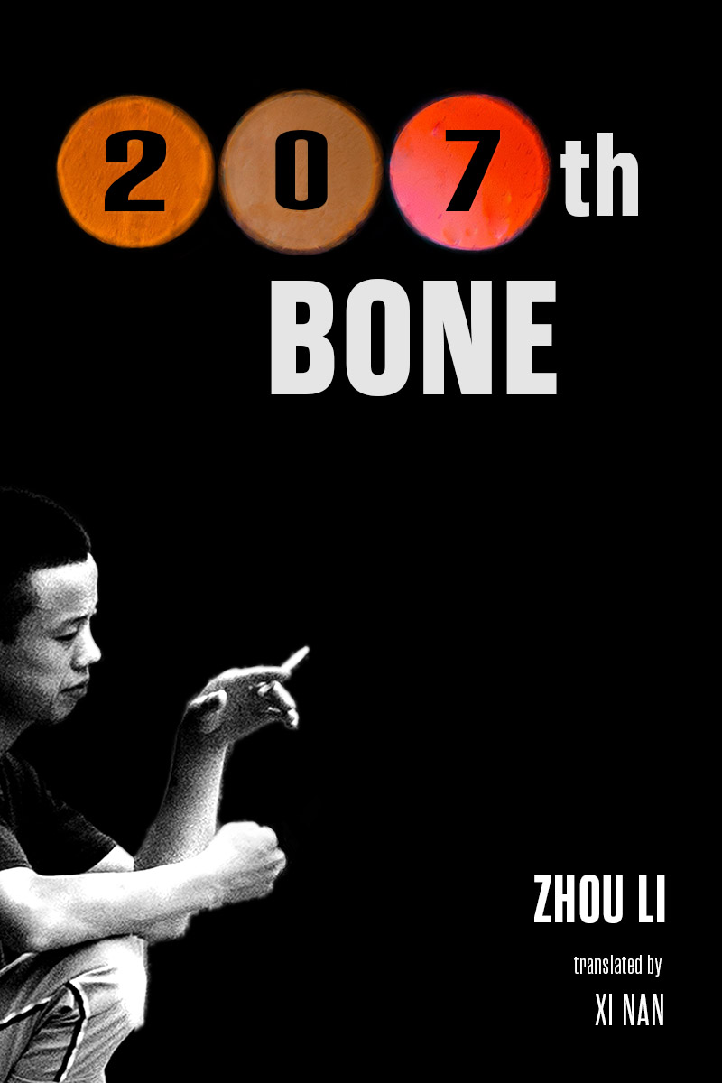
Category: Covers

Back Time

The author says:

GENRE: Sci-Fi action story, present day, moving into the past.

STORY: Neo-Nazi German terrorists attack the lab of time-travel scientist Peter Waylan. To save his life, he sends himself through his untested portal. It sends him on a reverse trajectory, streaming backwards through time. The Germans create their Fourth Reich and conquer not only the future but the past. Waylan is the only one who can correct this nightmarish timeline, but first he must somehow change his trajectory while on the run from Nazi assassins from the future.

APPEAL: fans of time-travel sci-fi and steampunk

Nathan says:

If you’ve got a novel about time-traveling Nazis and you only reference time travel on the cover (or just time, really), you’re doing yourself a disservice.  Especially as both clocks and swastikas are radial designs, you should be able to work a visual Nazi reference in there with moderate effort.

And I’m sad to say that the “clever” backwards type doesn’t work for me at all. Confusing the audience isn’t the same thing as intriguing them, and I think the flipped letters work against you, especially because it’s inconsistent: only some of the letters are flipped, and in one case they’re out of order too.  I think this probably works better in your head than on paper.

Other comments?

The Joke at the End of the World

The author says:

YA Sci-fi novel narrated by the 12-year-old protagonist. Takes place in the 1950s at first but then the character time travels to 2020 where he’s exposed to the worst real-world issues we’re facing now, as well as new fantastical ones. Theme extols science over religion. Lots of unexpected twists and turns. Intended to appeal to readers of Kurt Vonnegut and Mark Twain.

Nathan says:

(Before anyone cocks an eyebrow at the “bestselling author” claim, he’s for real. Scott Dikkers is a founder of The Onion. He’s probably funnier than you are.)

The cover’s professional, but a little flat. Maybe put a little variation into that flat teal background?

And if the initial 1950s setting is part of the hook (and I think it should be), maybe a more “Googie”-style typeface for “#1 New York Times Bestselling Author.”

Other comments?

Paws and Stones

The author says:

Genre: Dystopian, Adventure, Satire

All of humanity disappeared in the blink of an eye. With constructions and monuments gradually losing place to nature, a mixture of domestic and wild animals fight for survival in a strange, new environment. A group of animals in central Brazil, with the lead of the mutt Tobi, tries to discover what happened to their old masters. Will it be possible to even survive to find those answers?

Target Audience: Distopy readers, Young Adults/Adults, readers of fictions that relies on contemporary issues and thoughts.

Nathan says:

The description sound intriguing. Unfortunately, none of that intrigue shows up in the cover. At best, a potential reader would guess that there’s something to do with animals in this novel, but your target readers will be more attracted to the other books they see that more firmly proclaim, “This book is for you!”

Using the “print” motif, my idea would be to have human tracks (footprints and tire tracks, for instance) with animal prints criss-crossing and covering them.  But even that would have to contain some of the hallmarks of dystopian book covers, like textures and a distressed typeface.  You’d have to invest to get that kind of custom cover, naturally, but it would definitely increase the potential sales.

Other ideas?

Snapper

The author says:

This is a somewhat darkly satirical take-down of the premise on which the movie Teeth (2007) was based, mainly intended to appeal to its detractors (and people who probably would be its detractors if they’d seen it).

In this story, the girl April Winters has a literal “snapper” down below: a fully functional vagina dentata complete with retractable teeth. While this provides her with a very effective rape deterrent (as one might expect), she gradually comes to realize it’s not very useful most of the time to a girl who doesn’t happen to be living in a Lifetime Movie of the Week, and actually quite a hazard to both her romantic prospects and the children she’d like to have someday.

Nathan says:

Well, THAT’S a niche audience!

I think the biggest problem here is the disconnect between the clean, blocky icon and the scratchy font used; a handdrawn font with more solid lines would tie it together better.

Beyond that, I think I’ll let the usual commenters do the heavy lifting. Have at it!

Geppetto’s Chains

The author says:

Genre: SciFi – cyberpunk

Pitch: Moon-based hackers infect Earth with a neurological suicide virus. After her mother is infected, our thought-scanner heroine heads to the lawless Moon colony to find the cure.

Reader appeal: sci-fi technology, exploration of potentials (and potential abuses) of neuroscience, mind-bending concepts.

Nathan says:

You’ve got some snazzy artwork there.  I might suggest more distinct stars around the edges, to indicate the outer-space setting.

Assuming you’ve got enough margin on the artwork, I’d move the live area upward so that the title doesn’t lie across the chin; the face isn’t immediately recognizable as such as it is.

I’m not sold on the typography for the byline and series title; it definitely needs to be a lighter shade to stand out from the background, and the typeface doesn’t work for me.  Fortunately, there are commenters here who will suggest some good replacements.

Other thoughts?