The author says:
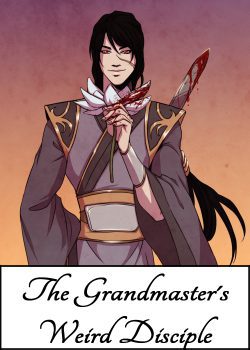
UMMD is a Chinese cultivation-inspired BL (boys love) web-novel, similar in style to “The Grandmaster of Demonic Cultivation” by MXTX (translated from Chinese), or “The Grandmaster’s Weird Disciple” (an indie web-novel in English that is top on the charts of the platform I will be publishing on).
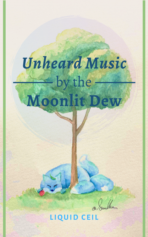
This is my first large project, so I am using the new platform ScribbleHub, which caters to young writers within my genre. I may post elsewhere later. Because this is a purely web-release, profits done by tip rather than purchase, the standards and expectations are a bit different. My title will be searchable, and the cover will only appear next to the appropriate genres, tags, & series description. In fact, the cover will only be shown as a small thumbnail, which cannot be expanded. This gives me more independence from a hardcopy release to catch reader interest. However, the trend for web-novels of this ilk display anime-style profiles of the book’s MCs. Obviously, I did not do that. I am not an artist, and I will not commission paid art for something that may in all likelihood provide nothing more than a bit of niche online hype. A friend of mine did custom art for the story herself, and the fox/tree represents my two MCs vividly (although it won’t become self-explanatory until well into the book). I am extremely grateful. The painting is so fluffy, and I am slightly concerned that it looks too children’s book-like, but the tags should take care of that, no?
Anyway, the artwork is set – unless covercritics find something egregious about it -, but my presentation of it is not. Some notes on the design choices I made: – The two lines are a simple border idea I took from a friend. I have no idea if they enhance or detract from the cover, but I thought that something to frame the art would make it feel more ‘book-y’ and modern. The color can be changed. – The circle watermark brushstroke over the tree can be flipped, altered in transparency, and changed in colors (the two colors are a magenta and a deep blue, to match the color distortion of the filter on the paper in the bottom edges). – The font for the title is Alegreya and the font for the author’s name is Alegreya Sans SC Bold. I chose – Alegreya because I was advised in a forum to use a simple serif font to put the focus on the art. I am inclined to agree, although, it still has to be viewable in the thumbnail. Alegreya seemed to fit, since the lettering didn’t thin out in places The triple em dash framing and italics of ‘Unheard Music’ were all done from a suggestion. I added bold, to make it more readable, except for ‘of the’, which I downsized the font of. I chose a related font for ‘LiquidCeil’ b/c I assumed that means some kind of consistency? I also expanded the kerning of the author’s title arbitrarily. Any more stretched out looked wrong to me, but idk. I originally considered more calligraphy-type fonts, specifically “Waterlily”. But I thought this could look more professional. – For the text color, I have received mixed reviews for having a deep blue (similar to the shadow on the fox), a rich red (to bring out the lychee fruit in the fox’s paw), or the current dark teal. White did not show up, and black was too brash. The teal is my personal favorite.
I welcome anything to add or alter to aid in readability, professionality, or appeal. 🙂
Nathan says:
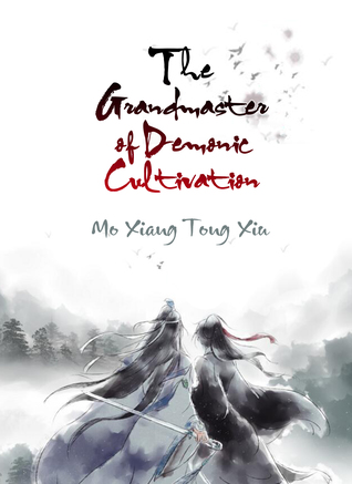
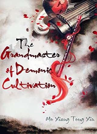
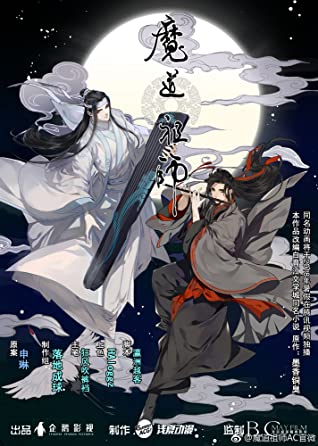
I’m gonna assume that most of the commenters here are going to be as ignorant of the genre and examples you cite as I am, so for reference, here are the covers to the two titles mentioned. (The first one has several editions, so here’s a representative sampling.)
Given that we’re looking at a thumbnail-only presentation in ScribbleHub, and that getting different artwork is off the table (the artwork you have is quite good, by the way), I think the main thing you need to add to your cover is something that conveys “Asian” at a glance, something which could most easily be done by using a typeface like the one seen on the English covers of Demonic Cultivation. I would also experiment with a dark red color for the title (again, similar to Demonic Cultivation) to make it stand out more from the tree behind it as well as to emphasize the similarity to that book.
Beyond that, given that the cover is going to be seen (a) only in thumbnail and (b) only beside a text description (as opposed to Amazon, where covers are usually seen practically all by their lonesome), I’m not sure that any other refinements would be worth the effort. Other comments?

The art is nice, though marred by the unnecessarily intrusive signature.
What needs to be worked on is the typography and Nathan has made some excellent suggestions along those lines. The typeface chosen is dull and inappropriate. There is also no reason to mix and match italic and non-italic—that adds nothing at all. The wide spacing between the three lines also adds nothing to the title—on the contrary, it makes it more difficult to read as one phrase.
More contrast would go a long way, too. Dark blue on a mottled green background does not help the readability.
Since the author name does not look like a name at all, I would suggest doing something, even if adding “by” to make it clear that it is the name of the author. Oh, and I would not make the name in a different typeface.
Nathan & Ron,
Thank you for your input! I changed the font to a Chinese calligraphy typeface (I can’t read the name, but it looks very oriental!). I nixed the italics/bold (new font doesn’t need it). Diminished the space between lines. Changed the font color to a deep, dark red. Changed the borders from simple lines to a Chinese architectural pattern, and set it in the same dark red as the title. I removed the double em dashes (too much with the new border). I changed my Author handle to my pseudonym (which is an actual name), and spaced out the kerning so it was in line with the title. The font is now the same as the title.
Oh, sorry, one more thing: I photoshopped out my friend’s signature, with her express permission!
Ah, yes. Web Novels and Light Novels are my confort zone.
The artwork is wonderful, I love it… But it says nothing about the book, nor the genre and I don’t think the typeface works either.
The thing is: you know how the web/light novels market works but you still want to ignore that because you don’t want to invest on an artwork that could appeal to the right readers… Ok, I’m not against that. But keep in mind that platforms like ScribbleHub are riddled with reputable publishers looking for popular authors, so you are exhibing your work to readers and publishers alike. So, if I were you (basically your case was my case some years ago), the only advice I can give you is to follow the trend and invest (even a little) in an artwork that appeals to the right audience. I tell you this because, as a member of the target audience, it does not attract my attention at all.
If you want to continue with that illustration (as I said, it is beautiful, but it has nothing to do with genre or target audience) you need contrast in the title, change the typeface as Nathan suggest and remove the artist’s signature.
Very pretty. My initial thought was this is a children’s book or a book of poems.
I have to agree. The art, as nice as it is, doesn’t really convey anything meaningful about the book as described.
I’m unfamiliar with the market, so…hard for me to wrap my arms around. Ditto the genre.
But, I do feel compelled to say, at first, I thought “The Moonlit Dew” was the byline. ;-(
Just sayin’. The way it was staged, and just…IDK, something about it, keeps making me read it as though the artist meant to say “by Moonlit Dew,” like “by Fred Smith” and somehow, the errant “the” snuck in there. Or that “The Moonlit Dew” was some band name, or authorial collective.
Sorry, but that’s just how it keeps very forcibly talking to me.
I thought the same. If the top and bottom lines of the title had the same type treatment, it would tie it together as a unit in a way that it isn’t united now.
But since I’m advocating for a whole new typeface anyway…
Maybe that word-salad title should have tipped me off, but just from looking at the cover, “book of florid poetry, probably intended for children” would have been my first guess. I’ll grant that judging by those other covers from the genre our esteemed host provided as our basis for comparison, your simple-looking artwork is more or less appropriate for it, but I’d have to say that means the genre itself seems a bit underwhelming to me; so yeah, I’m definitely not part of the target audience. About the best I can do is tell you how to make your book look more like those others, and less like the children’s book of florid poetry it looks like here.
As I say, that word-salad title might have tipped me off to this being a somewhat more foreign and exotic genre, had it not also reminded me somewhat of the purple prose typical to more domestic genres such as literary fiction. With some popular works from Japan bearing such bizarre titles as I, My, Me, Strawberry Eggs and Negative Happy Chainsaw Edge, I might actually have picked up on your book being from one of those genres a lot sooner had you made the title less comprehensible. As it stands, the title is otherwise pretty fitting to the genre, but you definitely need to present it a bit differently to clarify what kind of book this is.
As I see it, there are three tweaks this cover could use that would greatly improve it:
1. A mild filter to de-saturate the artwork and make it look a little more like a watercolor painting (like some of the artwork on those other covers from the genre) than the crayon drawing it appears to be now would greatly help with clarifying that this is not a book of florid poetry for children.
2. Considering your source of inspiration comes from China, have you considered showing your title in Chinese as well as English on the cover? Chinese Hanzi and Japanese Kanji and other Asian logographics are veritable artworks unto themselves, and when we here in the West see them on a book’s cover, they immediately clue us to the book’s foreign and (therefore, by implication) exotic origins. Even if you and your book aren’t truly foreign and exotic, it wouldn’t exactly be dishonest to clue your target audience to your book’s inspiration being so, and this therefore being the kind of book it likes to read.
3. If you can’t find a suitable calligraphic typeface, why not try some actual calligraphy? Done right, custom captioning can do just as much as custom artwork to attract prospective readers. If your own calligraphy skills aren’t up to the task, you can probably commission a professional and relatively inexpensive freelancer to do it for you at Fiverr or some such site.
Basically, you’ve got a pleasant cover here, but it needs a little flash and dazzle and general pizzazz to draw the target audience’s attention to it. Boring typefaces and artwork that looks like it was made for an illustrated children’s book just aren’t going to do that for you. Try to give your cover both some more gravity and some more wit with a darker and less saturated color scheme and some keener lettering.
Could you change the artwork to black and white, more like a Sumi painting, then use a dark red black brush/calligraphy font for the title? That might go a long way towards making it fit in with the other covers in the genre.
I love that idea
I concur that that would be a big improvement, in terms of tone. From what I see here, in other titles in this area/genre.
NATHAN!
Are you seriously telling me we don’t have ONE. SINGLE. COVER. in the queue???
There are a couple just in, but I thought that a holiday week wasn’t a good time to post them.