The author says:
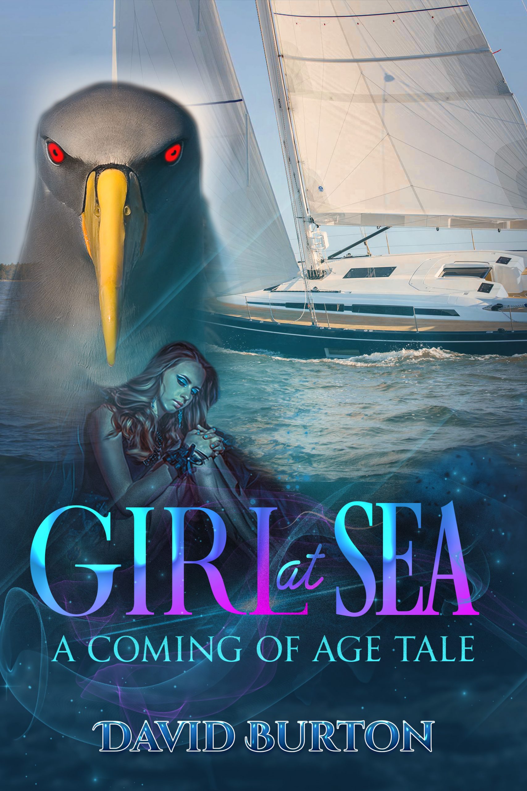
Girl at Sea is a dark coming-of-age, slightly supernatural novel for adults and mature young adults. Beth, 14, and her crewmate, Silas, 45, have lost their families to violence. They sail the S Pacific, seeking solace for their grief. But Death, in the form of a black Albatross, has a task for them. When Beth’s best friend joins her in Australia, followed by her abusive father, Beth and Silas discover where Death’s journey is leading them.
Nathan says:
The problem here is that you’ve got three main image elements competing with each other — there’s no real focus. Especially in the thumbnail, the most attention-grabbing bits are the bird’s beak and eyes because of the splash of color, but even the bird seems shoved to the side, and the girl is wedged in at the bottom.
And it’s not even a case of just jettisoning one of the three. The three images are not only disparate, but actively clashing with each other: the sailboat is in full sunlight, the girl is in interior shadow, and the bird is so brightly colored that it looks painted.
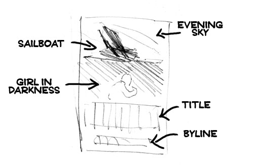
Here’s what I would do: Place a different photo of a sailboat silhouetted against a fiery evening sky at the top, with everything from the waterline on down being dark; then center the girl against that darkness. (Afraid the bird gets left out.)
Other suggestions?
I think there is just too much going on. So much so that the cover comes close to falling into the Kitchen Sink School of book cover design. That is where the author feels the necessity of including everything he thinks is important.
There is also the problem of objectivity: I think that many of the visual elements are significant only because you already know the story. So all of the things you think are meaningful are only so because you have insider knowledge.
The visual elements are also too disparate: they not only appear to come from very different sources, there is no real visual connection between any of them. The result is like a page from a scrapbook.
The bird is overwhelming while the girl is murky to the point of near-invisibility…which also makes it difficult to tell just what she is doing. The faint swirling shapes seem gratuitous and only serve to make the cover more difficult to read.
I think you need to focus on just one main visual element that best suggests what your book is about, its ideas or themes. Any other elements need to be subordinate to that.
You certainly need to better get across the supernatural nature of the story. At the moment that is completely missing.
Finally, there are at least two too many typefaces. But at the moment, the typography is pretty much a moot point since the image itself needs to be rethought.
Y’know…I got nuthin’. I’m not sure why, but usually, I have an immediate reaction to covers here. Good, bad, dreadfully off, but I’m having a “blah” reaction to this. It’s simply not evoking a strong reaction of any kind, which I would say is not great.
Other than to say “well, the coloration behind the title lettering is nicely done,” EXCEPT, the bar on the upper-case L in “Girl” is so light a weight as to be nearly invisible at full-size and absolutely invisible at the thumbnail size, so the title appears to be “GIRI at Sea,” Not “Girl at…”
And the connector word (at) also disappears at the thumbnail and nearly at full-size. I’d consider playing with the color-flow behind the letters so that the L’s bar and the “at” are both very light and easily visible, if you still have the title text on a darker background.
I agree that the other two fonts aren’t helping at all.
All I see on this is the bird. I keep zooming the page to stare at it, trying to figure out what the hell it is. That’s all well and good, but hardly the point of the cover. Nobody who does that is going to buy the book, because the book, the story, is now lost. So, I strongly second what Nathan and Ron have said and no doubt, RK shall be along shortly to provide greater depth and insight with his thoughts.
Sorry–I’d like to see it when it’s redone.
I can’t say much about the cover because I think there is no point in repeating the title elements in the cover images.
It could suggest two things: change the name (because it’s boring and would harm a story that seems interesting) or use it and forget about using the image of a girl at sea.
First, and most obviously to all of us, you’ve got too many different things on your cover and no focal point. Other than that rather dull and mundane sailboat, almost any one of the images you’ve patched together on your cover would be at least visually interesting by itself, but showing all of them together focuses on none of them. Worst of all, none of these visual elements is even centered on the cover; instead, all I see there in the vertical and horizontal center is a bland and empty ocean surface.
The obvious solution to this is to pick just one visual element to be your primary focus, center it on the cover, and then shunt everything else to the periphery or off the cover altogether to keep the focus on the center. While that seriously pissed-off-looking bird is an obvious candidate for being the main focus, I might actually prefer to bring that dejected young gal front-and-center instead, depending on whether she or that bird are more central to the story. Given that you indicate this to be a “coming of age” story with just a little supernatural material in it, I’m guessing she probably is the main character, with Death’s representative bird there serving as something like a stand-in for the old “deity who gives the hero a quest at the start of the story” archetype from ancient mythology: important enough in that role, but not really the main focus of the plot.
As to the title, well… yes, it’s rather bland and generic and redundant as my colleague José Luis Vázquez says. While we usually try to make the cover image speak for itself before even considering the title, it remains that after the image catches a prospective reader’s eye, a title can still make or break the sale. In your case, I’d have to ask: what’s supposed to be so special about a Girl At Sea? While that title might have been interesting to readers centuries ago when the captains and crews of ships at sea were almost always exclusively male, this story is presumably set in contemporary times when there are lots of girls at sea, so no one is even going to give that title a second glance.
Consider a psychodrama the French author Howard Buten wrote several decades ago: when he first published it here in America, he simply titled it Burt after its protagonist. It proceeded to flop, and flop hard, since just about nobody here found that title even the tiniest bit intriguing. Taking it back to his native France for a second try, he then proceeded to re-title his book Quand J’avais Cinq Ans Je M’ai Tué, which means When I Was Five, I Killed Myself.
Guess what happened to his sales then? Yeah, his book became a best-selling smash hit, got a movie adaptation that earned him some extra royalties, and is famous among the French to this day, some ten percent of the entire country’s population having read it. Happy as all his book’s success made him, he probably still ended up mentally kicking himself later for not having thought to give it some such intriguing title in the first place back when he was still publishing it here, since America’s population of prospective readers is (of course) a lot greater than France’s.
Now let’s consider your book’s title again: as mentioned, there are lots of girls at sea these days, just as there were plenty of boys named Burt here in America back when Buten tried to sell his book here with that name as its title. Don’t you think it might sell better from the start if your book’s title were a bit more mysterious and intriguing? Instead of Girl At Sea, why not call it something like Death’s Sailors or Call of the Grim Reaper or Abuser Across the Sea?
Now mind, though I’m working from your synopsis to get ideas here, your title needs not necessarily be directly and literally about some part of the story. Despite what that title said, for instance, the protagonist of Howard Buten’s novel was explicitly stated to be quite alive in the mental hospital where he was imprisoned at eight years old and going on nine at the beginning of the story. His supposed suicide as indicated in that title was entirely metaphorical; but what an attention-grabber it was to tell the prospective reader right there in the title that the protagonist (and narrator) killed himself at just five years old, right?
Speaking of your synopsis, am I the only one who thinks a lot of people might be rather suspicious of a situation involving a pubescent teen girl in need of consolation traveling alone with a (presumably somewhat sexually experienced) man in early middle age who’s also in need of some consolation out on the ocean where they’re at quite a distance from the jurisdiction of any country’s age-of-consent laws? I mean, unless this guy and gal have been like family to each other almost since the day she was born and already have something more like a father-and-daughter relationship, a gal in the grip of puberty’s hormone storms at fourteen years of age might well see that guy as fair game for seeking some solace in a torrid romance, regardless of how the years might have degraded his looks; and though he’s likely to be more mellow and level-headed and usually responsible enough to resist sexual temptation at his age, it’s also likely that along with the rest of his family who got slaughtered, he’d be sorely missing the company of his late wife and seeking solace in the arms of an attractive young female who shares his grief. Considering too that nearly all “coming of age” stories specifically involve some kind of awakening of the adolescent protagonist’s sexuality… do you see where I’m going with this—and where I think you might be going with this as well?
Of course, if such a morally questionable inter-generational romance is an important part of your story (with the arrival of the gal’s best friend and that gal’s abusive father doubtless serving to complicate an already tangled situation that much further), then the fourteen-year-old girl protagonist should definitely be the main focus of your cover, with her middle-aged widower crew-mate (my browser’s spell-checker insists you should be breaking that term with a hyphen) maybe hanging out somewhere nearby on the cover too. While you need not be too explicit with the dubious implications of a man and girl traveling together alone (the way someone accidentally was with a man and boy on the cover of a reprint of The Cay), you probably should at least leave their positioning and body language toward each other ambiguous enough to be open to that particular interpretation. Having them both looking with some astonishment at a life-sized version of that albatross who represents Death as he dictates that task to them would also greatly help to mitigate any of your readers’ more perverse suspicions about them, whether those are justified or not.
Whatever you do, however, be sure to make your cover’s image all one integrated scene: no photobombing or layers upon layers or bulletin board layout (as we call these design mistakes over on our companion site Lousy Book Covers), and definitely no smorgasbord layout as I would probably call this cover’s current design. Unless something in the story specifically calls for split-screen scene of the sort one sometimes sees in movies (which rarely happens for book covers), you should never try to put more than one image on the same cover; and if you must cut and paste images from various different sources to get the scene you want, you’d better be exceedingly talented at integrating them all into one single cover image so the seams don’t show. If you’re not up to that task, try purchasing some art or hiring an artist from over on Deviant Art (the starving artists there are usually available at pretty reasonable prices) to draw you a custom scene instead.
For indicating the mildly supernatural elements of this story, those glowing red eyes on the bird (which make him look like he’s mad as all Hell and seeking to put somebody’s head on a pike, by the way) or even just that aurora-laced starry night sky should be quite sufficient, but make sure they’re in their proper place. That colorful night sky should be glowing overhead, not stashed away somewhere beneath a picture of a sailboat on a sunny day. That albatross should be properly life-sized and integrated into the scene, not larger-than-life and looming over a bunch of other unrelated pictures the way you’ve got it now.
While you’re at this, be sure to leave some room at the top and bottom of the picture for your title and byline (which shouldn’t be too difficult, especially if you’ve got the main focus of the scene properly centered), and use no more than one or two fonts for all captioning on the cover. (Hitch should be able to help recommend what kind of font(s) to use for that.) Also, if you’re doing this properly, you probably shouldn’t need any descriptive tagline to spoon-feed this being “a coming of age tale” to your readers; once the cover image gets their attention (and clicks), the summary you write for your book’s sales page should be quite sufficient to clear up any remaining uncertainties they might have about its genre.
Above all, try to make everything interesting: the image, the title, the fonts, and the cover in general. These covers are click-bait as Hitch would say, and advertising as I would say. You don’t see professional advertisers jumbling a bunch of vaguely related stuff together on billboards or store posters, let alone on internet banner ads, do you?
Likewise, think like you’re designing a movie poster or one of those side-panel ads on somebody’s website, except you’re going to slap your ad on the physical (and probably the electronic) cover of a book instead of a wall or a website. Don’t try to use your cover to explain anything rationally to your target audience, but instead use the kind of image and color scheme and lettering that will grab your prospective readers by their guts or heartstrings or sense of nostalgia or some kind of emotional interest. Get their attention first and foremost; save the rational explanations and appeals to their intellect for later when they’re actually on your sales site looking at your summary and (possibly) the preview of the inside.
RK: Oh, nooo. You are not the only one that wondered at the implications of the pubescent girl-child with the man. I was hoping rather fervently that it was an uncle-niece thing or some equally harmless scenario.
Maybe we’ll find out. 🙂
I think there are two many images and not one you can focus on. I like the picture of the girl and the boat. The bird looks a bit creepy and evil. I think he’s suppose to be. I think in book covers you don’t have to reveal all in your cover about the book. Make it a tease. Maybe make the girl on the sailboat, holding a black seagull. Take photoshop and change the contrast to black from white and make a black sea gull. It think the photos are too big with each other. I like the colors though. Also the girl could be les faded. I’d like to see her face. Maybe show her face up front, the gull flying over head and the sail of the boat in the background. Make some things bigger and others smaller. The bird needs to be a bit smaller. Love the book idea. Interesting read.