The author says:
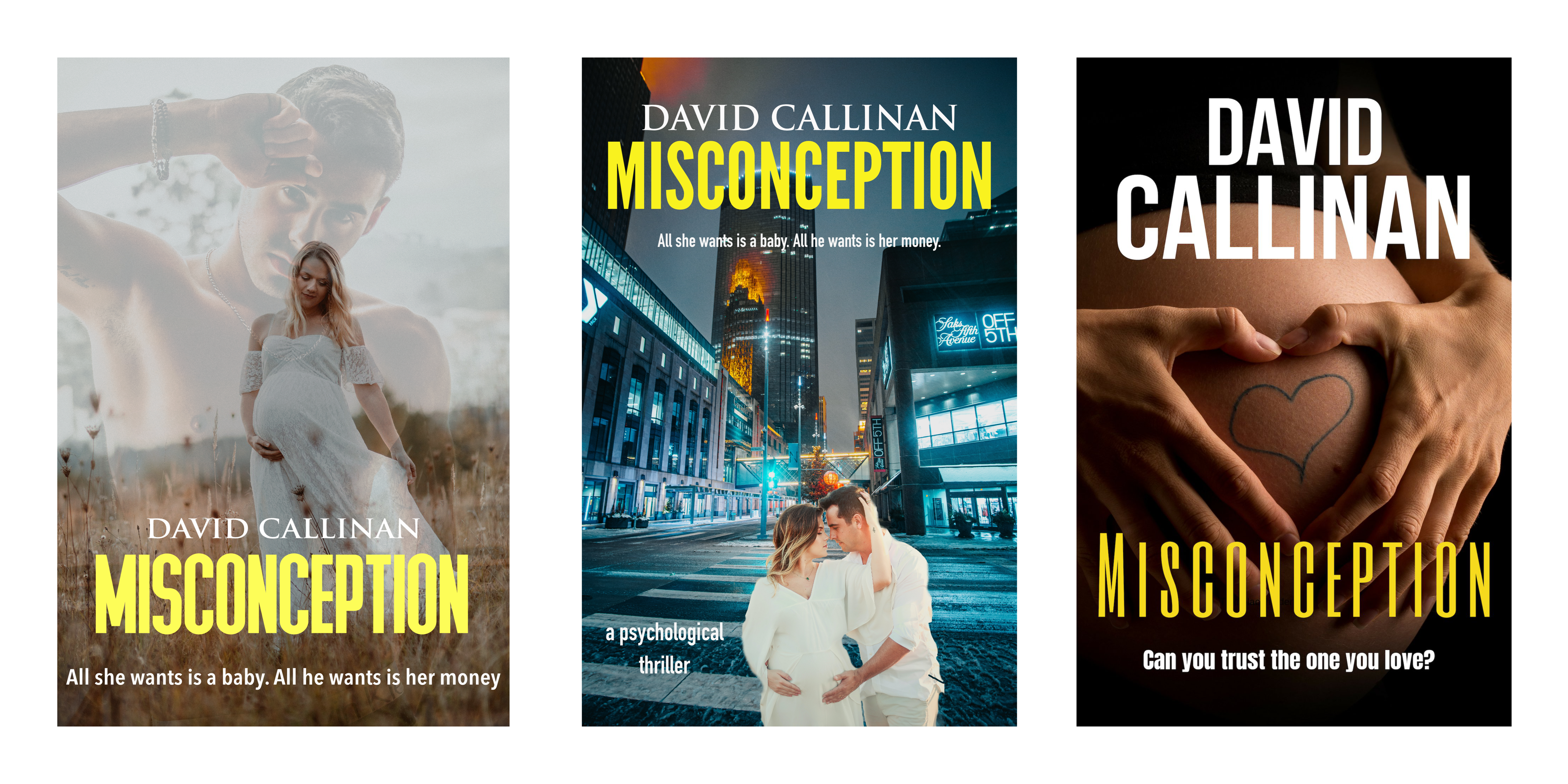
MISCONCEPTION – a psychological surrogacy thriller. Think movies ‘Fatal Attraction’, ‘Basic Instinct’ meets ‘Girl On A Train’. This is not an action thriller but involves relationships, surrogacy, betrayal, a wealthy heiress who cannot conceive, a dangerous surrogate, a seduction, theft of a fortune, a brain-damaged child and an abduction. I am trialling straplines: a) All she wants is a baby. All he wants is her money b) Can you trust the one you love. I am testing three cover approaches.
Nathan says:
I think the cover photo on the third is the strongest — it’s a simple, easy-to-read image and puts the pregnancy at the front-and-center. However, I would use the title font from the second one; the one in use on the third one is significantly harder to read.
From there, I would play with the contrast and hue of the photograph to give more of a “dangerous” vibe; look at other thrillers, even non-action ones, and you can see the high contrast and muted color schemes in use. Of course, play with the color too much, and suddenly the baby bump won’t be immediately recognized as a baby bump. It’ll take some fine tuning.
Other comments?
I don’t think that any of the covers suggest “thriller” let along “psychological thriller.” Without the tagline any of the covers might be taken for a straight romance. And given the choice of the male image in the left-hand example, anyone might be excused for thinking so. The bottom line for all of the covers is that not one of them even hints at the themes—other than that the story apparently involves a pregnancy—you use in your description of the book. There is no suggestion of betrayal, dangerous surrogacy, theft or abduction…let alone the presence of a brain-damaged child.
The middle cover suffers not only from the problem of looking too much like a light romance but from poor composition as well.
The right-hand image has some potential if the heart drawn on the woman’s abdomen were instead something directly related to the nature of the story, especially if were something that conveyed the darker side of the novel.
I certainly would not depend on taglines to convey the nature or theme of your book: someone has to get that far first. And even at that, tagline B would only reinforce the impression that the book is a standard romance novel. Even tagline A doesn’t really get across the novel you describe.
I think you need to focus more specifically on the themes that set your book apart. If it is indeed a “psychological thriller” involving surrogacy, then convey unambiguously that in the cover image.
I would suggest abandoning all three covers (with the remote exeption of #3) and starting from scratch.
A friend of mine saw the third cover and suggested a dollar sign instead of the heart.
I like the dollar-sign on the baby bump idea.
There’s too much color, overall, if this is going to be a thriller, with any of the images. The one on the left is simply straight-up, right-outta-Harlequin romance. There’s nothing thriller or suspense-ish about that, particularly with the boy-toy image. The one in the middle really does nothing, IMHO. Only the third has potential, to my mind.
Suspense of late tends to have mostly text–the title sprawled (or scrawled) across the cover, top-to-bottom and a muted background image. You only have a single-word cover, so…that’s not going to work for this particular title. No matter how cleverly the word is deployed for this particular storyline.
I wonder if angling it, upper-left to lower-right, MIGHT work? I’m not sure it would; but I would at least play with it, see if it might. That’s tricky to do and almost never works, but once in a while, it will.
This one definitely needs some re-tweaking. I would also consider, if you use the “all she wants/all he wants” taglines to vertically stack them, one atop the other, not horizontally stacked.
Offered FWIW.
Sorry..OR, curving the title around a silhouette of a preggers woman’s baby bump. THAT might suit.
Judging by the genre and proposed taglines, this sounds much like a higher-class “Lifetime Channel Movie-of-the-Week” kind of story: you know, the kind of story in which the (almost invariably) female protagonist must struggle to overcome some major problem with something or someone while (quite often) getting jerked around by the males in her life. In fact, this particular story sounds more than a little like the Lifetime Channel’s The Surrogacy Trap, albeit with the villain being the supposed wannabe father rather than the hired surrogate mother. While Lifetime movies are (some would say quite deservedly) the butt of many satirical websites’ jokes at the expense of that rather misandrist channel, you can indeed pull off a classier version of such stories, as demonstrated by the novel (and subsequent movie adaptation) Gone Girl‘s financial success.
In fact, the posters for Lifetime movies are an excellent place to begin when looking for an effective cover image for your novel. While that poster for The Surrogacy Trap has a lot of the right kind of elements (a silhouette of a pregnant gal to hint that this is a pregnancy drama, its being set against a blank white background to hint at her insanity, and the knife-shaped shadow to drive home what a psycho she is), I’d say what your cover really needs is a “traitor shot” something like the one on certain posters of Stanley Kubrick’s Eyes Wide Shut, albeit with the guy rather than the gal doing that treacherous-looking sideways glance. Get a picture of a guy hanging around a pregnant gal and looking sort of menacing and untrustworthy like that, and you won’t need a tagline to tell your target audience he’s up to no good.
As with all such traitor shots, of course, the unsuspecting victim should not actually be in a position to see that look on his face. To this end, altering what would otherwise be a fairly straight-up romance novel cover to reveal the guy’s impending treachery might be the very thing you ought to be doing here. Take something like the happy expectant couple on that middle cover above, except with the pregnant gal’s face pressed into the guy’s shoulder so she can’t see what he’s doing; center and zoom in on them, and edit the guy’s face so that he’s glancing aside and flashing one of those psychotic smirks at the viewer.
Voila! Instant psychological surrogacy thriller!
I really like the third one. It makes a statement and is very intimate. I like the yellow color font. The only thing i see is that the font is a bit hard to read on the pic. Just make sure it’s readable on your cover. Love the third one. I would read it with that cover.