The author says:
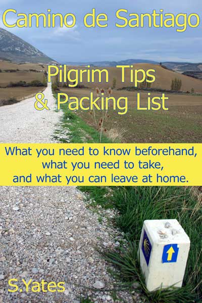
This book has already been published, but I would like to have some help to improve the cover.
Book Content
A non-fiction book about preparing for the Camino de Santiago covering things like:
– When to go and what to take (and what to leave behind!)
– What to expect during the walk
– Addressing lots of practical things like insurance, cultural shock, health, communication etc
– Pilgrims anecdotes to illustrate the points
– Links to other resources
Nathan says:
Now, I’m not a Camino de Santiago expert (in fact, I had to google it just so I’d know what we’re talking about here), but I would surmise that a guidebook such as this goes broadly under the category of “travel guidebooks,” for which it looks fairly appropriate; travel guides consistently have a no-nonsense vibe about them that says, “You can trust me.”
I think the design weaknesses here can be best seen in the thumbnail: The title merges into the background, and the subtitle wars with the title for importance. Here’s what I would do:
- Find a font that’s similarly no-nonsense (likely, but not necessarily, another sans-serif font) which has a thicker silhouette.
- Use that font for the title, subtitle and byline.
- Play with putting those (the title, subtitle and byline) in a darker color that will stand out against the background, possibly with a slight drop-shadow.
- Make the subtitle smaller so it’s easy to tell which is the title and which is the subtitle.
- I like having the byline to one side to balance out the signpost in the photograph, but I’d move it in and up some so that it really balances the signpost.
Anyone think anything different?