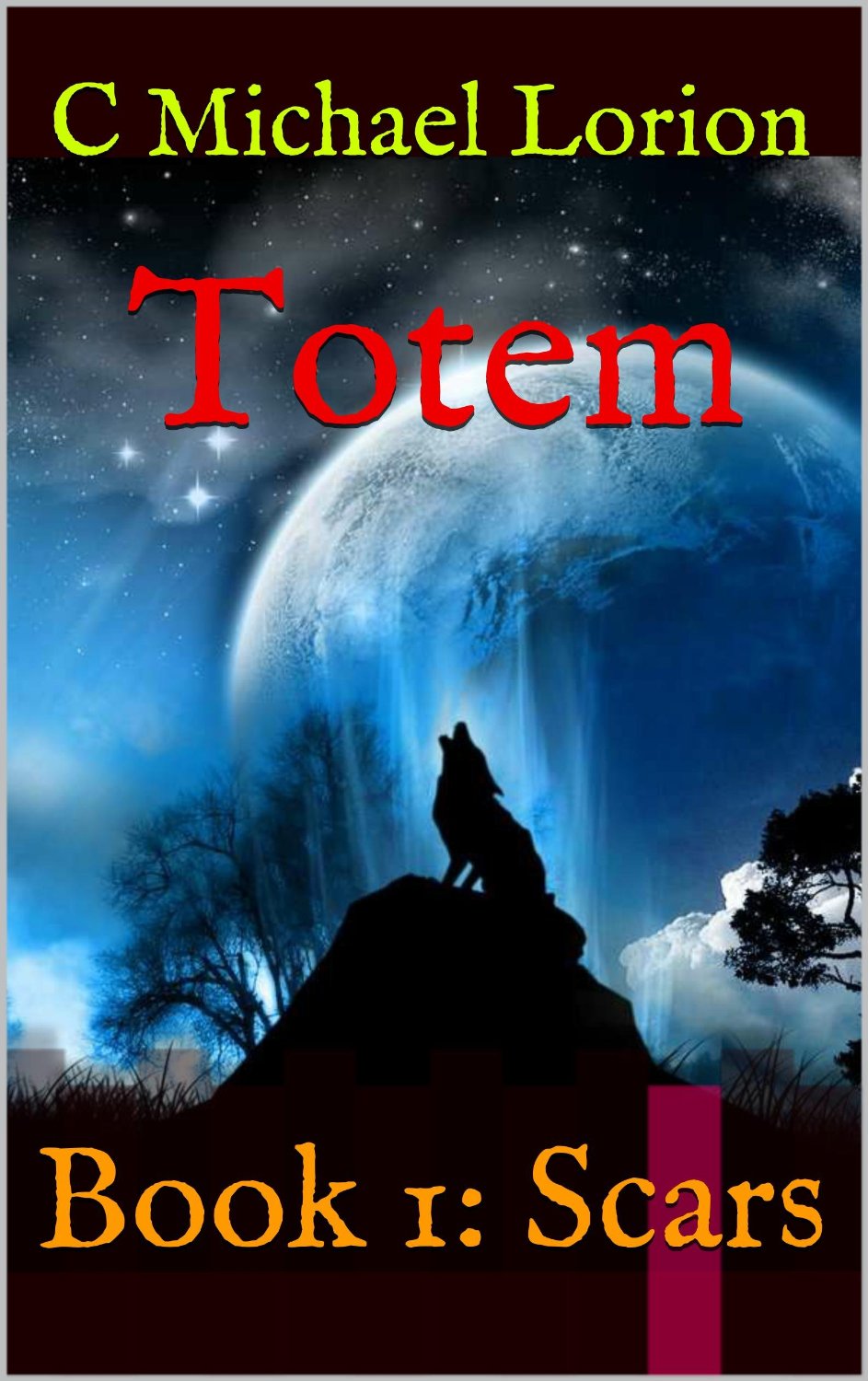
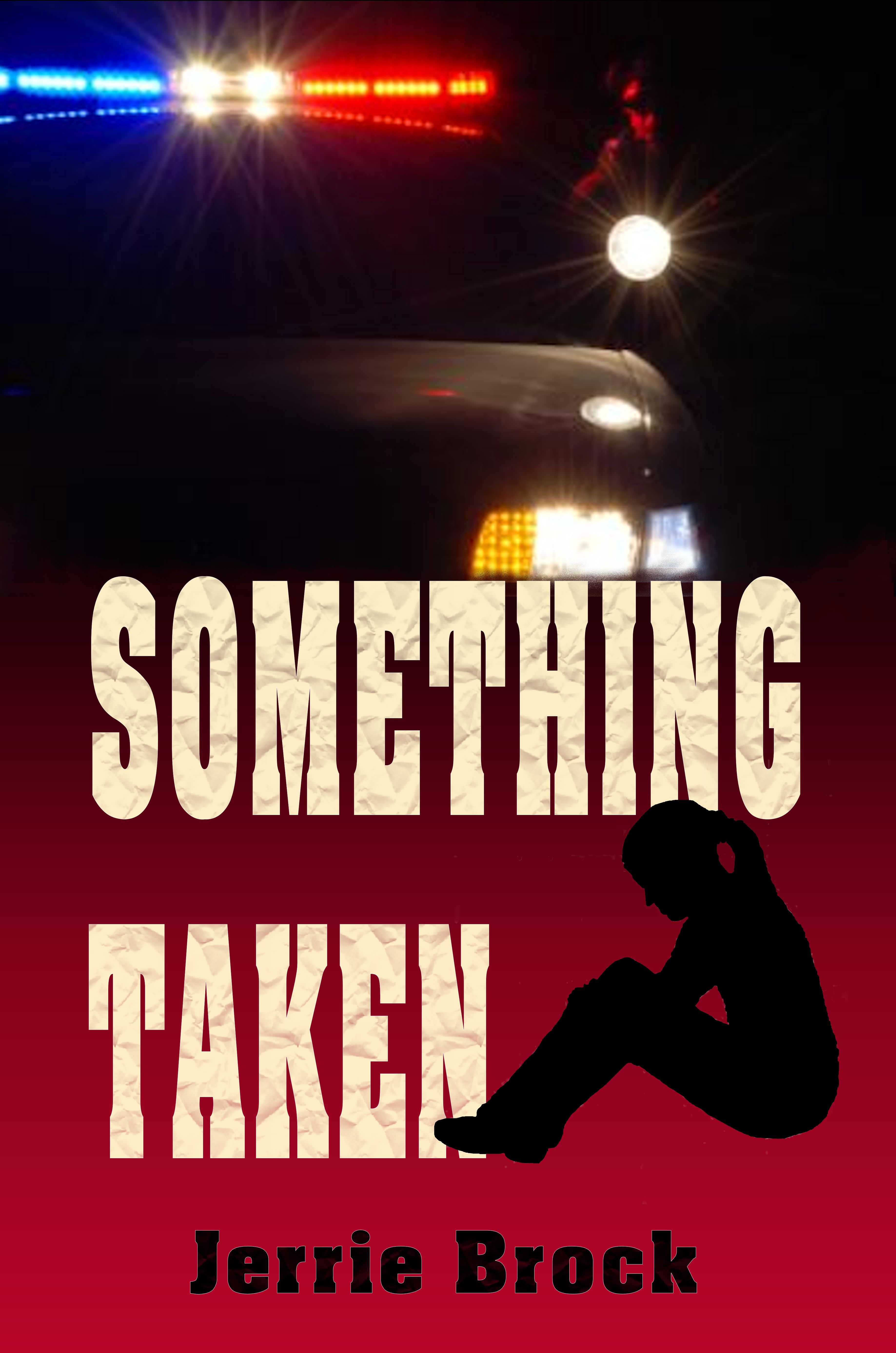
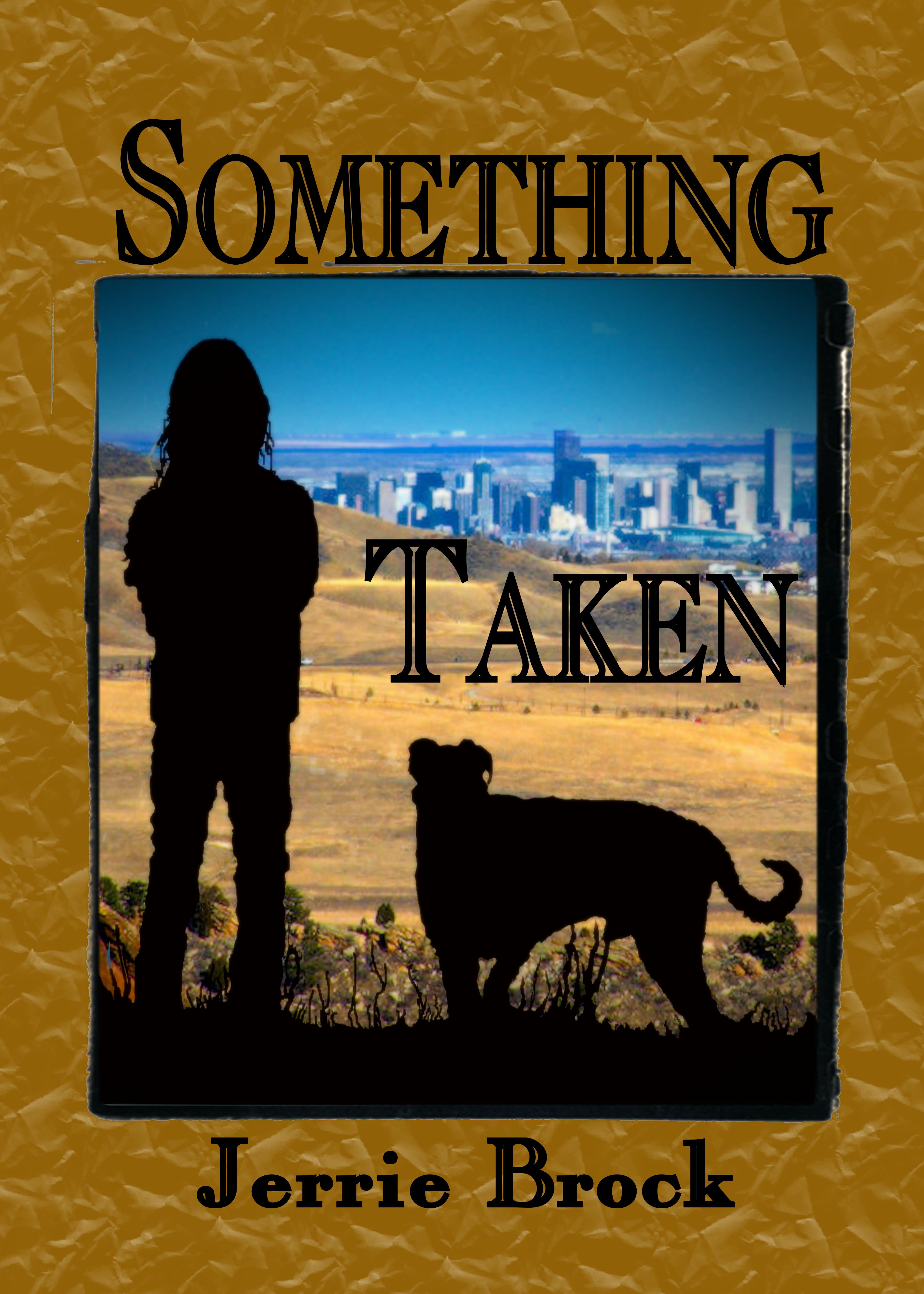
The author says:
This is a short in a series that I hope to compile as a novel. I’d like to see if these covers work or not. Set in modern day. A standard “serial killer with a mission” thriller. This would likely (I hope) appeal to anyone who liked “Silence of the Lambs” or John Sandford’s Prey series.
Nathan says:
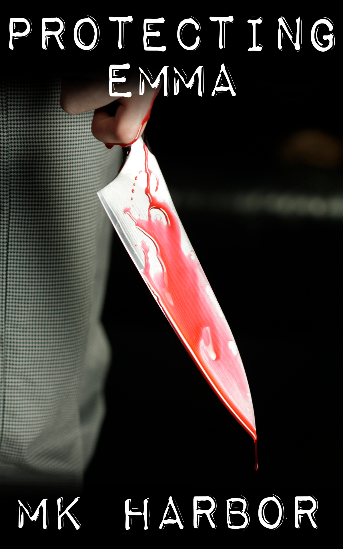
There’s nothing here that I’d classify as “wrong.” It seems competent, but unremarkable. If this were my design, I’d now start experiments to crank it up a notch, and here’s what I’d try:
- pulling the image lower so that I could increase the size of the title (I’d either reduce the space between the letters of “PROTECTING” without squeezing the letters themselves, or I’d increase the font size just of “EMMA,” or possibly both)
- adding a tint and/or a filter to add some character to the stock photo; take a look at how, for instance, horror DVD covers often add a scratched-up texture on top of everything
You said that this is part of a series, so I looked on Amazon for the rest of them. You’ve been very consistent in the design and layout of the covers, which I was going to recommend. So any changes you make here, remember that you’re going to need to be sure they work across all covers.
Other ideas?