The author says:
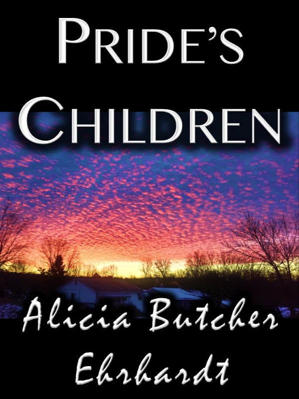
Obsession is commonplace; what you do with it can be exceptional. Pride’s Children is a story of betrayal and love in a modern retelling of the Book of Job that answers the question, Who is allowed to want? The reincarnation of Job is fragile writer, Karenna Ashe, who has lost almost everything—and put herself back together. Acceding to a request for a unique interview exposes her to powerful Irish actor Andrew O’Connell—and the specter of public ridicule, when she falls for a man she never expects to see again. Her competition, Hollywood actress Bianca Doyle, is young, beautiful—and infinitely more suitable.
Nathan says:
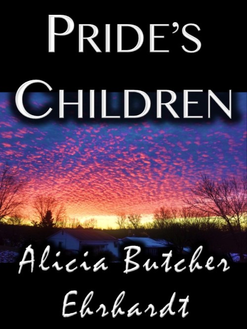
The biggest problem is that the byline font is almost unreadable. Even if it were spaced correctly (a cursive font like that shouldn’t have jarring breaks between each character), it’s still a hard font to read, and the fact that your last name is a less common variant doesn’t help.
I don’t think the title font is the best, but it’s not as distinctly inappropriate. At worst, it doesn’t help convey the genre or mood of the novel.
And really, that’s the underlying problem here: The novel sounds like a romantic modern-day recasting of the Book of Job, but the cover doesn’t relate to that at all; it’s simply generic. Even if you only indicated the romance without the Job part, that’d be something. Look at some romance novels (especially those without cover art dominated by people groping each other’s loosely draped bodies) and see how the fonts used indicate the genre.
(I’m not crazy about how the image, the type, and the black bars at top and bottom interact, but I think that’s of secondary concern.)
Other opinions?