The author says:
Wanderer’s Diary: Daydreams is a collection of emotions, friendship, and practical life. The book includes sketches, short stories, an essay, and poems by Qumber Rizvi. A few of the contents are detailed here.
1. Just To Hold Your Hand (Sketch): She fulfills his dream suddenly when she holds his hand and walks with him. He experiences what he had never dreamed of. Or, perhaps, dreamt everyday. Don’t put it down before the climax. There is a BIG twist.
2. Imperfect Us (Sketch): John Smith has a big crush on his classmate. She is the most perfect person he ever met. Even perfect that himself. But what happens when she rejects him? 3. The Best Buddies (Story): Three friends, classmates are the weirdest buddies in the school. They, together, can do what others won’t even think of. A humorous collection of their crazy deeds in their high school.
3. Change In My City (Story): Author returns to his city after six years. Many things are changed there, but what change he observes is what others won’t really see as significant as he does.
Three poems in Wanderer’s Diary: Daydreams are: 1. Forgery 2. I Was Blind, But Now I See 3. Park Bonus Read (Essay) – Internet Is A Boon
Nathan says:
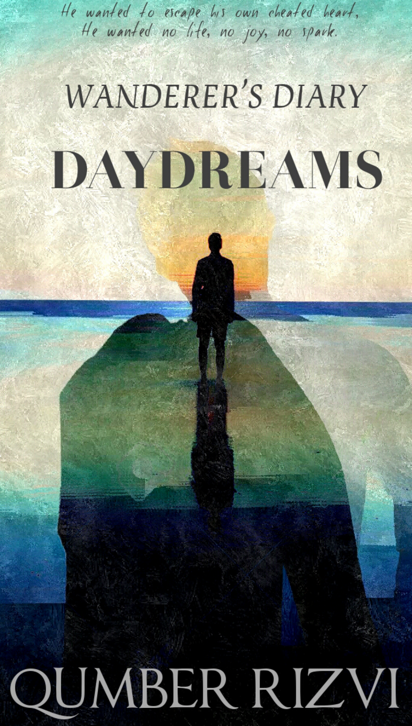
The great thing about single-author collections with varied content is that the cover doesn’t have to represent any single theme; it just needs to be visually intriguing. I think you’ve got that here.
The tweaks I would look at are these:
1. The dimensions are a bit elongated — not necessarily a problem, but given that a lot of ecommerce sites such as Amazon create their thumbnails by defining a maximum height, your cover will look smaller in thumbnail and be that much harder to see. It may seem like a little thing, but of such little things are big things determined.
2. There’s no indication on the cover that this is a collection. In fact, the tagline at the top makes it seem that this is definitely not a collection, but a single story. (The tagline is also hard to read at normal size, a combination of the irregular typeface and the color behind it that reduces the contrast.) It seems that both 1. and 2. (partially) can be improved with one edit: Chop the cover down to a 2×3 proportion, sacrificing that blue area at the top of the artwork and the tagline over it.
3. Your name being as unusual as it is, it won’t strike readers immediately as a name. (I’m not saying that Stephen King’s success comes from being named “Stephen King,” but it didn’t hurt.) But you can improve this, and solve the other half of 2., by adding “Stories and Poems by” or “A Collection by” above your byline, which will both identify your name as a name and give more of a clue to the contents.
4. Even if we cut off the tagline at the top, that still leaves us with three different fonts on the cover, and all three of them are serif fonts, which tend to clash with each other. (That’s why you see so many book covers that use two fonts — one serif, one sans serif). Since the byline is far from the title, you could use a single serif font for both parts of the title (maybe with “Wanderer” in regular weight, and “Daydreams” in bold) without much danger of clashing. I would definitely remove the italics from “Wanderer’s Diary.”
Other ideas?
![for-waterpearl-4-png[1]](https://covercritics.com/wp-content/uploads/2015/05/for-waterpearl-4-png1.jpg)