The author says:
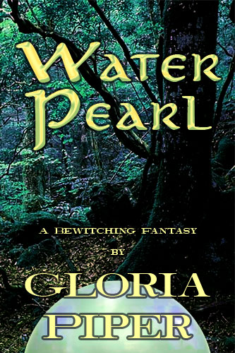
In this fantasy, a magic pearl made of water by a forest sprite serves a major role throughout the story. A youth “borrows” it and aches to return it, but circumstances prevent him until the end.
Nathan says:
The more I do this, the more I become convinced that the two most basic parts of any book cover are:
- Color scheme
- Typeface(s)
In other words, it would be possible to create an acceptable cover for a fantasy novel using nothing but this photograph, with color manipulation and appropriate fonts.
First: The photograph is too “blah.” It looks like exactly what you’d see if you, well, took a photograph in the forest. But fantasy needs to be more intense. What colors could suggest a magical forest? Or magical water?
Second: Neither font you have here is terribly evocative. The Rosetti font you use for the title is ornate, yes, but gets no support from layout or color, and the Comic Sans… Sorry, there is NO appropriate use for Comic Sans. It’s so overexposed and hated these days, I wouldn’t even use it for a coloring book.
Third: There’s no detail in the background image that you need to be sure not to cover, so the off-center placement of both title and byline accomplish nothing. You may be trying to achieve a bit of visual interest by breaking the byline into two lines, but its off-centeredness just makes it look haphazard.
Fourth: The “water pearl” doesn’t look much like a pearl. What it mostly looks like is an afterthought.
Now. The good news is that, as this isn’t a complex cover, the fixes don’t need to be time-consuming. I did an image search and couldn’t find the exact stock photo you used, but I grabbed a more-or-less similar one to do a “five-minute fix” demo for you.
Definitely not the best cover for this, but it’s a quick sketch showing you what I’m talking about.
Anybody else have thoughts?
![for-waterpearl-4-png[1]](https://covercritics.com/wp-content/uploads/2015/05/for-waterpearl-4-png1-500x800.jpg)
![for-waterpearl-4-png[1]](https://covercritics.com/wp-content/uploads/2015/05/for-waterpearl-4-png1-94x150.jpg)

All the tweaks in the world are never going to make this more than a so-so cover. High fantasy pretty much needs an illustrated cover, IMO. Otherwise it will always look like a picture someone took on a hiking trip with a pearl stuck on it.
I do read a lot of fantasy books. All of the fantasy covers on my Kindle device feature artwork (not from a conscious decision to exclude books with other kinds of covers).
This is actually the first time I’ve disagreed with Nathan, albeit only in part. I like the photo very much and would submit, as someone well acquainted with the forest, that it is not a shot one could easily get unless they found what appears to be a cave or tunnel that has clearly been there a while. It suggest a lot of ideas to me. I would, however, suggest that you play with some Photoshop filters on it to tip the ideas it evokes toward the fantasy realm. With that image and the correct font I think this would be a real hook.
Beyond that, I’d listen to Nathan.
My sole issue with the image–I concur, with some tweakage, it mightn’t be bad–is whatever is going on with those “threads.” I’m not sure what else to call them–it looks as though someone went in and added black and (grey?) lines, overlapping each other, on the inside of the tree-cave/funnel. That’s a bit odd. On the other hand, it’s highly unlikely that anyone except we cover and design wonks will notice those, either.
Also, the thing-that-might-be-a-steer-skull doodah, in the back of the cave–is that intentional?
I do, absolutely, think that the color needs serious bumping up. It’s too blah; you can see what Nathan did with saturating some of the hues and tones. With regard to fonts, ye olden Derek Murphy has a post on Creativindie, that has “The best fonts for covers,” (a similar title–that’s not quite right), and you can find some freaking AWESOME fantasy fonts there. I highly recommend that you find one or two there that you like, and give it some GUSTO.
Hope that helps.
My advice will be this: When in doubt go simple.
Why not have just a picture of a pearl? On a blue sheet maybe so it looks like water.
One of the main things wrong with both cover ideas is the lack of any really dominant element in the image. In the original, the “pearl” of the title is reduced to not only an afterthought but one rendered entirely unrealistically. The title is placed in the center over the dark opening of the cave—in which there is nothing of any special interest except a large dark shape. In the second version, the eye is drawn to the center of the picture…and there is nothing there. And again the pearl, though much better rendered, looks like an afterthought, peeking as it is from the bottom the frame and half-covered by the author’s name.
I agree with Adrian that the first photo has real possibilities…not the least of which is the more than vaguely sexual appearance of the cave. I would work on moving the type to a better position (and taking Nathan’s advice about the typefaces chosen) and giving the cover a dominant visual element by placing the pearl half-hidden in the cave, in that dark shape where the eye would be naturally attracted. This would also help emphasize the importance of the pearl to the story as well as attach some mystery to it.