Category: Covers

First Epiphany of the Time Vandal [resubmit]

The author says:

Dr. Elijah Snow wanted to record history, not become a part of it. But after stealing the T714 time-displacement craft from his US Air Force benefactors, he quickly found out that witnessing an event without participating in it was easier than it sounded. Accompanied by his quirky A.I ‘Fuzzy’, Dr. Snow sets out to document many of the major historical occurrences which had always intrigued him. From the Mongol Invasion to the crowning of the Danish king Harald Bluetooth, Elijah does his best to record without getting involved. But invariably he ends up embroiled, time and time again, in these events, never failing to leave his footprint on the pages of history.

delCOVERNEWEST

delCOVERNEWEST

[original submission and comments here]

Nathan says:

A much stronger design concept this time out. Now we can get down to fine-tuning.

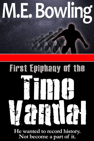
First: I like the idea of the echoing silhouette, but not THIS silhouette. His foreshortened limbs look odd, and he’s in an unnatural stance.  I also suggest rotating the successive silhouettes, which will give a more “out of control” impression.

Second, you have too many fonts.  Unless there’s a compelling reason, I always advise to use at most two fonts on the cover. What I would suggest is using two-and-a-half fonts, as it were; I know a lot of stencil fonts come in more and less distressed varieties; if this is one of those, use the less distressed version for “First Epiphany of the” and save the more distressed version for the big words.  Then use the tagline font for both the tagline and the byline.

A final word; from the original description (and somewhat from this description, though less so), I have the impression that this is at least partly a humorous story.  If so, then you need to find some way to indicate that on the cover, which is pretty humorless.

Other comments?

Avenge Me My Suicide

The author says:

This is a psycho-drama about the eight (almost nine) year old Aaron, who’s been locked away in a mental asylum for several months now for what he did to his classmate Marissa. His story is told in a series of flashbacks as he gradually gains the sympathies and friendship of his assigned caseworker Dr. Catar explaining how and why he engaged in the rebellious behavior that got him institutionalized. Dr. Catar then faces considerable opposition from his superiors as he comes to believe Aaron does not belong in the asylum and starts campaigning for him to be released.

AMMS

AMMS

Nathan says:

First up, this crowd may be over-sensitive to this kind of thing (thanks to the discussion surrounding previous covers), but the first impression I get is one of the morning after an eight-year-old one-night stand.  I don’t know if child-sex figures in your book, but whether it does or whether it doesn’t, featuring an image indicative of it on the cover will probably drive away a lot more readers than it attracts (and those it attracts will probably be attracted for the wrong reason, because ew).

I don’t mind the childish hand-drawn type because it’s actual hand-drawn type, not a pre-made font that tries to imitate hand-drawn type. However, I would definitely blur or otherwise soften the edges so that it looks less like it was drawn digitally.

Not technically a “cover” comment, but I question whether an eight-year-old would use the arcane grammar of the title (unless the eight-year-old in question were a pre-pubescent H.P. Lovecraft).

Of my three comments, I think the first one is by far the most important.  Unless there’s another shot from that same photoshoot in which the boy is at least wearing a shirt, I would advise you to scrap it and find an unrelated image which doesn’t have that same “ick” factor.

Other comments?

There’s Magic in the Sky!

The author says:

This is a picture book intended for adults to read to young kids, or for older kids to read to themselves. The aim is to present the science behind how an Aurora occurs but without losing the sense of wonder and awe that science can sometimes kill off. This is done by simplifying the scientific explanations, adding some drama, and the use of rhyming language. This book is the first in a series titled ‘Tales of Science and Magic’.

Front_Cover_Preview

Front_Cover_Preview

Nathan says:

A commendable project, and I have no complaints about the art (which is good, since that is the one thing that can’t be changed here). So let’s look at the type.

I was going to point out the mismatch between the whimsical flavor of the supertitle and the simplicity of the rest of the type, but I think we actually need to go back further.  The cover art is obviously hand-done, and while the type tries to match that, it’s just as obviously a computer imitation of hand-drawn lettering.  I think you would end up with a far superior project if you asked one of your contributing artists to hand-letter the cover!

There’s a particular problem with your credits block.  I would (a) separate the “Written by” info a little from the multi-line “Illustrated by” part. I would also make sure that none of your illustrators’ names are split by a line break.

Other comments?

Chasing Redemption [resubmit]

The author says:

Take two of my cover upgrade for “Chasing Redemption.” I found a background image that gives a clear impression of SPACE, and even added in a space vessel. The photo resolutions are low (using sample images) and the lighting/shadows are not really correct on the vessel, but it gives you an overall feel for my idea. I’m also very tempted to nix the vessel and just go with the background image. I fear it’s going to be too difficult to add something to this background without it looking too cut-and-paste.

ChasingRedemption2015bUpgrade

ChasingRedemption2015bUpgrade

[original submission and comments here]

Nathan says:

Much, much better.  I can instantly tell the genre and setting from the thumbnail.

I would vote not to lose the spaceship (or not to lose the idea of a spaceship — you may find one with lighting that meshes better, though I doubt it; you’ll probably have to go in and paint a reflective glimmer along the far bottom edge of the ship).

My only suggestion, and I leave this open to commenters to support or nix this, is to add a hint of contrasting color somewhere on the color.  May a red-orange in “Chasing,” or in the shadows on the byline; maybe some subtle maroon veins in the shadow-side of the planet.

Other comments?

Oliris [resubmit]

The author says:

Senana Sa’z Rays has always been angry. Since the day he hit puberty an unholy rage festers in him threatening to destroy everything he loves. It ultimately gets him imprisoned on planet Indiku for a sentence of five years to harvest in the Leeri flower fields. Sena didn’t expect to be taken by a blue dragon, or what they would end up meaning to each other. There is a race against time for the two, and they’ll have to find a way to survive when everyone is trying to kill them.

OLIRISNOTAHORSE

OLIRISNOTAHORSE

[original submission and comments here]

Nathan says:

Well, the dragon pretty definitely isn’t a horse this time. That’s good.

However, it looks like you traded some old problems for some new ones.  As is especially noticeable in the thumbnail, the two image elements — “dragon” and “torso” — are just hanging there separately.  If the torso were larger and was more clearly behind the dragon head, not only would it attach the two elements, but it would get rid of the problem of the male figure not having any body below the belt.

I don’t think it works to have the title nudged over ever-so-slightly to the right; just center it and be done.  And I don’t know why you insist on having having the byline so faint that it’s almost invisible.

Other comments? (Not about bestiality, thanks.)