Category: Covers

Over Time

The author says:

This cover is for a speculative fiction novella for ages 18+. Setting is contemporary.

Avery Crenshaw’s life is interrupted by the End of the World. He quickly learns that Heaven requires overtime. With personal direction from a very special guide, Avery must navigate raw emotions, submerged memories, and unexpected revelations with the people he loved in life. Reunions with family, adolescent sweethearts, his “first-time” girl, and his ex-wife confront Avery with apocalyptic consequences. He starts asking himself if love had been worth the risk. These encounters lead him on a path through laughter and tears, losing and finding, joy and triumph – and shockingly, back again.

Nathan says:

I’m having a hard time drawing a bead on this novella from your description.  Is it sort of a post-Rapture drama, making-peace-with-your-life kind of thing?  If I’ve got that sorta right, then I think that the cover you have doesn’t work, right down to its initial concept — it simply has nothing visually that would attract the interest of the readers who would enjoy the book. So rather than spending time critiquing various parts of your design, I think we need to send you back to the drawing board, and ask yourself, “How should my cover look so that a reader wouldn’t be surprised by the contents?”

Maze Weaver

The author says:

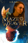
YA fantasy (sequel, so I have to have the same models on this cover as on the first book, which you can see here: https://www.goodreads.com/book/show/62990067-dreamwalker )

Nathan says:

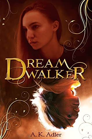
For everyone’s reference, here’s that first book’s cover:

Well, you’ve definitely got branding down…

I think the biggest problem with both covers is that the photo you have on top is just not impressive — between the lack of expression and either the poor original photography or the processing which washes out a lot of the contrast, it’s a lot less worthy of focus than the lower photograph. However, if you flipped it, the currently-on-top photo would be even less worthy of attention, and the readers who focused on it (secondarily, after the top image) would subconsciously feel that they had expended the brainpower to interpret an upside-down image with no real payoff.

My advice is to revise both covers, using the bottom image as your main image, and ditch the whole concept of the flipped upside-down images. I see from your book’s description on Goodreads that parallel/linked identities is a big part of the novel, but I think you can find a different way to indicate that visually.

Other comments?

An Army of Lies

The author says:

Two years ago, Angelo Barsotti lost his wife. As a Private Investigator, he still can’t get over the fact that he cannot solve the case. Angelo moonlights at McGinty’s as a bartender, which is a known cop bar and a great source of information. Angelo and his best friend and associate Lewis Pollard have just taken on a murder case. While working on this investigation, new clues about Angelo’s wife emerge from an unlikely place. A huge technology firm, a military platoon, and a swarm of lies make this one of the toughest cases that Angelo and Lewis have ever had. Will they catch the killer? Will they figure out Angelo’s wife’s murder? Follow along for the twists and turns in An Army of Lies.

Nathan says:

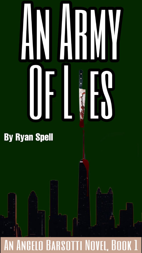
This is one of those cover concepts that looks good in your head, but… as you can see especially in the thumbnail, the knife standing in for the “i” doesn’t pull its own weight. It might work if you enlarged it so that the blade alone takes up the full space that the “i” would, but then you’d have to jigger things so that the handle is both visible and not blocking text behind it.

As it is, the blood drip doesn’t work like that (blood doesn’t run that way), and the cityscape isn’t as ominous as you want.

Plus: I always think it’s best to keep the book title and series title near each other, and the byline separate.

Other comments?

An Insult Troubling the Elements

The author says:

An Insult Troubling The Elements is a fantasy set in contemporary New Mexico and is targeted to young adults and older.

Xaila commands the powers and abilities as an Enchantress of Turquoise Sky. Responsible for directing the Elemental Forces over the Land of Enchantment, Xaila discovers her work is being interfered with by sinister influences. She encounters an unpredictable Interdimensional obstacle, cryptic signals from an unknown source, and a teenage runaway on the edge of desperation. These challenges threaten the very fabric of the Land of Enchantment. Xaila must find the answers in an exploration of her own past and deep into the history of her ancestral culture. In spite of Xaila’s great skill and prowess, the Enchantress soon realizes the solutions are not entirely under her control.

Nathan says:

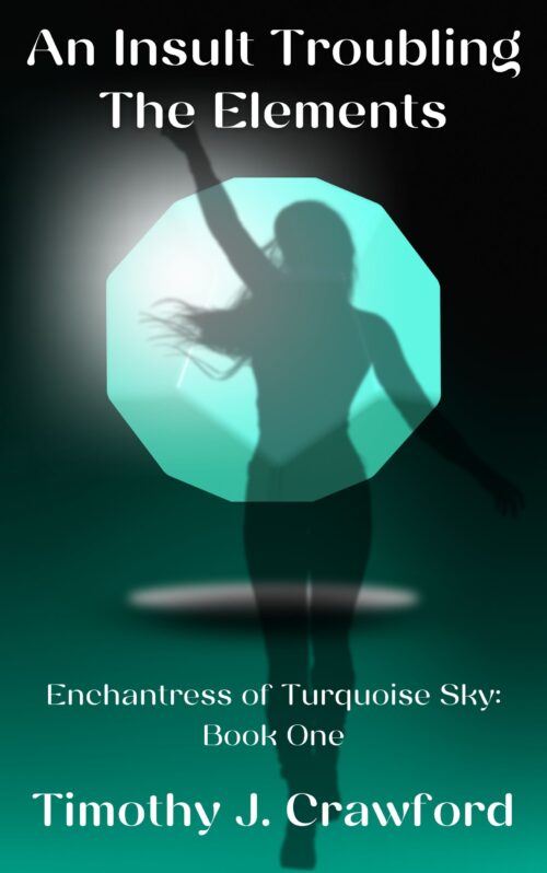
Sorry, I think this one just needs to be re-thought from the ground up. The current cover concept gives no idea of what the book is about; there’s neither magic nor New Mexico in evidence, which are the two main selling points. Back to the drawing board (or rather, before the drawing board, back to the brainstorming session).

The COSI Home

The author says:

A practical how-to-get-control-of-your-life book for people with minimal resources (whether time, money, or energy). Written and illustrated by a neurodiverse teacher/traveller/graphic artist. Fully illustrated with mid-century-modern style ‘ink-and-watercolour’ graphics on nearly every page, with high and low options, personal anecdotes, and a detailed workbook included to make solutions fully personal…or at least that’s the plan, because I’m about forty percent through the actual writing at this point. 🙂

I’m the author AND the illustrator, and the central house image on the cover is representative of the inner illustrations, all scratchy pen and fifties-hued washes. Think vintage cookbook or repair manual of the time! Fonts were chosen for that mid-century mod look as well. Is this going to catch the eye of my target audience and suggest practicality mixed with creativity, empathy, and a bit of humour, or do I need to take another run at it altogether?

Nathan says:

I think it’s a great cover concept… but I’m not sure that it’s the cover for this book.  I just don’t see the target audience for “a practical how-to-get-control-of-your-life book” recognizing that they’ll find it behind googie fonts and mid-century modernist architecture — if anything, the first impression of this cover is “nostalgia.”

Without looking at similar covers in the genre, my gut impression is that your cover should give a first impression of “accomplishment in progress” — I can think of several visual metaphors regarding construction, gardening, cooking, etc., although you’d want to keep from making your book look like a gardening how-to or cookbook.

Other comments?