The author says:
A practical how-to-get-control-of-your-life book for people with minimal resources (whether time, money, or energy). Written and illustrated by a neurodiverse teacher/traveller/graphic artist. Fully illustrated with mid-century-modern style ‘ink-and-watercolour’ graphics on nearly every page, with high and low options, personal anecdotes, and a detailed workbook included to make solutions fully personal…or at least that’s the plan, because I’m about forty percent through the actual writing at this point. 🙂
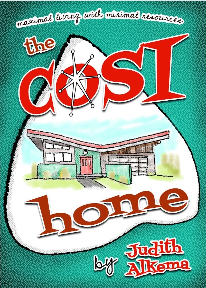
I’m the author AND the illustrator, and the central house image on the cover is representative of the inner illustrations, all scratchy pen and fifties-hued washes. Think vintage cookbook or repair manual of the time! Fonts were chosen for that mid-century mod look as well. Is this going to catch the eye of my target audience and suggest practicality mixed with creativity, empathy, and a bit of humour, or do I need to take another run at it altogether?
Nathan says:
I think it’s a great cover concept… but I’m not sure that it’s the cover for this book. I just don’t see the target audience for “a practical how-to-get-control-of-your-life book” recognizing that they’ll find it behind googie fonts and mid-century modernist architecture — if anything, the first impression of this cover is “nostalgia.”
Without looking at similar covers in the genre, my gut impression is that your cover should give a first impression of “accomplishment in progress” — I can think of several visual metaphors regarding construction, gardening, cooking, etc., although you’d want to keep from making your book look like a gardening how-to or cookbook.
Other comments?
I agree with Nathan: the cover really doesn’t seem to convey what the book is actually about.
And I am unsure about the clever spelling of “Cosy,” since there seems to be little point to it.
At first, I wondered why the house was Italian. (Cosi meaning “so” or “thus,” “such” and so forth). Then I wondered if it meant to say “Cost,” because the uppercase “I” in Cosi, looks, at a glance, like a “T.”
I like the cover, but…as Nathan said, as a piece of artwork, rather than a cover for this book.
I also tend to think that the very marketplace one might be targeting with this cover–I suspect younger folks?–might walk right on by, assuming this is for old coots and Boomers.
What is the target demographic, Judith? That would help us to know.
I agree with what the others have said. Also, I’d suggest making the “Maximal living with minimal resources” more legible and prominent. That’s the selling point and explanation of the book. I’m also not crazy about the textured green background and the shape around the house. It all seems too busy. Maybe just the house with toned-down title and clearer subhead, and no guitar pick shape and no textured background?
I do not like the style of art.
I think you need a different part.
Would you buy it from a store?
Would you place it in a drawer?