Bloody Lilies

The author says:

The book is about a PI who’s given a missing person’s case after the police decides the man to be a runaway. It’s a mystery book, targeted to young adults up and no specific genre (though probably to women than men).

Nathan says:

I think you can immediately see the biggest problem when you look at the cover in thumbnail: The lilies are practically invisible.

My advice: Move “Bloody” and “Lilies” together, and increase both brightness and saturation until the flowers look like flowers. (You can always burn it darker at top and bottom around the text.)

Other comments?

Moonsteed

The author says:

It’s a technothriller, but its primary target audience is probably women and girls.

Nathan says:

I’m very confused. You say it’s a technothriller, but your front cover is entirely any like any technothriller ever… and your back cover description, while involving espionage, is very clearly SF.

There’s at least a little SF in your front cover imagery, but only if the potential reader lingers long enough to see that that’s Jupiter in the sky, not just the moon.

There’s nothing wrong with the techniques by which the cover is rendered, but it doesn’t succeed in giving anyone in its target audience a signal that this is a book they’d want to read.

It really needs to scrapped back to the concept stage.


Frank Meets Greta and the Voodoo Curse

The author says:

Tag-Line: “Together but alone, Frank and Greta struggle to protect those they hold dear from both real-world mobsters and the unearthly monsters haunting the Rustbelt.”

Blurb: The Sultan, a drug kingpin with otherworldly mojo, is on the hunt, collecting debts. Which sends punk rocker Greta scrambling to save her hapless boyfriend. But all’s not lost. She’s got a wicked pair of Doc Martin’s: superb footwear for butt-kicking. And best of all, she’s got Frank, father of her junior high choir director, an ironworker whom the Sultan mistakes for a dimwitted pushover. He’s not. Because Frank has a burning desire to see his little princess’s youth orchestra concert, and he’ll smash through bedrock to get there… even though he hates that highfalutin Mozart crap. Problem is, Greta and Frank are stuck between a brewing modern-day wildcat strike and a 1966 racial uprising, placing years, firebombers, disgruntled hardhats, beleaguered shop owners, and the Sultan’s horde—dragons, demon bikers, Nazi stormtroopers, and whatnot—between Frank and his seat in the concert hall. Lacking superpowers but full of grit, determination, and moxie, they’ll claw their way back, or die trying.

Frank Meets Greta And The Voodoo Curse is book one of the Shantytown Voodoo books, a trio of stand-alone a character-driven magical realist novels. This novel addresses racism and the hard-scrabble life of America’s working-class using (and abusing) tropes from urban fantasy, horror, and crime fiction.

Nathan says:

I like the image, but the type treatment (a) is a complete impediment to reading comprehension, and (b) messes with the image beneath it.

Two-toned type is always tempting, but I don’t see one use in a hundred that isn’t a problem.

My suggestion: Right-justify the title and leave it all in light tones. That alone will do wonders for the cover.

Other suggestions?

The Hunter

The author says:

An epic fantasy set in the medieval world of Fareldin. The story follows a man content to die, who begins to find new meaning as he helps a kidnapped teen girl return to her fiefdom. But protecting her may prove fatal as dark plots threat All because he can’t say no to his wolf. This book would appeal to adult readers of Tolkien, John Flanagan, and Micheal J. Sullivan.

Nathan says:

While there’s nothing specifically wrong here, it’s very murky, and strikes me more as a gritty medieval historical novel (or, at most, grimdark fantasy) rather than epic fantasy.  And at thumbnail size, it all fades into a gray that can be easily overlooked in favor of the book covers that will appear to its left and right on Amazon.

My advice: Up the contrast, crop it so there’s less gray space, and keep looking at fonts until you find one that gives a more epic feel.

Other comments?

APOLLO DREAMS: The Space Case Chronicles, Volume 1

The author says:

“APOLLO DREAMS: The Space Case Chronicles, Volume 1” is a coming-of-age novel set in 1970, juxtaposing the real-life challenges of a young boy named Billy McBride with his vivid space adventures as Captain Apollo. Set against the backdrop of the Apollo 13 launch, the narrative seamlessly blends historical events with a rich imaginative world. This dual narrative offers a unique exploration of family dynamics, bullying, and the power of imagination. Targeted towards middle-grade to young adult readers, the story would resonate with fans of authors like Madeleine L’Engle, Roald Dahl, and E.L. Konigsburg, who weave reality with elements of fantasy and adventure.

Nathan says:

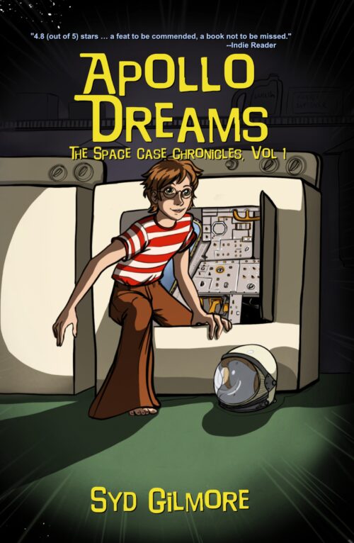
No pun intended, but there’s an awful lot of empty space here.  Given that most of your potential readers will first encounter your book as a thumbnail on Amazon or some other ecommerce store, you would be well served by maximizing what they can see in that tiny real estate.

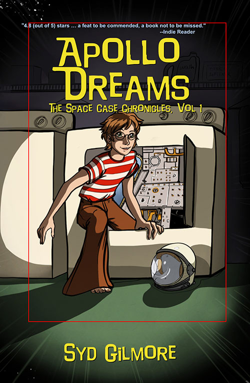
If you crop it like this, you lose no detail at all, and instead maximize what readers see:

My second suggestion would be to double the spaciness. Until you zoom in, you don’t really notice the instrument panel in the washing machine (there’s a sentence I never thought I’d write). So bling it up! Add glowing Christmas lights to the panel, put a Saturn-like ring around the title, anything so that the science fictional nature of the story is instantly apparent.

My third suggestion: Between the striped shirt and the glasses, your protagonist looks like the lovechild of Waldo and Harry Potter. That may be intentional, but if not, at least change the color of the red stripes.  (And the shadows on his face are a little distracting.)

Other comments?