Melancholy [resubmit]

The author says:

[Note: No new synopsis was submitted, so I assume it’s the same.]

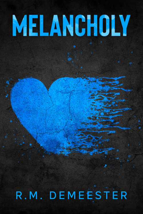
Two strangers both have one thing in common, they lost a partner to death. Brett Miller, a widow with a ten-year-old daughter, has spent the last two years grieving the death of his wife Natasha. The heartbreak and the devastation don’t seem to end, when he loses his job, and his relationship with his daughter continues to disintegrate. He tries to keep everything together, but isn’t sure he has it in him. Victoria Bell’s boyfriend of two years died unexpectedly, leaving her alone to raise their infant daughter. With the help of her sister, she learns to live again. But an unexpected foe from her past puts a wrench in her new beginning and she fears staying in the realm of heartbreak forever. Can Brett and Victoria break free from melancholy?

[original submission and comments here]

Nathan says:

Without a new synopsis, the former criticisms are in play: “How do the stories of Brett and Victoria relate? Is this a romance? Are they neighbors who platonically help each other through their crises? Do they become each other’s arch-nemesis? I’m trying to find the core of the story here and what readers it’s meant to appeal to, because that will matter which way we go on this cover.”

The typography is more professional this time around, but it still tells us NOTHING about the book. The cover could be anything from a collection of poetry to a memoir of depression to…
Dauntless Hearts

The author says:

Dauntless Hearts is a sweet standalone Regency romance written in the archaic language of 19th-century Britain. This novel explores themes of ambition, bigotry, love, developing maturity, and courage in the face of adversity, all in a richly realised historical setting with well-rounded characters. If you love Jane Austen and Georgette Heyer, you will adore Dauntless Hearts.

Nathan says:

I have absolutely no problem with the technical aspects of the cover. That said, don’t most Regency romance covers feature a couple, rather than a woman alone?  It could go a long way toward flagging your target audience.

Also, I looked you up and know that you’re female, but “Lincoln” isn’t a name that people assume belongs to a woman, and almost all romance writers use a name that instantly says “female” (including some male writers that I know — Angelica Hart, I’m looking at you). I’m not saying that you HAVE to change your byline, I’m just saying that it’s worth considering.

Rogue 13

The author says:

Rogue 13 is a contemporary fiction novel set in Las Vegas Nevada. It is targeted for adult readers with an affinity for action romance thrillers. An FBI agent on an undercover operation is sold out exposing her op, blowing her cover, and leaving her at the mercy of the dangerous individuals she has been investigating. A former black-ops agent the intelligence world believes was neutralized long ago immerges from the safety of his obscurity to aid her escape. Labeled as a rogue agent with her own agenda by her superiors, and falling into the crosshairs of the intelligence underworld, the two unite their unique skillsets in a fight to clear their names amongst a world intent on silencing them.

Nathan says:

My usual aim with submitted covers is “keep them from embarrassing themselves.” I don’t think this is an embarrassing cover, but at best it’s completely unremarkable.  If it were handed to me at this stage, I’d try a series of tweaks:

  • The typeface isn’t very strong, especially for thrillers. I’d play with a thicker, taller font and see how much I can edge it behind the heads while still being readable.
  • The foreground color scheme is awfully warm. I’d play with different tints and levels of contrast until I got something that said “danger.”
  • Speaking of danger, the only dangerous part is the gun, which vanishes at thumbnail size. I’d pay special attention when playing with the color above that I made the gun stand out.

Other comments?

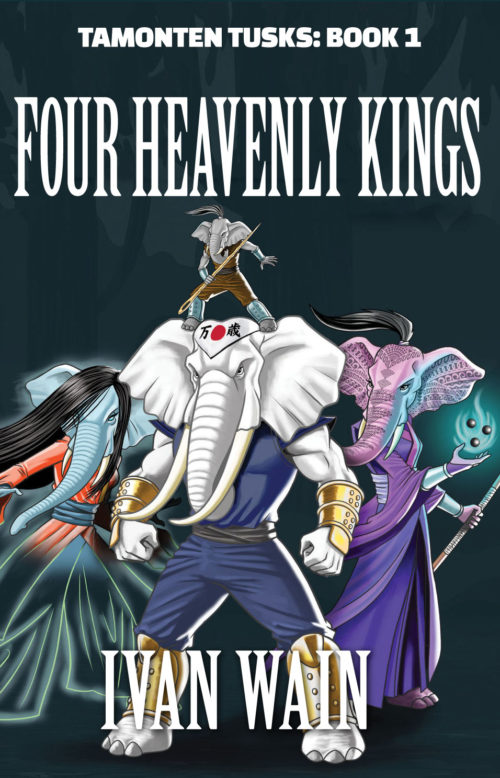
Tamonten Tusks

The author says:

Tamonten Tusks is a fantasy fiction adventure featuring 4 anthropomorphic elephants who are given special powers by one of the gods of the savannas. Their quest is to fight for the survival of endangered species and fulfilling their destiny they encounter many challenges and enemies.

Nathan says:

The artwork is fine for the genre. I think you could improve the layout.

  1. No need for the tacked-on space at the bottom. No one will be upset if there are words across someone’s shins.
  2. Use a stronger title font, and make it clear which is the book title and which is the series title.

Here’s a five-minute redo:

(I’m not happy with my choice of fonts, and maybe the series title should go in the big letters with the book title beneath it, but hey, five minutes.)

Other comments?

Tropic Death

The publisher says:

Tropic Death is a collection of short stories from the Caribbean and Central America, with themes of colonialism, race, and class. The book was first published in 1926 by Eric Walrond, and it became a popular book associated with the Harlem Renaissance. This is a new edition of the original publication.

Nathan says: Sorry, but I don’t think this works. At all.  The three main image elements don’t mesh with each other stylistically or spatially, and worse, I don’t come away with any inkling of what the book is about or why I should read it.

I find that covers for new editions of “significant” literature from the past works best using one of two starting points:

  • A photo of the author.
  • An image sourced from the time period of first publication.

Any other comments?