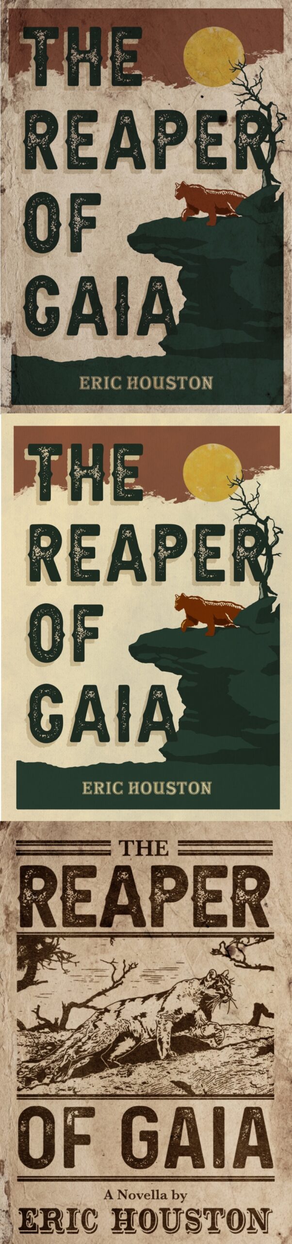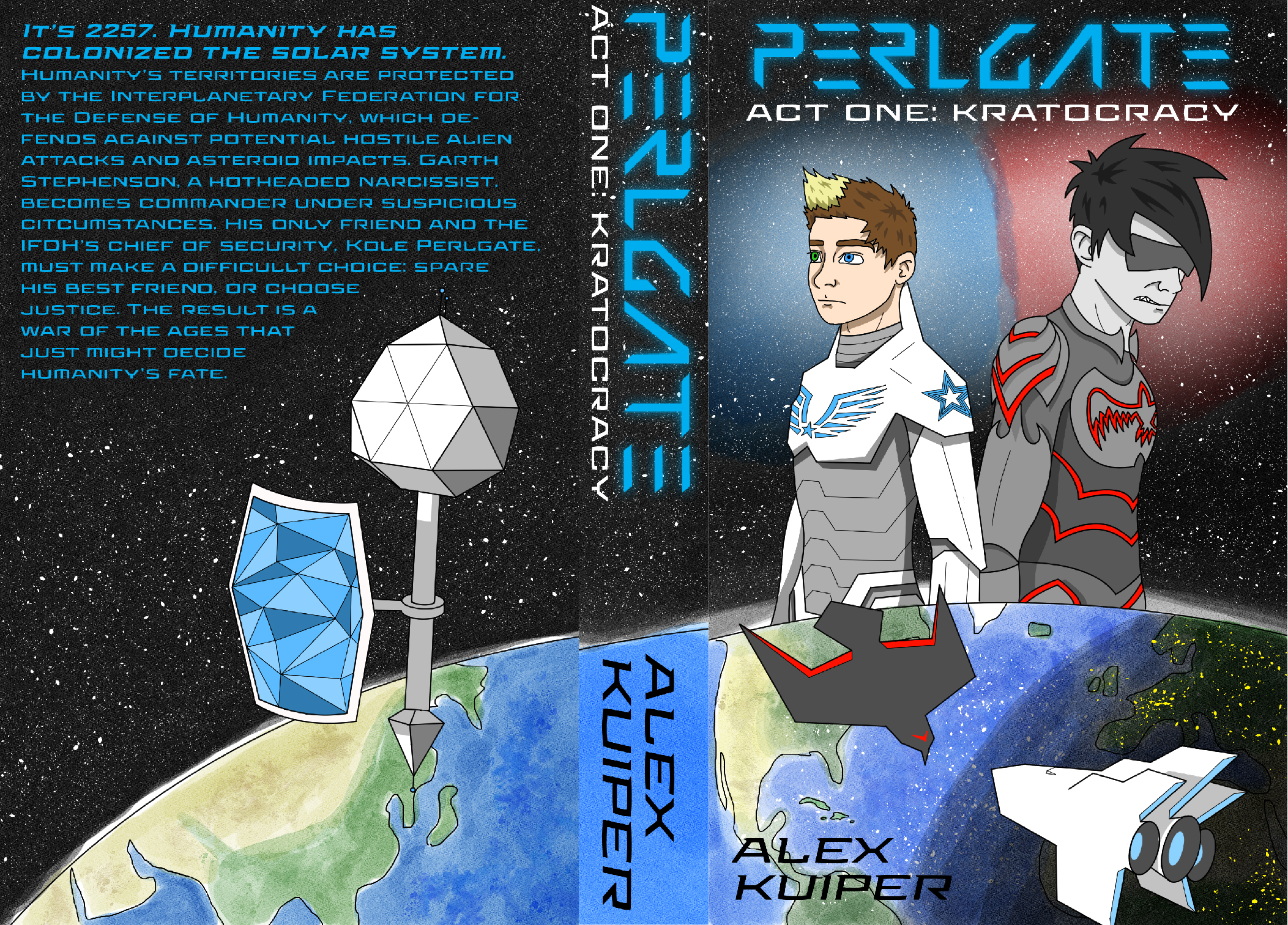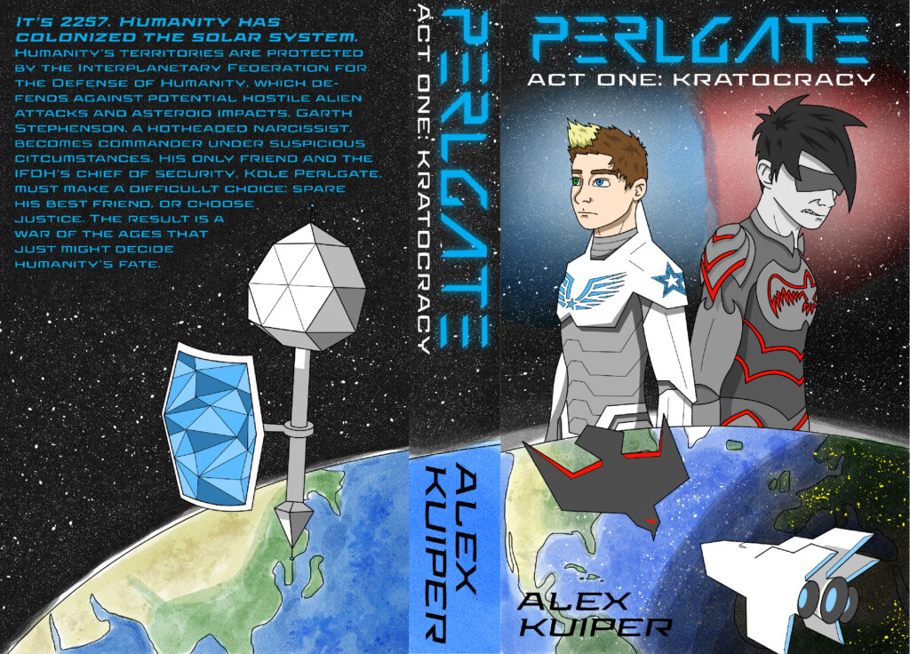
The author says:
I am the author as well as the cover artist.
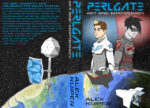
PERLGATE is a young adult sci-fi. The chief of security of a space federation is forced to discharge his best friend after he becomes commander under suspicious circumstances. Longer description on cover.
Issues I’m aware of: I know the earth’s curve doesn’t line up; the program I used to make this (Clip Studio) doesn’t allow multiple artboards to be used in the same file unlike Adobe Illustrator, so I had to eyeball it. I also know my art style makes this look like a graphic novel when it’s really a regular written novel.
Nathan says:
This is going to sound really savage. Please remember that I bear you no no personal malice; I’m just giving you the blunt truth.
If you know that your art style is wrong for this cover, why are you using it on the cover? Your excuse about Clip Studio vs. Illustrator gives me a clue: You don’t think you can afford better. But here’s the point: READERS DON’T CARE. You won’t be able to stand next to every potential reader and comment, “Hey, I know the cover’s not right, but the novel’s really good anyway.” Your cover has to be able to stand on its own, with no excuses. If it can’t, you’re sabotaging your novel sales, and no number of excuses will make up for that.
The second part of the question is, why are you sending us the cover to critique if you know it’s wrong? I think I can answer that: You want affirmation. You want us to say that it’s okay. I get that, I really do; we all want someone to tell us that our mistakes aren’t as important as we think. But that’s not what we do. We bear you no animosity, but we have no soft spot for you in our hearts either. We’re not your Aunt Gladys, who thinks everything you do is just wonderful.
I get being stretched thin and having to decide whether to put money into a cover or make rent. I really do. In this case, maybe you’ll have to settle for a cover that is less customized to your story in favor of it being professional-quality, if slightly generic.
Tough love. That’s what we specialize in around here.