The author says:
History: The Diamond has been out for a while but I am considering a minor tweak to the current cover. Yes, it’s a revision, but I’ve never posted any version of it here before. I’ve integrated the M from the ball cap into the title since the first cover, but thought it might benefit from being bolder and more consistent with my other book covers. The current cover can be seen here: https://i.imgur.com/v4aauIP.jpg
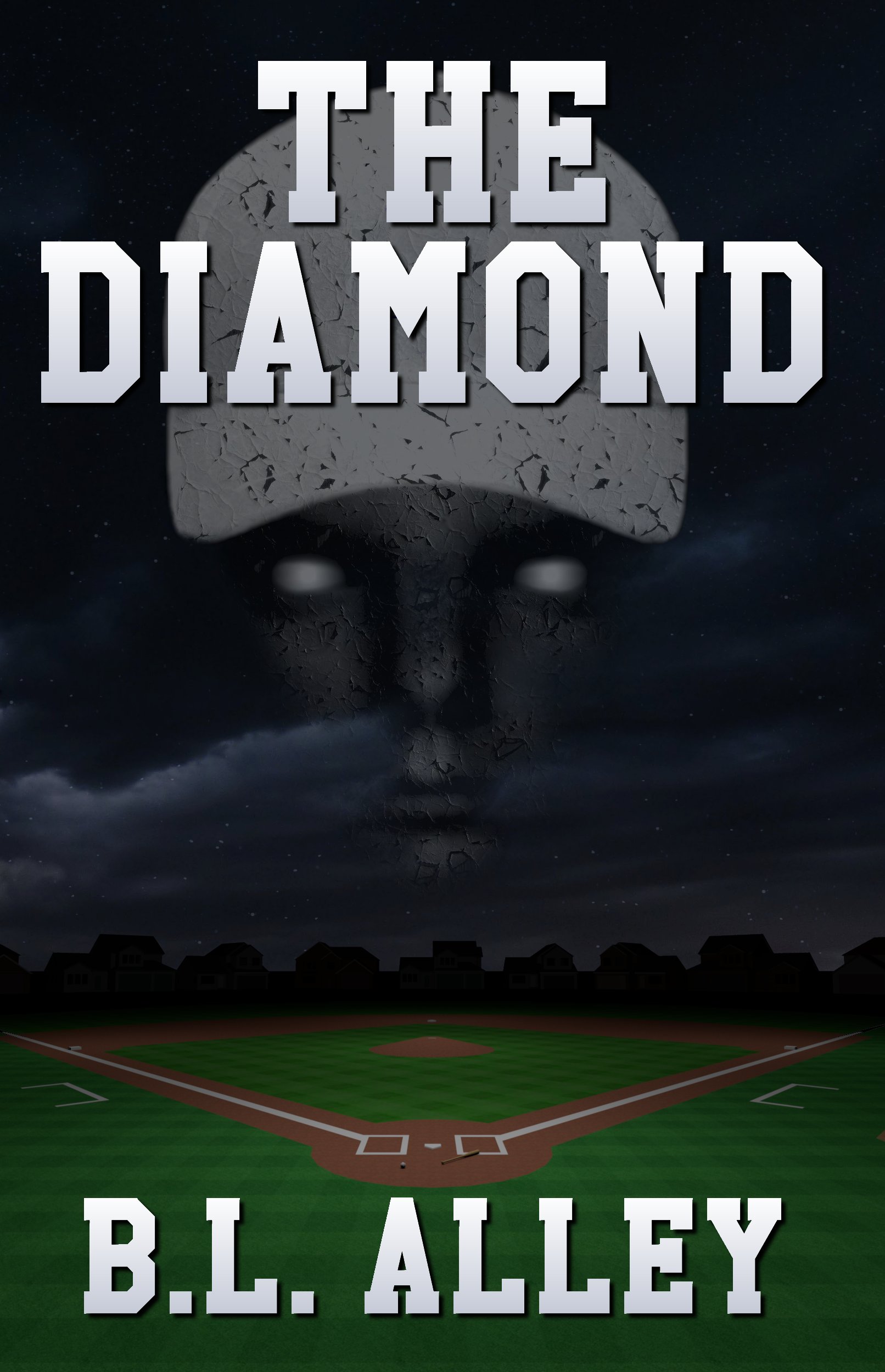
Description: Ethan and Marie Crane are still settling into their first home but all is not well. Their new neighbors are anything but friendly toward them, the builder is slow to respond to complaints, and Ethan begins experiencing a series of vivid dreams which repeat at the same time on the same day of the week. The Cranes leave town for a long weekend of rest and relaxation, but Ethan’s dreams only become more intense, to the point of encroaching on reality. They return home to find the ground beneath theirs and the empty surrounding homes has been transformed into a baseball diamond, complete with a pitcher’s mound under their rear deck and home plate in front of the living room window. Ethan is both astonished and angered by such an elaborate act of vandalism, but as they attempt to uncover the truth they make a startling discovery that profoundly changes their perception of reality.
Audience: Set in modern times, The Diamond is more of an old-fashioned ghost story rather than horror. It would likely appeal more to the Goosebumps or Harry Potter audience than Stephen King or Clive Barker.
Thanks in advance. Let the stoning commence!
Nathan says:
I think your description of the potential audience tells you where this goes wrong conceptually. If that’s truly the audience you expect to enjoy the book, you need to flag for them — a fun “ooh, I’m spooky!” typeface and type treatment, a more colorful cover, and enough of a cartoonish touch to the artwork that the target audience (or their parents) knows that the book might be ghostly, but isn’t going to cause nightmares or otherwise go over the line.
Other comments?
I forgot to mention I’m not opposed to using a different typeface. To be honest, unless someone presents a compelling alternative to the artwork that is achievable within my very limited means, I have no plans to change the image. I’m hoping to capture more attention and possibly better convey the type of story through the lettering.
What about a drawing of a skull wearing a baseball cap or riffing on the skull-and-crossbones motif with baseball bats? There’s a number of similar images at CanStockPhoto at the $6 level, and at 123rf.com at the $9 level (4 credits; and you can buy just 4 credits). Just search “skull baseball” and “skull baseball cap” and ignore the gangsta art.
I agree with Nathan: the cover is too ambiguous.
The art is also a little too murky. There is very little left at thumbnail size. And I don’t think that the cap works at all. It was difficult enough to discern what it was in the original cover, but covering the seam between the bill and the crown of the cap simply makes the face appear to have an inexplicably white head. And the significance of the texture eludes me (and since this texture doesn’t follow any of the shape or perspective of the hat and face, it contributes to making these—and especially the former—look flat).
I think that there are a couple of things you might want to work on. First, increase the contrast so that the cover is not so grey. Second, make it absolutely clear (at a glance) that the figure is wearing a ball cap.
I can’t increase the contrast without losing details, but I increased the color saturation to reduce the gray-ish tone, then brightened the cap and added more of a shadow at the crease. Better?
https://i.imgur.com/Ykg8KcM.png
BL:
Honestly, I thought that was a turban or an…I don’t know what, but I never thought it was a ballcap until you SAID it was. FWIW.
And sorry, but I really don’t love that image. I don’t think it’s great and I don’t think it says anything about what you say this story IS. I thought it was more grown-up Stephen King than HP or Goosebumps. I don’t see anything YA or whatever about it.
It’s definitely not Stephen King, but think more of the adult parts of those kid-friendly books without the juvenile elements.
I can’t see anything but a baseball cap. I realize my mockup text covers a lot of it, but it’s a baseball cap hovering over a baseball field. How do you get turban?
Not the commenter you’re asking, but the mockup text is covering up exactly the thing that says it’s a baseball cap: the transition between the bill and the cap proper. The texture is further divorcing it from “baseball cap.”
The closest I come to having a skull in the story is a man’s rapidly decaying head, but even then it’s only rotten, not stripped, and it’s very brief. The face is taken directly from the story, including the cracking and white-ish eyes.
I agree about the text covering it too much. I’m playing with having “THE” left aligned, if I can find an appropriate typeface.
https://i.imgur.com/NubP50D.png
Different type
https://i.imgur.com/c1nqCZO.png
Bless your heart for saying “typeface” and “type” instead of “font.”
Not to be the Pedant Queen here, but he wouldn’t be using a typeface, snookums, he’d be using A font. 😉 Righty-o?
I know, I know, I’m SUCH a PITA…
Dammit. Hitch is right. It should be “font” in this case.
I like this placement of the font, and the typeface itself has the feel of a collegiate sports team. The texture overlay is problematic, as it flattens the hat and face into one dimension–maybe use the warp mesh or liquify persona to mold the texture to the hat and face?
It’s a real person (half of me) and a real baseball cap. I only added the cracking effect to reflect the story. Of all the people I sought advice from, the few of you are the only ones who didn’t recognize the ball cap. I even polled friends after posting and they knew it’s a cap.
I searched online and in person for a baseball field and found nothing suitable, not even among the paid images. Using the CG field allowed me to perfectly place it and adjust the lighting. I also think a real image would have conflicted with the field in the story since they wouldn’t match, so something more abstract eliminates that conflict. Assuming I couldn’t find a location that matched. Where the field lies is important to the story.
I chose the typeface because it was appropriate for the M on the cap, and using the M as part of the title helps clarify the cap. My intent with submitting this was to get insight on a more descriptive typeface, but after trying the new title and having everyone shit on the cap I decided to keep the original type and format and simply make it bigger.
I also took Ron’s advice and increased the color saturation of the background and hat and it looks much better, especially in thumbnail.
On the advice of a friend I added the ghosts from the story on the field.
I sometimes forget what a contradiction this site can be. “You have to let potential readers know what the story is about” followed by “you shouldn’t include things from the story because the reader doesn’t know it’s part of the story.”
It’s done. I haven’t seen any more advice I can actually implement and I’m never going to sell any books, so I can’t justify wearing myself out to marginally improve my covers again.
I was correct using the term type and typeface since I was referring to the style of the type, not the weight or scale. Font refers to each subset of a typeface consisting of a specific weight and scale. If I wanted an opinion on the size and weight I would have asked “what do you think of this particular font for this typeface?” Instead I was referring to the type itself.
I would do without the texture. It is really not working at all. This is in large part because it looks like what it is: an overlay.
It doesn’t matter too much if the face is literally accurate to the story if it is potentially confusing. Someone shouldn’t have to read the book to understand the cover.
I suspect that it’s clearly a baseball cap to you because you already know what it is.
I chose the image because it was clearly a baseball cap and it’s on the cover with a baseball diamond. I have no idea how that could be any more clear short of adding an arrow with the words “Baseball Cap”
True, no one knows the significance of the face until they read the book, but it lets the potential reader know something other than playing baseball is going to take place. The cover need not reflect specific elements, but we certainly don’t want to include specific things that don’t appear in the story. Then the reader thinks “where was THAT thing in the story?”.
I submitted this for help with the type to better convey the ghost story nature of the book. I have no issue with criticism as long as it’s constructive, but so far you’ve torn apart the image without offering viable alternatives.
I am disabled, can’t work, and exhausted all of my money years ago. I can’t even afford a $6 stock image, so if you can’t help me within my means then take down my submission.
B.L. you are not acquitting yourself well here. People are telling you, “The baseball cap doesn’t work for me,” and you’re in effect telling them, “It does too work! And anyway, I can’t afford to make it work anyway!”
There have been plenty of constructive criticisms, from Ron specifically as well as from others. If you intend to fight back against everyone who doesn’t love it, you’re violating Rule #5 of “Submitting a Cover For Critique.”
And if you can’t afford to improve your cover and don’t want to take ANY criticism except in the minor elements which you think you can bracket off, then you’re right: You shouldn’t have submitted it.
Nor are you. You suggest I am not open to ideas except I am. My current Relative Age cover was completely influenced by the feedback I received here. Yes, I kept the fetus in spite of objections but took to heart the specific criticisms of the original version and found one that looks much better.
With this cover I realized the new title covers the elements of the cap which make it obvious and restored those elements in a later version. However, I stand my my assessment that as long as those elements are present it’s ridiculous to think the average person won’t know it’s a baseball cap. The bill, crease, M, button, title, and image all reinforce the cap.
I also listened to Ron’s suggestion the cover is murky and gray and increased the color saturation. I tried manipulating the contrast but the subtle lighting on the houses and other details were completely lost. I listen, but those were the only useful suggestions. The skull and crossbats idea is clever but inappropriate, and “I don’t like it” doesn’t tell me what’s wrong and how to fix it. No one has yet to address the text, which is what I was hoping to improve to better convey the tone of the book.
When I participate here I am constantly offering alternatives and new ideas including typefaces and imagery as well as descriptions as to why I feel a particular image or layout doesn’t work. Being on the other side, If I wasn’t open to constructive criticism I’d still be using the original, terrible covers I created for my books. I will change every part of the cover if someone can offer an alternative that perfectly captures the story and tone.
Yes, my resources are severely limited and it’s extremely difficult for me to even sit upright for any length of time, yet I managed to write, format, cover, and publish six books. Please stop suggesting my mention of those limitations are excuses. They are merely guidelines within which I must operate.
I get “turban” because it’s more like an image of a genie, I guess, (? Giant floaty semi-transparent head in the sky?) than whatever it’s supposed to be. I don’t “know” that there’s the edge of the rim of the cap, underneath the title. I’m sorry, BL, but you’re…I don’t really know how to say it. You’re projecting what you KNOW onto what you see. It’s a BIT like Pareidolia but more scotomisation–you see what you EXPECT to see–the ballcap. I see what I see–a turban or something like it.
All things being equal, BL…I suspect that I see what most buyers will see. You’re seeing what you expect to see, because you KNOW what you put there.
I thought it was just a stone head with a really big forehead.
Well, nowhere in the original post is there even a suggestion that all you wanted advice on was the type. Only later did you mention that you are “not opposed to using a different typeface.” I also see that you said that you were unwilling to change the image.
Unfortunately the type is, frankly, the least of the cover’s problems. Yes, I told you that elements of the face and hat where not working…especially their readability as to what they are. Two specific suggestions I made were to not hide the division between the crown of the hat and the bill. The lack of shading on the hat works against it, too: it’s too much a flat shape. Another suggestion was to drop the texture overlay. I think that the basic concept may work, but you are hiding some of the very features that help identify it’s elements.
One thing you might definitely consider is rethinking the face. I don’t think that the immediate reaction would be “ghost.” Bluntly, I am more inclined to see “zombie.”
BL, dear:
I’m certainly not trying to pile on here but, you’re like, jonnie-on-the-spot (gender-neutral spelling there) to make new covers for other folks. You make covers like a banshee howls. So of course, we’re all a little confused as to why you’re so adamantine here. Why not treat it as someone else’s cover and whip out your cover magic?
And it doesn’t look like a damn baseball cap, ESPECIALLY in a thumbnail! The only person here who saw a baseball cap–was you. That doesn’t say anything to you? Anything at all?
But, hey, my friend, it’s your book. I’m certainly not going to rag you about it. Your choice.
I’m out on this one. It’s gone sideways a LOT faster than most and I’m still not sure why.
I’m not sure why you’d think I don’t treat mine the same as others, In fact, my practice of throwing out ideas for other creators is based on the creative process I adopted for my own book covers. I know they aren’t great, but I put a lot of thought and effort into them. I believe that counts for something and is usually the difference between the covers and mock-ups appearing here and those on Lousy Book Covers. I have far more respect for those who try and fail than for those who never try. My current covers alone were preceded by at least a dozen mock-ups each before I even arrived at the idea for the final versions. If I saved all of them I’d need a TB of extra storage.
This went sideways because all I got initially was “I don’t like the image” and “I can’t tell it’s a baseball cap”, rather than “X doesn’t work, but if you did Y it might convey the story better while grabbing the potential reader’s interest.” I also received no feedback on the typeface (and font) even though that was my primary reason for posting here.
Until Shelley chimed in, the only suggestions were the skull and crossbones (not appropriate for my book but clever), tone changes (which I heeded), and using a photo of a real field. I tried different many color combinations, and even reached out to the local Little League for both technical information for the book and possible imagery for the cover. The reason I would reject Shelley’s example is because it doesn’t match the story. I understand we don’t want to be too specific, but a cover shouldn’t contradict the story, either. It’d be a great starting point if the boy was wearing a Monarchs uniform and his physical appearance matched the boys in the book. Unfortunately I had no way to put one or three boys in fictional uniforms and makeup and photograph them, so I came up with the face looming over a baseball field.
I tried dozens of images before I found one that was objectively identifiable as a cap, and even then I came up with the idea of using the M as part of the title and making ‘THE’ small and placing it to the left to make that more clear. That idea is validated by my submission above which covers every part of the cap identifying it as such. Even I have to admit in that example it’s difficult to identify the cap. When I came up with that original concept I showed the image to friends and family and posted it in different forums. No one failed to identify it as a cap. That’s why I kept it.
Shelley’s cover contradicts the story, exactly, how? I’m not arguing, I’m asking. I’m wondering if there’s a way to utilize it with a few small tweaks.
This is what I would do for a book like this.Trade out the sky for one with shades of purple, blue pink and orange. Use a real kid in a cap but make him ghostly while keeping the color in the cap. Make sure the color of the cap compliments the sky.
keep your grass nice and bright green like it is now but lose the dark horizon.
raise the boy and put title across the center in the dead spot between the boy and field. I might give the title a slight sheer. I might pot a ‘motion’ effect on the first or last letters.
I’d definitely pick a decorative font, probably one with overdone sharp edges but that would depend on the tone I was trying for, which in this case I think is dangerous fun but I could be wrong.
You might be better off with a really round font, one that looks puffy. That’s the sort of thing you need to play with because the art will determine what type of font should be used to portray the correct tone overall. if you’re going for playful and the art isn’t playful enough making the font very playful will work but if your art is very playful you’ll want a ‘scary’ font
I’d probably use strong shading on the title and very likely a bright color. I’d probably use glow. It might be fun to use a baseball for the o and maybe giving it a ghost effect.
It might be better to lose the floating head and put a ghostly boy on the field because floating heads are hard to pull off. then you could have a baseball ‘traveling from the field to the title.
This might be a great cover for a silhouette, one of these with the picture inside the shape
https://imgur.com/a/5P5ziaS
something like this. -(made from all free pictures)
colors that are kid friendly -one integrated picture.
I’d go with a different font though for the tagline if my target audience was late teens young adults.
I really like this. It definitely communicates “spooky, but OK for the 8-to-12 crowd.”
So people have criticized the face, the hat, and the typography. I’m going to be the big jerk who criticizes the baseball diamond.
Why use a CG ball field? Surely it’s easy to find stock images of baseball diamonds. A photo would not only make it look more natural, it would make it look spookier, since it would look more worn and irregular instead of unrealistically smooth and crisp.
PS I love the story conceit, though.
Or even go to a nearby high school or college baseball field and take a photo.
It seems to me that like many an author, you’ve grown so attached to a single idea (having a letter on a baseball cap integrated into your title) that you don’t want to try anything that doesn’t use that idea. Even aside from being all too obviously being rendered, though, the image itself seems far too serious for the kind of story you’re telling: remove all the text from the cover, and what does a prospective reader see? That blank-eyed marble sculpture of a baseball player hovering over the field amid stormy weather has me thinking of an idol from some ancient heathen religion: “You puny mortals have angered Ace, the ancient god of baseball!” (Never mind that baseball can’t be too “ancient” since it’s only existed in anything resembling its current form for about two centuries.)
As the Savoys noted, the Goosebumps-reading crowd that is (presumably) a substantial portion of your target audience prefers that whatever horror you’re depicting on your cover be shown in a lot of “kid-friendly” bright and cheery colors to indicate the story isn’t really too terrifying for younger readers. Dark and stormy skies over a bleak and empty baseball field hardly seem to match that description. Now take a look at an actual (somewhat) baseball-themed Goosebumps book cover: while I definitely wouldn’t have wanted that creepy-looking freak in his uniform to be my baseball coach at a summer camp when I was a kid, you can see from the bright and cheery colors that the “horror” depicted on this particular cover is really all in good fun, can’t you?
Like those ghost stories you mentioned, typically told around a campfire and intended to elicit giggles from the listeners rather than shrieks of terror, what the picture on your cover should be saying to your prospective reader is “I am trying way too hard to scare you.” That’s why the covers for R.L. Stine’s Goosebumps series use “horror” fonts that are actually goofy rather than scary, and why we typically recommend against using the same kinds of fonts on the covers for serious horror novels. Where we critics would typically tell the author of such serious horror to “Get it right!” when picking out a font, we’re actually telling you to “Get it wrong!” here: as in, pick out some font so ridiculously gory or rotten or slimy (depending on what kind of “horror” you’re pretending to be depicting) that no one can take it too seriously.
As the more competent and experienced advertisers who design movie posters for “horror comedy” genre movies can tell you, the secret of designing these covers is to take some relatively ordinary picture related to your story (e.g. something to do with baseball in your case), make just one thing a little “off” about it (e.g. the pitcher’s eyes are glowing, or there’s a pentagram on home base, or blood is dripping from the scoreboard), slap your title in one of those goofy “horror” fonts down on it, and then maybe add a tagline with some kind of lame pun or wordplay or absurd hyperbole in it. A nigh-perfect example of this: the Canadian horror-comedy Parents, which is a movie about a little boy in the 1950s gradually discovering that his loving and seemingly wholesome and clean-living suburban-dwelling parents are cannibals. Notice how, were it not for that overwrought title and tagline and the human skull in the freezer, the picture on the poster would be a perfectly mundane (if perhaps nostalgia-inducing) domestic scene from the 1950s.
Go thou and do likewise. The apparently demon-possessed pitcher in S.M. Savoy’s mockup may or may not be the right image to portray the otherwise seemingly mundane subject of baseball as a menace to your protagonists, but either way, that’s the effect you want: the mundane made “menacing” in an absurdly over-the-top way. I’d also consider adding a silly tagline; since your summary suggests the menace in question has to do with a baseball field displacing the protagonists’ homes, I’m thinking maybe something parodying the Field of Dreams slogan: “If we build it, will you please go away?”
Just because I participate and try to keep the suggestions within my capabilities doesn’t mean I’m not open to new ideas. I came here hoping to discover a new typeface that would instantly suggest “ghost story that’s not goofy yet not to be taken too seriously”. As I said in another reply I only used the M as part of the title to better sell the cap, and that is what dictated the use of the high school school typeface. I have spent countless hours searching font sites for such a thing with no luck. They are either too goofy or dripping blood. I tried the technique I used for the back cover, having it turning into vapor, or crumbling, but none show up well in thumbnail. I used a dripping type for some marketing material but it felt out of place.
Maybe Goosebumps wasn’t the best example, or at the very least I should have said it’s for Goosebumps readers who have become adults. In the back of my mind I thought of it as Field Of Dreams meets Poltergeist (which was rated PG).
The story involves three boys who have been killed by a bulldozer when they were protesting the destruction of the baseball field. That event is found to be related to the current happenings as well as the neighborhood’s anti-social reaction to the MCs moving in, and their outrage toward the greedy builder and anyone associated with him. It’s also about the MCs (and others) realizing there is more to life than our corporeal existence. Beyond that it’s fairly light with a couple of moments of fright for the characters, crushed shins, a shovel to the head, and a suicide with a gruesome twist. I wasn’t keen on killing the boys within the narrative so their deaths occur before the story starts and are only discovered later in news articles.
I really like the idea behind Shelley’s mockup and tried making something very similar to that when I was first revising the cover, but I simply didn’t have the means to make it fit the book. The first cover was a ‘painting’ of the actual neighborhood from the book with the focus on the field. A bulldozer sat in the middle with Police tape around three evidence markers in the trench created by the blade (where the boys were killed). The floating head was overlooking the scene. The image was far too busy, and even at paperback scale it was too hard to make out the details. I went abstract, using the CG field but with a simple gradient for the background and the face hovering. That was too simple and boring, so I added the clouds to provide color and texture and better integrate the face, and the row of houses behind not fully lit but also not completely in silhouette to suggest the isolation and sadness of the neighborhood.
Everyone here needs to understand most are submitting their covers here because they lack the means to hire a professional artist and need all the help they can get to avoid ending up on Lousy Book Covers. That’s why I am so quick to show a variety of alternatives that can be done with free images, basic tools, and little or no money (none I my case) by putting in more time and applying a little more effort. Even basic software can do layers, color grading, shading, drop shadows, and other simple tricks. Even when they still aren’t professional quality it becomes obvious more thought and effort was put into it compared to the “art for refrigerator” and poorly composited “pseudo-human” covers.
Probably the biggest hurdle is your conviction that the choice of typeface will carry the cover. It won’t…especially if the cover image—which is the dominant feature of this (and most) covers—works against the impression you are trying to achieve. The fact that everyone in here went straight to the image simply underscores how important it is.
I see where you describe a number of alternate attempts at a cover image. I wish we could have seen these. Perhaps more could have been done with them than you thought. But since I see that the floating head is mentioned as being in all of the previous cover ideas, this may be a device you are much too locked into. What you might want to do is sit back and rethink the cover from scratch…and from an entirely new, completely different direction.
As ever, with a story as fascinatingly complicated as you described, it’s probably best not to try to put all the plot points on the cover. In fact, this being a baseball-themed ghost story, just integrating the title into a logo and having it dripping with blood (to symbolize the probably-not-entirely-accidental deaths behind this haunting) should probably be enough. If I were making a cover for your story using the cover aspect ratio you’re using, it would probably look something like this:
https://i.ibb.co/MhFsfyB/The-Diamond-Cover-Proposed-Revision.png
If you’re trying to integrate the M into the cap make the M look sewn on, use a different font from the rest of the title and probably a different color. It needs to look actually sown on, made of thread, or nobody is going to ‘get ‘ it.
I’d also use a fixed-width or monospaced font so that the DIA and OND took up the same amount of real estate on either side of the (presumably centered) M on the cap.
like dis: https://imgur.com/fZt05UG
The downside is, free-for-commercial-use monospaced fonts are pretty plain, so the art has to do the “light-hearted ghost story” work.
I found this image and thought it had potential for a complete re-do, but am stull struggling to convey ghost story without the face.
https://i.imgur.com/Xcj2TCi.jpg
Ghosting the title
https://i.imgur.com/xzIzUaz.png
This has some serious WOW factor! I don’t know if I get ghost specifically, but I definitely get both supernatural and baseball–would click for the blurb!
And going back to the original cover concept…
https://i.imgur.com/oT8ANRu.png
Trying to integrate the title into the clouds to make it more apparitional. I know it’s hard to read, and any feedback on the idea or how to make it stand out while still blending into the background would be appreciated
https://i.imgur.com/kRBEQ2D.png
You know what, BL?
I like that a lot, particularly compared to the original. I think you’ve really done a 180 on this and you should be pretty pleased with that one.
If only I can figure out how to say ‘Ghost Story’ without saying “Ghost Story”.
That’s an excellent cover as is, though I’d increase the saturation as much as you can without banding it, and change the color gradient on those letters to full white on the top and bright arterial red on the bottom (both to symbolize bloodshed and to make the text more legible in thumbnail by contrasting it with the background).
I desaturated the image to make it more gloomy and chose the gradient so I could blend the bottom of the title into the clouds.
Here is your idea:
https://i.imgur.com/DlRFpHU.png
I like that, but I liked it a bit better with creepy ghosty clouds? I love the deepened saturation.
https://i.imgur.com/jwQczCE.jpg
Hmmm….something’s not quite-quite.
Guys? What can BL do, to make the lettering ghostly/cloud-ly, without it looking like it’s dripping to death?
Put the rusty red on the bottom as before, and don’t rub it around or fade it into the clouds too much when slurring it; think of it as being like the “pink mist” supposedly created by blasting a guy with an explosive artillery round.
Extended drop shadow only…
https://i.imgur.com/NaueW6l.png
oooohhhh, I like that, RK. Nice eye.
Any thoughts on the byline treatment?
https://i.imgur.com/IygRddU.png
If you’re using the same typeface, no reason not to use the same gradient. It’ll stand out against the grass just as well as the sky since red is a “hot” color and blue and green are “cool” colors.
The skies still look nice and gloomy, and again, those bright colors from an R.L. Stine cover help reassure everyone it’s not too scary of a ghost story. You seem to have doubled the saturation, which is good, but double it again and you’re there (and you can get away with doing this because the graininess of the picture keeps any banding from being visible).
Doubled again, title fading without the smudging…
https://i.imgur.com/k1g5kIk.jpg
I’m not completely sold on this saturation level, but have an idea to make the shadow more consistent.
I tried the same white to red with the byline but it didn’t look good, so I stuck with the yellow of the blade. I ‘smeared the red down but now added white smeared upward to represent ‘ascension’, and to balance it.
https://i.imgur.com/tpEVFXd.jpg
Now that I have a solid idea no one will comment?
I think that’s because it’s all over but the tweaking and you’ve pretty much got your final draft there. If you hear no more complaints, go ahead and run that as your cover.
It would have been nice to have the group issue their stamp of approval so I can run it with confidence. My local help likes it, but she still tends not to be totally honest with me and instead tells me what she thinks I want to hear.
I’m not convinced the last version does enough to convey paranormal, supernatural, or ghost story.
I’m good with it. It’s dramatically better than our starting point, BL.
What about the 4 below?
I’d say you’re trying a little too hard. Stick with the straightforward lettering and a rusty red gradient. Since the deaths happen before the story, that hint of dried blood should be sufficient to suggest there was some skullduggery behind the bulldozing of the baseball field.
I was thinking the same thing as I waited for the page to reload.
I think this one is the best overall version: https://i.imgur.com/tpEVFXd.jpg
I also like the yellow from the blade in the byline.
Thanks to everyone who helped.
Two final ideas:
Straightforward Lettering – https://i.imgur.com/b7CJ7QL.jpg
Crookedforward Lettering – https://i.imgur.com/G1vZo6N.jpg
I can tweak the title glow and opacity
… and two variations…
https://i.imgur.com/zpQAjBr.jpg
https://i.imgur.com/G8yROSX.jpg
Since there’s been no activity I’d like to ask a question. This might come off as snarky but that is not my intent. I am genuinely curious and a logical explanation can only improve my graphics work going forward (Which I doubt will be anything more than future mockups for other authors).
Why is my ghost face a bad idea because the potential reader doesn’t know what it means even though it’s directly from the book, but the bulldozer and baseball image works even though its relevance is still unknown and is a stylized depiction of an event which takes place before the book starts? Anyone?
Personally? Since you ask, my problem with the “ghost face” cover is that I wasn’t really seeing a ghost there; as mentioned in my critique, it looked more like a marble statue of a baseball player. I should probably also mention that in that particular pose, I could have mistaken its partial transparency for being a partial reflection such as one sometimes sees when staring through a window. That everything on the cover was pretty obviously rendered graphics didn’t help either.
With the “bulldozer and baseball” cover, the symbolism is hard to miss: what is that innocent baseball lying in front of a vaguely menacing bulldozer likely to suggest to a casual viewer even before you caption it? Bulldozers are for… well, bulldozing things; a baseball is for… playing baseball. So the image on the cover fairly shouts to people that this story is about baseball getting bulldozed.
The defenders of a baseball field that got bulldozed quite literally over their dead bodies (if I’m reading your synopsis right) evidently got their posthumous revenge by supernaturally bulldozing the development that had replaced the field and reinstalling their beloved baseball diamond. Now as you point out, this whole incident that touched off their desire for revenge took place before your story even begins; as much as this is a ghost story, however, that also means it’s a tale of a haunting. Without spoiling the mystery too much, the blatant symbolism of the cover effectively shows people exactly why this haunting is taking place.
Such effective symbolism is the kind of brilliant design we cover critics live to see. Consider another ingenious cover image that manages to be loaded with innuendo relevant to its story without being the least bit pornographic: Allissa Nutting’s Tampa, to which numerous self-publishing authors referred during a controversy over Amazon’s censorship of some of their racier novels. Incidentally, from personal experience, I should warn you it’s inadvisable to go looking for a larger version of that particular cover on a reverse image search engine with the safeties off if you don’t want to see some actual pornographic images listed in the engine’s “similar results” section.
Does that cover tell you that it’s a story of a beautiful and yet sociopathic young middle school teacher who’s shamelessly molesting her 14-year-old male students? No, but it’s almost impossible for those past the age of understanding to miss how the cover image symbolizes that this is the story about a woman’s… um, buttonhole (and what she does with it). Again, that kind of immediately accessible symbolism is what we cover critics live to see.
Remember too that the relevance of the symbolism to the story is only part of how the cover image sells the story. The other part is how the image appeals to the prospective reader viscerally: how it feels as much as (if not more so than) what it makes the reader think. Book covers and movie posters have sometimes gotten away with outright lying to the target audience about the story’s contents when their image is striking enough. Case in point: one of the posters for the movie Escape From New York showed the head of the Statue of Liberty broken off and lying in the middle of the street with graffiti scrawled all over it, whereas in the movie itself the Statue of Liberty was quite intact and never got ruined that way; this later inspired the indie writer and director of Cloverfield (who was irritated that the poster had lied to him) to write his story in which the Statue of Liberty’s head actually does get ripped off and tossed into the streets of New York City during a monster attack, and to show a broad shot on his poster of the Statue of Liberty standing there smoldering with its head missing.
Your baseball-and-bulldozer cover grabs people by the heart and spine by showing a bulldozer threatening that innocent baseball. Allissa Nutting’s cover grabs people by their… lady parts (if they have them) or the comparable manly parts (if that’s what they’ve got) by showing them something awfully reminiscent of a lady part. The Escape From New York poster grabs them by the patriotic and social parts of their hearts by showing a beloved national symbol being ruined and degraded in a miserable-looking future.
Your rendered baseball-player-statue-overlooking-a-baseball-field cover… just doesn’t really grab people by anything in particular. That’s why the symbolism isn’t all that accessible. That’s also ultimately why your cover needed an upgrade to that more viscerally appealing image of a bulldozer threatening a baseball.
Thank you for taking the time to present a thoughtful and detailed response. It will certainly also help when I approach future cover mockups.
“It doesn’t work” and “only you know what it means” was not helping solve the issue and I never got much helpful feedback beyond color grading. The one positive was that my frustration led to spending several days searching for imagery, and that is how I happened upon the images and eventually combined them to have the machine threatening the ball (it’s also some of my best compositing considering the ball’s thread and blades of grass).
It’s funny how I ended up revisiting the original cover concept, but in a much bolder and more articulate manner. In that way it now has more in common with the Relative Age cover, both depicting the object which drives the story.
FYI, the story is less about revenge and more about completion, but it has its moments.
Thanks again
I personally don’t love the bulldozer covers (I think Savoy’s cover was the best), but mainly it’s just a) the ghost doesn’t look that much like a ghost and b) it’s not very dynamic. So, really, it’s a matter of execution more than a matter of concept. The bulldozer covers are very slick and they present a sense of imminent threat. I think a cover of a ghost on a baseball field could work perfectly well, it just needs to be a bit tidier and the ghost needs to be actively doing something instead of just hovering there.
I agree, but I have no way to do that and searched through thousands of images for a boy or boys playing baseball that were generic and isolated enough to turn into ghosts, but had no luck. Once I found the ball and dozer images I knew it would at least be more eye-catching. It’s done, and so am I, so it’s a moot point now.