The author says:
In late 1999, Deak and Marie work for different businesses in the same office complex. At the big Halloween party, they each meet a heartthrob from the other’s office. Once they discover this, they decide to help each other spy out clues to win their crushes before New Year’s Eve arrives, and the dreaded Y2K bug destroys us all.
This is a light-hearted romance — not sauna steamy, just a portable tea kettle. I’m trying to appeal to people of any age interested in art, games, and computers (aka nerds and geeks like myself.) It’s strictly Teen YA, and I intend to let my 6th grade daughter read it.
Nathan says:
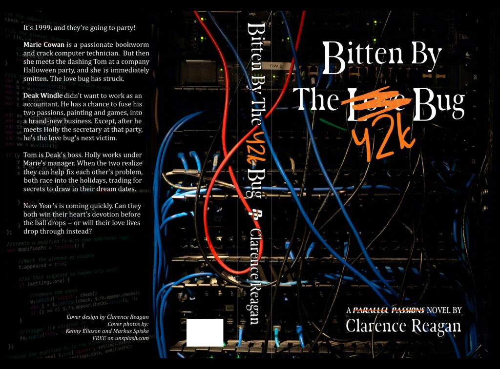
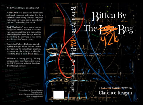
There are no huge problems, but I think you can see what needs to be fixed by looking at these smaller versions: The type is hard to read, and the background fades into irrelevance. Remember, most readers are going to see your book cover first in thumbnail, and only if that hooks them will they click through and see the rest. So make the type larger and easier to read from a distance. Can the background do something more than just be there? Maybe a pink color scheme, or something to help indicate the romance story?
Other comments?


Looking at the front cover by itself (which is how most people will first see the book), the image doesn’t convey much. It’s mostly a relatively empty, dark space. What little of the computer circuitry that is visible is just a few colored lines. Other than suggesting “computers” in a very generic sense, there’s really nothing that relates specifically to the book you describe…that is, a light-hearted romance. And there is always a problem with the slightly over-clever idea of crossing out one word in the title and substituting another: What is the actual title? After all, you have something different on the spine. Your main issue, though, is to get an additional visual element into your cover that conveys the nature of this book, its idea and theme.
Well, from my perspective, it’s too dark, far too busy, and it doesn’t say genre to me—not which genre, or if it’s genre, if it’s LitFic…I can’t get there from here.
But the thing that grabs at me is that when I see it, all it says to me is the question, “What is the answer to the Ultimate Question of Life, the Universe, and Everything?”
And the answer is…42..
Just sayin’. That’s what the Y2 looks like to me–forty-two. Sorry. (H/T to Douglas Adams.)
Hitch
The first impression I got from this cover was… “computer server innards,” and that’s all. All it told me was that the story’s got something to do with computers. Even the title didn’t help much, as I could barely see the scratched-out word and even once I did, figured it could mean “No time for love, junior programmers; you gotta help us squash the Y2K bug!”
What your cover mainly needs is a human element to it; this being a romance concerning two computer geeks pursuing each other’s coworkers as love interests in 1999, I figure it should have people on the cover as one sees on the cover of… well, just about any kind of romance novel really. Feeding a summary of your story’s premise into the Deep AI Image Generator, I got it (after several tries) to give me this: not a particularly steamy picture, but gal and guy alike look like (reasonably attractive) computer geeks, the setting does look roughly like an office in 1999 (which is probably making a few people nostalgic already just looking at it), and simply having one gal and one guy present suggests the potential for romance without absolutely promising it. (From your premise alone, it occurred to me you might be thinking to have these two platonic lovebirds’ plans to pursue their crushes fall through and them end up turning their romantic attentions to each other in a twist nearly all experienced adults would see coming but a sixth grade reader might not; or alternatively, you might be planning an “untwist” in which their plans don’t fall through and they both end up happy with their love interests after all, thereby teaching the social value of having a platonic relationship with someone of the opposite sex.) However it goes, this kind of ambiguity would serve you well.
Notably, a number of the pictures the AI generator spat out at me reminded me of the state of technology in 1999: while flat screens were a lot more common by then (especially in offices), the monitors for computers still typically came in a 4:3 full screen ratio, the transition to making 16:9 wide screen the new standard for practically every kind of monitor still being several years away. Whatever else you show on your cover, it should likewise show technology fitting to the setting’s time. The characters’ having glasses to show that they’re computer geeks is also entirely optional in my opinion, but Deep AI (at least) seems programmed to believe that they are a necessity; make of that what you will.
Now I’m not saying to use this exact image, since (among other concerns) it might not be quite high-resolution enough for your needs anyway, but I am saying this is the kind of image appropriate for a YA light romance novel. Depending on whether you have anything specific in mind for each of your characters, you might want to waltz around with one of those free online AI image generators yourself. See if you can come up with a somewhat more human-oriented image for your cover, and then we’ll consider the finer points of adjusting the title and byline and where they should be placed on your cover.
the cover doesn’t fit the genre at all. You need something that ‘says’ lighthearted to attract the right reader.