The author says:
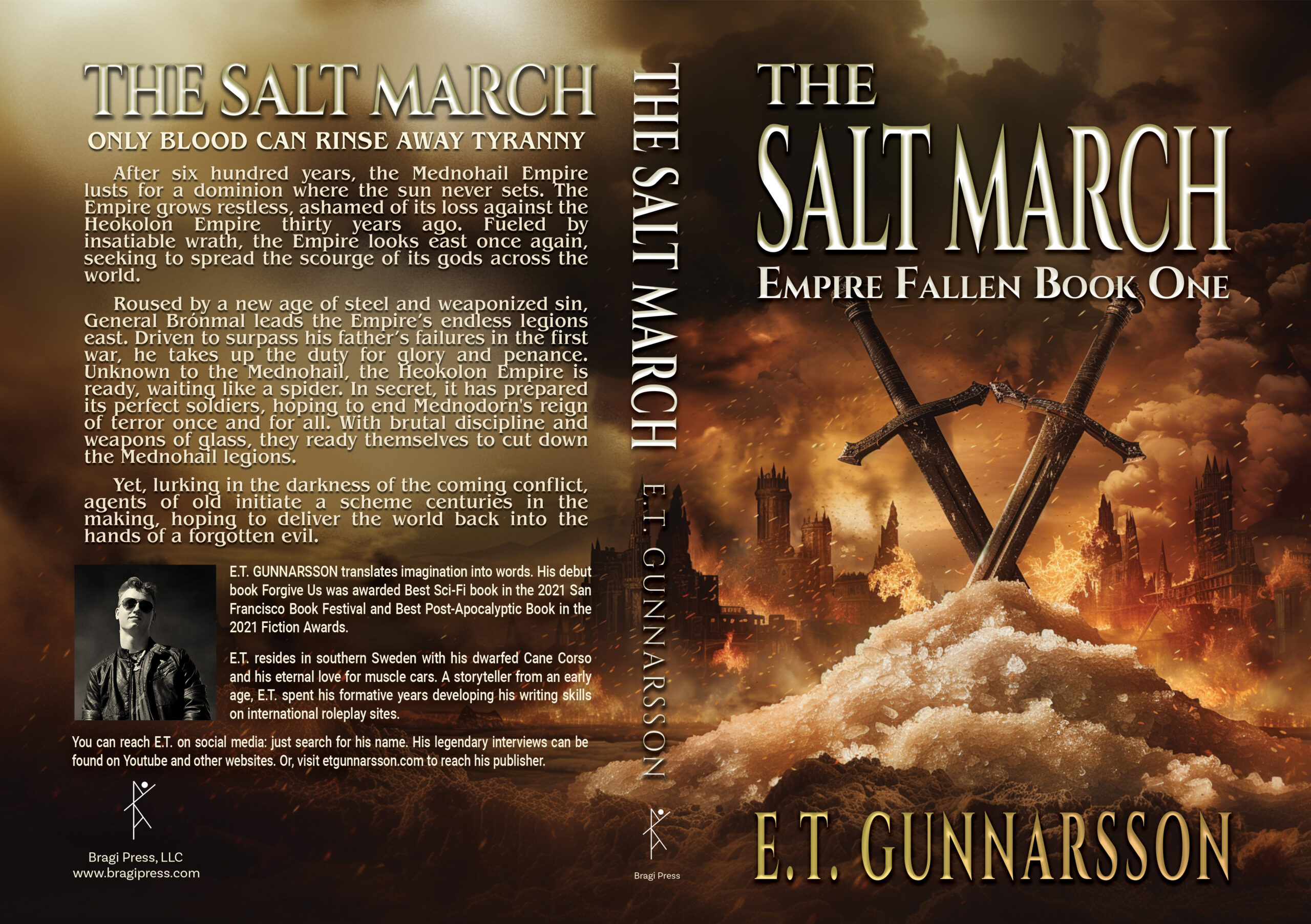
ONLY BLOOD CAN RINSE AWAY TYRANNY
After six hundred years, the Mednohail Empire lusts for a dominion where the sun never sets. The Empire grows restless, ashamed of its loss against the Heokolon Empire thirty years ago. Fueled by insatiable wrath, the Empire looks east once again, seeking to spread the scourge of its gods across the world. Roused by a new age of steel and weaponized sin, General Brónmal leads the Empire’s endless legions east. Driven to surpass his father’s failures in the first war, he takes up the duty for glory and penance.
Unknown to the Mednohail, the Heokolon Empire is ready, waiting like a spider. In secret, it has prepared its perfect soldiers, hoping to end Mednodorn’s reign of terror once and for all. With brutal discipline and weapons of glass, they ready themselves to cut down the Mednohail legions. Yet, lurking in the darkness of the coming conflict, agents of old initiate a scheme centuries in the making, hoping to deliver the world back into the hands of a forgotten evil.
Nathan says:
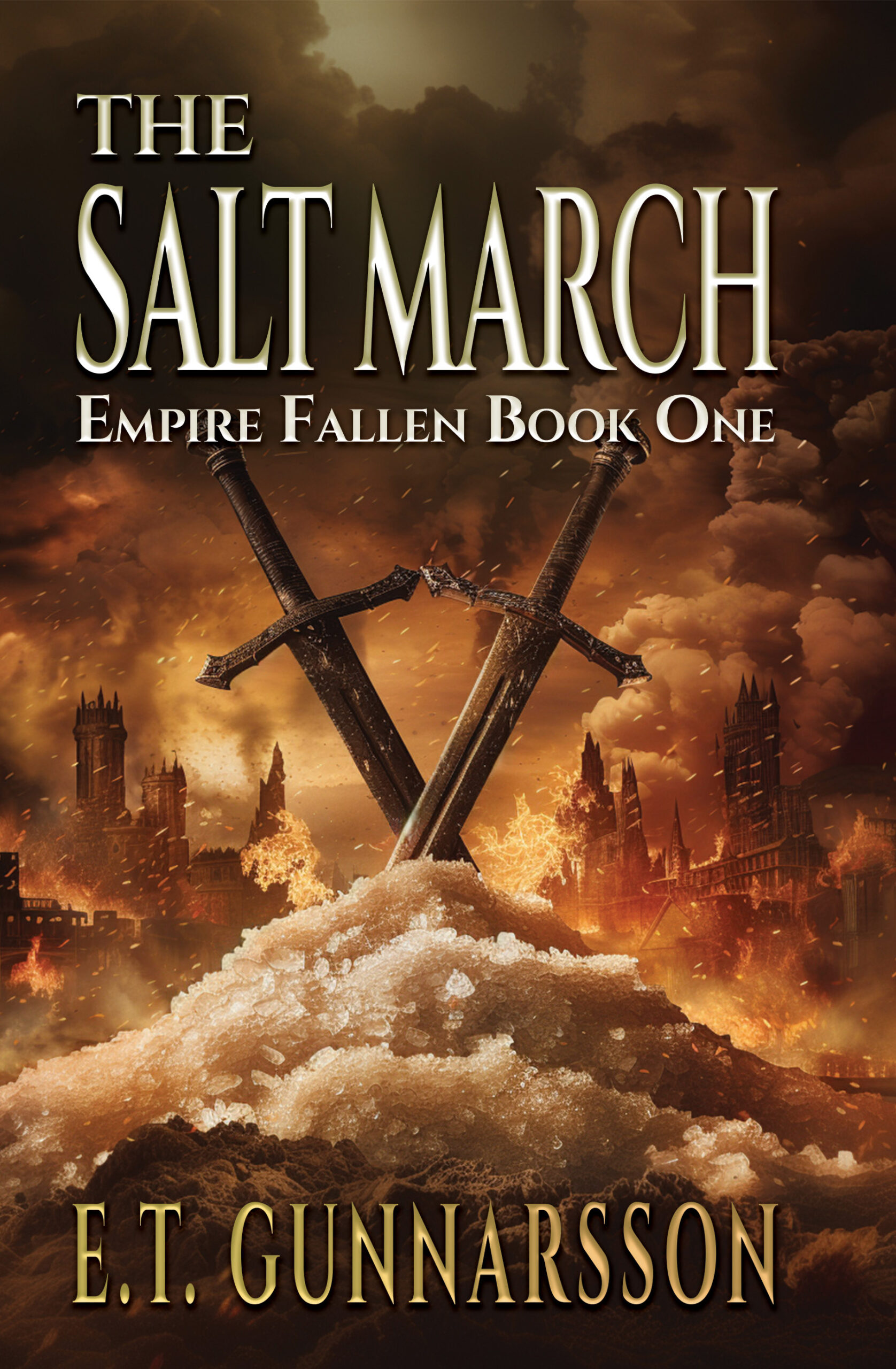
The first thought I had was, “Lower the swords!” Pull them down so that the text doesn’t overlap the pommels. All we’d lose is the bottom edge of the pile of salt, which isn’t essential visual information.
Anyone else?
My biggest problem with this cover—which otherwise is pretty nicely designed—is that it is not very informative. It’s two swords stuck in a pile of what I can only presume is salt. Aside from seeming to be a very literal depiction of the title, any significance it might have would seem to depend on a prior knowledge of the book. The blurb doesn’t seem to suggest any sense of what the cover might be trying to convey. (The only historic Salt March I ever heard of occurred in 1930 in India. If it has any other meaning, then that eludes me.)
The cover is technically well-rendered, typical AI stuff for a fantasy genre. The blurb read like a string of keywords and tedious to wade through. What does this mean? “Driven to surpass his father’s failures in the first war… Does it mean he wants to be even a greater failure than his father?
So the author of a post-apocalyptic trilogy we’ve critiqued on here is now doing what looks to be dark fantasy set in a world something like ours in the late Medieval period. Fair enough, but three nitpicks do immediately occur to me:
A) While the symbols on the cover are sufficiently universal to be understandable even outside the book’s context, they’re a bit bland and generic. Are we to assume that like Assyria and Babylon, these Mednohail and Heokolon Empires are very similar to each other in tactics and weaponry and the ethnic composition of their peoples? Even if so, it seems to me a pair of banners or shields showing the opponents’ differing coats of arms (even if, as with the Houses of Lancaster and York in the War of the Roses, they use similar symbols) might be a little more interesting to a prospective reader; and if they’re not all that similar (e.g. if they’re more like the European peoples of Rome vs. the African peoples of Carthage), maybe having the weapons differ from each other—e.g. a sword and an axe crossing each other—would convey this point. (I notice your summary mentioned one side using “weapons of glass” to its advantage, which sounds intriguing; maybe you could show us one of those glass weapons?)
B) Like Joann, I was also wondering about that “Driven to surpass his father’s failures…” line in your summary. Considering that unlike people working in the various sports and entertainment industries, there’s no means to fail one’s way to fame and fortune in war, should we assume the general in question actually wishes to surpass the initial successes his father’s campaign had before it ultimately failed (by, y’know, not ultimately failing this time)? If so, you should definitely clarify that in your summary on the back cover, e.g. “Driven to surpass the glories of his father’s initially victorious campaign, which ultimately ended in defeat…”
C) Dark fantasy though this may be, is the same washed-out red-tan-and-black color theming you used for the covers of your post-apocalyptic trilogy of novels really appropriate for books set in pre-industrial times? Even the covers of George R.R. Martin’s A Song of Ice and Fire novels have more varied and vibrant coloring (i.e. they’re mostly gold-and-scarlet themed, but with some splashes of silver, blue, and green as well). I’d recommend at least using some colors of gleaming metals (i.e. silver and gold) and brightly dyed cloth on your cover as well rather than the sickly post-apocalyptic colors of dust and rust and sludge you’ve got now.
On the whole, you’re off to a decent start; but if you’re shifting genres, you need to shift your cover designs as well to match the new settings. The idea of salt being a treasure for which kingdoms would go to war is not so far-fetched, especially considering that—as I recall—certain salts are rather important to the process of glass-making, are they not? Still, if you’re wanting to portray a pile of salt crystals as a treasure trove, then try to make them look all bright and white and shiny like diamonds; not dull and tainted yellowish-brown like something that looks like it was scooped from a cesspit.
Thank you for the critiques, much appreciated! The sword placement issue has been fixed. A new blurb is in the works.
The other four covers in the series are more colorful. I will consider your input and see what can be done with this cover.
Again, thank you so much for your help.