The author says:
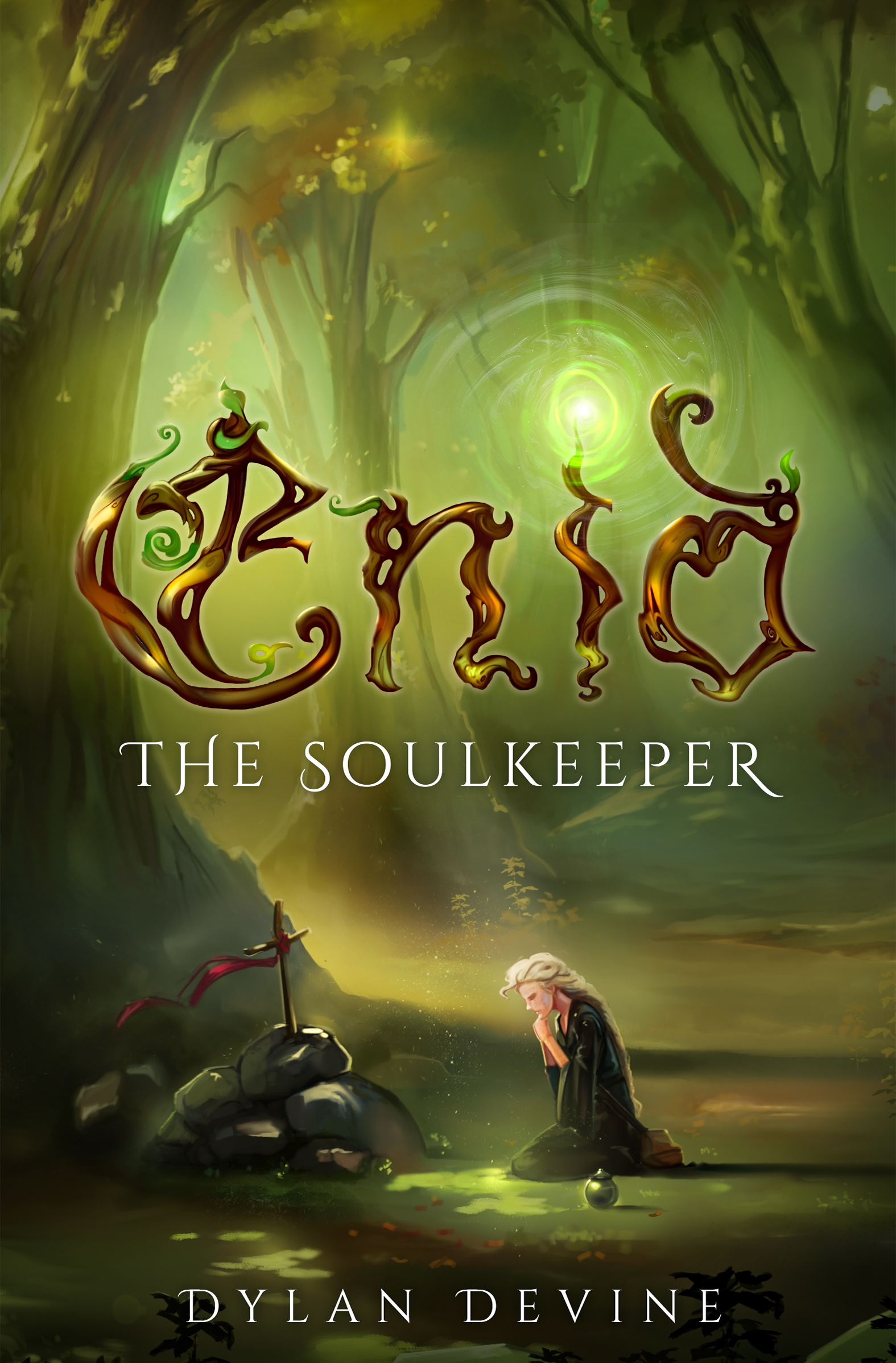
An epic fantasy novel written like a historical novel with Catholic themes; the story follows a 20-year-old woman named Enid, who has the ability to make others tell the truth, but can’t tell any lies herseself, as she tries to stop a supernatural disaster. While it is fantasy and is set in a fictional world, it’s written with a hyper-realism in mind, and the prose is very similar to Tennyson. The target audience would likely be adult women or older adult women who enjoy historical fiction or want fantasy that feels immersive. The writing is chalked full of obscure medieval terminology and is pretty dense with Catholic theology, with lots of long flowery descriptions; my main concern is that the cover might seem too “YA,” because I don’t think teenagers would enjoy this book very much. It would likely be too dense and challenging for most YA readers, so this cover might send the wrong message. I’m not opposed to getting an updated cover in the future–thoughts?
Nathan says:
Well… You call it an “epic fantasy novel,” but the rest of your description works against that. I’m all for writers ignoring the confines of genre when it serves the story, but when you put on your publisher hat, you need to know which bookshelves (or Amazon categories) it belongs in to find its target audience. With as fractured as your description is, all I can really say is:
a) Yes, it looks YA.
b) The title (even the single main word of the title) is difficult to read.
I can suggest some other definitely-not-YA art styles for a new cover — something with an Alphonse Mucha influence, for instance — but without understanding exactly what marketing segment you intend to hit, I’m at a loss. What other books would you expect to be in the shopping carts of your target readers?
I think the general idea is nice. The title is edging a little close to the borderline of illegibility. The main visual elements in the art—the kneeling figure and the grave, are much too small. A bigger issue might be relevance. While the cover certainly suggests “fantasy” there’s really not much that conveys any sense of the book you have described. I am sure that the scene being depicted is significant but one would have to have already read the book to know what that significance is. If a major theme of the story is the main character’s quest to ward off a supernatural disaster, then I think that should be the theme of the cover.
I think you need something like this
https://imgur.com/a/X12OygU
a simplified image and classic typeface
pick a graphic that says ‘epic’ the more themes your simple graphic can cover, the better, but it’s better to focus on one then to be too busy
using large author name is also better for adult readers because they expect author name to be large whereas kids don’t bother with that much. their books are more image driven. Adults are influenced by books other adults like and their books tend to have large author name and a simple image that sets tone more than tells the story. I’d recommend a small line of text across the top to further meet genre expectation. it doesn’t need to be the tradition bestseller tag just something that mimics it at a glance.
I’d further recommend a hand drawn looking image to give that Tennyson feel.
I’d stay away from adding a character (unless there’s a strong romantic element)
PS. adding some glitter, just a hint will ‘say’ fantasy. in this case making it look like sparks would also say disater
I think it looks more like MG (8-13 year olds) than YA with the ornate title font and the style of the cover art.
I tried this
https://imgur.com/nZKcNJc
And it looks “aged up” to YA.
Look up adult fantasy books and see what the major trends are. Also, what you’re describing isn’t epic fantasy, it sounds more like magical realism. If you try to market it as epic fantasy, you might end up with disappointed readers.
Thank you guys for your replies! I don’t want to throw this cover away right off the bat, so I think this will just be a first-edition cover and I’ll comission a new cover for a future second edition. I’m thinking in an art style similar to Arthur Rackham: https://youtu.be/kTD0csU14Qs?si=wiOvfkPEd6ZVIGBs
Addmitedly, I’m not 100% sure what “epic fantasy” means. It’s my understanding that “epic fantasy” or “high fantasy” is when it’s set in a completely fictional world, whereas “low fantasy” is when it’s set in the real world on Earth, but there’s also magic; that would put most supernatural stories and intrusion fantasy into the “low fantasy” camp.
If “epic fantasy” just means “set in a completely fictional world,” with its own fictional cultures and customs, and a big quest is involved, then this book would be both epic fantasy and magical realism.
However, if “epic fantasy” means “dragons and wizards and elves,” then no, this definitely isn’t epic fantasy, because the magic that does exist is very subtle and is treated like an intrusion on an otherwise magicless world indistinguishable from our own.
Here’s the synopsis on the back cover, if that matters:
.
.
.
On a quiet, chilly night in the mountains, a peaceful monastery burns to the ground. But the Queen’s target, a twelve-year-old girl named Enid, escapes with her life. Not knowing what the seventh Soulkeeper looks like, the Queen of Al-Haven resolved to burn down the entire temple.
Between her homeland and the great city-state of Al-Haven, a cancerous blight on the world has begun to spread. A layer of supernatural ice called the Frost has rapidly grown from the size of a building to the size of a country. As the Soulkeeper, Enid’s birth-given abilities are meant to help her tackle the greatest threat of the generation. After all, every Soulkeeper preceding her had a divine power that perfectly suited the problem at hand. Yet, the only ability Enid was born with is the ability to make anyone tell the truth—and even so, it comes with a cost: she is incapable of lying. How is this so-called “gift” supposed to help her stop a force of nature as unstoppable as the Frost?
Throughout Enid’s heart-wrenching journey she travels to Al-Haven, endeavors to drag the corruption into the light, and comes face-to-face with those who want her dead the most. But time is running out, and strange things are beginning to emerge from the ice…
.
.
.
So is this epic fantasy, or would you classify this as something different? Regardless of what subgenre you guys think best classifies this, I’ll definitely look into getting an updated cover that appeals more to an adult audience.
Yes, the cover does look to be designed for a younger audience than the adult-and-up women you’ve got in mind, though I’m not sure how much younger; an irrelevant question in any case. While I’m also not entirely sure by what you mean by “hyper-realism” in a fantasy world, your mention of “obscure medieval terminology” and “Catholic theology” and “long flowery descriptions” in particular has me thinking you’re one of the many authors looking to walk the path J.R.R. Tolkien forged with his Legendarium (especially his Lord of the Rings trilogy), as those books are also full of all three of these things. While he and his works are certainly a worthy inspiration to follow (and doing so has produced plenty of successful authors of well-written books), you will—of course—need to exercise the virtues of humility when following in the footsteps of such an exceedingly rare once-in-a-generation-level talented individual as he was.
So, about the cover… in addition to appearing to be for younger audiences (specifically due to the bright colors, soft lighting, and pleasant scenery), the imagery seems rather generic, and I’m not really seeing anything about it to suggest your book is specifically targeted toward either sex or any particular age range. What exactly makes this story not so suitable (or at least not very appealing) to male and/or younger audiences, your summary doesn’t really specify. Am I right in guessing it perhaps contains more family-unfriendly sexual—though not particularly titillating—subject material than any of Tolkien’s works? (While there’s certainly no shortage of violence—and sometimes rather explicit violence—in those stories, about the most family-unfriendly the sexual content ever got was his posthumously published Children of Húrin in which the protagonist unwittingly marries and impregnates his own sister while under a dragon’s amnesiac curse; and even that part of the story is written in such a way that it probably wouldn’t traumatize younger children if they happened to hear the audio book reading.) Whatever the nature of these age-and-sex-restrictive story elements may be, you should probably clarify it to us at some point.
As to what should be on your cover, as our esteemed host points out, the specifics are definitely a “need more information” question for us. As for what generally should be on it, I can say that novels for more mature audiences should have relatively less color saturation, harsher lighting, and starker contrasts between the background and the figures in the foreground. Literary “realism” of any kind doesn’t necessarily mean grim ‘n’ gritty—no deliberately hideous and/or potentially traumatizing imagery is required—but a “realistic” cover image for mature works should necessarily evoke a somewhat gloomier and more serious mood in a prospective reader than the mood the cheerier covers for children’s and young adults’ literature are intended to; for examples of this, look to the works of E.T. Gunnarsson we’ve critiqued on here, particularly his cover for Remember Us: nothing too ugly or traumatic on the cover, but you can tell from the dull and dusty coloring that the story is set in a rather grim post-apocalyptic future, can’t you?
Finally, as to the title’s lettering… well, our host is right: it’s not very legible. I can tell you wanted to make the title look all fancy like the Ye Olde English lettering one sees in medieval monks’ illuminated copies of ancient manuscripts while also making the lettering look like it’s made out of budding vines (in keeping with the lush earth tones of your general color scheme) but the truth is you were trying too hard. If you still want that look of an illuminated manuscript (which can certainly have a certain grandeur to it even with a duller and dustier color scheme) crossed with budding vines, I’d recommend still using a solid 3D-looking Ye Olde English kind of lettering, but looking like it’s made of stone overgrown with vines instead of just the vines.
The image on this draft of your cover is pretty pleasant and soothing to behold, but being pleasant and soothing is not what sells books for a more mature audience. What you need is a book that—figuratively speaking—reaches out and grabs them by their collars and shakes them a little bit to get their attention. Try not to take too “polite” an approach to the task of attracting your prospective readers to come buy your book.