The author says:
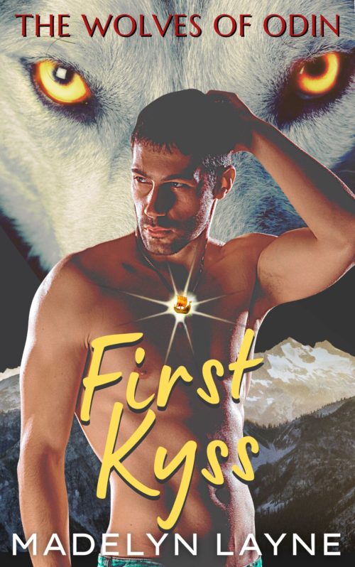
Thanks to all who commented on the first pass of First Kyss. I appreciate it so much! I don’t have a designer, so it’s just me on Canva. I took in all the suggestions and tweaked and tweaked—brightness, saturation, fonts, font colors and size, kerning, tracking, image size and that damn medallion—which I think looks so much better even if it’s not perfect! Any other thoughts?
First Kyss is a paranormal romance featuring wolf shifters, magic, and Norse mythology. It is set in modern day Missoula, Montana with trips across the Rainbow Bridge to Asgard. My target audience are readers who love paranormal romance, particularly wolf shifter romance. It would appeal to readers of Nalini Singh’s Psy-Changeling series and Maria Vale’s The Legend Of All Wolves series.
[original submission and comments here]
Nathan says:
It does look much better. My only two solid recommendations:
- On the male figure, darken the shadows everywhere except around the medallion.
- I actually like the title font less this time around — it may be easier to read, but it’s less aesthetically pleasing.
Other comments?


Better.
You need to increase the saturation and contrast in the figure.
If the jewel is meant to be hanging around the neck of the man, it needs to look more as though it is doing that. At the moment it’s just tacked on. If it is a light source—which is implied—then have it illuminate the nearest parts of the man’s body.
There appears to be three different typefaces, which is one too many.
Different versions of the same problems.
Sorry, but still 3 fonts and the new title font is not right for this or this genre, in my opinion. It’s closer, conceptually, to something like Comic Sans (sorry) than a fantasy/romance font. I would suggest visiting the covers of other books in that genre, and looking at the successful ones and the fonts that they use.
Am I mistaken or is that gem actually a wee, teeny, unseeable Viking ship???? That’s gotta go. Sorry, but…no.
Hmm. Your model is backlit, so I think you need a bright light behind him, between him and the dark background. Also the pendant/medallion–it is supposed to be a magical glowing thingy or are you just trying to highlight it to show it’s there? Because I think that falls into a “reader won’t know what it means until they read the book” area, a cover no-no. If it’s just supposed to indicate a magical glowing pendant (revealed inside to be a tiny viking ship), then I think you’d be better with just a glowing amber-ish stone.
I did a quick mock-up; couldn’t find your assests so just pulled similar ones. Picked a model based on the lighting being similar so I could demonstrate what I meant about having some light behind him. https://imgur.com/a/6CE3hki
If I had more time, I’d add some glow to the wolf’s eyes and match the colours of the eyes and glowing thingy and title.
I did the title in Wabroye, a public domain font, though Cinzel Decorative seems to be most common for shifter romances. Definitely pull up best selling shifter/pnr romances to check out their font usage.
Used to be Canva didn’t let you use your own fonts; if that hasn’t changed, save the image without a title and take it over to Pixlr (free online graphic editor) and add it there.
Syd:
I luv your mockups, but (yes, yes, folks, this is deliberate, groan), I think you missed the boat here.
I’m not sure that model is really targeting a shifter romance, m/f audience, but that could just be me. Secondly, please, don’t anybody use that font and thirdly, where’s the Viking Ship? 🙂
The lighting iisbetter!
H
Ha, thanks!
And LOL, no, I only picked that model because he had similar lighting, to demonstrate why the OPs model should have a light source behind him! I’m in the midst of packing and short on both time and attention! Also, I really hate Cinzel Decorative. I know there are other fonts similar to it without the poor kerning and ugly ligatures, but ugh–time!
Maybe make the amulet/medallion a Mjolnir if the intent is to signal “Viking”.
If the OP lacks the software or skills to get the medallion/ship (if it absolutely must be a ship) looking like part of the overall image, I’d say leaving it off completely would be a better choice. Sometimes the design we really want must be modified to fit the skills we possess.
They could also ask for help. There are people willing to do so without charging. Not necessarily the best quality, but an improvement.
This is true!