The author says:
Genre: Children
Reading Age: 7+ (or bedtime reading by parents/grandparents etc)
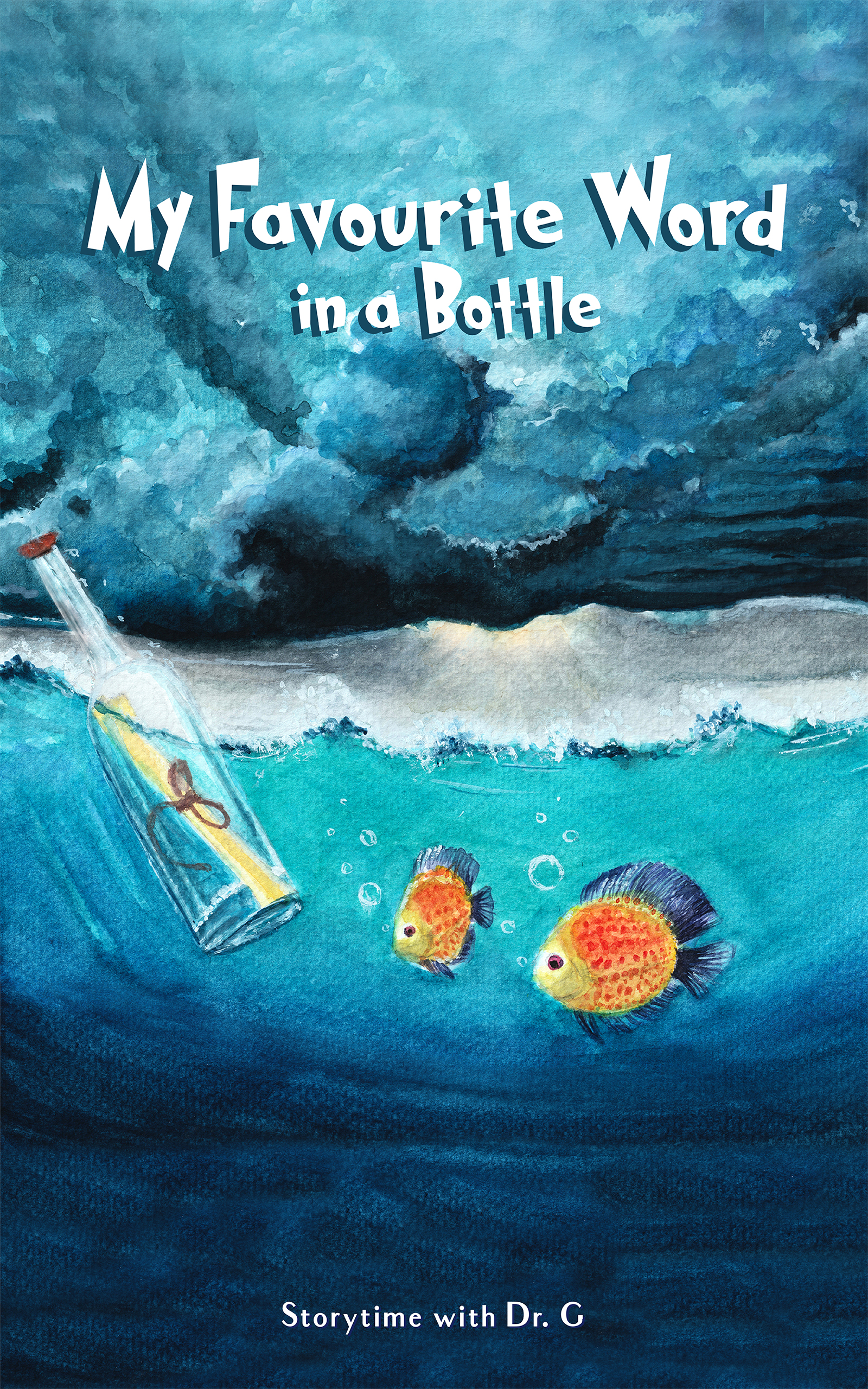
A young girl puts a bottle with a letter containing her favorite word and asking others to add their favorite word. Where will the bottle travel, what other words will be added and will the bottle return to the girls island?
The choice of photo has been decided but font size/location etc is maybe too small in thumbnail images?
Nathan says:
The first thing I’d do is trim the artwork to avoid dead space and make the important parts clearer.
 And then choose a title font that isn’t so obviously Dr. Seuss-y.
Other comments?
https://i.imgur.com/iGktroN.jpg
I think you need to play with the text a bit. like:
https://imgur.com/a/eolsVNo
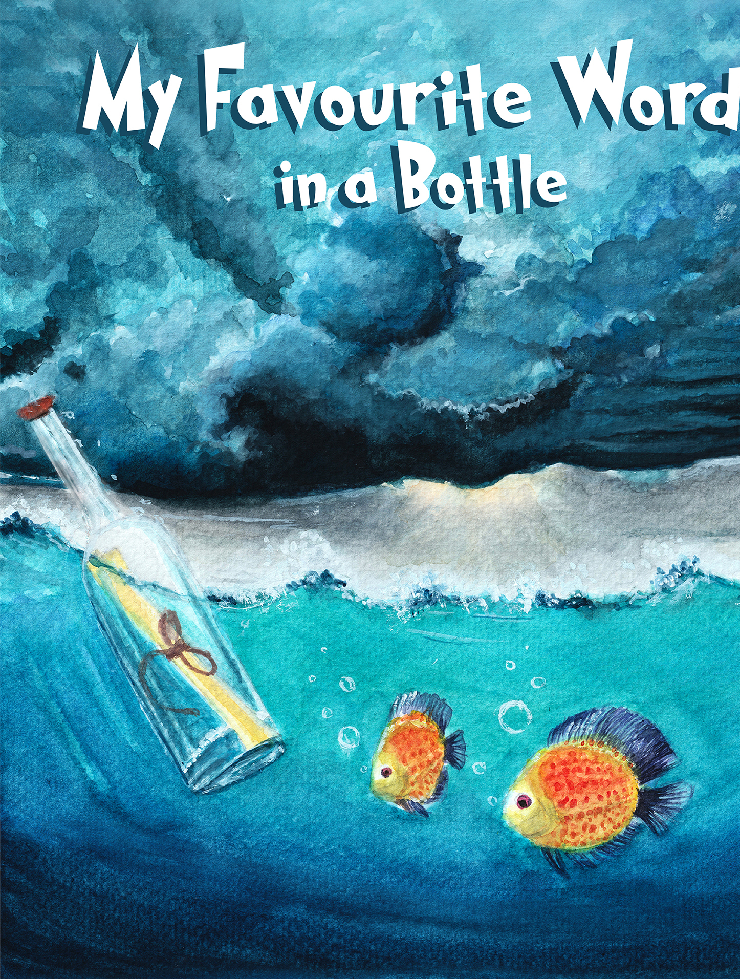
You want to use the available space and make it look purposeful. Avoid the typed line look so play with spacing and sizing. Here I went for a ‘bobbing’ feel by staggering letter height and sizes just a bit.
(your font was fine I just didn’t want to take time to match it…lol so I used one of my go to fonts for this age group.)
There are tons of options for the text placement on this.
I really loved the art!
Having the separate pieces of art overlap a hair will further integrate the graphics, which is why I added 1 more small fish. Plus, for whatever reason, people like things in 3s
I also made the bottle just a bit bigger to make it more clearly the focal point.
Yours is far better than mine
In thinking about it and staring at the mockups, I think that the art only skewed too young based on the typography. With the right lettering, I think it would be fine. That’s my nota bene for the day. 🙂
The art is really nice. I would take Nathan’s suggestion and crop into it a little more while at the same time making the title (and your credit line) much larger.
I have a couple of comments.
Firstly–and yes, I’m well aware, submitter, that you said that the image has been decided–I’m really not sold on that image. I feel that it’s skewing (quite a bit) younger than 7+, for one thing; 7+ is either Early, leveled readers or First Chapter books and this looks more like 5-6, than 7-up.
The description makes this sound like a First Chapter Book, which means far fewer illustrations, more words per page, etc. but the cover looks more like a picture book. It’s your call, obviously. If you’re sold, you’re sold.
The good part is, it shows the topic of interest–a corked bottle, afloat on the ocean. Being Nemo’ed, apparently (inspected by fish).
CC Participant does a good job with managing the space and the title/bylining. I can’t love that font. Neither the original nor CC’s rework, work.
If you could find something more “Hank BT Roman,” or “Life Savers Extra Bold,” but with more weight, something like that might work. I think that Catseye, for example, again, skews far too young. If you look at First Chapters or 7+ on Amazon and bookshelves, their fonts are not too childish, for that age range. What about Ayita Pro Bold? That can go either way–children or adult. Or Marseille SemiBold. Children 7 and up are generally trying to exert their first reading independence, and they want books that look like that, not that appear younger.
On the other hand, this bottle is on an adventure, yes? With its progenitor’s (so to speak) hopes with it? What about–and yes, I know this sounds outre, initially–what about something like Adventure? (CC Participant, would that work or is the title too wordy for it?) Submitter, that long title might prevent using something like Adventure.
Vis, “storytime with Dr. G,” again, to me, this seems to indicate a book that’s being read to you, either at bedtime by a parent or at the Library, etc. If you want to brand it, “Dr. G’s Storytime,” might work better. Dr. G seems a bit short, a bit abrupt, for the byline. So…not sure what to say about that. I am assuming that there’s no usable logo or the like, with which to brand the bottom of that cover.
Those are my thoughts.
Inspired by Shelley’s example and Hitch’s suggestion.
https://i.imgur.com/lEvD4vp.jpg
Thanks for this mockup CC Participant. This is an individual project (self-published) and on a low budget so I wanted to know if your inspired mockup uses a copyright free font.
Many of us know what that is like. No budget is the reason I learned basic computer graphics.
Thank you all for the great observations. CC Participant could you give the name of font used in your last mockup (inspired by Helly-Hitch). Kind regards Dr. G
It’s called Rocket Mission and was created by Joe Letter (https://www.fontspace.com/joe-letter)
It is free for personal and commercial use, but any donation to the creator you can afford will be appreciated.
In the story, does each finder of the bottle add a random word or do they create a story one word at a time? If that’s the case I created an alternate tag (and made other subtle tweaks):
https://i.imgur.com/Em36TEp.jpg
Take note of Shelley’s version. The alignment of the drop shadow makes it appear as though you’re looking up at 3D lettering.
I didn’t quite copy that, offsetting mine horizontally to the right by 2 points, but it might work better set to 0.
some tiny tweaks would make that awesome, CC!
https://imgur.com/a/88Tq46z
The available space for the words filled more equally.
(The spacing on it needs to be adjusted to give a .5 margin on both sides of the text still. Right now, the text is a bit overwhelming to the image. I think shrinking all of the words just a hair would work.)
I think the B in bottle should be made a bit bigger too and maybe tilted just a hair. I really like the font.
I LOVED your fish…lol
Story building as a phrase might be a bit off because it makes me think choose your own adventure but I’ll admit, I haven’t shopped for this age range in forever so it might be just me.
You might want to consider using your full name and adding credentials in the more tradition manner to appeal more to the adults buying the book.(image2)
I chose that typeface because it’s already kooky and uneven, meaning individual letters need not be manipulated to achieve such an effect. I tend to favor repeatable designs since they must also appear on other parts of the print book and in promotional materials.
Not knowing the actual content of the story, I provided an option for the tag just in case.
Your idea of adding a third fish made sense, and the empty space in the bottle was demanding attention. If I was doing the artwork I’d probably add a slight cylindrical distortion to sell the refraction and highlight the eye, making it a bit more whimsical.
I really like that top one, Shel!
H.