The author says:
YA historical fantasy set in 1910. Aiming for the same market as Lani Taylor or Maggie Stiefvater. My premise involves a magic system where my protagonist, a 17-year-old girl, can talk to the characters in books.
Nathan says:
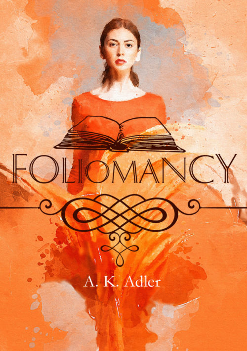
The underlying art is terrific, of course, but there’s nothing magical on this cover — you’re going to miss your target audience almost completely. And the book icon has two problems: (a) it clashes with the style of the main artwork, and (b) its position and lack of color makes it entirely indistinguishable in the thumbnail.
My advice would be to find a painted image of an open book, place it at the bottom of the cover, and blend the two pieces of art together. There are already streaks of color shooting up from the bottom in the present artwork; if done well, the added book image can convey a “springing from the book” concept. That, some color tuning, and some fine-tuning on the title font could give you a cover that works really well.
Other comments?


As Nathan says, a very nice illustration. The problem is really lies in (apparently) trying to make an inappropriate illustration fit your story. The artwork itself suggests nothing of the story you describe. Superimposing a line drawing of a book doesn’t work: the discontinuity in style works against that. (And the enormous decorative graphic device is only an irrelevant distraction). The result is a piecemeal cover: random visual elements that have no apparent relationship to one another.
Nathan’s ideas are first-rate: what they would do is tie all of the important visual elements into a single image, one that would, in a glance convey some idea of the nature or theme of your book.
This is one of those times where I devoutly wish that I actually had mad Photoshop, etc. skills to show what I’m thinking, but I don’t, so y’all will have to use your imaginations.
When I look at this, when I view the slatey color behind her head, I confess to being hit with an overwhelming itching-fingers compulsion to do that teal-orange thing that creates such a bang. I think of images like this: https://www.greatbigcanvas.com/view/red-orange-twilight-sunset-over-navarre-bay,2528403 or the Blade Runner 2049 poster.
BUT, before ya’ll leap in, yes, yes, I know that people are allegedly tired of that, (although, you’ll see that filmmakers and book cover designers are STILL whacking away with it….) so what about something a bit less-used?
Remember that purple sky/dusk, in the Bohemian Rhapsody poster? What if something like that purple: https://www.imdb.com/title/tt1727824/mediaviewer/rm2666152448/ were to ombre its way from behind her head to the orange? Give it that bang, that contrast, that covers, by and large, tend to need, particularly in genre fiction? That purple may also give you some magical resonance that you’re not getting now. (Or, hell, put it on the outer edges and ombre your way in–something.)
Nathan’s suggestion about the open book–if you could get her to appear as if she’s standing IN the book, that might be very cool.
Now, this seems to be custom art, so it’s entirely possible that the coloration alterations I just suggested are heresy. If so, mea culpa.
I’m not 100% sure that the Dolphian (formerly Delphian font by OPTI-Castcraft) font is helping you. I like it myself, don’t get me wrong, but I’m not sure it’s saying “magical fantasy.”
And I absolutely agree with Nathan–the book graphic is slaying this cover dead (so, not in that good “slaying” way) and so too is the fleuron. They’re like putting on cheap costume jewelry with a custom ballgown; it’s off-tune and noticeable. They could even be affecting my read on the font.
That’s my $.02, FWIW.
Like this?
https://i.imgur.com/mFfepAL.jpg
Hi: I think that blue is too bright, but yes, something like that, to give it vivid contrast. (I confess I’d mostly envisioned it around her head/neck area, but hey…I’m easy!)
I know that Savoy will say I’m a contrast addict, but I have actual, tangible, proof that when you change a cover from flattish to vivid, using contrast particularly, it works, from a sales perspective.
Thanks for that!
https://i.imgur.com/NH0UpUY.jpg
Yes, now it’s definitely starting to say magical. I still think that the blue is a skoosh too light–I was thinking more like that deeper blue at the top of the Spider-man 2 poster, (or Brave) or the deeper blue in the Batman one, Dark Knight, or the like. Now, that might be totally inappropriate for this, which is why I pondered the purple option. If this isn’t a harder action-adventure sort of thing, then the deep blue/teal-orange may be overkill.
I tried some faffing around myself–my crap is not adequate to be shown, even here, but a darker teal, ombre-ing from around her head out, into the orange, makes a world of difference and I would also strongly consider using typography that also incorporated that blue.
OTOH, I could be completely out in left field. But the typography and the non-original-image graphics gotta go, no matter what.
https://i.imgur.com/NzxMziX.jpg
Readable typefaces for the title and byline, and make the byline much larger.
Lose the clipart book. It ruins the artwork.
I was thinking something similar to Nathan, having an oil painted open book at the bottom, or, have an open book behind her head with a talking person in profile emerging from each of the open pages facing her.
Another issue you might want to consider is the fact this version of the image appears on a Spanish-language book titled ‘El reino de las mujeres’ and Huawei used the original photo to advertise their smart phones.
Here is a quick mockup:
https://i.imgur.com/pDMY5iz.jpg
I agree with Nathan, the main artwork is excellent. But the book the girl is looking at is blank. It might be difficult to add something to the pages but just a few faint lines might convey the image of writing. You could also add something to give the impression something is coming out of the book. I guess a few lightening flashes would be a bit of a cliché but ghostly characters might also work if well done.
I actually like this one, it’s one of those covers where the art is the important part. But it’s hard to read in the thumbnail. I like CC Participant’s last example, and it stands out. But yours looks more elegant, like fine literature rather than popular fiction or YA fantasy. It depends what you’re going for. I mean, sometimes it’s nice when people do something different and don’t do typical typefaces and designs, but you also have to sell the book and it has to be readable.
Hitch’s idea:
https://i.imgur.com/Kssh04b.jpg
Yeah….maybe. That is sort of the idea, yes. (I still think that the blue needs to be more Dark Knight but you may well be right with that shade.)
I’m still more concerned with the image itself. If Huawei commissioned the original photo then it belongs to them. If it was a stock image purchased for commercial use, then it belongs to them or the original seller.
Y’know, the more I look at that mockup idea, the more I like it. I like the space at the bottom for a byline or even the title, too. (Regardless of my feelings about the blooooo….)
(I just wanted to add that.)
I think the artwork is pretty enough, but way off base for this book and its genre.
This is one of those covers that demonstrates the principle you can be ticking so many of the appropriate boxes but still not getting the cover you need at all. Covers are so particular! You’ve clearly paid attention to what’s going on in covers of your genre and seen that a centred portrait of the heroine is a big trend. But you’re missing some of the crucial stuff to make that work.
I’ve written up what’s not clicking about this cover, and how to rethink to get to something that I think will be much more successful here https://www.kathrynrosamiller.com/post/cover-advice-foliomancy.
This is a great title and intriguing premise, it just needs the cover that gets that across to browsers at a glance.