The author says:
When the baby she’d prayed for is taken – revenge is all she has left
A psychological surrogacy thriller where a woman loses everything she ever wanted and must kidnap her own child.
Nathan says:
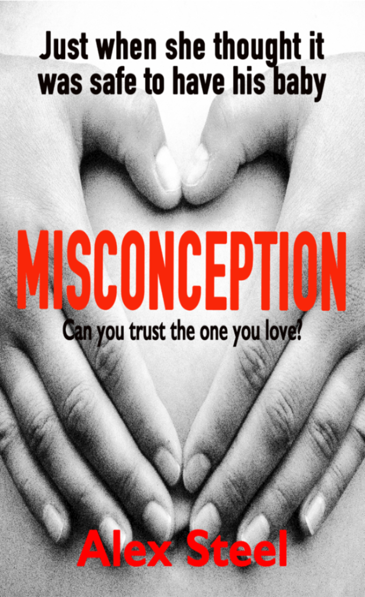
I could point out things to correct in the cover as it is — the stretched photo, the difficult of reading the red letters on the back-and-white background, etc. — but the bigger problem here is: The cover makes it look like it’s a novel about pregnancy. But the description is clear that the “hook” is about the loss and retrieval of the baby. It doesn’t sound like you’re selling the right sizzle.
Other comments?
Actually, all I can do is to second what Nathan has said. There is not too much I can add. I think this cover needs to be rethought from scratch.
I have to agree too. The quality of the picture is very very bad, the coloring, the sizing just everything. Poor quality images translate to subconscious thoughts that they represent poor quality writing. As Ron says, I think a different image would better in any case.
I recommend and empty crib or a discarded broken baby toy/item, but in the appropriate color tones. By that I mean not sweet happy colors like you’d normally see in a nursey. Make them darker/more vivid with long shadows and bright light.
Use title case on the taglines but that being said, you might want to rethink and use just one of them because that top line is just a hair misleading. If you read that line and then title it will seem a book about pregnancy and I think your sales will be affected because it depends on the browser to keep reading, which I doubt would be the case. I think you need a new stronger tagline.
As others have said, the cover doesn’t seem to fit, and has a number of quality issues.
The plot is a bit confusing as well. Is this about a mother hiring a surrogate mother, who then runs off with the child? And the genetic mother must then kidnap her child once he is born?
Because as written and with the photo it’s set up as if the genetic mom might be the creepy-stalker-kidnapper-vengenace hungry lady while the surrogate pictured on the cover (as the genetic mom was never pregnant with the child) is the sympathetic mom who loves the kid.
It will probably help your cover to nail down the angle/blurb first and then show a picture more relevant to the age of the child when the genetic mom wants to kidnap the kid the other women carried and is apparently raising. Or if the surrogate wants to kidnap the baby she carried – whatever the exact plot is. Be a bit more specific on the character and the stakes.
Look at other thrillers in your subgenre for an idea of color schemes, tone, fonts, backgrounds, etc. “Baby Doll” by Holly Overeton, “The Child Taker” box set by Conrad Jones, “Baby Grand” by Dina Santorelli, “The Midwife Murders” by James Patterson, and “Hush Now, Baby” by Cheryl Bradshaw would be a good few to start with.
I’m getting a sense of déjà vu here: didn’t we already review some covers for a “psychological surrogacy thriller” called Misconception? Aside from this synopsis suggesting the story is more about what happens after the baby is born rather than during the pregnancy like that earlier novel, it’s definitely not a good idea to look too much like a copycat. I’d recommend changing the title as well as the cover imagery; maybe call it something like The Baby Is MINE!, and show an infant with two distinctly different adult hands each wrapped around one of the kid’s arms in what looks to be an imminent tug-of-war.
Wow, you have a great memory. I forgot all about that one. That other cover was remarkably similar. Having same title and imagery is sure to get you banned at Amazon as soon as the original author notices and complains. It could get you sued. I have no idea what cover the other guy went with but I recommend checking to be sure you don’t have have a close match.
Hi, I’ve followed this site for a long time but never posted until now.
I just looked up the other Misconception on Amazon to see which cover he went with. And discovered that “Alex Steel” is a pseudonym for David Callinan– the guy on the old covers. So this is a less-competent resubmit rather than a similar novel by a different guy.
And the book on Amazon has a different cover than either this one or the old ones on this site, for whatever that means.
I like the concept. However, I find the white space at the top distracting. Perhaps a slightly more distant perspective showing more of the woman’s body would be better. I don’t dislike it as is, though.