The author says:
A unique reading of the Qur’an from a Christian point of view designed primarily to engage people from Islamic religion in a conversation about the context, history and background of the various texts associated with the Qur’an, using a friendly, conversational style.
Nathan says:
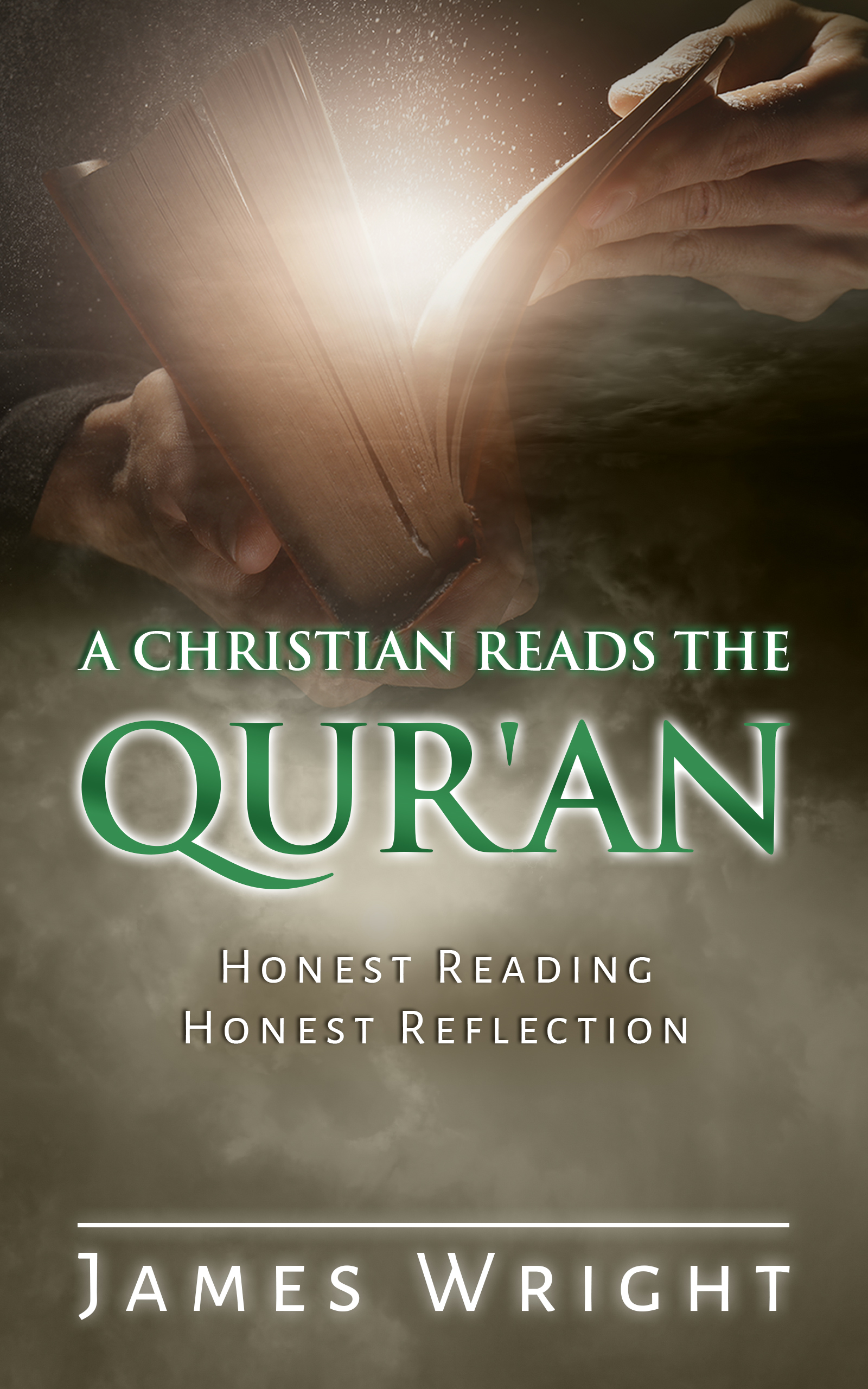
I think the most obvious problems come to light from viewing the cover in thumbnail: I can only read “Qur’an” with concentration, and the rest of it is lost. As thumbnail size is how 99% of your potential readers will first encounter your book, the cover needs to be comprehensible at that size, at least on a surface level.
I think this is one of the covers where the actual text of the title needs to be the most of the cover, as the main “hook” of the book, a Christian’s reaction to the Qur’an, isn’t something you can really convey with imagery (and using excessive imagery would probably run afoul of at least some Muslims’ sensibilities).
Other comments?
I agree with Nathan about the readability issue. There needs to be much more contrast between the title and the background.
The image, too, needs to be rethought. At the moment, the cover is divided in two: the image of the book at the top and a cloudy, amorphous mass at the bottom. For one thing, this results in crowding the image of the book into the top of the cover. I would move everything down further into the cover space.
I think moving the text down a hair so that it isn’t over the hands and making better us of the space you have there would be great but I also think the color tones are all wrong. Red and green just aren’t right for this. I’d recommend losing the green and using white against black because the brown is making it murky. Maybe try blue for the color on the book. Red is the color of danger and not the tone you’re going for. Blue is a calmer tone. I love the idea of light emanating from the book but you need to be careful that the rest of the image doesn’t gain a sci fi feel. you need it to have a factual vibe to it, not a fantasy vibe. you want potential readers to think fair and factual, which is the opposite of a science fiction background.
You might want to try a different image of a man reading at a desk and have the light emanating from the book the same way. Omitting the stars and clouds and glow, adding a color banner under part of the text, would go a long way to making this more ‘factual’ at first glance.