The author says:
Ryheem is driven by vengeance the moment he wakes up, he’s even more unstable in his mind. Tallman will pay for what he has done to him and there was Phylisha his beautiful wife, she’s going to be finally his and no one will stand in his way. Blood and violence are his company where ever he goes. Phylisha starts a new life in Mandeville, and she has her own business and living in her mother’s house the way she wanted. She’s trying to find justice for her mother’s death, not knowing the truth plagues her. but her new life has been threatened by her estranged father who wants more from her than what she can give. Along with Ryheem who tries to kidnap her again. Will she be able to survive Ryheem’s threat or succumb to it, will she be able to protect herself from her father? Damien Tallman James is a crime boss who wants Ryheem dead, Dontae and Rick want the same. The alluring Mr. Doc just wants what is own to her, Ryheem’s death is the next best thing. Will Ryheem be able to survive the people who want him dead before he gets a chance to get Phylisha? Will Phylisha survive her father’s relentless ways added by Ryheem returns or will she let it consume her? It’s enough crime and violence to make one’s head spin with revenge being the driving force.
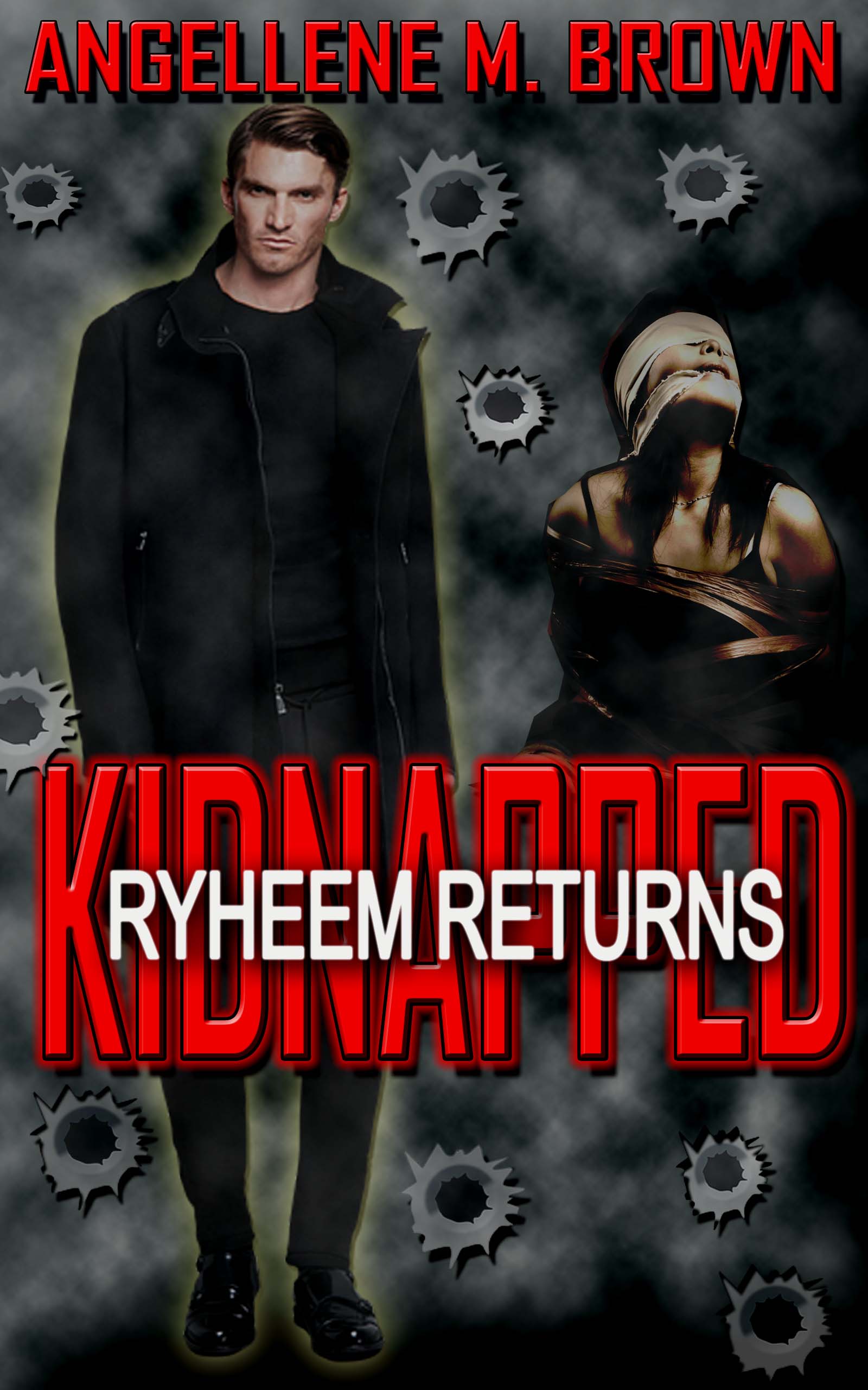
Nathan says:
This is another cover which displays its weaknesses best at thumbnail size.
- There isn’t a focus to the cover. There are two human figures, but their arrangement in relationship to each other seems pretty random, and the woman in bondage seems like an afterthought. The low contrast also makes it hard to notice either of them, really. Maybe arrange them so that the man is looming over/behind the woman?
- Having “Ryheem Returns” across the front of “Kidnapped” renders the latter completely unreadable — even at full size, it’s a struggle.
- The bullet holes just don’t work. At thumbnail size, you can’t tell what they’re supposed to be; at full size, it’s pretty obvious that they’re not photorealistic like the other image elements, and that they’re all just the one hole over and over.
Other comments?
Several thoughts come to mind immediately. In no particular order…
The cover art is much too dark and murky. There is neither saturation nor contrast.
The visual elements are piecemeal, with no visual relationship to one another. The is a male figure, a female figure and bullet holes. The first two (and especially the girl) appear pasted-in. The glow around the male figure is gratuitous. The bullet holes are out of scale, obviously cut and pasted and don’t really appear to be in anything. Placing “Rhyheem Returns” squarely on top of “Kidnapped” only serves to make the latter word hard to read.
You need to rethink the cover: especially with an eye to simplifying it. Every visual element needs to work together, to appear to be part of a single picture and not as though they are separate images in an album. This results in the lack of focus that Nathan refers to.
This cover feels like it’s trying too hard. It doesn’t need all of the special effects. (I didn’t realize they were supposed to be bullet holes until I read Ron’s thoughts here.)
I recommend removing the glow, rewriting title to be normal, repositioning the figures, adding a contrasting color element behind them (maybe a doorway with light) Like him in the doorway and her in front but make him look at her not out. Add some shadow from him going over her.
I can see a version of this in mind’s eye that would be awesome….lol
And the image of the bound woman needs to be much, much crisper. Right now it’s so low-resolution and fuzzy–presumably, because this is just a mockup–that it’s noticeable. Not in a good way.
FYI and for what it’s worth, I’m a shooter, recreationally–and I didn’t realize that those were meant to be bullet holes, either, until Nathan’s comments. That’s not good. If you’re going to use bullet-holes, you need to do something so that ppeople see them
Hell, if you can find a good one, you could even do the old James Bond thing–make the bullet hole the vignette lens through which we see him and the bound woman. It would take some solid visual layout talent to make it work, but it could work if done well.
And yes, the font work needs simplification; the 3D effect, the glow…it’s making them bleary, not sharply contrasted. In other words, they are causing the opposite effect. You have to be exceedingly careful with red on black or vice-versa; the text needs to be anti-aliased and it’s actually difficult to make them readable. You would likely be better off with yellow, or a very light pastel shade that jumps off the dark background at you.