The author says:
The year is 2035. The story is about love and survival. Christine Conder by her own actions, but against her will, is a contestant in the most serious lottery game ever played. Money generated by this new lottery supports the advancement of government programs throughout America and millions of people, young and old, are buying tickets for a chance to enter ‘The Hunt for Money.’ Signs flash along freeways and in downtown parking lots: “The Hunt for Money—$493,940,076—Enter to Win—Hunt for Money—Enter to Win!” And the dollar amount changes daily.
There is an unquestionable lack of morality in America. Some say it was caused by the promotion of violent video games while others say it was caused by the unprecedented violence accepted in television programming. Televisions are the babysitter parents do not have to pay. Cancer is no longer the number one killer but now despair and fear generate the highest coincidence of suicides ever known to a society of civilized people—It is a desperate time in America, and there is a growing desire to hunt for money. If you win an opportunity to hunt in this lottery you may become rich, or you may lose everything.
There is a difference in belief between two sisters. One believes there is a God and that we must return to those values, the other does not. Yet they love one another unconditionally. That bond grows stronger during Christine’s struggle to survive.
Nathan says:
First up, I applaud you for publication at an early age. The tools available to you are something I would have killed for in my youth. (Not family or friends, of course. But strangers would have been fair game.)
Now here are some pointers to make a cover that will attract people to your book:
- There needs to be a focus. On your cover, there’s no particular part worth looking at. The power of type is too often underappreciated, but in a cover where the imagery doesn’t really have any focus, the type needs to do the heavy lifting. It needs to be strong, eye-catching, and easily read. You’ve got a lot of space; use it. I should be able to understand at least SOMETHING from the tiny thumbnail view, because on Amazon or other ebook sites, that’s the first thing I’m going to see, and if that doesn’t draw me in, I’ll never click through to see more.
- While it’s possible to pull off a cover with just strong type and an unremarkable background image, a better strategy is to use an image with a strong icon. You know that people are going to think of your book in relation to The Hunger Games, so let’s look at that cover:
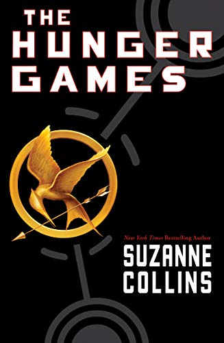 Strong, clear type with plenty of contrast with the background, and a single focal image. I’m not saying you need to imitate this cover slavishly; you need to understand the principles of why it works.
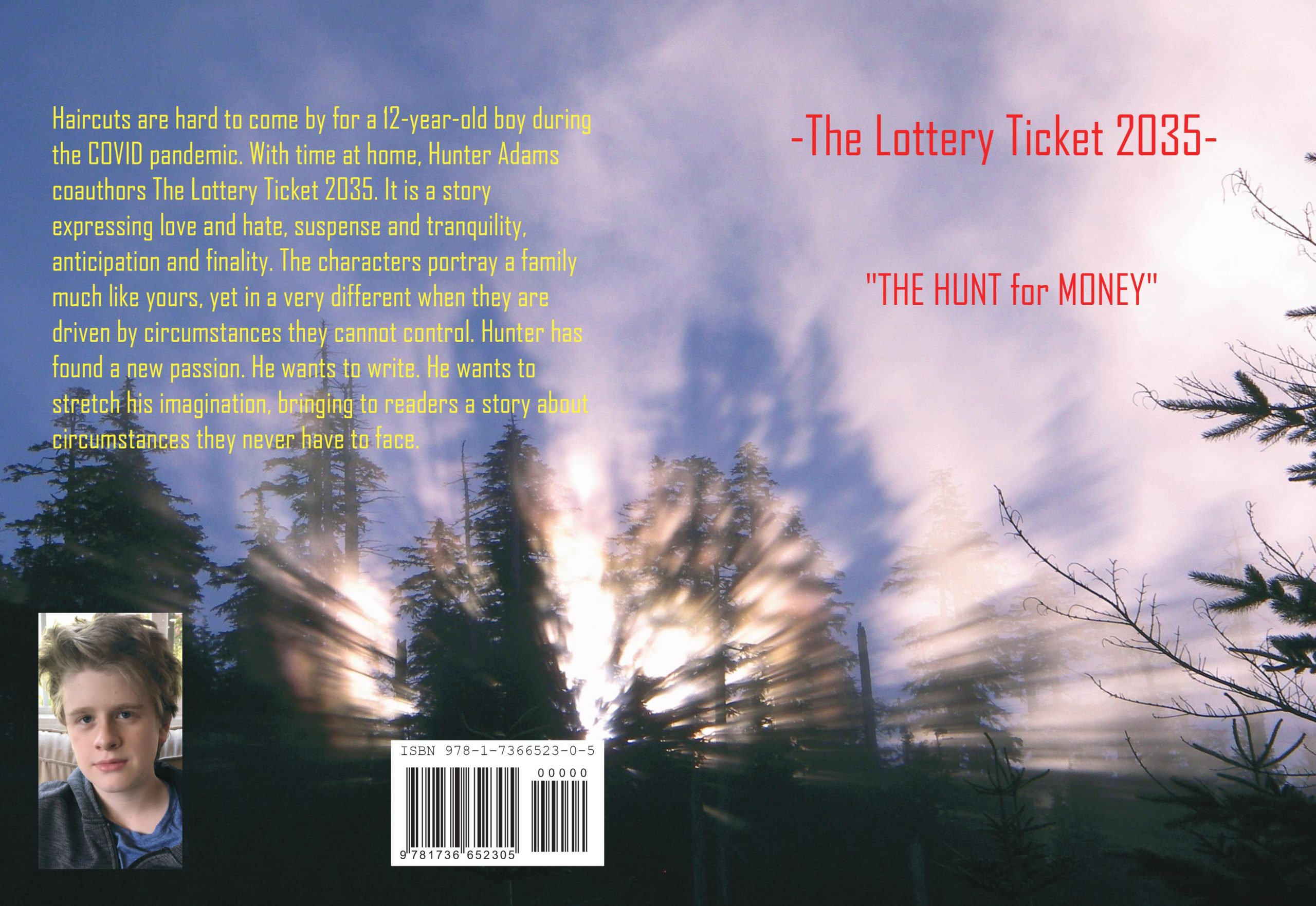
- Where are the author names (called the “byline”) on the cover? I have to explore the back cover to find your name, and your coauthor’s name is nowhere to be found. They don’t need to be as big as Stephen King’s or James Patterson’s names are on their covers — they’ve got such a huge fanbase that their names are the biggest selling point — but they should still be there.
- Since you gave us the back cover too, a couple of comments specifically for that: Don’t take up the back cover talking about yourself, talk about the book first. Then use extra space to introduce yourself. And remember that paragraph text needs to be in as readable a typeface as you can find — the more text there is, the more readable it needs to be.
Other comments?
Nathan gives you some very good advice!
Just to underscore a few things he pointed out and to add a word or two of my own…
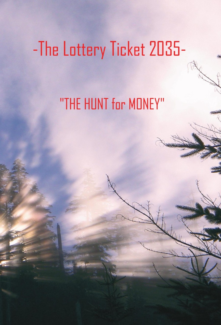
Be clear as to what the title of your book is.
I take it that “The Lottery Ticket 2035” is the title and “The Hunt for Money” is a subtitle or tagline? If so, then the title should be much larger and the subtitle or tagline moved closer to it. Do not put The Hunt for Money in quotes.
Add your name to the cover.
Now here is something that is very important: What does your cover tell a potential reader about your book? Does it suggest “love and survival”? Does it suggest that your story takes place at a future time? Does it suggest anything about the conflict between the two sisters?
There is a test I apply to every cover I see. You might try it yourself: Imagine the title of your book in a language you do not understand. Would you, just by the image and design alone, be able to learn anything at all about what sort of book this is, what it might be about, its idea or theme? Or even its genre? If the answer is “no” then you might want to think a little more about the image.
A potential reader is only going to give your book a very brief glance. In that split second your cover has to first catch their eye and then tell them something significant about your book.
On the back cover, separate your description of your book from your description of yourself.
Good luck!
Great advice. I like your test and will try it with a new book design project.
At my shop, we literally call it “The Miller Test.” 🙂
From seeing the full cover in thumbnail, I might have guessed this was something in the inspirational literature genre, but never that it was science fiction set in the not-too-distant future. From seeing just the front cover, I probably wouldn’t even have guessed it was inspirational literature. It’s appropriate that our esteemed host shows us only the front cover at full size, however, as the front cover is likely to be the only cover your prospective readers will see until well after they’ve actually bought your book. (It takes a conscious effort most of your prospective readers aren’t willing to make to find the back cover in a book’s preview at the sales site, assuming the preview even includes that back cover.)
From the full cover, I can see that the picture is supposed to be of sunlight streaming through the trees in a forest; but from seeing just the front cover at first, I initially thought these streams of light were a motion blur such as one might see while poking one’s head out of the passenger side of a fast-moving vehicle. Either way, I’m not seeing how any of this is supposed to point to a story about people in a violent dystopian future in which the government gets the revenues for its social programs from some kind of high-risk lottery. At the very least, your cover ought to demonstrate that something has changed between our time and this story’s futuristic setting; sunlit forests evidently have not.
Unless this “hunt for money” is a literal hunt set in a forest (as in a blood sport in which humans track other humans through the trees and try to ambush and kill them to win cash prizes), it seems to me your cover really ought to feature more urban scenery, or at least something to indicate human habitation. A simple highway with a number of glitzy billboards on either side of the road advertising the lottery might suffice. In fact, even if this “hunt for money” does take place in a huge unpopulated forest wilderness somewhere (e.g. Alaska), showing some of this advertising you mentioned in your synopsis would go a long way toward cluing your prospective readers to what kind of story this is and whether it’s specifically the kind they’d like to read.
So… well, break out the advertising! As my colleague Hitch is fond of saying, book covers these days are clickbait, i.e. internet advertising; so what’s more likely to draw your prospective readers’ eyes (and mouse clicks) than actual advertising (albeit for a fictional lottery) on your cover? The science fiction television series Babylon 5 and the Robocop movies showed some in-universe commercials for fictional products (and organizations seeking recruits) to give the audience some insight into the nature of the societies in which their stories were set, and I don’t see why your book (and its cover) shouldn’t be able to do the same.
My suggestion: try studying some actual banner ads and billboards that advertise actual lotteries, and then make imitations of them to advertise your story’s lottery and put those imitations on your cover; bonus points to you if the ads reference or imply some noteworthy difference between your fictional lottery and the real ones (e.g. a disclaimer in fine print reading “*Lottery winner survival rate is approximately 25%” at the bottom of the banner/billboard).
I agree with the above statements. I do feel that you may want to Pursue a cover with the winning lottery ticket all tricked out and in gold or something or the billboard for the lottery. It could be over the top fantastical or kind of dismal. Another idea I saw when looking at book covers in this genre is just the backs of 2 sisters in a beautiful forms maybe reaching out for each other’s hand but seperate. Maybe something else on the hand or arm of one something used in the game. Colors are important in choosing a book cover. What colors do you want? What colors are used in the game or the story. Is there a message in the color of the book. Who are your readers, young teen sci fi? Look at book covers on Barnes and Nobles and Amazon. What do you like and don’t like? I suggest something fantastical and over the top like flashy like the ticket or sign. Something peaceful, sleepy, and messaging like the sisters. Good luck. Research, research, research.
You need something more like this:
https://imgur.com/a/pL217rI
This was made from free images.
You guys are as if sent by God to help me. I have no idea how covercritics.com found this cover picture, but it is not the cover my grandson and I went with. I would love for each of you to go to Amazon and type the title in. If you do not even buy the book, let me know what you think of the cover we went with. I do not think I ever found such good advice before finding covercritics.com and each of you. My grandson (at thirteen) is starting to build a website. He needs this type of help, from honest people who care about helping. I was severely injured in 1997 when a tree fell on me. My hope for this book has been to set my grandson on his way to a career in writing. Thank you for any help you offer and may God bless your work if you are a writer.