The author says:
An adult techno-thriller mix of Tom Clancy and John Le Carre. An honest Russian scientist is compelled by the difficulties of living in Russia to sell the submarine technology secrets he has developed, via a shady business associate and that person’s nephew, the Russian Consul in Seattle. Although these people believe they are selling the technology to a fishing company, it is a front for US Naval Intelligence, who are desperate to obtain the technology. A Naval Intelligence Officer travels incognito to St Petersburg to conclude the deal, but an honest Russian Special Investigator is on the shady business associate’s trail and knows what is happening. The businessman attempts to bribe and influence his way to immunity via the KGB (now known as the FSB) and offers to betray the scientist, the Navy Officer, and potentially his nephew too. A duplicitous American Diplomat, an accidental shootout, and a problematic escape by slow train heighten the stakes while the angry involvement of Russia’s President bullies the CIA into refusing their support when the mission needs it the most. What happens to the Consul in Seattle, can the scientist and his family escape to the West, and will the Navy Officer marry the scientist’s daughter?
Nathan says:
Tom Clancy and John Le Carre don’t Venn as well as one might think — Clancy is solidly techno-thriller, while the recently departed Le Carre is old-school espionage — but here are what the current covers for each look like:


The problem, of course, is that their names take up half of the cover because they’re well-known authors, and you’re not. But here are mistakes I see on your cover compared to the comparable titles you suggest:
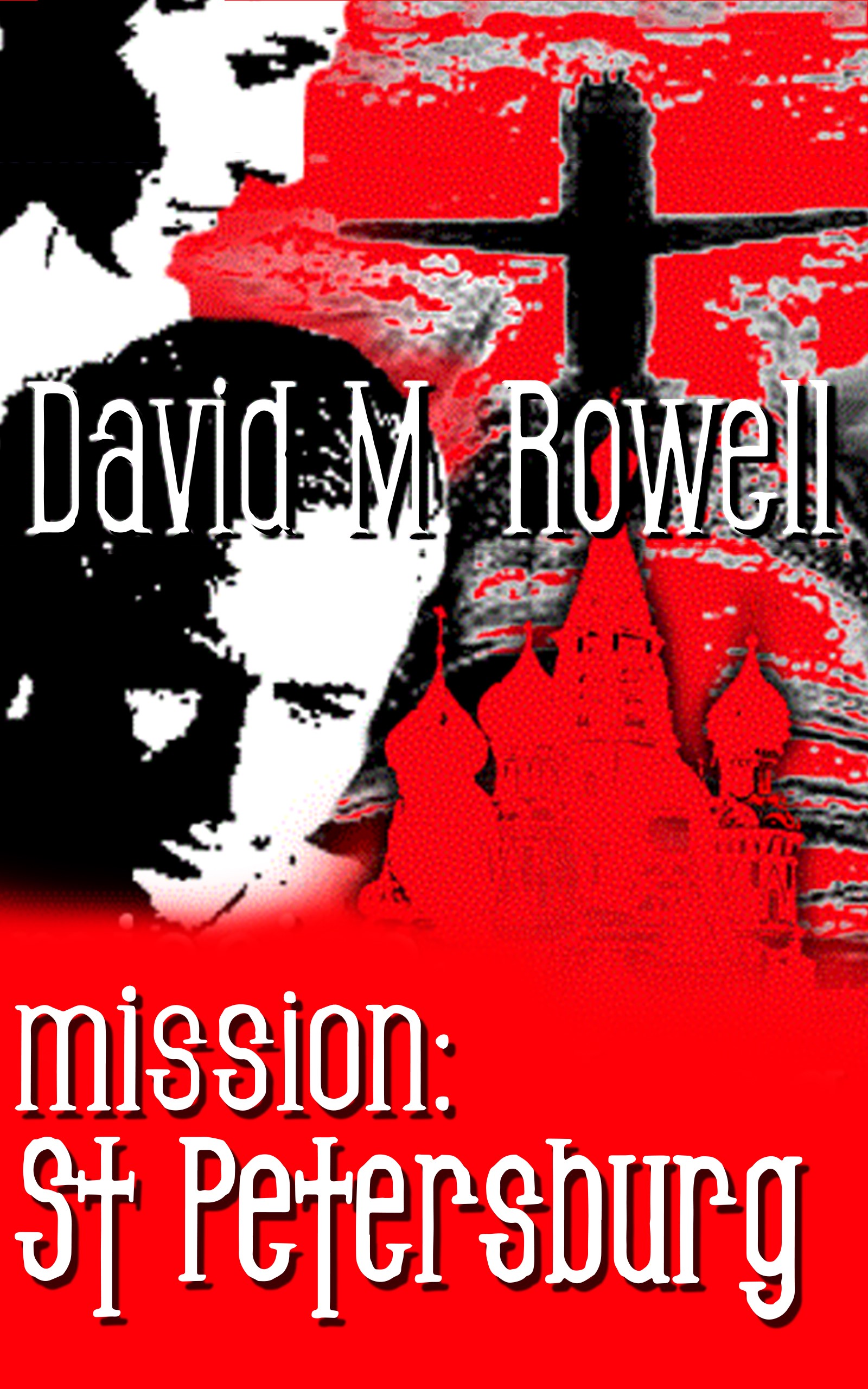
- Your typeface is too playful. You want something strong and easy to read.
- Your image is too busy, both from multiple overlapping elements and from the godawful filter you used (sorry, but it’s true). You want something strong and simple; either a photographic or photo-realistic image with a single strong focal point, or, like the Le Carre novels, something stylized and simplified (but still focused around a single focal point).
Other comments?
A close call but still a misfire.
As Nathan points out, the typeface chosen for the title simply does not work at all.
The cover image comes close to being in the Kitchen Sink School, where everything important is put on the cover. You need to eliminate at least one visual element (I would recommend the submarine). There is also no reason for the cover image to fade out into solid red the way it does…especially since that inexplicable truncates the bottom of the lower face.
Including St. Basil’s isn’t a bad idea, since it certainly indicates the setting of the story, but you are going to need to make it more explicitly recognizable.
What you need to do is decide just what overriding theme best describes your book—what you would say if you had to sum it up in just one sentence—and then look for an image that says that. Other than the Russian connection, there is really very little that suggests what your story is actually about.
Firstly, I feel as though I recognize the faces in this; that they’ve been filtered to death to preclude recognizability, but is that Sean Connery, on the top, from the original Dr. No poster? The one with Ursula Andress in it (the poster, not the movie, although that too)? And the lower face from the original Thunderball poster? By any chance?
I want to strongly iterate what Nathan said–Clancy and LeCarre aren’t anything alike, either in marketing or in the essence of their books (I’ve been an avid reader of both). I would suggest that while there are some readers that read both, like me (I’m an omnivore, around books), those are two different genres. You describe it as a blend–a mix–of the two, but the techno-aspect of this book is not apparent to me from your description and there’s nothing on the cover that suggests it, either. Or, sorry, thriller.
So…I’d revise this and honestly, probably from the ground up. Thrillers use very strong sans serif fonts. Go to Amazon and search on Thrillers–>Thrillers & Suspense–>Spies & Political Thrillers and look at their covers. You will not see a pseudo-sixties font, sort of Matt Helm-ish-looking one, in the bunch. Pay attention to that.
And lastly, yes, the overdriving filters, the big red splooch…these really aren’t helping you. I’m sorry, but they’re not. you could do a much better job by simply using something like this: https://depositphotos.com/81264984/stock-illustration-kgb-spies-figure.html superimposed on a suitable background and running with that. It’s a highly affordable graphic and unlike most crappy silhouettes, it’s not lousy. Or its sibling: https://depositphotos.com/83358192/stock-illustration-the-kgb.html
If it were me, given that stock photos for this sort of thing tend to be impossible to find, I would consider hiring an affordable fiver to do a lifelike illustration of the characters you need and then roll with those. Get a suitable background and suitable fonts and give it a go.
Offered FWIW.
I get that the red background is the Soviet thing, and it almost gives me a feel of something like the movie poster to “Hunt for Red October” as far as the style goes. Others have commented on the design issues, but design aside, it still doesn’t look good to me. It just looks low quality because of that super pixelated filter, and St. Basil’s Cathedral looks over-saturated. Find a more professional font for sure. Anyway, that’s my two cents.
Begging the cover designer’s pardon, but about all I’m getting from this design is a “box cover art for an old 8-bit video game that didn’t sell because it wasn’t very good” vibe. If you want to do a “techno-thriller” or spy novel or some mixture thereof and you don’t have a famous name like Clancy or Carre as a selling point, I’d recommend looking to advertising posters of such novels’ movie adaptations for your inspiration instead. While movie posters still do mention the famous author’s name as a selling point, they usually do so only in tiny captions since their main focus is necessarily on some of the movie’s more striking visuals.
Though you are (unfortunately) lacking in any right or reason to put any big-name movie stars’ likenesses on your cover, you can still always do a version of your protagonist in the “Sean Connery is about to shoot you” pose so popular with both big-name stars (like Sean Connery) and relative unknowns (such as Arnold Schwarzenegger on the Terminator poster, which is not at all coincidentally where his face and name first got famous). This pose should probably work just as well for your as-yet unknown protagonist if you show him doing some version of it in front of… well, either some place in St. Petersburg, or some place that looks like it might be St. Petersburg; most of your audience probably doesn’t know its Russian geography all that well. As for the other plot points… well, unless this story mostly takes place at sea like The Hunt For Red October, you probably don’t actually need to specify on your cover that the technology the Russians are trying to pilfer is naval; it should be sufficient that your cover have that “cloak-and-dagger political intrigue involving Russia in some way” vibe to it.
RK:
Just a point of clarity–it was I who thought that I recognized the two images were Connery from Bond posters; the cover designer or author hasn’t confirmed that is what he used.
H.
I sort of like your color and bottom font. Right away I thought Russian spy. Still I think the two faces to the left pull your design to the left too much. I thought the sub was a sword symbol. I don’t mind the colors and sort of like them. I see the cover without the faces, but the sub symbology and the cremlin and a knife or gun like 007. Sometimes gun symbols can be bad too. Maybe focus on the fonts and symbolism. It would look cool that way. Love the back and red. Maybe make the images clearer. Hope that helps. You have some good ideas to work with. I like the bottom font.
Many thanks to all for the helpful comments. Not altogether surprising feedback, but still great to receive and to give direction for a future revision.
To answer the specific question of who the two people are, I don’t know. This cover was designed for me many years ago and, oooops, the guy who did it is now dead.
Current cover, in case you’re interested, can be seen here : https://amzn.to/38VICHl
It still needs some work as well, but it is good enough, I hope, to show prior to the book being formally live and published.
If you look at the two Bond posters I mentioned, unless this is the most remarkable coincidence know to design-kind, those are both Sean Connery, as Bond, in those early Bond flicks. Clearly, your cover designer thought that your MC was Bond-ish. 🙂